Turning a static block into a dynamic reusable block #1516
Comments
This is an interesting idea and I think it was discussed a few times in the past. Maybe could be interesting to have a look at other systems that are already treating content as reusable "pieces of content", first one that come into my mind: Liferay. |
|
Cool idea. We've developed plugins that create a custom post type to embed these via shortcodes in the past, so this addition would be very welcome.
TYPO3 does that. Basically, every content element (block) is a separate post, thus you can reference each one of them. Not really user friendly though. Neos CMS has nodes, but I'm not sure they can be referenced/embedded. |
|
This sounds similar to what is being done by Divi. You can make an element "global" and it changes the background color of that element.
|
|
💥 This is the stuff that Gutenberg was built for. Even just for trivial use cases like "avatar on the left, text on the right, then a separator" on an "About Us" page would be so good to have. To expand on what @jwold says, I think it's important that we have the right visual style for this. Color is one tool, background is another, border-style is a third. When we choose this style it's important we think about what other things we might one day use block borders and colors on, and in the past collaborative editing has been suggested as something that might be built as a feature. In such a feature, you could imagine a block being "locked" to the person editing it. Perhaps in this case we would "gray it out". But we'd want to find a style for these reusable blocks that was distinct from "locked" blocks. Would there ever be a situation where a reusable block had aspects that could be edited? In that case we'd want a style that stacked with being locked to a user. |
|
@jasmussen great points! Here are a few ideas I had to start off the conversation of what the global/locked states could look like:
|

|
Beaver Builder uses a similar model where we store saved module instances in a custom post type. We have two flavors: normal & global. A normal saved module acts as a preset, so when someone adds it they get a preconfigured block and they can make changes to that instance. A global saved module has all it's instances bound so when it's edited, those edits are reflected across the site. Both are very useful. |
|
Airstory thinks about these shared "global" content as "Cards" that you can drag into different posts. It might be useful to have a library of saved content blocks that you can insert. Once inserted, any changes that you make could be pushed back to the original saved block or kept different. |

|
Imagine global blocks replacing headers, footers, and sidebars :) Like @jasmussen said, color, background color, etc. can be a good differentiator, especially if we add a secondary indication like border thickness or radius. Or, even a label. Would be good to run some usability tests on other services and plugins that offer "global blocks" to see how they perform and what kind of pitfalls they have. @karmatosed is this something you could help shepherd? |
Absolutely, any you can think good to focus on? |
|
Definitely Divi. Should also figure out if or how any of the big site builders (Squarespace, Wix, Weebly) handle content across multiple pages. @brentjett, have you done any usability testing on global blocks in Beaver Builder you could share the results from? If not, we can also include that in testing. :) |
|
@melchoyce I'm not aware of any specific to saved/global blocks but I'll ask the guys. If anyone would like to see how they are used in Beaver Builder for yourself, i'm happy to set up a demo. |
|
@brentjett I would appreciate a demo, thank you so much. An aside, but I also would love to have any usability testing insights in general from the Beaver Builder team. |
|
@karmatosed and anyone else who'd like to play with it, I set up a demo site with some saved and global modules. Feel free to play. Beaver Builder and Beaver Themer are both installed. |
Aside from the UX question, I think at a technical plumbing level it is similar to the issue of previewing and saving changes to postmeta. In the Redux store, I think essentially it should be structured to allow for any number of REST API resources to be contained within them, whereas right now it only contains the one post resource (with nested |
|
That is to say, the Redux store for the editor could essentially look a lot like a Customizer changeset, and changesets actually then be utilized for revisions and and frontend preview. |
I love the global block idea and the UI @saracannon shared re Airstory is an interesting approach. I want to echo @jasmussen, however, if we end up using borders and backgrounds to indicate a block's status we're assuming that Gutenberg will always hide in the backend. I hope this not to be the case... a Gutenberg + Customizer union (Gutenmizer?) would potentially give us a decent "site builder" without having to visit customize.php and without having to worry about themes (gasp!). @melchoyce said... "Imagine global blocks replacing headers, footers, and sidebars :)" YES! I am imagining. Imagining aside. @jwold is there another way you can think of to represent a global block other than changing the border/background? Some kind of status icon perhaps? |
|
THAT. |
|
Yeah, but we can still make the labeling friendlier. |
|
Definitely, but "Show on all" wouldn't apply. I don't have any bright ideas, though :) |
|
Well, we could always ask some copywriters :) |
|
Quick suggestion: "Reusable block" |
|
So, here are some mockups that assume that you can only convert a single block into a reusable block. That means if you want to create reusable layout parts, you'll have to wait for nesting. Step 1, converting to a reusable block:
Step 2, prompt to create a reusable block:
Step 3, a reusable block:
Step 4, editing a reusable block:
Step 5, inserting a reusable block:
Thoughts? |


|
Great job. This is a great start to moving into reusable blocks and adds a ton of benefit right off the bat. A few thoughts:
|
|
It's hard to judge discoverability and distinguishability as well we're us and bias. I would say this is a great case for a/b testing. I would suggest get the feature in then we can take from there. I'm super excited about this. |
|
Solid feedback, thanks.
We could do it so the alert only pops up once, when you start typing or doing an actual change, and not just selecting the block. But seems like this is also an area we might want to polish in implementation.
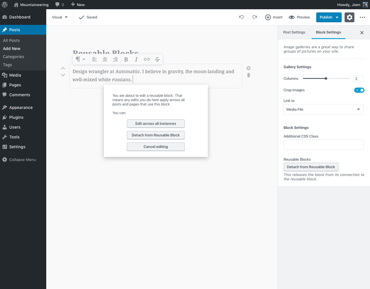
I tried a color, and I was considering a gray background, to imply it's "grayed". But in case of the color, it feels like that's a territory owned by the collaborative editing PR now (#1877) — though that could just be me falling short. One thing we could do is add a label when the block is selected, same as the design for collaborative. A label that just says "Reusable Block: [Blockname]", or something.
Good points. Seems like this is something that could be optimized as a second phase of this. Maybe the creation modal is two-step, with a "You can now find your new block in the inserter" message in step 2, or something. All solid ideas. If you would like to mess with the mockup (or if I have to step out in case of baby), I've updated the sketch file that includes these mockups here: https://github.com/WordPress/gutenberg/blob/master/docs/design.md#more-resources |
|
Great flow, thanks for exploring these @joen! Piggybacking on @jwold's feedback with some ideas:
Maybe the prompt should only show up the first time you edit a reusable block on whatever post or page you're working on. Once you save, leave, and come back to edit later, you could see the prompt again.
+1
To be honest, I'd still like to see us explore tabs on the left side of the block inserter on desktop. I foresee folks wanting to add tabs in the future (maybe even us, once we start doing more with customization), and moving the tabs to the left would better accommodate this growth. Plus, I believe it would help fix some of the accessibility problems @afercia has pointed out in other issues. If we moved tabs to the left, we could try something like:
|
|
Solid feedback as usual. Just zooming in on the "tabs on the left" thing — that's an interesting idea. I have a feeling @afercia might love it ;) |
|
Editing reusable block prompt:
+1
+1
That does allow for a lot more expandability. Good idea. Would be nice to know our longest word in German (for example) to see how much width to give it. |
I wonder if we could let the tabs be as wide as they need to be to fit one word (and go onto multiple lines if there are multiple words), or maybe hyphenate if a word is too long? |
Good point. Doesn't have to be a limit on how much it expands, or cuts off words for another line. |
|
I'm going to work on building out the flow that @jasmussen describes here—it's a really good starting place that we can iterate on. One question, though: how are reusable blocks deleted? I'm thinking we add an |
Excellent question to be asking. I think for now, it's probably fine to have an X button next to the block in the inserter menu, so long as it has a Long term we should think of a better interface for this. It could perhaps be accessible from the ellipsis menu... or maybe it lived elsewhere. Maybe it's a submenu item of the wp nav menu, like categories? Perhaps the inserter has a blue link to "Manage reusable blocks" that loads a new section? This is something to think about as we explore this. |
|
Howdy! In WP.com, we have a feature called "Simple Payments" which allows you to create and insert a (PayPal) payment button into a post very easily. We have a custom UI built for creating and managing those buttons and use Custom Post Types on the backend to keep track of them. Gutenberg reusable/global blocks look like the perfect solution for the payment button:
However, we've discovered that it currently doesn't satisfy all of our needs. First, it would be great if we could use our own CPT definition to store the payment buttons and tell Gutenberg to use that for this specific global block. Would that be possible? Secondly, the global blocks inserter UI is lacking more details about a payment button. From the mockups, it looks like a global block is identified only by a title. It would be nice, though, if we could add some more info like price and/or the button preview. @mtias had this idea that we could have a special function in a block which would return a preview/something for a global block which would get rendered to the right (or on hover/focus?) of the global block in the inserter UI. What do you think? Something worth adding? |
…ndle

Force translation update when generating new bundles
One appealing aspect of blocks is that they lend themselves to become reusable pieces. This will be key for theme customization (think menus, headers, footers, etc) down the road, but it could already be useful in the context of posts, and it may be wise to get the foundation in place.
Examples
WordPress at the moment treats galleries like this—you insert the shortcode and it is evaluated at render time. But it would be nice if any block could be turned into such a reusable entity in a way that is clear to the user and not a surprise.
Proposal
Shared blocks can get a different outline color:
And when updating them the user can be presented with a confirm dialog asking if they want to update across all posts or convert the current instance back to a static block.
Saving flow can be tricky, because we could issue saves through the API separately from saving a post, since the post only has a reference to the content of the block. This is more of a UX question, though, that will affect blocks like "navigation menu" down the road.
cc @aduth @nb @westonruter @jasmussen @melchoyce @iseulde @youknowriad @nylen and anyone interested.
The text was updated successfully, but these errors were encountered: