Around the world in 140 characters.
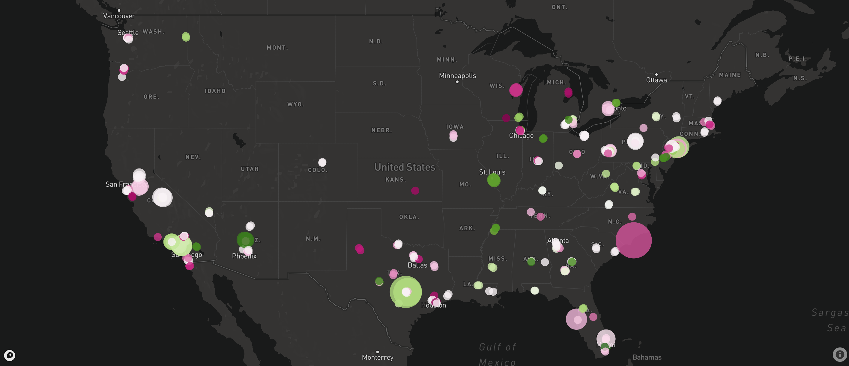
Tweet Map in the United States for querying "Donald Trump"
There are so many news articles and tweets written everyday about so many events and people. People want to find out what's going on in the world around them, and see why it's important and why people care.
After a user query, we scrap Twitter for recent and popular tweets and display the tweets on a world map to show users where their event is being talked about the most. The map also displays the points with a sentiment color, so you can see groups in the world where people really like/dislike the event. We then use different text extraction and analytics to generate a word cloud to show users the most important topics and entities talked about in the news. We also scrap the newsapi for recent news on the event, and display them and tweets on a timeline, with sentiment attached to each article so users can see how others feel about the event.
We're planning to add more features in terms of visualizing the data, as well as filtering. One idea we have is to figure out if the query is related to finance, and if it is, we would display a stock graph related to the companies mentioned, and then news articles that appear at the stock's spikes and dips. Likewise if the query is related to politics, we want to implement a model that is able to determine political bias, and display left and right leaning tweets and articles on a spectrum. We also want to finish the entity tagging, which would be shown on the map. Additionally, showing some kind of relationship between articles/tweets would be interesting.