
Antwort offers responsive layouts for Email that both fits and adapts to client widths. Don't underwhelm desktop users with single column layouts that work for mobile. Antwort offers columns on desktop that automatically become rows on mobile.
Author: Julie Ng (@jng5)
Date: October 2014
Version: 1.0.0
- Works on mobile: Mail on iOS and Email on Android.
- Works in major clients like AOL, gmail, outlook.com and Yahoo.
- Even works in Outlook (2000+).
- Bulletproof layouts: made with dynamic content in mind.
- Minimalist in design for maximum customizability.
-
Source templates
Antwort now includes the source templates (pre inlined CSS) for your reference. This lets you easily customize the template for your own use. Each template has abuild.htmlwith inlined CSS as well as the original source files in asourcefolder. -
Support for Android 4.3+
Antwort v0 relied on applyingdisplay: block;to<td>to force columns into rows. Starting with Android 4.3, that is no longer possible, i.e. columns remain columns.Antwort v1 relies on conditional wrapper tables to support Microsoft Outlook desktop clients. The columns themselves are no longer
<td>s but<table>s, whose width expand to 100% on mobile devices.
Included templates as of v1.0.0 release (14 October 2014):
Single Column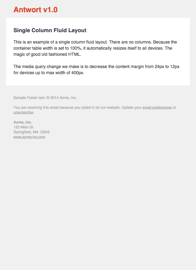
|
Two Columns (text)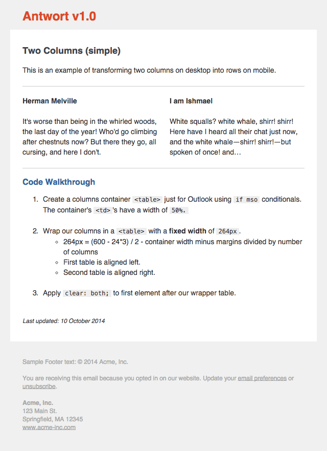
|
Three Columns (images)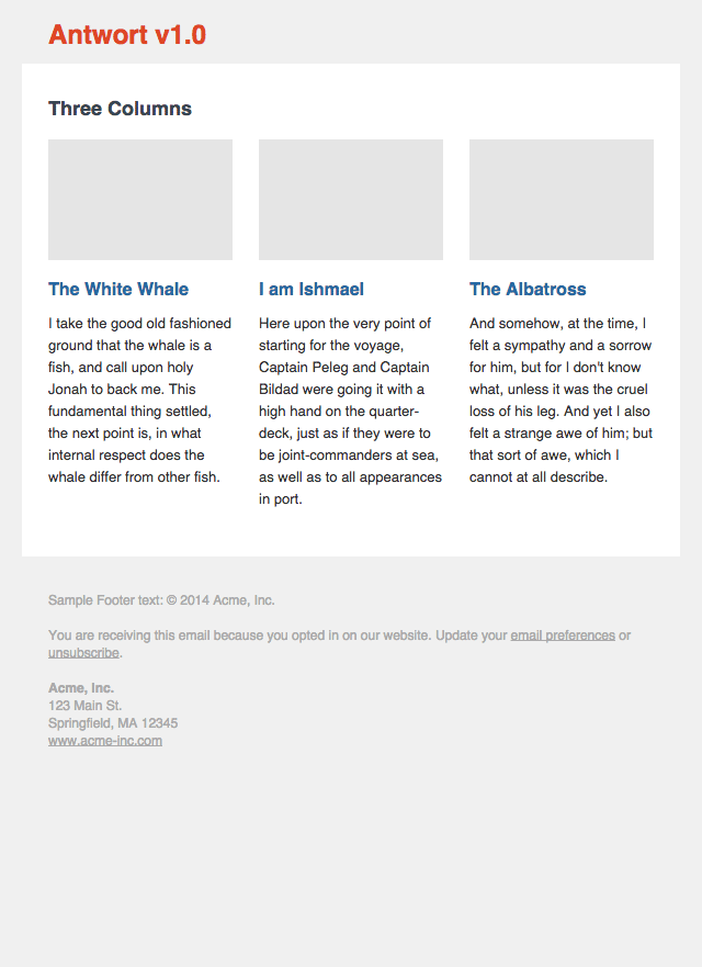
|
| Litmus Previews | Litmus Previews | Litmus Previews |
NOTE: many Litmus thumbnails are broken and not showning the white background container. But if you view the large version, you will see that the Antwort templates render perfectly as intended.
Screenshots updated on 13 January 2016.
Antwort is not a framework. Antwort is meant to teach you how to do responsive layouts for Email. That's why source pre-lined HTML is now included for you to learn from.
Before posting an issue, please
- Make sure you are sending the email from an Email Service Provider (ESP), for example MailChimp not your Email client e.g. Outlook.
- Double check any code changes you might have made
- Do a test send to yourself and view the source. Did your ESP change the code?
8 July 2015
- New: removed
attribute=""CSS selector syntax now that Yahoo Mail fixed their CSS parser - Fixed: Three columns with images: replaced margins with padding to support Outlook.com
3 December 2014
- Added
<meta http-equiv="X-UA-Compatible" content="IE=edge">to enable media queries on Windows 8 phones
14 October 2014
- Complete re-write of code, to reflect latest email development challenges, especially with Android 4.3+
- New: include source folders before inlining CSS.
- New: single column fluid layout
- Footer now includes example address, which has an example for removing blue iOS links.
April 2013
- Fixed issue #8 - headlines no longer centered in Outlook.com and older Outlook.
- Fixed issue #7 - moved padding overrides to parent
<td>in mobile styles.
26 March 2013
- Fixed column margin issue after Hotmail/Outlook dropped margin support.
- Issue #5 fixed - Outlook.com parses HTML tags in comments.
- Issue #3 fixed - control characters removed from template.
- Added screenshots of current version from Litmus test.
4 Jan 2013
- Hello open source world.
Antwort is provided under the MIT License - see LICENSE.md for full details.