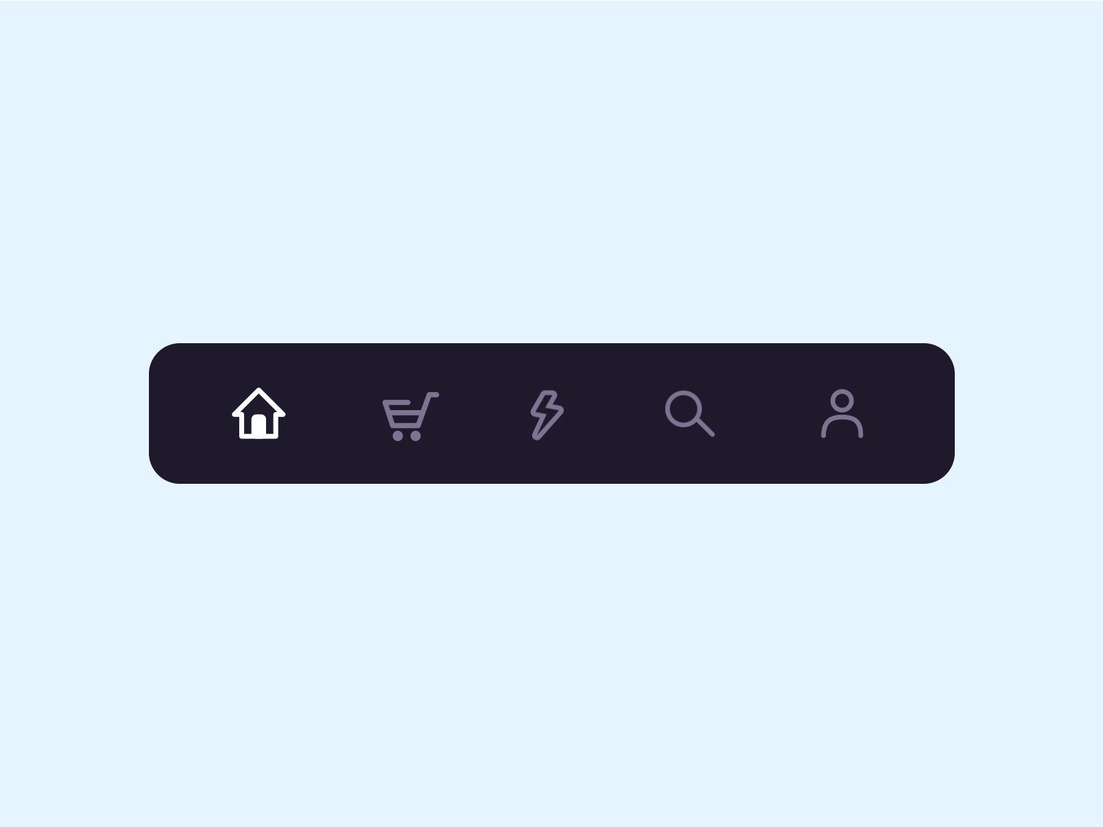
A custom navigation bar with bubble click effect.


This project is inspired by this post from Dribbble and The Boring Flutter Development Show, Ep. 35
This package gives you a cute bubble effect when you click on the navigation bar.
Dribbble:
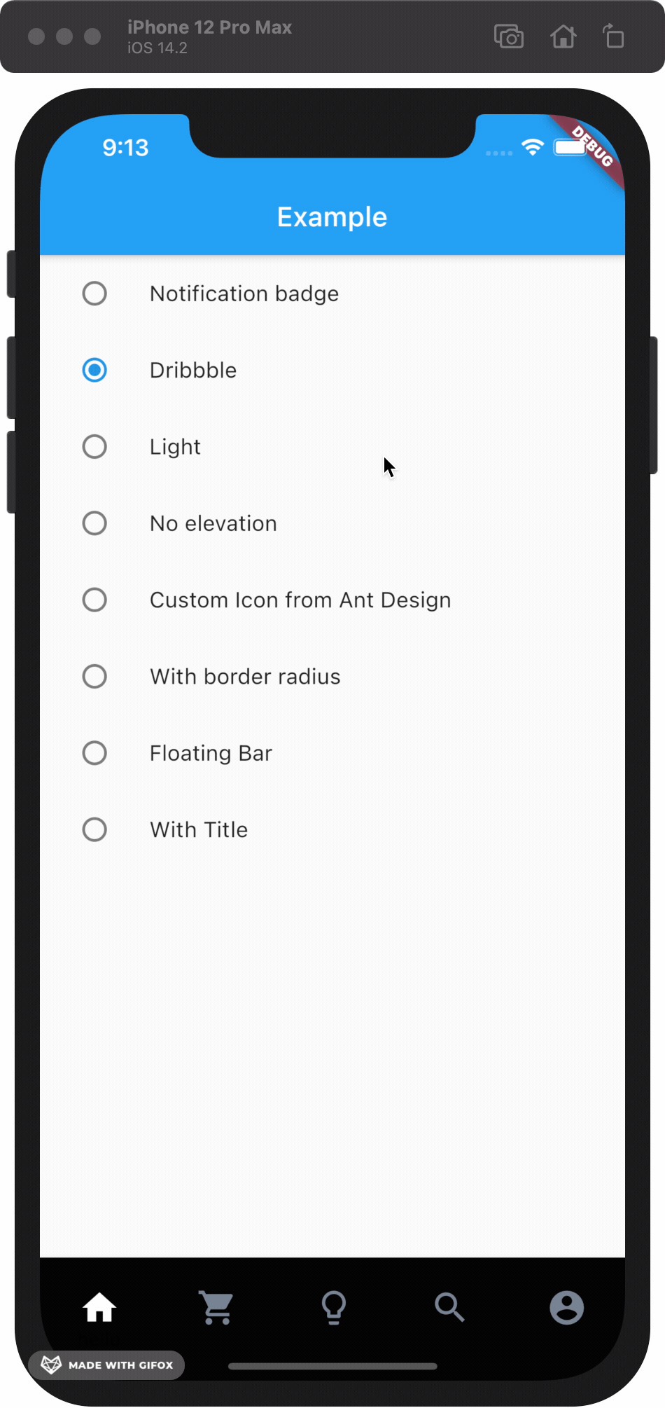
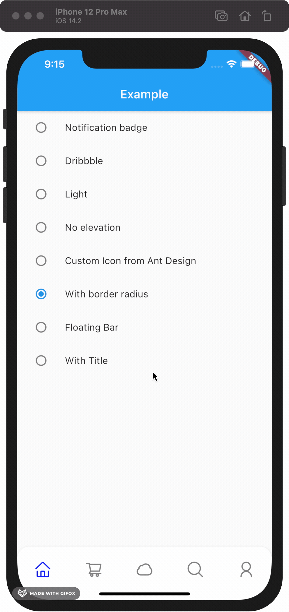
Implemented:
|
|
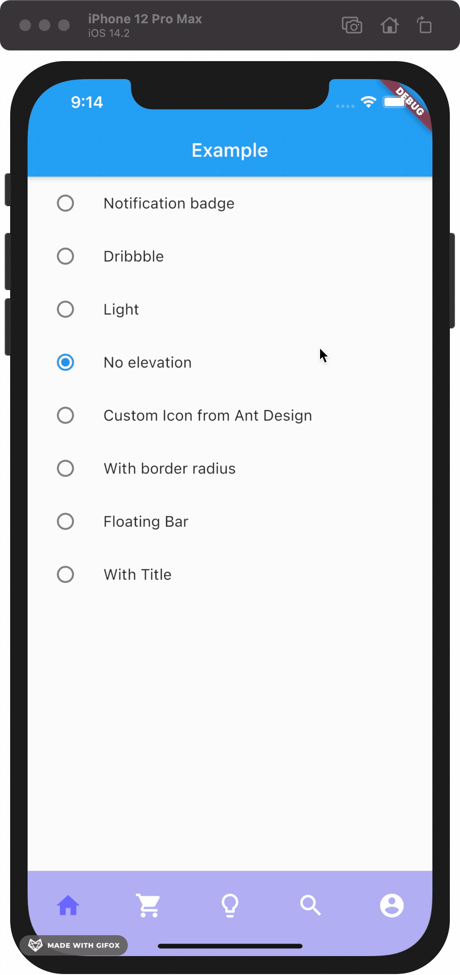
|

|
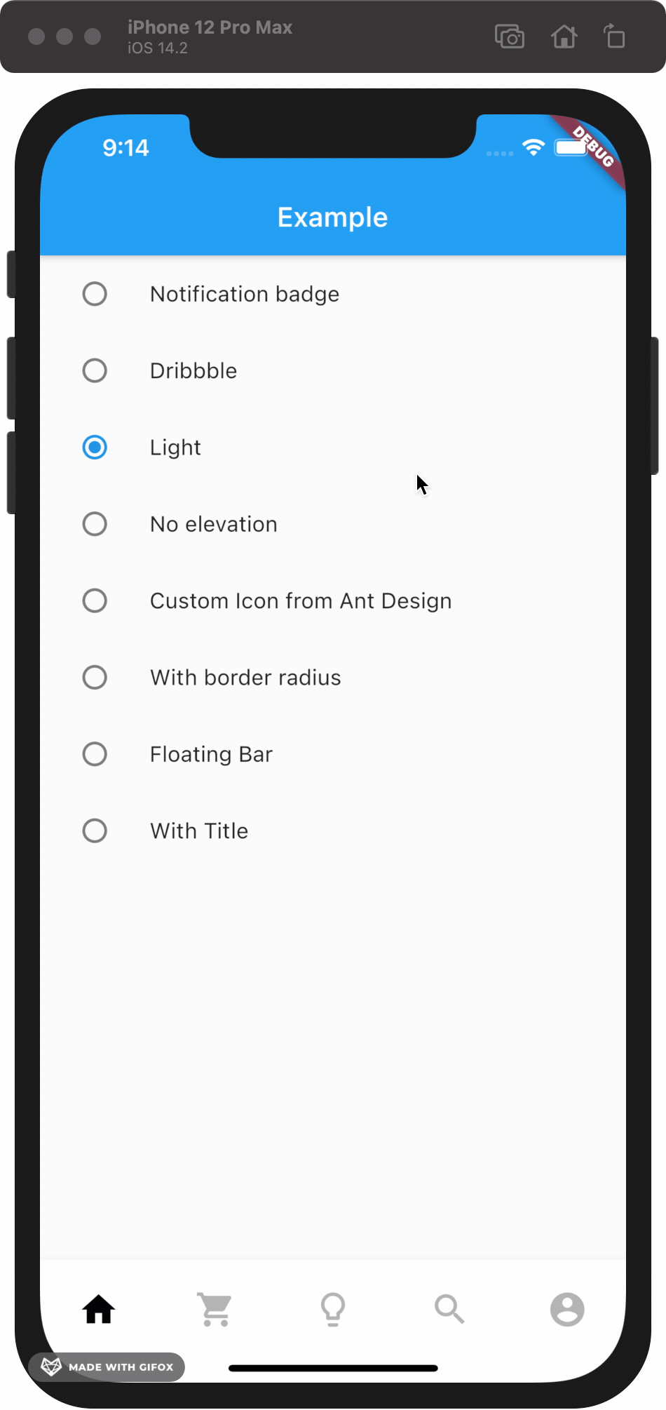
|
|
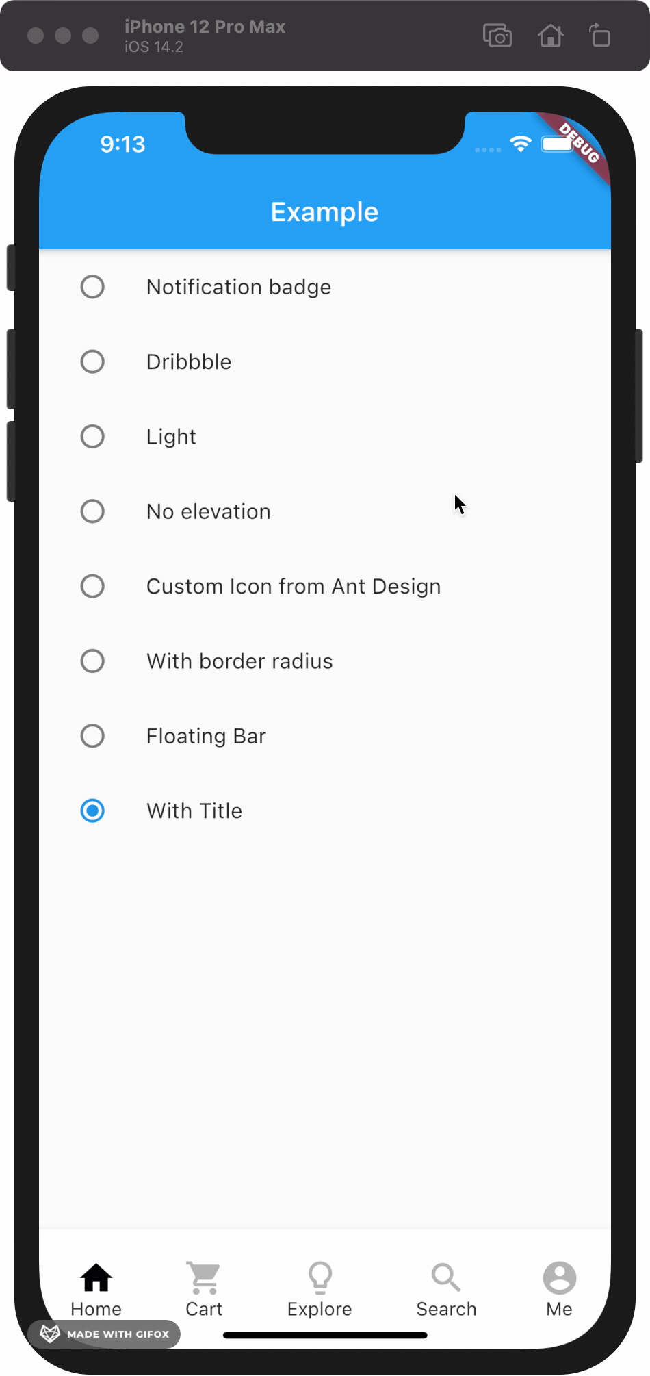
|

|
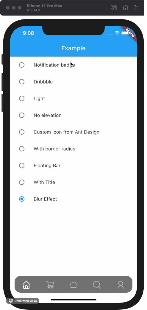
|
Add this to your package's pubspec.yaml file:
dependencies:
custom_navigation_bar: lastest versionIf you update from version under 0.6.0, there are some breaking changes in the version 0.6.0. The icon in CustomNavigationBarItem has changed from IconData to Widget.
old version
CustomNavigationBarItem(
      {@required this.icon,
      IconData selectedIcon,
      this.selectedTitle,
      this.unSelectedTitle,
      this.badgeCount = 0,
      this.showBadge = true})
      : selectedIcon = selectedIcon ?? icon;

  ///
  /// The icon of the item
  /// Typically the icon is an [Icon].
  ///
  final IconData icon;
new version
CustomNavigationBarItem(
      {@required this.icon,
      Widget selectedIcon,
      this.title,
      Text selectedTitle,
      this.badgeCount = 0,
      this.showBadge = false})
      : selectedIcon = selectedIcon ?? icon,
        selectedTitle = selectedTitle ?? title;

  ///
  /// The icon of the item
  /// Typically the icon is an [Icon].
  ///

final Widget icon; | Attributes | Type | Description | Default |
|---|---|---|---|
scaleFactor |
double |
scale factor for the icon scale animation. | 0.2 |
elevation |
double |
The z-coordinate of this CustomNavigationBar | 8.0 |
items |
List |
item data in CustomNavigationBar | required |
selectedColor |
Color |
[Color] when [CustomNavigationBarItem] is selected | [blueAccent] |
unSelectedColor |
Color |
[Color] when [CustomNavigationBarItem] is not selected. | grey[600] |
onTap |
Function(int) |
callback function when item tapped | null |
currentIndex |
int |
current index of navigation bar. | 0 |
iconSize |
double |
size of icon. also represent the max radius of bubble effect animation. | 24.0 |
backgroundColor |
Color |
Background color of [CustomNavigationBar] | Colors.white |
strokeColor |
Color |
stroke color | blueAccent |
bubbleCurve |
Curve |
animation curve of bubble effect | linear |
scaleCurve |
Curve |
animation curve of scale effect | linear |
borderRadius |
Radius |
border radius of navigation bar | Radius.zero |
isFloating |
bool |
control if CustomNavigationBar is floating | false |
blurEffect |
bool |
control if CustomNavigationBar show blur effect | false |
opacity |
double |
control CustomNavigationBar blur effect opacity when blurEffect is true |
0.8 |
brightness |
Brightness |
describes the contrast of a theme or color palette. If you want adaptive system display setting like iOS dark mode , you should set Brightness.dark or Brightness.light . if this attribute be set , other attributes with "*Color" (like selectedColor) will not take effect , should use lightThemeData or darkThemeData |
null |
lightThemeData |
CustomNavigationBarThemeData |
when brightnessis light,you can custom the light theme color if you want it |
null |
darkThemeData |
CustomNavigationBarThemeData |
when brightnessis dark,you can custom the dark theme color if you want it |
null |
Attention: If you set isFloating to true, I would recommand you to set extendBody to true in Scaffold for a better performance.
And for customize icon in the navigation bar, just put the icons you want in the CustomNavigationBarItem like this.
CustomNavigationBar(
        ...
        items: [
          CustomNavigationBarItem(
          icon: Icon(Icons.home),
          title: Text("hello"),
        ),
        CustomNavigationBarItem(
          icon: Icon(Icons.shopping_cart),
        ),
        CustomNavigationBarItem(
          icon: Icon(Icons.lightbulb_outline),
        ),
        CustomNavigationBarItem(
          icon: Icon(Icons.search),
        ),
        CustomNavigationBarItem(
          icon: Icon(Icons.account_circle),
        ),
        ],
        ...
      )
If you want add notification badge, just use like this
CustomNavigationBar(
        ...
        items: [
        CustomNavigationBarItem(
          icon: Icon(Icons.home),
          badgeCount: _badgeCounts[0],
          showBadge: _badgeShows[0],
        ),
        CustomNavigationBarItem(
          icon: Icon(Icons.shopping_bag),
          badgeCount: _badgeCounts[1],
          showBadge: _badgeShows[1],
        ),
        CustomNavigationBarItem(
          icon: Icon(Icons.lightbulb_outline),
          badgeCount: _badgeCounts[2],
          showBadge: _badgeShows[2],
        ),
        CustomNavigationBarItem(
          icon: Icon(Icons.search),
          badgeCount: _badgeCounts[3],
          showBadge: _badgeShows[3],
        ),
        CustomNavigationBarItem(
          icon: Icon(Icons.account_circle),
          badgeCount: _badgeCounts[4],
          showBadge: _badgeShows[4],
        ),
      ],
        ...
      )
To clear a badge, set showBadge to false
If you want add title under icon, just use like this
CustomNavigationBar(
      iconSize: 30.0,
      selectedColor: Color(0xff040307),
      strokeColor: Color(0x30040307),
      unSelectedColor: Color(0xffacacac),
      backgroundColor: Colors.white,
      items: [
        CustomNavigationBarItem(
          icon: Icon(Icons.home),
          title: Text("Home"),
        ),
        CustomNavigationBarItem(
          icon: Icon(Icons.shopping_cart),
          title: Text("Cart"),
        ),
        CustomNavigationBarItem(
          icon: Icon(Icons.lightbulb_outline),
          title: Text("Explore"),
        ),
        CustomNavigationBarItem(
          icon: Icon(Icons.search),
          title: Text("Search"),
        ),
        CustomNavigationBarItem(
          icon: Icon(Icons.account_circle),
          title: Text("Me"),
        ),
      ],
      currentIndex: _currentIndex,
      onTap: (index) {
        setState(() {
          _currentIndex = index;
        });
      },
);Check example app for more details.
Issues and pull requests are welcomed!!
- Code format
- Make it more like native navigation bar in Flutter.
- Better documentation
- More customizations!! And more...