GridTag
A tag that renders a dynamic AJAX based data table. The grid tag is based on the jqGrid plugin.
For custom locals use the head tag
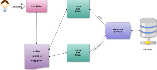
Enable JSON support in your Struts2 web application.
- Use the json plugin that is distributed by Struts2 since version 2.1.8
- Copy struts2-json-plugin-2.x.x.jar in your WEB-INF/lib path.
- Enable json results for your package in struts2.xml config file.
<package name="showcase" extends="struts-default,json-default" namespace="/">
</package>
Create a Struts2 action that return a valid JSON result.
@ParentPackage(value = "showcase")
public class JsonDataProvider extends ActionSupport {

  //Your result List
  private List<Customer>      gridModel;

  //get how many rows we want to have into the grid - rowNum attribute in the grid
  private Integer             rows             = 0;

  //Get the requested page. By default grid sets this to 1.
  private Integer             page             = 0;

  // sorting order - asc or desc
  private String              sord;

  // get index row - i.e. user click to sort.
  private String              sidx;

  // Search Field
  private String              searchField;

  // The Search String
  private String              searchString;

  // he Search Operation ['eq','ne','lt','le','gt','ge','bw','bn','in','ni','ew','en','cn','nc']
  private String              searchOper;

  // Your Total Pages
  private Integer             total            = 0;

  // All Record
  private Integer             records          = 0;

  @Actions({
	@Action(value = "/jsontable", results = {
	  @Result(name = "success", type = "json")
	})
  })
  public String execute() {
	int to = (rows * page);
	int from = to - rows;

	//Count Rows (select count(*) from custumer)
	records = CustumerDAO.count()

	//Your logic to search and select the required data.
	gridModel = CustumerDAO.find(from, to);

	//calculate the total pages for the query
	total =(int) Math.ceil((double)records / (double)rows);

	return SUCCESS;
  }

  public String getJSON() {
	return execute();
  }

  //Getters and Setters for Attributes
}<%@ taglib prefix="s" uri="/struts-tags"%>
<%@ taglib prefix="sj" uri="/struts-jquery-tags"%>
<%@ taglib prefix="sjg" uri="/struts-jquery-grid-tags"%>
<sj:head jqueryui="true" jquerytheme="redmond" />Add grid and grid columns to your page
<s:url var="remoteurl" action="json-data-provider"/>
<sjg:grid
	id="gridtable"
	caption="Customer Examples"
	dataType="json"
	href="%{remoteurl}"
	pager="true"
	gridModel="gridModel"
	rowList="10,15,20"
	rowNum="15"
	rownumbers="true"
>
	<sjg:gridColumn name="id" index="id" title="ID" formatter="integer" sortable="false"/>
	<sjg:gridColumn name="name" index="name" title="Name" sortable="true"/>
	<sjg:gridColumn name="country" index="country" title="Country" sortable="false"/>
	<sjg:gridColumn name="city" index="city" title="City" sortable="false"/>
	<sjg:gridColumn name="creditLimit" index="creditLimit" title="Credit Limit" formatter="currency" sortable="false"/>
</sjg:grid>| Topic | Event | Parameter |
|---|---|---|
| onSelectRowTopics | onSelectRow | event.originalEvent.id, event.originalEvent.status, event.originalEvent.grid |
| onSelectAllTopics | onSelectAll | event.originalEvent.ids, event.originalEvent.status, event.originalEvent.grid |
| onBeforeTopics | loadBeforeSend | event.originalEvent.xhr |
| onPagingTopics | onPaging | event.originalEvent.pgButton |
| onCellSelectTopics | onCellSelect | event.originalEvent.rowid, event.originalEvent.iCol, event.originalEvent.cellcontent, event.originalEvent.e |
| onGridCompleteTopics | gridComplete | |
| onFocusTopics | beforeSelectRow | event.originalEvent.rowid, event.originalEvent.e |
| onCompleteTopics | loadComplete | event.originalEvent.request, event.originalEvent.status |
| onErrorTopics | loadError | event.originalEvent.request, event.originalEvent.status, event.originalEvent.error |
| onEditInlineAfterSaveTopics | event.originalEvent.rowid,event.originalEvent.response | |
| onEditInlineBeforeTopics | ||
| onEditInlineErrorTopics | event.originalEvent.rowid,event.originalEvent.response | |
| onEditInlineSuccessTopics | event.originalEvent.response | |
| onCellEditErrorTopics | errorCell | event.originalEvent.response, event.originalEvent.status |
| onCellEditSuccessTopics | afterSaveCell | event.originalEvent.rowid, event.originalEvent.cellname, event.originalEvent.value, event.originalEvent.iRow, event.originalEvent.iCol |
<script type="text/javascript">
	$.subscribe('rowselect', function(event, data) {
		alert('Selected Row : ' + event.originalEvent.id);
	});
</script>

<sjg:grid
	...
	onSelectRowTopics="rowselect"
	...
>
| accesskey | false | false | String | Set the html accesskey attribute on rendered html element | |
| altClass | false | ui-priority-secondary | false | String | The class that is used for alternate rows. You can construct your own class and replace this value. This option is valid only if altRows options is set to true |
| altRows | false | false | false | Boolean | Set a zebra-striped grid |
| autoencode | false | true | false | Boolean | When set to true encodes (html encode) the incoming (from server) and posted data (from editing modules). By example < will be converted to < |
| autowidth | false | false | false | Boolean | When set to true, the grid width is recalculated automatically to the width of the parent element. This is done only initially when the grid is created. |
| caption | false | false | String | Defines the Caption layer for the grid. This caption appear above the Header layer. If the string is empty the caption does not appear. | |
| cellEdit | false | false | false | Boolean | Enables (disables) cell editing. See Cell Editing for more details |
| cellurl | false | false | false | Boolean | the url where the cell is to be saved. |
| connectWith | false | empty string | false | String | Determines the target grid(s) to which the row should be dropped. The option is a string. In case of more than one grid the ids should be delemited with comma - i.e #grid1, #grid2 |
| cssClass | false | false | String | The css class to use for element | |
| cssErrorClass | false | false | String | The css error class to use for element | |
| cssErrorStyle | false | false | String | The css error style definitions for element to use | |
| cssStyle | false | false | String | The css style definitions for element to use | |
| dataType | false | false | String | Type of the result. e.g. html, xml, text, json, ... | |
| direction | false | ltr | false | String | Determines the language direction in grid. The default is 'ltr' (Left To Right language). When set to 'rtl' (Right To Left) the grid automatically do the needed. |
| disabled | false | false | String | Set the html disabled attribute on rendered html element | |
| draggable | false | false | String | Enable draggable functionality to the DIV element. Move the draggable object by clicking on it with the mouse and dragging it anywhere within the viewport. | |
| draggableAddClasses | false | false | Boolean | If set to false, will prevent the ui-draggable class from being added. This may be desired as a performance optimization when calling draggable init on many hundreds of elements. Default: true | |
| draggableAppendTo | false | false | String | The element passed to or selected by the appendTo option will be used as the draggable helper's container during dragging. By default, the helper is appended to the same container as the draggable. Default: parent | |
| draggableAxis | false | false | String | Constrains dragging to either the horizontal (x) or vertical (y) axis. Possible values: x or y. | |
| draggableCancel | false | false | String | Prevents dragging from starting on specified elements. | |
| draggableContainment | false | false | String | Constrains dragging to within the bounds of the specified element or region. Possible string values: parent, document, window, [x1, y1, x2, y2]. | |
| draggableCursor | false | false | String | The css cursor during the drag operation. | |
| draggableDelay | false | false | String | Time in milliseconds after mousedown until dragging should start. This option can be used to prevent unwanted drags when clicking on an element. | |
| draggableDistance | false | false | String | Distance in pixels after mousedown the mouse must move before dragging should start. This option can be used to prevent unwanted drags when clicking on an element. | |
| draggableHandle | false | false | String | If specified, restricts drag start click to the specified element(s). e.g. h2 | |
| draggableHelper | false | false | String | Allows for a helper element to be used for dragging display. Possible values: original, clone. Default is original | |
| draggableIframeFix | false | false | Boolean | Prevent iframes from capturing the mousemove events during a drag. Useful in combination with cursorAt, or in any case, if the mouse cursor is not over the helper. If set to true, transparent overlays will be placed over all iframes on the page. If a selector is supplied, the matched iframes will have an overlay placed over them. Default: false | |
| draggableOnDragTopics | false | false | String | This event javascript function is triggered when the mouse is moved during the dragging. | |
| draggableOnStartTopics | false | false | String | This event javascript function is triggered when dragging starts. | |
| draggableOnStopTopics | false | false | String | This event javascript function is triggered when dragging stops. | |
| draggableOpacity | false | false | String | Opacity for the helper while being dragged. e.g. 0.75 | |
| draggableRefreshPositions | false | false | Boolean | If set to true, all droppable positions are calculated on every mousemove. Caution: This solves issues on highly dynamic pages, but dramatically decreases performance. Default: false | |
| draggableRevert | false | false | String | If set to true, the element will return to its start position when dragging stops. e.g. true, valid, invalid Default: false | |
| draggableRevertDuration | false | false | String | The duration of the revert animation, in milliseconds. Ignored if revert is false. | |
| draggableScope | false | false | String | Used to group sets of draggable and droppable items, in addition to droppable's accept option. A draggable with the same scope value as a droppable will be accepted by the droppable. | |
| draggableScroll | false | false | Boolean | If set to true, container auto-scrolls while dragging. | |
| draggableScrollSensitivity | false | false | String | Distance in pixels from the edge of the viewport after which the viewport should scroll. Distance is relative to pointer, not the draggable. Default: 20 | |
| draggableScrollSpeed | false | false | String | The speed at which the window should scroll once the mouse pointer gets within the scrollSensitivity distance. Default: 20 | |
| draggableSnap | false | false | Boolean | If set to true, the draggable will snap to the edges of the selected elements when near an edge of the element. Default: false | |
| draggableSnapMode | false | false | String | Determines which edges of snap elements the draggable will snap to. Ignored if snap is false. Possible values: inner, outer, both. Default: both | |
| draggableSnapTolerance | false | false | String | The distance in pixels from the snap element edges at which snapping should occur. Ignored if snap is false. Default: 20 | |
| draggableZindex | false | false | String | z-index for the helper while being dragged. | |
| droppable | false | false | String | Enable any DIV element to be droppable, a target for draggable elements. | |
| droppableAccept | false | false | String | All draggables that match the jQuery selector will be accepted. e.g. #myid or .myclass | |
| droppableActiveClass | false | false | String | If specified, the class will be added to the droppable while an acceptable draggable is being dragged. | |
| droppableAddClasses | false | true | false | String | If set to false, will prevent the ui-droppable class from being added. This may be desired as a performance optimization when calling droppable init on many hundreds of elements. Default: true |
| droppableGreedy | false | false | false | String | If true, will prevent event propagation on nested droppables. Default: false |
| droppableHoverClass | false | false | String | If specified, the class will be added to the droppable while an acceptable draggable is being hovered. | |
| droppableOnActivateTopics | false | false | String | This event javascript function is triggered any time an accepted draggable starts dragging. This can be useful if you want to make the droppable 'light up' when it can be dropped on. | |
| droppableOnDeactivateTopics | false | false | String | This event javascript function is triggered any time an accepted draggable stops dragging. | |
| droppableOnDropTopics | false | false | String | This event javascript function is triggered when an accepted draggable is dropped 'over' this droppable. | |
| droppableOnOutTopics | false | false | String | This event javascript function is triggered when an accepted draggable is dragged 'out' this droppable. | |
| droppableOnOverTopics | false | false | String | This event javascript function is triggered as an accepted draggable is dragged 'over' this droppable. | |
| droppableScope | false | false | String | Used to group sets of draggable and droppable items, in addition to droppable's accept option. A draggable with the same scope value as a droppable will be accepted. | |
| droppableTolerance | false | false | String | Specifies which mode to use for testing whether a draggable is over a droppable. Possible values: fit, intersect, pointer, touch. | |
| editinline | false | false | false | Boolean | Enable editing inline. Default: false |
| editurl | false | false | String | Defines the url for inline and form editing. | |
| effect | false | none | false | String | Perform a effect on the elements specified in the 'targets' attribute. e.g. bounce, highlight, pulsate, shake, size or transfer. See more details at http://docs.jquery.com/UI/Effects |
| effectDuration | false | 2000 | false | String | Duration of effect in milliseconds. Only valid if 'effect' attribute is set |
| effectMode | false | none | false | String | The Effect Mode. show, hide, toggle, none |
| effectOptions | false | false | String | jQuery options for effect, eg 'color : #aaaaaa' for the highlight effect or 'times : 3' for the bounce effect. Only valid if 'effect' attribute is set. See more details at http://docs.jquery.com/UI/Effects | |
| errorElementId | false | false | false | String | This should provide the id of the element into which the error text will be placed when an error ocurrs loading the container. If 'errorTest' is provided, that wil be used, otherwise the ajax error message text wil be used. |
| errorPosition | false | false | String | Define error position of form element (top|bottom) | |
| errorText | false | false | false | String | The text to be displayed on load error. If 'errorElement' is provided, this will display the error in the elemtn (if existing), if not, it will display the error as the contents of this container |
| filter | false | false | false | Boolean | This method construct searching creating input elements just below the header elements of the grid. |
| filterOptions | false | false | String | Options for Filter Settings as JavaScript Object. e.g. { autosearch : false, formtype : vertical } | |
| footerrow | false | false | false | Boolean | If set to true this will place a footer table with one row below the gird records and above the pager. |
| formIds | false | false | String | Comma delimited list of form ids for which to serialize all fields during submission when this element is clicked (if multiple forms have overlapping element names, it is indeterminate which will be used) | |
| gridModel | true | false | String | Name of you grid model. Must be a Collection | |
| gridview | false | false | false | Boolean | Insert the entry row at once with a jQuery append. The result is impressive - about 3-5 times faster. If set to true we can not use treeGrid, subGrid, or afterInsertRow event. |
| groupCollapse | false | false | false | Boolean | Defines if the initially the grid should show or hide the detailed rows of the group. |
| groupColumnShow | false | false | String | Show/Hide the column on which we group. The value here should be a boolean true/false for the group level. If the grouping is enabled we set this value to true. e.g. [true] | |
| groupDataSorted | false | false | false | Boolean | If this parameter is set to true we send a additional parameter to the server in order to tell him to sort the data. This way all the sorting is done at server leaving the grid only to display the grouped data. If this parameter is false additionally before to display the data we make our own sorting in order to support grouping. This of course slow down the speed on relative big data. This parameter is not valid is the datatype is local. |
| groupField | false | false | String | Defines the name from colModel on which we group. The first value is the first lavel, the second values is the second level and etc. Currently only one level is supported. e.g. ['name'] | |
| groupMinusIcon | false | ui-icon-circlesmall-minus | false | String | Set the icon from jQuery UI Theme Roller that will be used if the grouped row is expanded |
| groupOrder | false | false | String | Defines the initial sort order of the group level. Can be asc for ascending or desc for descending order. If the grouping is enabled the default value is asc. e.g. ['asc'] | |
| groupPlusIcon | false | ui-icon-circlesmall-plus | false | String | Set the icon from jQuery UI Theme Roller that will be used if the grouped row is collapsed |
| groupShowSummaryOnHide | false | false | false | Boolean | Show or hide the summary (footer) row when we collapse the group. |
| groupSummary | false | false | String | Enable or disable the summary (footer) row of the current group level. If grouping is set the default value for the group is false. e.g. [true] | |
| groupText | false | false | String | Defines the grouping header text for the group level that will be displayed in the grid. By default if defined the value if {0} which means that the group value name will be displayed. It is possible to specify another value {1} which meant the the total cont of this group will be displayed too. It is possible to set here any valid html content. e.g. ['{0} - {1} Item(s)'] | |
| height | false | false | String | The height of the grid. Can be set as number e.g. 400. Default: auto | |
| hiddengrid | false | false | false | Boolean | If set to true the grid initially is hidden. The data is not loaded (no request is sent) and only the caption layer is shown. When the show/hide button is clicked the first time to show grid, the request is sent to the server, the data is loaded, and grid is shown. From this point we have a regular grid. |
| hidegrid | false | false | false | Boolean | Enables or disables the show/hide grid button, which appears on the right side of the Caption layer. Takes effect only if the caption property is not an empty string. |
| hoverrows | false | false | false | Boolean | When set to false the mouse hovering is disabled in the grid data rows. |
| href | false | false | String | The url to be use when this element is clicked | |
| id | false | false | String | HTML id attribute | |
| indicator | false | false | String | If loading content into a target, Id of element that will be displayed during loading and hidden afterwards (will override settings for the target container) | |
| javascriptTooltip | false | false | false | Boolean | Use JavaScript to generate tooltips |
| key | false | false | String | Set the key (name, value, label) for this particular component | |
| label | false | false | String | Label expression used for rendering an element specific label | |
| labelSeparator | false | : | false | String | String that will be appended to the label |
| labelposition | false | false | String | Define label position of form element (top/left) | |
| listenTopics | false | false | String | The comma separated list 'listenTopics' is the list of topic names that is used to trigger a request. | |
| loadingText | false | false | String | If loading content into a target, The text to be displayed during load (will be shown if any provided, will override settings for the target container) | |
| loadonce | false | false | false | Boolean | If this flag is set to true, the grid loads the data from the server only once. After the first request all further manipulations are done on the client side. The functions of the pager (if present) are disabled. |
| multiboxonly | false | false | false | Boolean | This option works only when multiselect = true. When multiselect is set to true, clicking anywhere on a row selects that row; when multiboxonly is also set to true, the multiselection is done only when the checkbox is clicked (Yahoo style). Clicking in any other row (suppose the checkbox is not clicked) deselects all rows and the current row is selected. |
| multiselect | false | false | false | Boolean | If this flag is set to true a multi selection of rows is enabled. A new column at left side is added. |
| multiselectWidth | false | false | String | etermines the width of the multiselect column if multiselect is set to true. | |
| name | false | false | String | The name to set for element | |
| navigator | false | false | false | Boolean | Navigator is a method that can add predefined actions like editing, adding, deleting, and searching. This must be a true or false. |
| navigatorAdd | false | true | false | Boolean | Enables or disables the add action in the navigator. When the button is clicked a editGridRow with parameter new method is executed |
| navigatorAddOptions | false | false | String | Add Options for Navigator. e.g. {height:280,reloadAfterSubmit:false}, | |
| navigatorCloneToTop | false | false | false | Boolean | Clones all the actions from the bottom pager to the top pager if defined. |
| navigatorDelete | false | true | false | Boolean | Enables or disables the delete action in the navigator. When the button is clicked a delGridRow method is executed. |
| navigatorDeleteOptions | false | false | String | Delete Options for Navigator. e.g. {height:280,reloadAfterSubmit:false}, | |
| navigatorEdit | false | true | false | Boolean | Enables or disables the edit action in the navigator. When the button is clicked a editGridRow method is executed with parameter the - current selected row |
| navigatorEditOptions | false | false | String | Edit Options for Navigator. e.g. {height:280,reloadAfterSubmit:false}, | |
| navigatorExtraButtons | false | false | String | Add extra buttons to Navigator. e.g.: { seperator: { title : 'seperator' }, hidebutton : { title : 'Show Hide', icon: 'ui-icon-gear', topic: showHideGrid} } | |
| navigatorInlineEditButtons | false | true | false | Boolean | Show buttons for edit and add rows in case of editinline is true. |
| navigatorRefresh | false | true | false | Boolean | Enables or disables the refresh button in the pager. When the button is clicked a trigger(reloadGrid) is executed and the search parameters are cleared |
| navigatorSearch | false | true | false | Boolean | Enables or disables the search button in the pager.When the button is clicked a searchGrid method is executed |
| navigatorSearchOptions | false | false | String | Search Options for Navigator. e.g. {height:280,reloadAfterSubmit:false}, | |
| navigatorView | false | false | false | Boolean | Enables or disables the view button in the pager. When the button is clicked a viewGridRow method is executed |
| navigatorViewOptions | false | false | String | View Options for Navigator. e.g. {sopt:['cn','bw','eq','ne','lt','gt','ew']}, | |
| onAfterValidationTopics | false | false | String | A comma delimited list of topics that published after the Ajax validation. event.originalEvent.formvalidate to see if validation passed/failed. | |
| onAlwaysTopics | false | false | String | A comma delimited list of topics that published always | |
| onBeforeTopics | false | false | String | Topics that are published before a load | |
| onBlurTopics | false | false | String | A comma delimited list of topics that published when the element is blured | |
| onCellEditErrorTopics | false | false | String | A comma delimited list of topics that published is called immediately if there is a server error. | |
| onCellEditSuccessTopics | false | false | String | A comma delimited list of topics that published is called immediately after the cell has been successfully saved. | |
| onCellSelectTopics | false | false | String | A comma delimited list of topics that published when we click on particular cell in the grid. Parameters: rowid is the id of the row, iCol is the index of the cell, cellcontent is the content of the cell, e is the event object element where we click. | |
| onChangeTopics | false | false | String | A comma delimited list of topics that published when the element changed | |
| onClickGroupTopics | false | false | String | A comma delimited list of topics that published when a group is clicked. | |
| onCompleteTopics | false | false | String | A comma delimited list of topics that published when the element ajax request is completed (will override settings for a target container if provided) | |
| onDblClickRowTopics | false | false | String | A comma delimited list of topics that published row was double clicked. | |
| onDisableTopics | false | false | String | A comma delimited list of topics that published when the element disabled | |
| onEditInlineAfterSaveTopics | false | false | String | A comma delimited list of topics that published is called immediately after the data is saved to the server | |
| onEditInlineBeforeTopics | false | false | String | A comma delimited list of topics that published after successfully accessing the row for editing, prior to allowing user access to the input fields. | |
| onEditInlineErrorTopics | false | false | String | A comma delimited list of topics that published is called immediately after the data is saved to the server | |
| onEditInlineSuccessTopics | false | false | String | A comma delimited list of topics that published is called immediately after the request is successful. | |
| onEffectCompleteTopics | false | false | String | A comma delimited list of topics that published when an effect is completed | |
| onEnableTopics | false | false | String | A comma delimited list of topics that published when the element is enabled | |
| onErrorTopics | false | false | String | A comma delimited list of topics that published when the element ajax request returns an error (will override settings for a target container if provided) | |
| onFocusTopics | false | false | String | A comma delimited list of topics that published when the element is focused | |
| onGridCompleteTopics | false | false | String | A comma delimited list of topics that published after all the data is loaded into the grid and all other processes are complete. | |
| onPagingTopics | false | false | String | A comma delimited list of topics that published after click on page button and before populating the data. Parameter: pgButton | |
| onRightClickRowTopics | false | false | String | A comma delimited list of topics that published after row was right clicked. Note - this event does not work in Opera browsers, since Opera does not support oncontextmenu event | |
| onSelectAllTopics | false | false | String | A comma delimited list of topics that published when multiselect option is true and you click on the header checkbox. | |
| onSelectRowTopics | false | false | String | A comma delimited list of topics that published when a row is selected | |
| onSortColTopics | false | false | String | A comma delimited list of topics that published immediately after sortable column was clicked and before sorting the data. Parameters: index is the index name from colModel, iCol is the index of column, sortorder is the new sorting order - can be 'asc' or 'desc' | |
| onSubGridRowExpanded | false | false | String | A comma delimited list of topics that published when subgrid row is expanded. Set event.originalEvent.orginal.proceed = false in your topic to prevent default action. | |
| onSuccessTopics | false | false | String | A comma delimited list of topics that published when the element ajax request is completed successfully (will override settings for a target container if provided) | |
| onblur | false | false | String | Set the html onblur attribute on rendered html element | |
| onchange | false | false | String | Set the html onchange attribute on rendered html element | |
| onclick | false | false | String | Set the html onclick attribute on rendered html element | |
| ondblclick | false | false | String | Set the html ondblclick attribute on rendered html element | |
| onfocus | false | false | String | Set the html onfocus attribute on rendered html element | |
| onkeydown | false | false | String | Set the html onkeydown attribute on rendered html element | |
| onkeypress | false | false | String | Set the html onkeypress attribute on rendered html element | |
| onkeyup | false | false | String | Set the html onkeyup attribute on rendered html element | |
| onmousedown | false | false | String | Set the html onmousedown attribute on rendered html element | |
| onmousemove | false | false | String | Set the html onmousemove attribute on rendered html element | |
| onmouseout | false | false | String | Set the html onmouseout attribute on rendered html element | |
| onmouseover | false | false | String | Set the html onmouseover attribute on rendered html element | |
| onmouseup | false | false | String | Set the html onmouseup attribute on rendered html element | |
| onselect | false | false | String | Set the html onselect attribute on rendered html element | |
| openTemplate | false | false | String | Set template to use for opening the rendered html. | |
| page | false | 1 | false | String | Set the initial number of page when we make the request.This parameter is passed to the url for use by the server routine retrieving the data |
| pager | false | false | false | Boolean | Defines that we want to use a pager bar to navigate through the records. This must be a true or false. |
| pagerButtons | false | true | false | Boolean | Determines if the Pager buttons should be shown if pager is available. Also valid only if pager is set correctly. The buttons are placed in the pager bar. |
| pagerInput | false | true | false | Boolean | DDetermines if the input box, where the user can change the number of requested page, should be available. The input box appear in the pager bar. |
| pagerPosition | false | center | false | String | Determines the position of the pager in the grid. By default the pager element when created is divided in 3 parts. Can be left, center, right |
| prmNames | false | {page:"page",rows:"rows", sort: "sidx",order: "sord", search:"_search", nd:"nd", id:"id",oper:"oper",editoper:"edit",addoper:"add",deloper:"del"} | false | String | Customizes names of the fields sent to the server on a Post. When some parameter is set to null they will be not sended to the server. |
| recordpos | false | right | false | String | Determines the position of the record information in the pager. Can be left, center, right |
| reloadTopics | false | false | String | A comma delimited list of topics that will cause this grid to reload | |
| requestType | false | POST | false | String | Type of the AJAX Request. POST, GET, PUT |
| requiredLabel | false | false | false | Boolean | If set to true, the rendered element will indicate that input is required |
| requiredPosition | false | false | String | Define required position of required form element (left|right) | |
| resizable | false | false | Boolean | Enable this div element to be resizable. With the cursor grab the right or bottom border and drag to the desired width or height. | |
| resizableAnimate | false | false | Boolean | Animates to the final size after resizing. Default: false | |
| resizableAnimateDuration | false | false | String | Duration time for animating, in milliseconds. | |
| resizableAnimateEasing | false | false | String | Easing effect for animating. Default: swing | |
| resizableAspectRatio | false | false | Boolean | If set to true, resizing is constrained by the original aspect ratio. Default: false | |
| resizableAutoHide | false | false | Boolean | If set to true, automatically hides the handles except when the mouse hovers over the element. Default: false | |
| resizableContainment | false | false | String | Constrains resizing to within the bounds of the specified element. Possible values: 'parent', 'document' or an id | |
| resizableDelay | false | false | String | Tolerance, in milliseconds, for when resizing should start. If specified, resizing will not start until after mouse is moved beyond duration. This can help prevent unintended resizing when clicking on an element. | |
| resizableDistance | false | false | String | Tolerance, in pixels, for when resizing should start. If specified, resizing will not start until after mouse is moved beyond distance. This can help prevent unintended resizing when clicking on an element. | |
| resizableGhost | false | false | Boolean | If set to true, a semi-transparent helper element is shown for resizing. Default: false | |
| resizableHandles | false | false | String | If specified as a string, should be a comma-split list of any of the following: 'n, e, s, w, ne, se, sw, nw, all'. Default: e, s, se | |
| resizableHelper | false | false | String | This is the css class that will be added to a proxy element to outline the resize during the drag of the resize handle. Once the resize is complete, the original element is sized. e.g. ui-state-highlight | |
| resizableMaxHeight | false | false | String | This is the maximum height the resizable should be allowed to resize to. | |
| resizableMaxWidth | false | false | String | This is the maximum width the resizable should be allowed to resize to. | |
| resizableMinHeight | false | false | String | This is the minimum height the resizable should be allowed to resize to. | |
| resizableMinWidth | false | false | String | This is the minimum width the resizable should be allowed to resize to. | |
| resizableOnResizeTopics | false | false | String | This event javascript function is triggered during the resize, on the drag of the resize handler. | |
| resizableOnStartTopics | false | false | String | This event javascript function is triggered at the start of a resize operation. | |
| resizableOnStopTopics | false | false | String | This event javascript function is triggered at the end of a resize operation. | |
| rowList | false | false | String | An array to construct a select box element in the pager in which we can change the number of the visible rows. e.g. 10,15,20 | |
| rowNum | false | false | String | Sets how many records we want to view in the grid. This parameter is passed to the url for use by the server routine retrieving the data. Note that if you set this parameter to 10 (i.e. retrieve 10 records) and your server return 15 then only 10 records will be loaded. Set this parameter to -1 (unlimited) to disable this checking. Default: 20 | |
| rowTotal | false | null | false | Integer | When set this parameter can instruct the server to load the total number of rows needed to work on. Note that rowNum determines the total records displayed in the grid, while rowTotal the total rows on which we operate. When this parameter is set we send a additional parameter to server named totalrows. You can check for this parameter and if it is available you can replace the rows parameter with this one. Mostly this parameter can be combined wit loadonce parameter set to true. |
| rownumbers | false | false | false | Boolean | If this option is set to true, a new column at left of the grid is added. The purpose of this column is to count the number of available rows, beginning from 1. In this case colModel is extended automatically with new element with name - 'rn'. Also, be careful not to use the name 'rn' in gridModel |
| scroll | false | false | false | String | Creates dynamic scrolling grids. When enabled, the pager elements are disabled and we can use the vertical scrollbar to load data. When set to true the grid will always hold all the items from the start through to the latest point ever visited. |
| scrollrows | false | false | false | Boolean | When enabled, selecting a row with setSelection scrolls the grid so that the selected row is visible. |
| shrinkToFit | false | true | false | Boolean | This option describes the type of calculation of the initial width of each column against with the width of the grid. If the value is true and the value in width option is set then: Every column width is scaled according to the defined option width. |
| sortable | false | false | Boolean | Enable sortable columns | |
| sortableAppendTo | false | false | String | Defines where the helper that moves with the mouse is being appended to during the drag. Default: 'parent' | |
| sortableAxis | false | false | String | If defined, the items can be dragged only horizontally or vertically. Possible values:'x', 'y'. | |
| sortableCancel | false | false | String | Prevents sorting if you start on elements matching the selector. Default: ':input,button' | |
| sortableConnectWith | false | false | String | Takes a jQuery selector with items that also have sortables applied. If used, the sortable is now connected to the other one-way, so you can drag from this sortable to the other. e.g. #myothersortable or .myothersortables | |
| sortableContainment | false | false | String | Constrains dragging to within the bounds of the specified element - can be a DOM element, 'parent', 'document', 'window', or a jQuery selector. | |
| sortableCursor | false | false | String | Defines the cursor that is being shown while sorting. | |
| sortableCursorAt | false | false | String | Moves the sorting element or helper so the cursor always appears to drag from the same position. Coordinates can be given as a hash using a combination of one or two keys: top, left, right, bottom. | |
| sortableDelay | false | false | String | Time in milliseconds to define when the sorting should start. It helps preventing unwanted drags when clicking on an element. | |
| sortableDistance | false | false | String | Tolerance, in pixels, for when sorting should start. If specified, sorting will not start until after mouse is dragged beyond distance. Can be used to allow for clicks on elements within a handle. | |
| sortableDropOnEmpty | false | false | Boolean | If empty allows for an item to be dropped from a linked selectable. Default: true | |
| sortableForceHelperSize | false | false | Boolean | If true, forces the helper to have a size. Default: false | |
| sortableForcePlaceholderSize | false | false | Boolean | If true, forces the placeholder to have a size. Default: false | |
| sortableGrid | false | false | String | Snaps the sorting element or helper to a grid, every x and y pixels. Array values: [x, y] | |
| sortableHandle | false | false | String | Restricts sort start click to the specified element. | |
| sortableHelper | false | false | String | Allows for a helper element to be used for dragging display. The supplied function receives the event and the element being sorted, and should return a DOMElement to be used as a custom proxy helper. Possible values: 'original', 'clone'. Default: 'original' | |
| sortableItems | false | false | String | Specifies which items inside the element should be sortable. Default: '> *' | |
| sortableOnActivateTopics | false | false | String | This event is triggered when using connected lists, every connected list on drag start receives it. | |
| sortableOnBeforeStopTopics | false | false | String | This event is triggered when sorting stops, but when the placeholder/helper is still available. | |
| sortableOnChangeTopics | false | false | String | This event is triggered during sorting, but only when the DOM position has changed. | |
| sortableOnDeactivateTopics | false | false | String | This event is triggered when sorting was stopped, is propagated to all possible connected lists. | |
| sortableOnOutTopics | false | false | String | This event is triggered when a sortable item is moved away from a connected list. | |
| sortableOnOverTopics | false | false | String | This event is triggered when a sortable item is moved into a connected list. | |
| sortableOnReceiveTopics | false | false | String | This event is triggered when a connected sortable list has received an item from another list. | |
| sortableOnRemoveTopics | false | false | String | This event is triggered when a sortable item has been dragged out from the list and into another. | |
| sortableOnSortTopics | false | false | String | This event is triggered during sorting. | |
| sortableOnStartTopics | false | false | String | This event is triggered when sorting starts. | |
| sortableOnStopTopics | false | false | String | This event is triggered when sorting has stopped. | |
| sortableOnUpdateTopics | false | false | String | This event is triggered when the user stopped sorting and the DOM position has changed. | |
| sortableOpacity | false | false | String | Defines the opacity of the helper while sorting. From 0.01 to 1 | |
| sortablePlaceholder | false | false | String | Class that gets applied to the otherwise white space. | |
| sortableRevert | false | false | Boolean | If set to true, the item will be reverted to its new DOM position with a smooth animation. Default: false | |
| sortableRows | false | false | Boolean | Enable sortable rows | |
| sortableScroll | false | false | Boolean | If set to true, the page scrolls when coming to an edge. Default: true | |
| sortableScrollSensitivity | false | false | String | Defines how near the mouse must be to an edge to start scrolling. Default: 20 | |
| sortableScrollSpeed | false | false | String | The speed at which the window should scroll once the mouse pointer gets within the scrollSensitivity distance. Default: 20 | |
| sortableTolerance | false | false | String | This is the way the reordering behaves during drag. Possible values: 'intersect', 'pointer'. In some setups, 'pointer' is more natural. Default: 'intersect' | |
| sortableZindex | false | false | String | Z-index for element/helper while being sorted. Default: 1000 | |
| sortname | false | false | String | The initial sorting name. This parameter is added to the url. If set and the index (name) match the name from colModel then to this column by default is added a image sorting icon, according to the parameter sortorder (below). | |
| sortorder | false | false | String | The initial sorting order.This parameter is added to the url - see prnNames. Two possible values - asc or desc. Default asc | |
| subGridUrl | false | false | String | This option has effect only if subGrid option is set to true. This option points to the file from which we get the data for the subgrid. jqGrid adds the id of the row to this url as parameter. | |
| subGridWidth | false | false | String | Determines the width of the subGrid column if subgrid is enabled. | |
| tabindex | false | false | String | Set the html tabindex attribute on rendered html element | |
| targets | false | false | String | A comma separated list of ids of container elements to load with the contents from the result of this request | |
| template | false | false | String | The template (other than default) to use for rendering the element | |
| templateDir | false | false | String | The template directory. | |
| timeout | false | 3000 | false | Integer | jQuery options for timeout. Default is 3000 |
| title | false | false | String | Set the html title attribute on rendered html element | |
| tooltip | false | false | String | Set the tooltip of this particular component | |
| tooltipConfig | false | false | String | Deprecated. Use individual tooltip configuration attributes instead. | |
| tooltipCssClass | false | StrutsTTClassic | false | String | CSS class applied to JavaScrip tooltips |
| tooltipDelay | false | Classic | false | String | Delay in milliseconds, before showing JavaScript tooltips |
| tooltipIconPath | false | false | String | Icon path used for image that will have the tooltip | |
| toppager | false | false | false | Boolean | When enabled this option place a pager element at top of the grid below the caption (if available). |
| userDataOnFooter | false | false | String | When set to true we directly place the user data array userData at footer. The rules are as follow: If the userData array contain name which is equal to those of colModel then the value is placed in that column.If there are no such values nothing is palced. Note that if this option is used we use the current formatter options (if available) for that column. | |
| value | false | false | String | Preset the value of input element. | |
| viewrecords | false | false | false | Boolean | Defines whether we want to display the number of total records from the query in the pager bar. |
| viewsortcols | false | false | false | String | The purpose of this parameter is to define different look and behavior of sorting icons that appear near the header. This parameter is array with the following default options viewsortcols : [false,'vertical',true]. The first parameter determines if all icons should be viewed at the same time when all columns have sort property set to true. The default of false determines that only the icons of the current sorting column should be viewed. Setting this parameter to true causes all icons in all sortable columns to be viewed. The second parameter determines how icons should be placed - vertical means that the sorting icons are one under another. 'horizontal' means that the icons should be one near other. The third parameter determines the click functionality. If set to true the columns are sorted if the header is clicked. If set to false the columns are sorted only when the icons are clicked. Important note: When set a third parameter to false be a sure that the first parameter is set to true, otherwise you will loose the sorting. |
| width | false | false | String | If this option is not set, the width of the grid is a sum of the widths of the columns defined in the colModel (in pixels). If this option is set, the initial width of each column is set according to the value of shrinkToFit option. |