- It's a Beginner Level Project
- One can buy this from Coursera.com or recreate the project by following this .md file as well.
- I would recommend going to Coursera.com as they are investing their time and resources to create this course.

- Should you be downloading MS Power BI Kostenlos Desktop Verson if not previously installed on your machine.
-
There are three views in the Power BI
- Report View
- Data View
- Model View
-
To get the data from storage, click on the get Data button & select your type of data

-
In the pop-up window we select either load or we can transform if needed.

- Loading time depends on the type of data we are loading
- After loading the we data, we see a list of all the available column on the right side of the window

- After clikcing the table logo on the left side of the window, we can see the data and thier columns. But the columns are not descriptive, although the original data had columns name or description

-
Source of the dataset is UCI- University of California, Irvine Machine Learning Repository. The dataset is about Credit Cards defaults in Taiwan in the year 2005
-
The right-most column is populated with US states names so that we can later use them to categorised by the states/or geolocations

-
Now we go to Home --> Transform; Here we see the descriptive names of the columns in the raw dataset.

-
Here, we click on Remove Rows --> Remove Top Row; there will be a pop-up window to specify the numbers of rows to be removed. In our case, we specify only one row and click ok button

-
Again we go to Home --> Use first row as Hearders. Now we see that the first is shown as column name.

-
We can double click on any column name and can rename them as we want.
-
To execute the changes, we need to press Home --> Close & Apply button on the left corner of the window
-
If we look at the SEX column, we see that the sex are given in 1 & 2. We can transform them in Male, Female; If there are value other than 1 & 2 we assume that they are unknown. * We can transform them by clicking on the
Home --> Transform --> Data Type Whole Number --> Text; We are doing this step because by default Power BI assumes that the column values are integers, but we need to change them to text so that we can perform our changes. -
Now we Click on the
Change valuesbutton and specify 1 = Male and 2 = Female.
-
If we did any mistake in any step, we can go the last correct step by looking at the
Applied Stepswindow on the right side of the P-BI interface. We can also delete some steps if we want.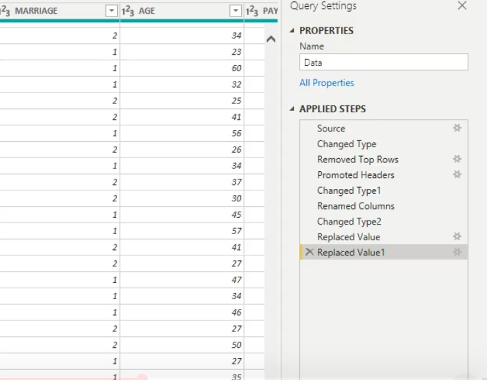
-
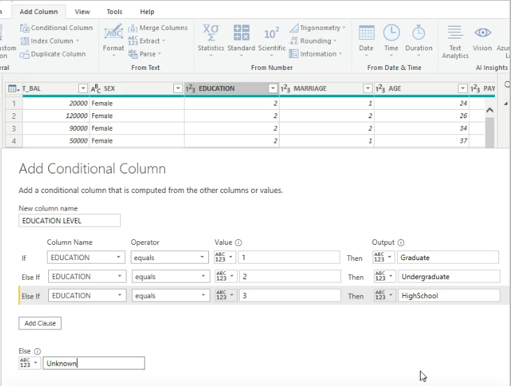
We also need to change the EDUCATION column values to some maning full and descriptive labels. Here, the EDUCATION are are give in 1,2,3 as we before in the SEX column.
-
We can do a trick, we can create a new column called Education and perform logical operation such as
If, else, value. This is helpful because we are now performing multiple operation with a single execution. -
Here we set
   1 = Graduate
   2 = Under Graduate
   3 = High School Diploma
   else = Unknown/ or as described in the original description in the source data.
-
We can see that the column's values are in descriptive names instead of 1,2 3,

-
Now we can remove the original EDUCATION column by right click --> remove if we want to do.
-
We perform the same operation on the MARRIAGE column,
   1 = Married
   2 = Un Married
   else = Unknown

-
Click on the report view on the top-left of the three view options

-
Now we want to see how the distribution of
DEFAULcolumn look like respect to the age group
We just simply select the DEFAULT column
Then Drag the AGE colum to the Axis button (in the next-left)

- If you want to zoom a specific plot, just click on the focus mode

- We can create different types of plots by clicking on the visualisation icons on the right side of the interface. Again, choice of plot depends on the specific problem and target report, and the domain knowledge as well.

- Just drag the
SEXcolumn to the legend tab to set AGE as legend
- We can remove, export usw from the three dot
...plot menu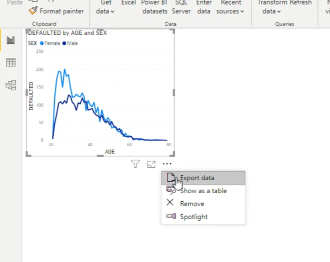
Select the DEFAULT check box like before
Drag the EDUCATION_ to the axis tab
Drag the SEX to the legend tab

Select the DEFAULT check box like before
Drag the AGE to the axis tab
Drag the SEX to the legend tab
Select DEFAULT to create a new plot
Drag the SEX column on to the Axis tab

Roller button --> Data Colors --> Show All --> Push Off to On --> Select the color from the list

- We can do many small changes like title or other by choosing from the drop-down menu

- Now we have three plots on the canvas, if we select any of the category, it will update accordingly and apply the changes to the all of the plots
-
Just select the
STATEcolumn from the column list it will automatically create a map on the canvas (P-BI is quite intellegent, it can understand that theSTATEis somehow related to the geographical locations)
-
We can select the
Field Mapnext to the map menu from the visualisation tab
-
New way to the last step
File --> Options & Settings --> Options --> Preview Features --> Shape map Visual --> ok

- At this stage need to save the workspace and restart the P-BI app.
- Load the previous saved file, and Drag the
STATEcolumn to theLocationtab.

- Drag the
DEFAULTColumn to the color saturation, find the below plot
Select DEFAULT
Drag the MARITAL STATUS on to the Axis
Drag the SEX on to the Legend
- Create a Card by Clickikng on the Card from the visualisation menu
- From the Fields drop-down menu of the DEFAULT we can select many descriptive statistics

- Slicer is a nice tool to view the data just clicking on a single factor to get all the dash-board simultaneously updated.
- Click on the slice button on the visualisation menu, a slice will be available on the canvas
- Select numerical column on the field
- Drag any factor column on to the
Axistab and another factor column on to theLegendtab - See the magic! More than one slicer would be helpful for different factors and numerical column.

- cntrl + C to omit the last command
Continue learning on Coursera!
To further your knowledge, please check out the following content on Coursera!
Courses, Specializations and Professional Certificates:
Data Visualization with Tableau - Specialization offered by University of California, Davis
Data Analysis and Visualization Foundations - Specialization offered by IBM
Business Analytics - Specialization offered by University of Pennsylvania
Excel to MySQL: Analytic Techniques for Business - Specialization offered by Duke University
Data Analysis and Presentation Skills: the PwC Approach - Specialization offered by PwC