In this tutorial we will learn:
- How to prepare a graph layout before publishing it online.
- How to export SigmaJS template and customize it.
- How to publish your interactive graph visualization online using GitHub pages.
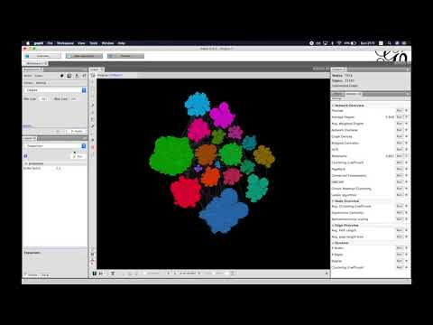
As a result of this tutorial, you will create an interactive visualization that will look similar to this one.
Watch a short walk-through screencast to get an idea of what we are going to do. Attention: the video has sound.
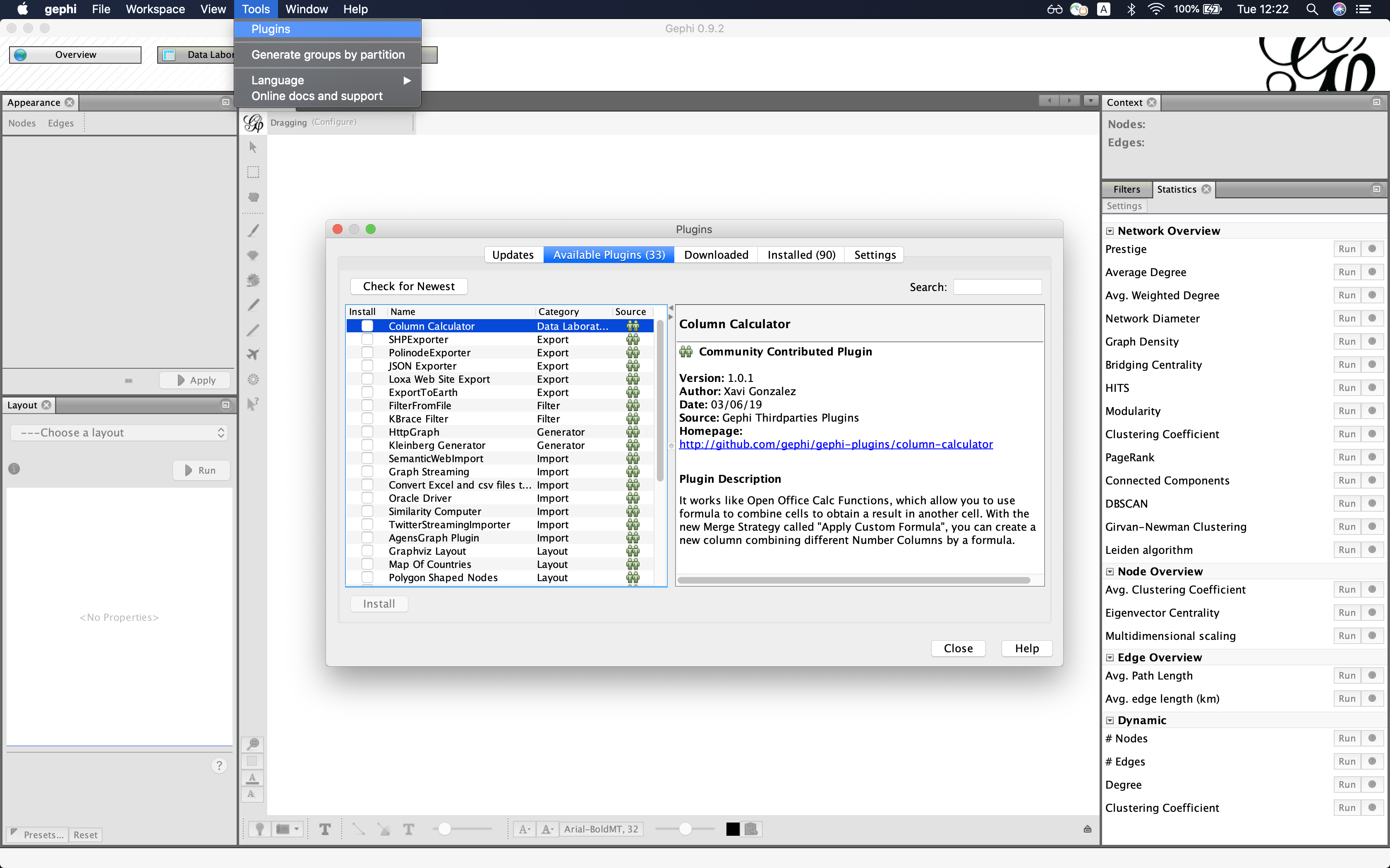
Install all necessary plugins before starting this tutorial (unless they are already installed):
- Multigravity Force Atlas 2
- Circle Pack
- Label Adjust
- SigmaJS exporter.
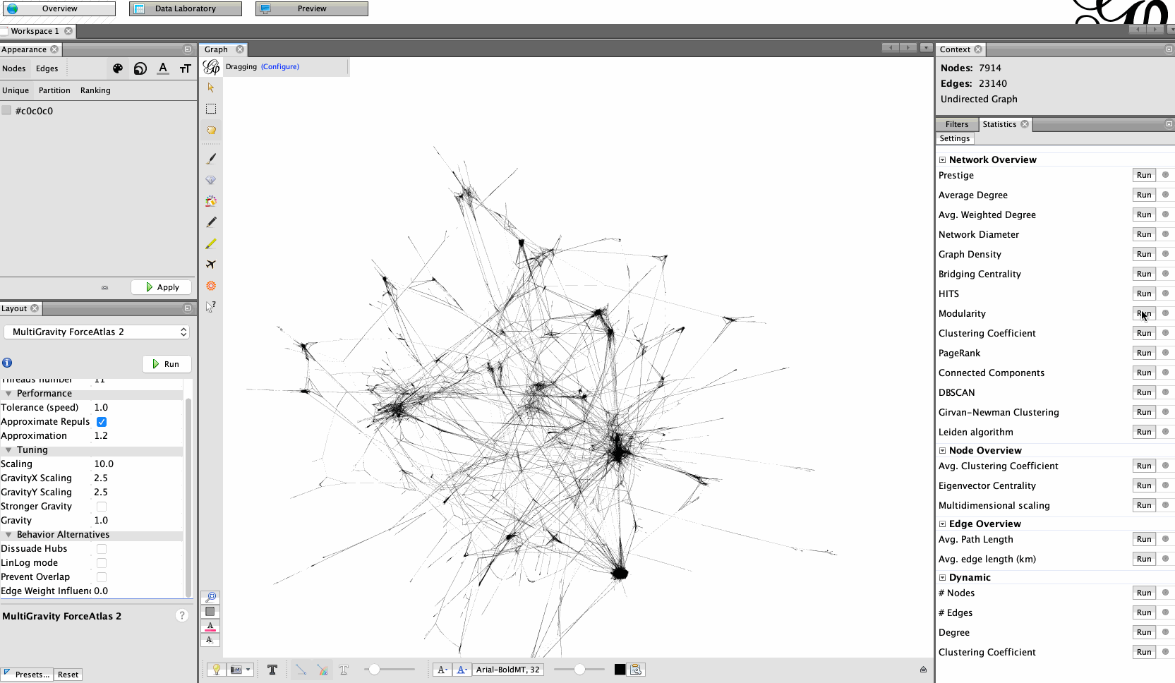
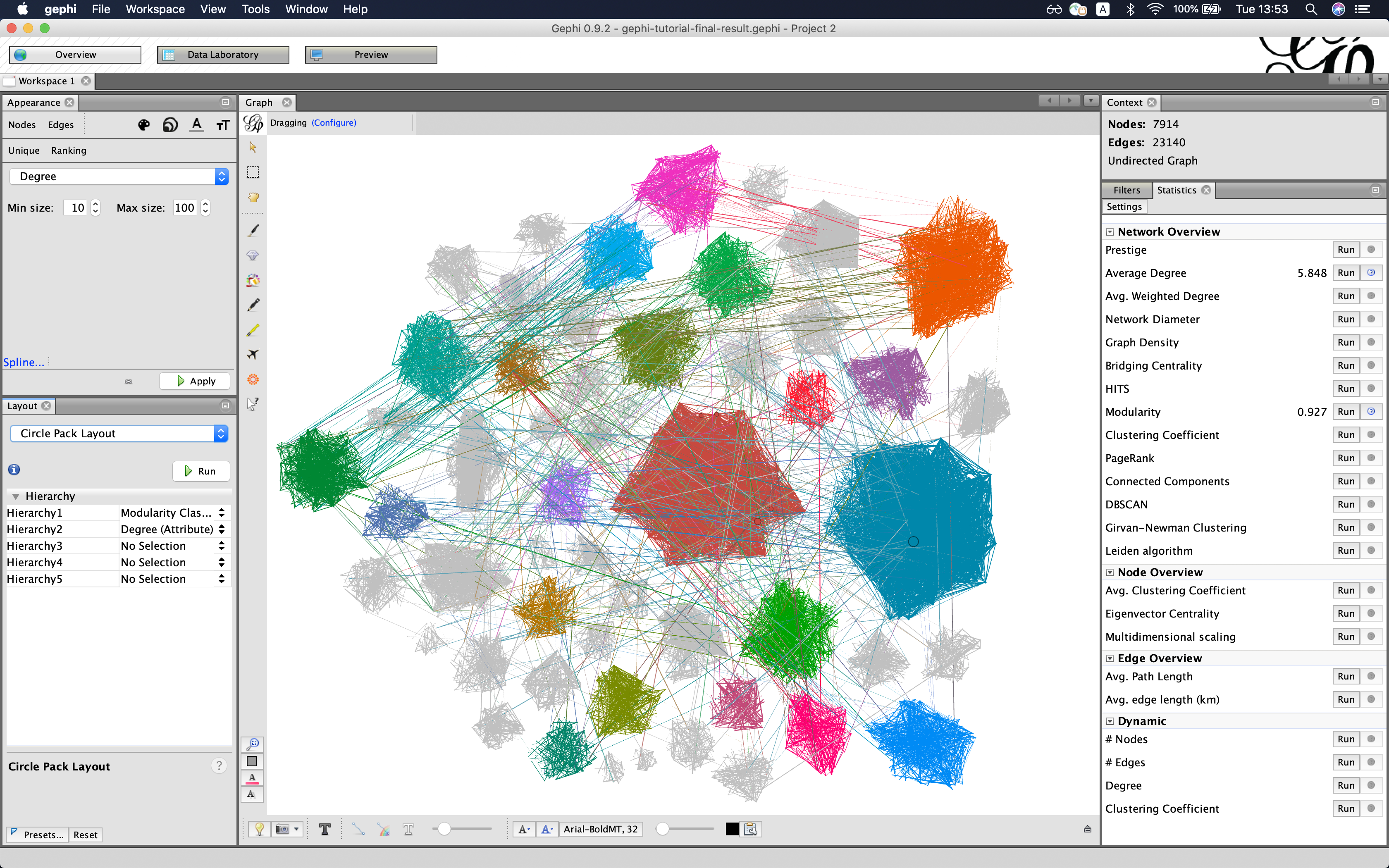
Open GEXF file in Gephi (File->Open...). In this example, we are going to work with a subsample of English Wikipedia. The graph contains pages that had anomalous visitor activity over the period 16-31 August 2018. You can find corresponding .gexf file in this folder.
Let's start with Multigravity Force Atlas 2. Take a look at this tutorial for inspiration if you want to use another layout.
Parameters:
- Scaling: 10
- Edge Weight Influence: 0
- Dissuade hubs: True
Export SigmaJS template File->Export->SigmaJS template and fill in all required fields.
Go to the exported folder and start a simple Python HTTP server to test your visualization. Depending on Python version, in the terminal, type the following command.
- Python 3.X
python -m http.server - Python 2.7
python -m SimpleHTTPServer
Now, you can interact with your graph using your web-browser (works best in Chrome). Go to http://localhost:8000/ and play with it.
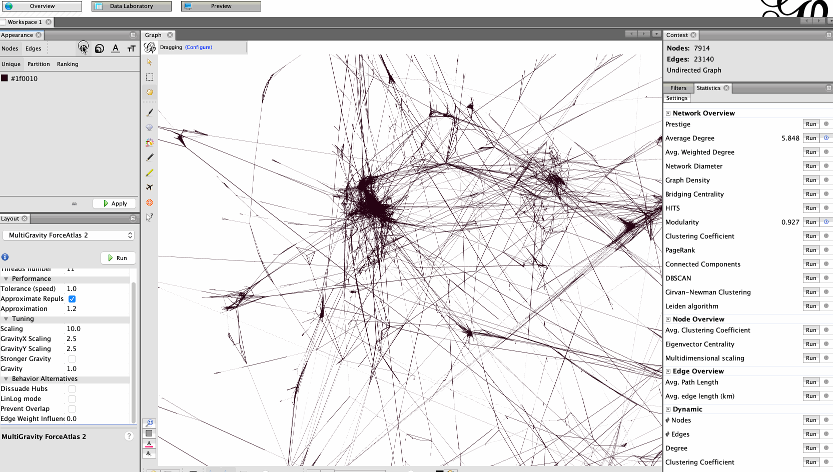
That is all we need to do to publish our visualization online. Although, as we can see, the graph looks quite raw and it is hard to interact with it. Let's compute more attributes and make the graph look nicer and more user-friendly.
We are going to use attributed layouts to enhance readability. Before doing that, we need to compute attributes.
Color nodes according to their modularity class and make their size correspond to their degree.
Use Circle Pack layout to rearrange nodes according to attributes. Use modularity and degree as parameters.
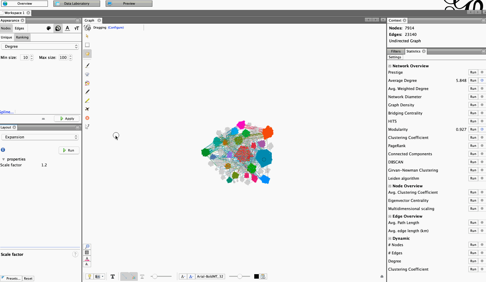
Adjust the scale and labels. Use Expansion layout to increase the scale of the layout. Display labels, reduce the font size and use Label Adjust layout to prevent overlapping node labels.
Our graph looks more readable now and it's much easier to interact with it. Export SigmaJS template once again and check it on localhost (steps 4 and 5).
Now, we can publish everything to GitHub pages.
- Create a GitHub repository.
- Go to the settings of your repository and find GitHub pages section. Specify
master branchas a source. - Clone the repository.
- Copy the exported SigmaJS template that we have prepared to the cloned folder.
- Push the files to the repository.
- Check the website with your interactive visualization (https://[YOUR-GITHUB-USER-NAME].github.io/[VIS-REPOSITORY-NAME]/network/)
- Et voila. You have just published your interactive graph visualization online.
You can adjust properties of the visualization using the config file that you can find in the folder with our SigmaJS template. Play with SigmaJS config file:
- Adjust node sizes.
- Adjust label thresholds.
If you are familiar with HTML/CSS, you can customise the style of the web page.