style: Outlined input migration #3566
Conversation
…e if not selected
|
CLA Assistant Lite All Contributors have signed the CLA. |
ESLint Summary View Full Report
Report generated by eslint-plus-action |
|
E2E Tests Failed Failed tests:
|
 iamacook
left a comment
iamacook
left a comment
iamacook
left a comment
There was a problem hiding this comment.
Nice work on this! Great to see you tweak a few inconsistencies along the way. Did you consult with @yagopv? I don't know if there's any likelihood we could move some of this in his SRC PR perhaps?
You might be able to condense some of the 'extra' styling into global overrides but I'll trust your judgement on that. I'd recommend converting the new MUI styling over to styled-components though.
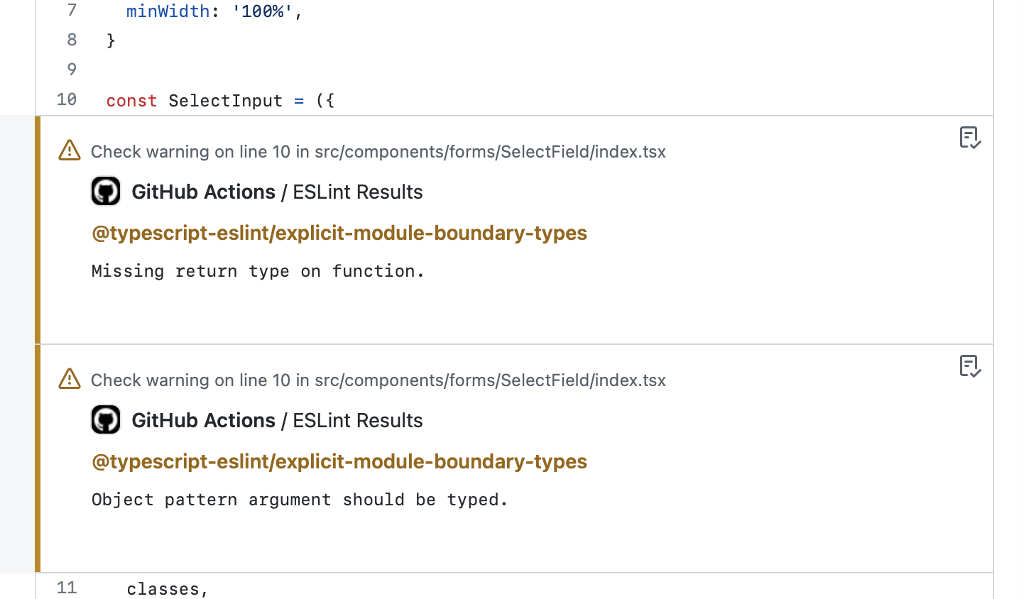
Side note: there's a missing return type in src/components/forms/SelectField/index.tsx.
src/routes/safe/components/Balances/SendModal/screens/AddressBookInput/style.ts
Outdated
Show resolved
Hide resolved
...utes/safe/components/Balances/SendModal/screens/ContractInteraction/MethodsDropdown/style.ts
Show resolved
Hide resolved
| }, | ||
| }) | ||
|
|
||
| export const selectedTokenStyles = createStyles({ |
There was a problem hiding this comment.
Please see my comment further up about styling in MUI.
There was a problem hiding this comment.
This also already existed. I moved it into a new file since it was duplicated before for SendFunds and SendCollectible. We should do the refactor to styled-components in a separate task.
src/routes/safe/components/Balances/SendModal/screens/SendFunds/TokenSelectField/style.ts
Show resolved
Hide resolved
| }, | ||
| }, | ||
| MuiFormHelperText: { | ||
| MuiFormControl: { |
There was a problem hiding this comment.
Have you checked for <FormControl> components across the app? When you add new overrides, they will ofc affect all instances already present.
There was a problem hiding this comment.
This change replaces the overflowStyle that I deleted where the width was set inline to 100% and overflow:hidden which interferes with the new input labels. There was also a cryptic comment // Neded for solving a fix in Windows browsers so we should make sure to do a full regression test on all form elements. We can still use width: 100% instead of flex: 1 as it is a bit more explicit.
There was a problem hiding this comment.
Make sure to add a comment about that to the testing section.
 katspaugh
left a comment
katspaugh
left a comment
katspaugh
left a comment
There was a problem hiding this comment.
Approved but there are lint issues.
|
This lint, I meant:
|
iamacook
left a comment
iamacook
left a comment
There was a problem hiding this comment.
Thanks for addressing my comments. Just some lint left.
|
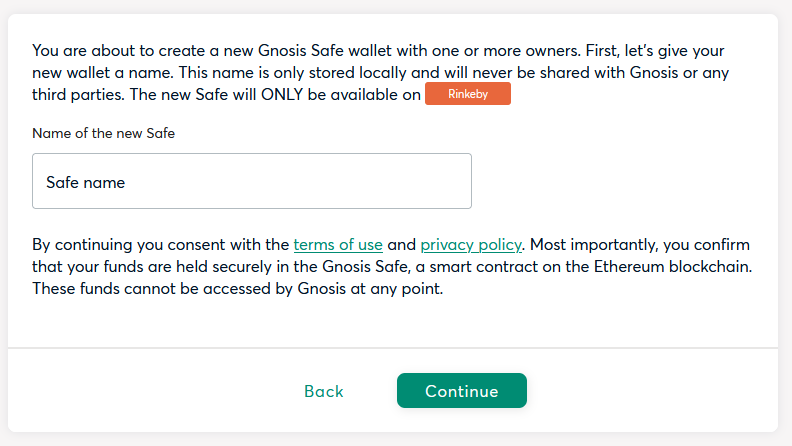
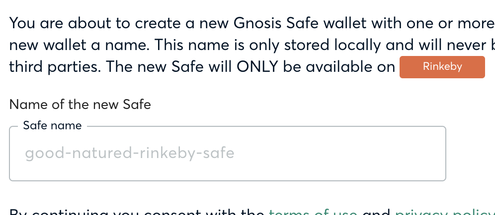
The Safe name field in the Safe creation doesn't have a correctly coloured placeholder:
It looks as though the Safe is to be called "Safe name". The dropdowns are a little skewed too. The numbers don't align quite right:
|
This is the label that animates to the top once the input is selected (Figma reference). One alternative we have is forcing the shrink state by default e.g. We could also remove it altogether in this case since there is already a label above the input field "Name of the new safe" |
|
Are you overriding the label colour? I'd suggest removing that. See the top right example here. |
We are overriding the label color as defined in Figma but I don't mind making it a bit lighter. cc @liliiaorlenko |
In this context, I would argue that it is more of a placeholder. I initially thought we had a bug naming the Safe. |
ESLint Summary View Full Report
Report generated by eslint-plus-action |
|
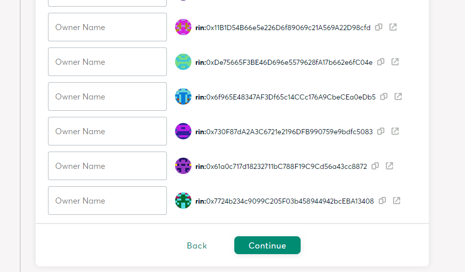
Load safe form - Owners list In this gif you can see that some owners have an ENS name already, but those are considered placeholders. See how when I enter a name manually "test1" the "owner name" label is moved to the top of the input |
|
The new error message outside of the input make the modals wiggle much more when the error is shown or not. EDIT: |

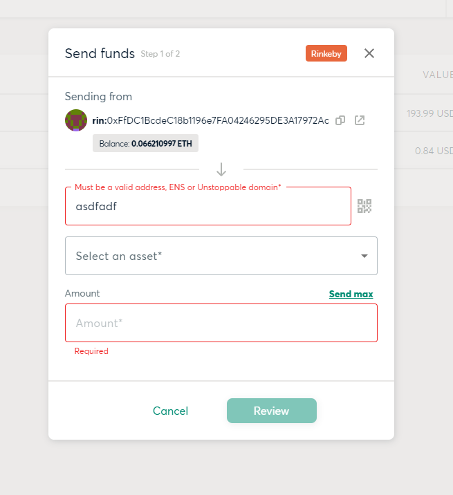
Good catch, I adjusted the owner name input fields to be "shrunk" by default so the ENS Name is always visible
I like the idea of keeping the error message at the top so the layout doesn't "jump". Some of our error messages are very unspecific like "Required" and would overwrite the input label which could affect UX negatively so we should discuss this cc @liliiaorlenko |
|
The issue reported with the names during the load safe process was fixed. For the other comment I think is best to create a new ticket to discuss it so we can pass this one |
|
Created this new ticket to discuss the error message placement #3621. I'll pass this one to QA done |
|
I dont mind error messages on top, just make it consistent everywhere |
What it solves
Resolves #3475 #534
How this PR fixes it
All input/form fields now use the outlined style instead of filled.
How to test it
Additionally, forms should be tested on Windows to prevent a potential regression with overflowing content within input fields.
Screenshots