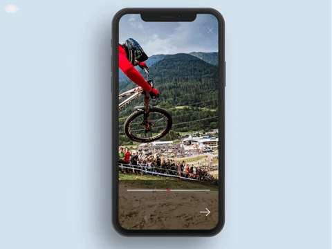
A Javascript slideshow image/video component for React-Native (Android and iOS).
| Property | Type | Default | Description |
|---|---|---|---|
| items | [object] | - | (Required at least 2 items) Sliders items. |
| loop | boolean | true | Boolean that is used to determine if the slideshow should be or not in loop |
| duration | number | 5000 | Each slide duration on screen (in milliseconds) |
| index | number | 0 | First Slide to appear |
| extraSpacing | number | 10% of width | Extra spacing each slide will have. This extra spacing basically represents the width that each image slides (eg. 300) |
| fullWidth* | boolean | false | Option that makes the image show it's full width in the animation, by using the Image.getSize from React-Native (later calculated to keep the screens ratio), and if true it will override the extraSpacing if it's set |
| progressBarColor | string | null | Option to change progress bar color |
| showProgressBar | boolean | true | Option to show or hide progress bar |
| progressBarDirection | string | null | Three options (fromLeft, fromRight, middle - null) |
| slideDirection | string | "even" | Direction of the each slide animation. Values are "even", "odd", "left", "right". Basically even means first slide goes from left-to-right, second slide goes from right-to-left and so on. Odd is opposite, left means all slides com from left-to-right and right means all slides come from right-to-left |
| footerStyle | style | null | Footer titles style |
| titleStyle | style | null | Footer titles style |
| textStyle | style | null | Footer text style |
| renderItem | func | null | Complete control of the rendered item, with one object param with 3 params ({ item, index, focusedIndex }) |
| renderFooter | func | null | Complete control of the footer, with one object param with 5 params ({ item, index, focusedIndex, defaultStyle, animation }) the animation param is an object with the following { titleTranslateY, textTranslateY, opacity } |
| renderIcon | func | null | Complete control of the icon rendered in the footer, with on param ({ snapToNext }) function to snap immediately to the next slide |
| renderCloseIcon | func | null | Complete control of the close icon rendered in the "header", with on param ({ wrapperStyle, imageStyle, onPress }) style used in the view with icon, style for the icon, and the onPress function that is passed |
| onClose | func | null | Function that is triggered when the close icon is clicked |
| Property | Type | Description |
|---|---|---|
| uri | string/number | The image url or number (if local image, the require returns a number instead) |
| title | string | The slide item's title |
| text | string | The slide item's text or description |
| duration | number | The individual slide time, this way you can customize individually how much time each slide can appear on screen |
| direction | string | The individual slide direction animation, Values are "even", "odd", "left", "right" |
| extraSpacing | number | The individual slide extra spacing, this way you can define how much width the image can slide on screen |
| fullWidth* | boolean | The individual slide width, if true the Image.getSize from React-Native will calculate the image's full width (later calculated to keep the screens ratio), and if true it will override the extraSpacing if it's set |
*This function is explained in the React-Native docs in the Image component if you want to check-out
The Image-Wrapper is a sub-component from Timed-Slideshow, it controls each image individual animation.
npm install expo-instagram-stories --save
import { ImageWrapper } from 'expo-instagram-stories';// Basic Usage
<ImageWrapper uri='https://greatist.com/sites/default/files/Running_Mountain.jpg' />| Property | Type | Description |
|---|---|---|
| uri | string/number | The image url or number (if local image, the require returns a number instead) |
| index | number | The image's index |
| duration | number | Duration of the images animation |
| focusedIndex | number | The focused image index |
| extraSpacing | number | Extra spacing of the images animation |
| fullWidth | boolean | The individual slide width, if true the Image.getSize from React-Native will calculate the image's full width (later calculated to keep the screens ratio), and if true it will override the extraSpacing if it's set |
| direction | string | The individual slide direction animation, Values are "even", "odd", "left", "right" |
MIT.