Add antarctic melt time series #237
Conversation
|
@xylar - FYI, my first few commit messages here were done incorrectly, so I repaired them and did a force push to correct. |
|
This is replaces #228, which contains some discussion related to this PR. |
| meltFlux = line[6] | ||
| meltFluxUncertainty = line[7] | ||
| meltRate = line[8] | ||
| meltRateUncertainty = line[9] |
There was a problem hiding this comment.
I would do the conversion to float here, rather than down below, because you never use the string values.
There was a problem hiding this comment.
I tried this previously in my little test script. For some reason, it doesn't like trying to convert to float at that point:
ValueError: could not convert string to float: B
In [269]: float()?
File "", line 1
float()?
^
SyntaxError: invalid syntax
There was a problem hiding this comment.
That's very odd. Can you give some more details of what the exact line is that causes that error? There should be no difference between doing the cast to float here or later on. It's just cleaner to do it here.
There was a problem hiding this comment.
If you grab the csv file from:
/global/project/projectdirs/acme/observations/Ocean/Melt/
(or set a path to it)
... and then just try w/ this little script in ipython you'll likely see the same complaint I'm seeing:
import csv
fn = open('Rignot_2013_melt_rates.csv', 'rU')
data = csv.reader(fn)
obsDict = {}
for line in data:
shelfName = line[0]
meltFlux = float( line[6] )
meltRate = float( line[8] )
obsDict[shelfName] = { 'meltFlux': meltFlux, 'meltRate': meltRate }
Ahhh wait ... I bet I know what is happening. It is trying to convert the first line of the data file to floats, and that first line is column headings. So I probably need to skip that first line, and then it will work. Let me try that. Thanks -
There was a problem hiding this comment.
Ah, I'm pretty sure you're right and you need to skip the first row, say with:
First = True
for line in data:
    if First:
        First = False
        continue
...There was a problem hiding this comment.
Actually, you can probably just do:
for line in data[1:]:
...There was a problem hiding this comment.
I found another fix for this on stack overflow. It's working now w/ the float conversion at the data-read in point. Thanks -
|
A suggested function for plotting these observations (has not been debugged!): def plot(self, config, modelValues, obsMean, obsUncertainty,
title, xlabel, ylabel, fileout):
"""
Plots the list of time series data sets and stores the result in an image
file.
Parameters
----------
config : instance of ConfigParser
the configuration, containing a [plot] section with options that
control plotting
modelValues : xarray DataSet
the data set to be plotted
obsMean : float
a single observed mean value to plot as a constant line
obsUncertainty : float
The observed uncertainty, to plot as a shaded rectangle around the mean
title : str
the title of the plot
xlabel, ylabel : str
axis labels
fileout : str
the file name to be written
Authors
-------
Xylar Asay-Davis, Stephen Price
"""
# play with these as you need
figsize = (15, 6)
dpi = 300
modelLineStyle = 'b-'
modelLineWidth = 1.2
obsColor = 'gray'
obsLineWidth = 2
maxXTicks = 20
calendar = self.calendar
axis_font = {'size': config.get('plot', 'axisFontSize')}
title_font = {'size': config.get('plot', 'titleFontSize'),
'color': config.get('plot', 'titleFontColor'),
'weight': config.get('plot', 'titleFontWeight')}
plt.figure(figsize=figsize, dpi=dpi)
minDays = modelValues.Time.min()
maxDays = modelValues.Time.max()
plt.plot(modelValues.Time.values, modelValues.values, modelLineStyle,
linewidth=modelLineWidth)
ax = plt.gca()
# this makes a "patch" with a single rectangular polygon, where the pairs are time and melt
# rate for the 4 corners, and "True" means it is a closed polygon:
patches = [Polygon([[minDays, obsMean-obsUncertainty], [maxDays, obsMean-obsUncertainty],
[maxDays, obsMean+obsUncertainty], [minDays, obsMean+obsUncertainty]],
closed=True)]
# make the polygon gray and mostly transparent
p = PatchCollection(patches, color=obsColor, alpha=0.4)
# add it to the plot on the current axis
ax.add_collection(p)
# also plot a line
plt.plot([minDays, maxDays], [obsMean, obsMean], color=obsColor, linewidth=obsLineWidth)
# this will need to be imported from shared.plot.plotting
plot_xtick_format(plt, calendar, minDays, maxDays, maxXTicks)
if title is not None:
plt.title(title, **title_font)
if xlabel is not None:
plt.xlabel(xlabel, **axis_font)
if ylabel is not None:
plt.ylabel(ylabel, **axis_font)
if fileout is not None:
plt.savefig(fileout, dpi=dpi, bbox_inches='tight', pad_inches=0.1)
if not config.getboolean('plot', 'displayToScreen'):
plt.close() |
|
sorry the lack of imagination: what does WIP stand for? |
|
WIP stands for work-in-progress. |
|
@xylar -- with a few tweaks, I've got your local plotting script mostly working, e.g. ...
You are only seeing the single 'mean' value line there because I'm having trouble with the patch object for displaying the range as a shaded patch. This fig. was made by commenting out the section that adds that patch to the plot. The offending line (351) seems to be this one: p = PatchCollection(patches, color=obsColor, alpha=0.4) , giving the following error: AttributeError: 'Polygon' object has no attribute 'get_transform' For now, I am going to commit and push the sort-of working version to my fork w/ this section commented out. Let me know if you have any thoughts on the error. |
| # SFP: the following are only needed for the stop-gap local plotting routine used here | ||
| import matplotlib.pyplot as plt | ||
| from matplotlib.collections import PatchCollection | ||
| from shapely.geometry.polygon import Polygon |
There was a problem hiding this comment.
@stephenprice, so this was a good guess but it's not the Polygon we need. Should be:
from matplotlib.patches import PolygonI think that's what's causing your error.
There was a problem hiding this comment.
If you take a look at the example I emailed you from POPSICLES, you can see which modules I import there.
There was a problem hiding this comment.
Ok, that works now. Thanks! I will try to tidy up the csv file so that we can re-test applying to all of the ice shelves we are modeling.
|
@xylar -- getting back to this after a long hiatus. For some reason, it doesn't look like I added a new plot showing that the melt rate unc. can now be plotted as well (but this was done / working ~2 weeks ago). I cleaned up the names in the csv table, so now I should be able to do a test w/ many more ice shelves included in the analysis (I will try this tomorrow). One potential issue is that any ice shelf region for which there is something like a "_1", "_2" etc. or "_East", "_West" will need to first be combined (e.g. "Ronne_1" and "Ronne_2" would just have to become "Ronne") for comparison to Rignot. Maybe this has already been done. I'd also like to talk with you at some point about what needs to be done to extend this to the 30to10 mesh. For the advis. board meeting that Todd and I have in early Oct., it would be nice to show a few comparative figures from a few diff. simulations (e.g., highlighting that biases appear to be better in the higher-res. simulation, at least based on what we know so far). |
|
Shoot ... hit "comment and close" by accident rather than "comment" (reopened now) |
no worries, this was a rite of passage mistake for me too on github.. |
|
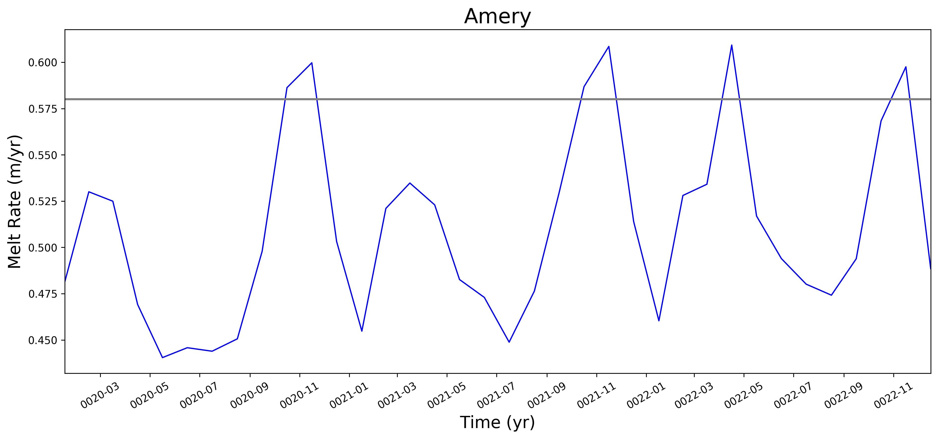
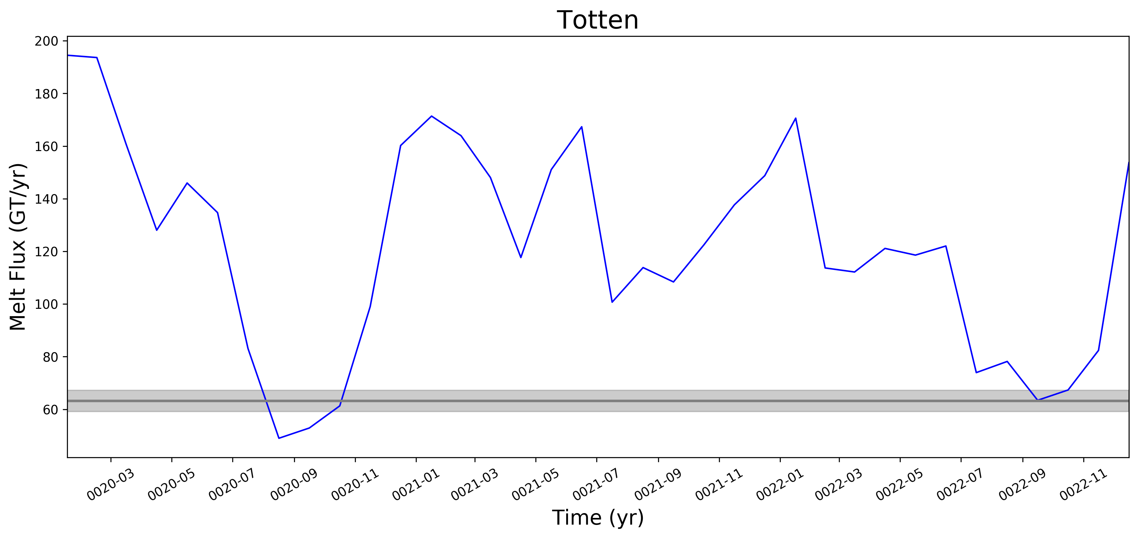
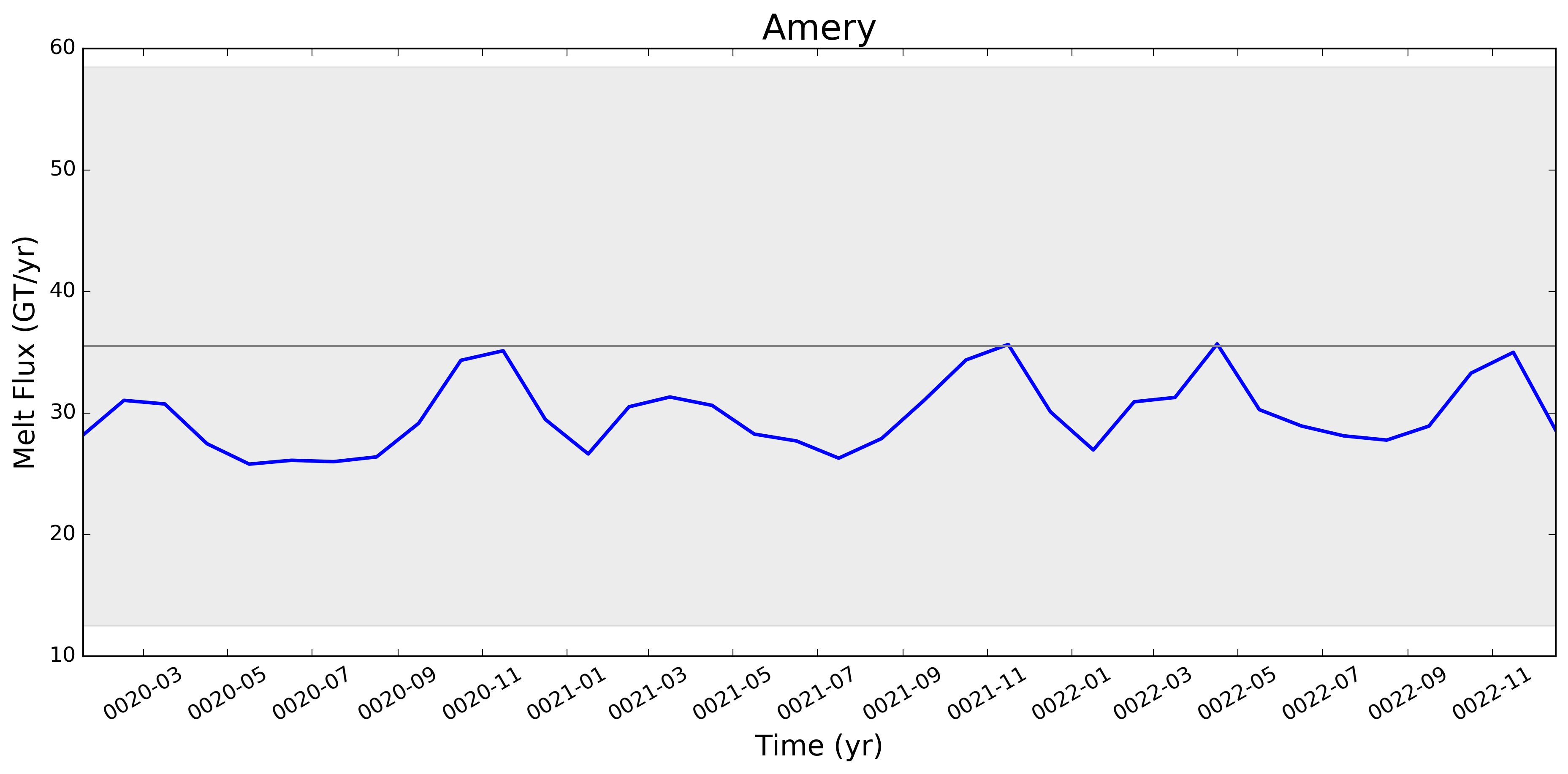
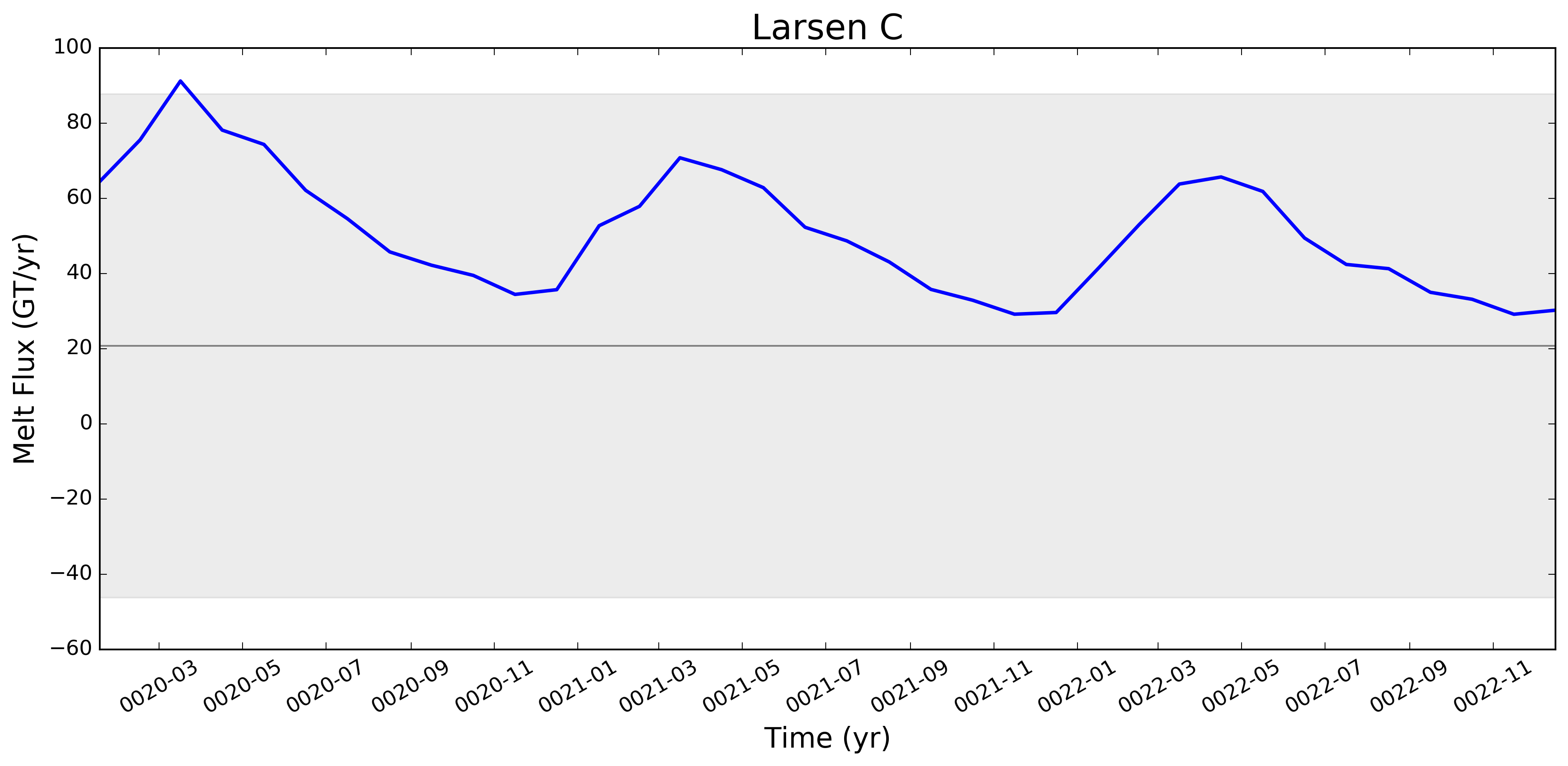
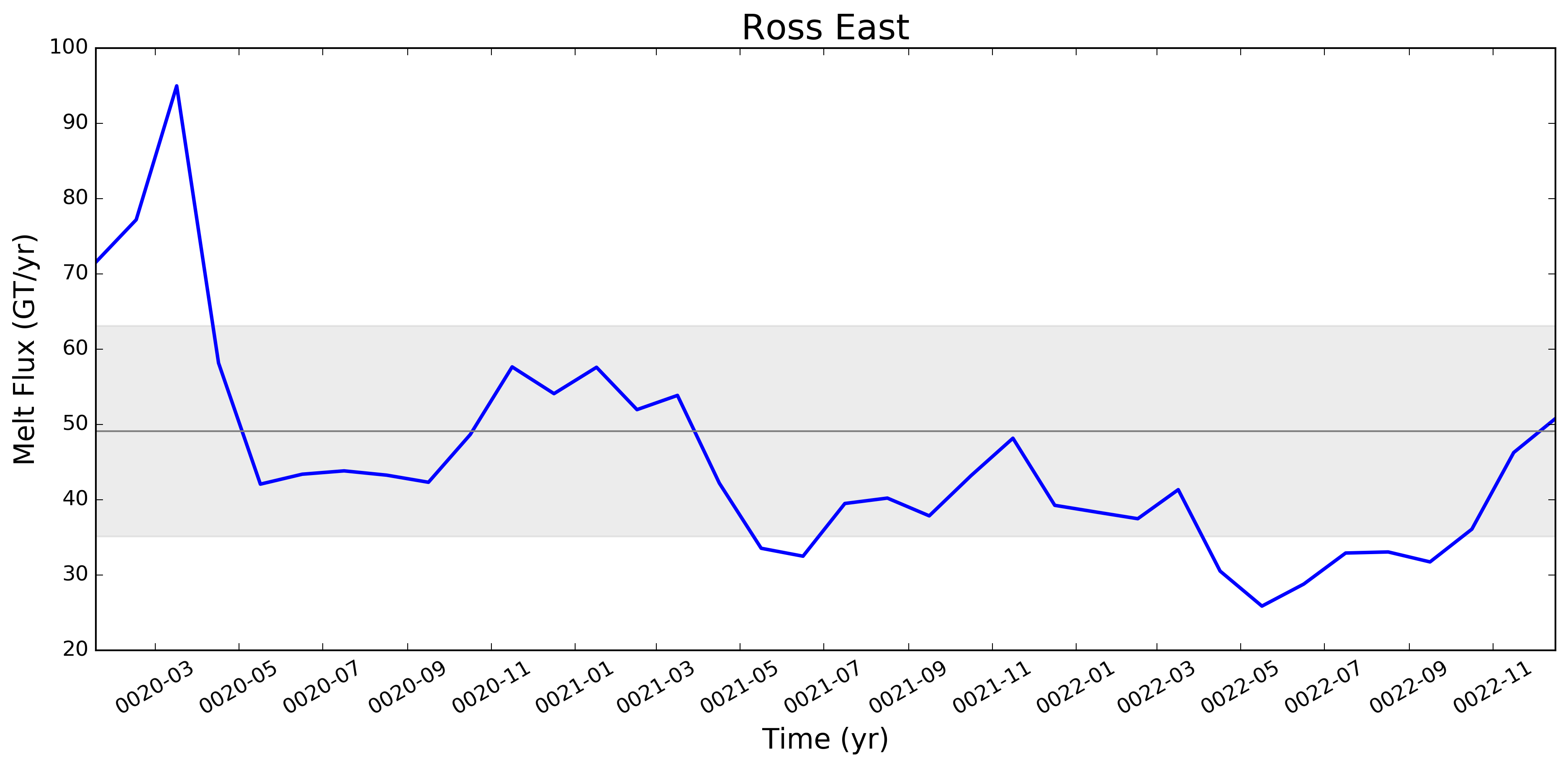
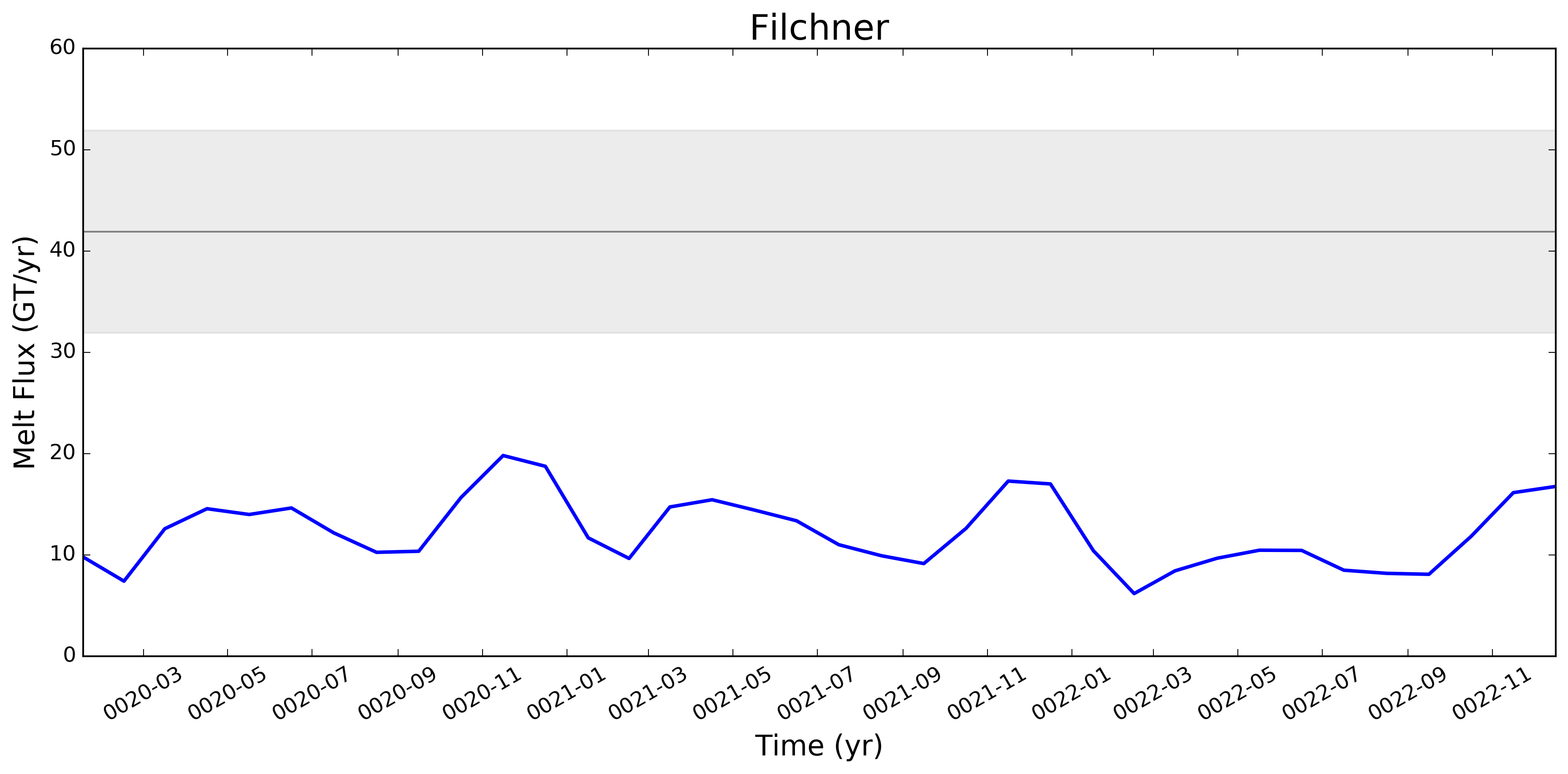
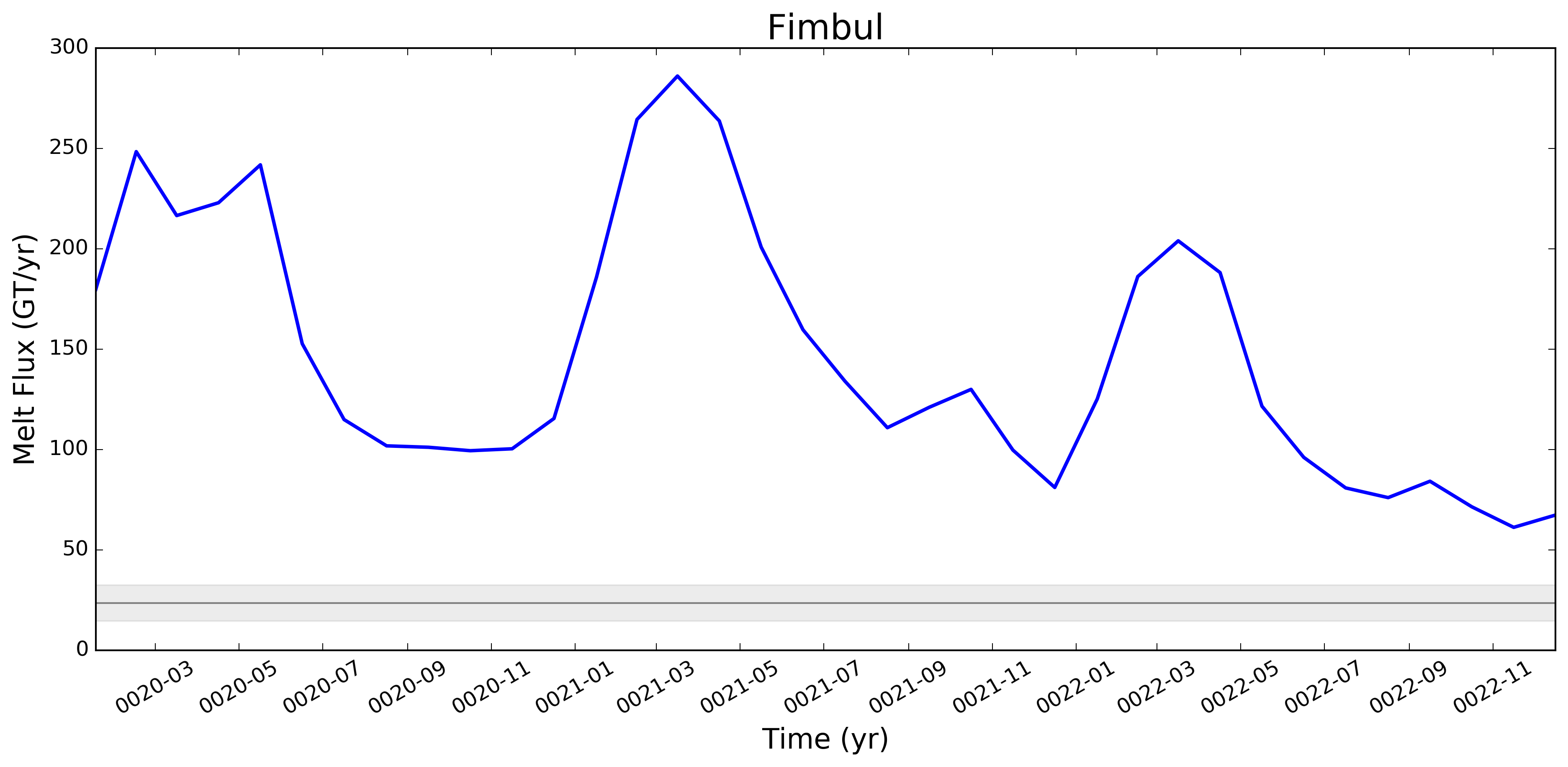
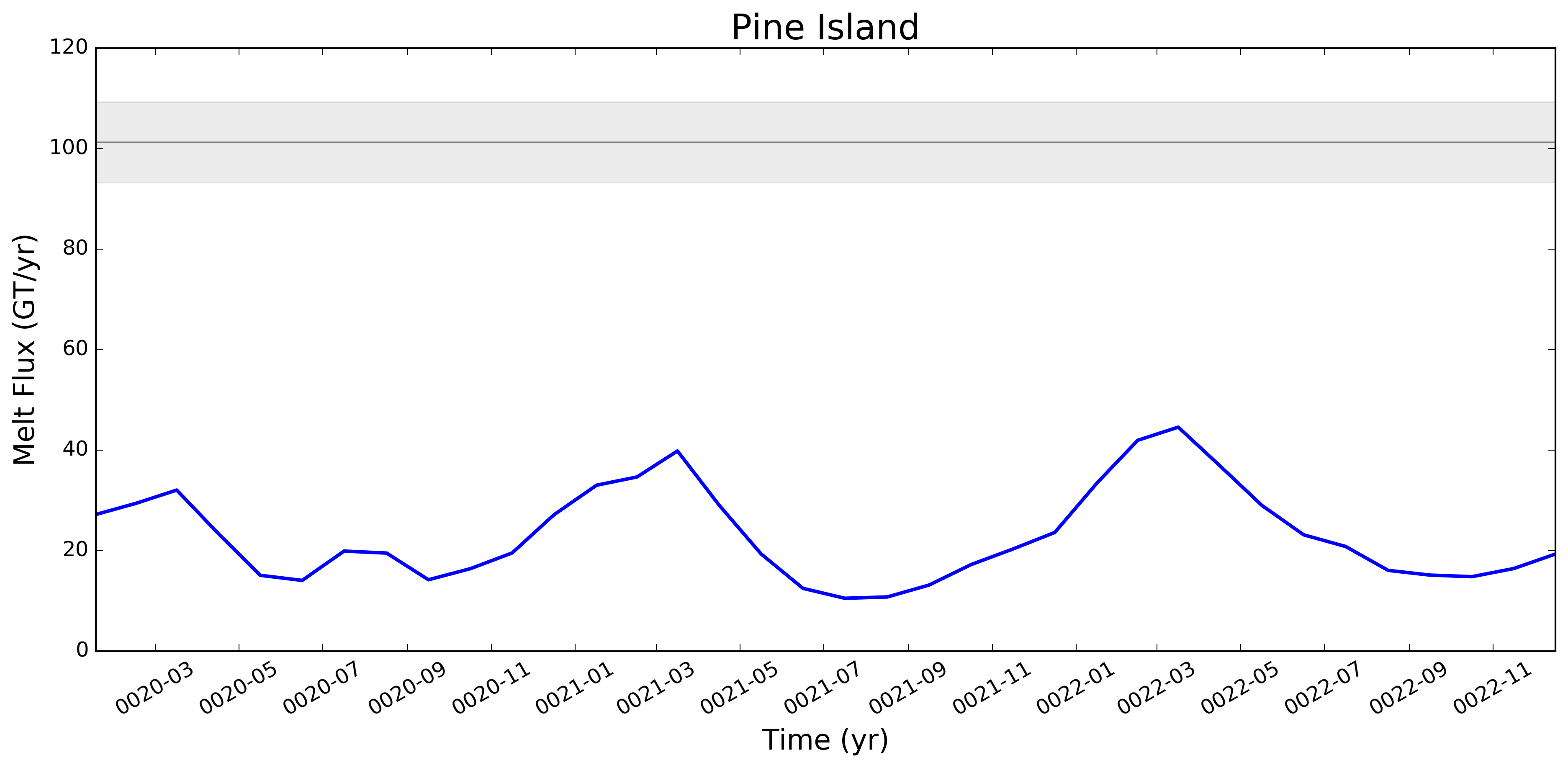
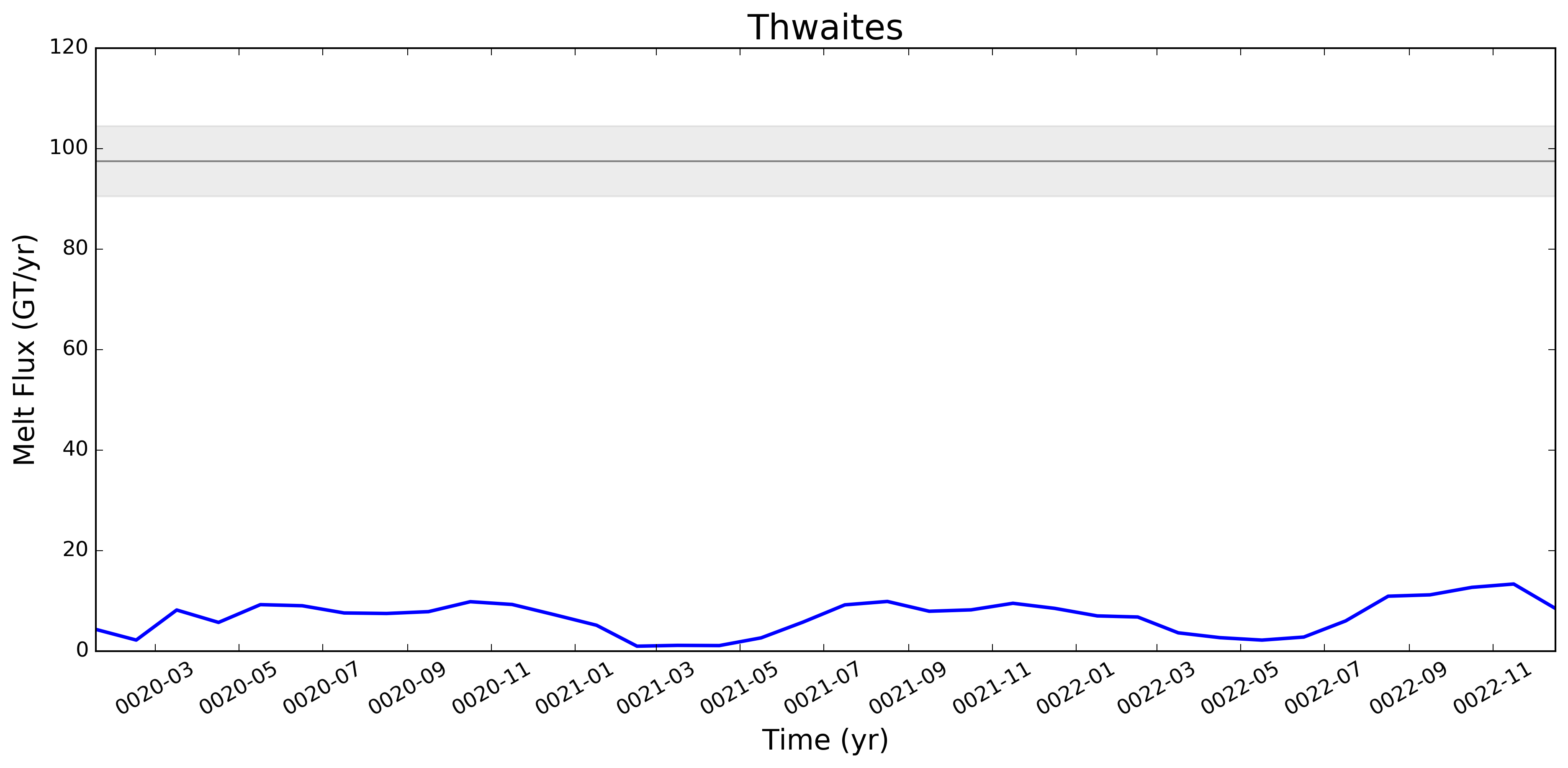
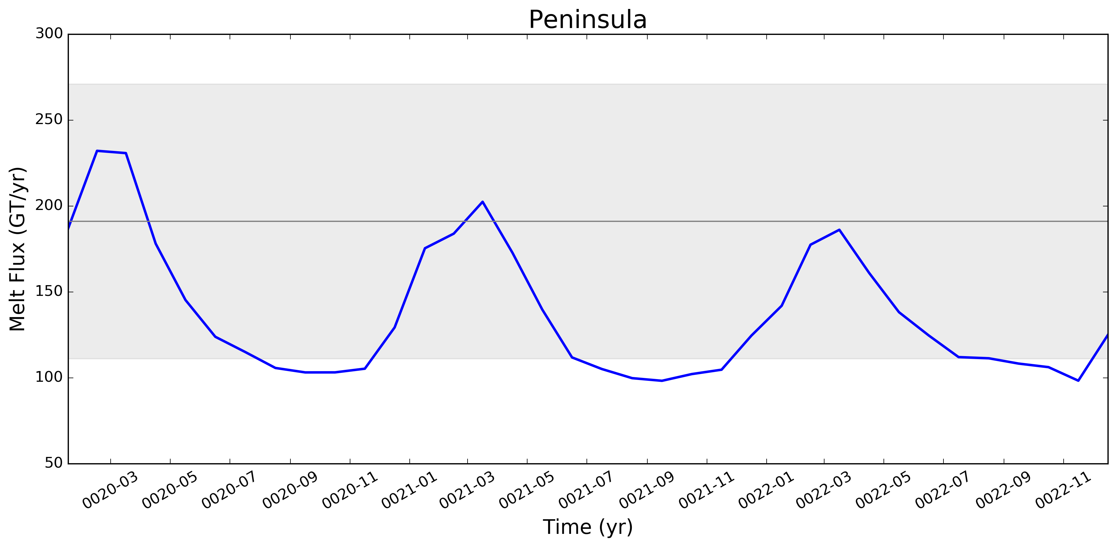
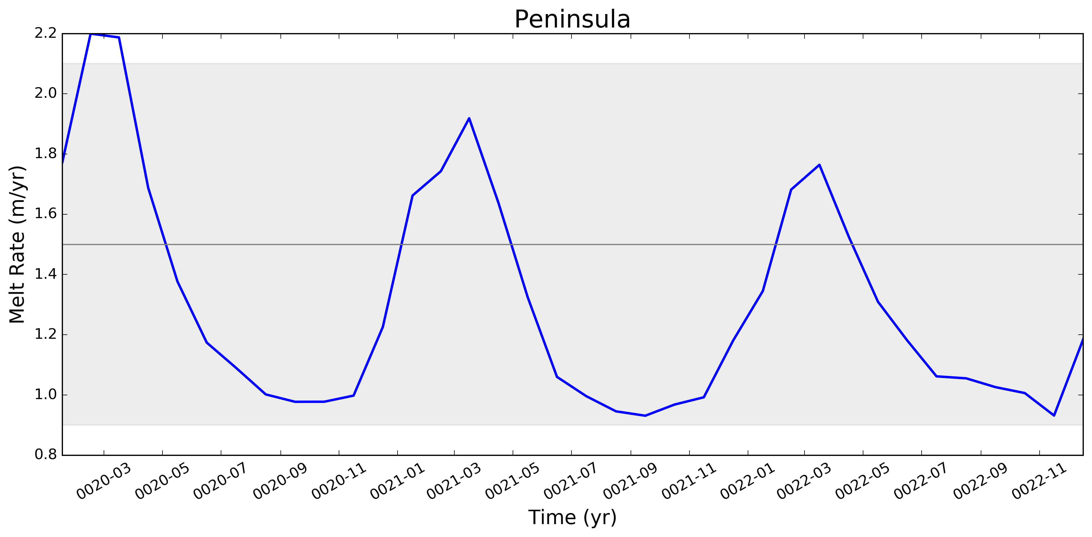
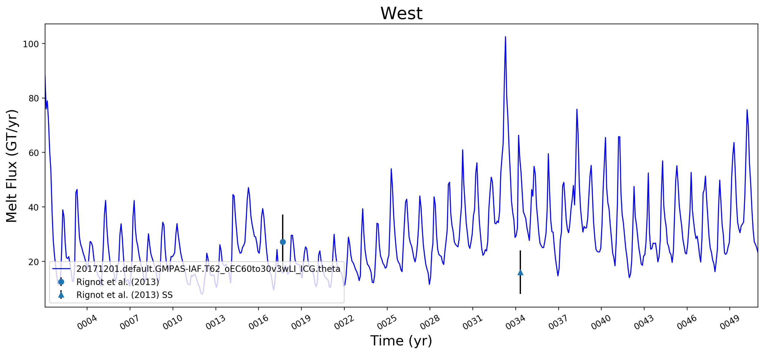
It looks like this is largely working now. Some example figs. below. The good ... and the bad ... But whatever. It will be great to have this capability now. I will try to apply to @JeremyFyke's longer B-case run tomorrow. One interesting thing is that the melt flux vs. melt rate plots don't quite line up the same w.r.t. the observations. E.g. ...
I suspect this is because our shelf areas aren't always close to the areas that Rignot et al. used. I'm not sure if there's a way to fix this, or if we should just plan to mainly look at melt flux rather than melt rate if we want a really accurate comparison. I should note these are from the old AGU 2016 runs. The same analysis applied to the more recent runs looks a bit better. I'll post some figs for tomorrows meeting on this. |
I thought I was combining these already. If not, I agree that there's work to do. |
|
@stephenprice, so if you're using the correct mask files, you should not see any of the cd /project/projectdirs/acme/mpas_analysis/region_masks/
ncdump -v regionNames oEC60to30v3wLI_iceShelfMasks.nc | tail -n 120I see only "complete" ice shelves when I do this. Note, these were generated using the driver script |
Nothing at all needs to be done. This is already supported (at least on Edison) because I generated the needed mask file: |
That's pretty unavoidable.
It would be useful to confirm this. Maybe it's worth thinking about how to plot our areas (times
I wonder if the too-low melt rates in the Amundsen region and under Filchner might be better in more recent runs. I'm really surprised, by the way, that Filchner is low. Melt climatology maps indicated that it would be way too high, if I recall. Fimbul and the other Dronning Maud Land ice shelves will probably still have large biases in the newer runs. Perhaps the coastal current is too strong there? |
|
Hi @xylar. Responding in order to your comments above:
What we saw here -- very roughly -- was that melt rates were LOW on the ASE and too high in say, Queen Maud Land, and that as we went from 60to30 to 30to10, both of these biases got better (ASE melt rates went up, QML melt rates went down). This is why I want to redo this same set of plots for the 30to10 run sitting on theta. |
|
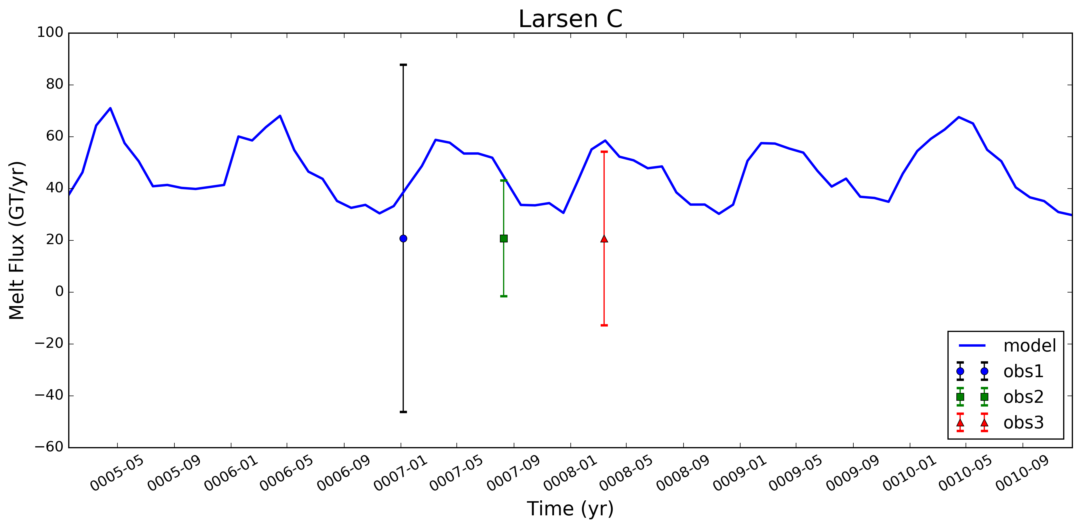
@xylar -- I've been thinking that when we add a few more obs. datasets in here (e.g., Depoorter and Moholdt), it might be better to include the obs. and unc. as simple error bars. Here's an example for what that might look like (I just plotted the same set of errors 3 times, w/ the 2nd two instances divided by a scalar - just to get the idea across). I still need to look at the logic for iterating over multiple obs. data sets, but I don't think that should be too hard. Let me know what you think. Flagging @JeremyFyke for his thoughts as well.
|
|
@stephenprice, yes, I agree, that's a nice idea. Do you have a good algorithm for spacing out the "times" where the observations are plotted for variable numbers of observations? Probably not too hard but also not trivial. |
|
@xylar -- no, haven't gone there yet. The spacing is not that hard to fiddle with. For the plot here, I just divided up the horiz. distance based on fractions of "maxDays - minDays". I think that would work fine for starters. Even if there's only one obs., you can plot it in the same place (say, 1/3 of the way across). If there are more, you add them in a bit farther along at some constant increment (I used 1/10th of maxDays - minDays here). The non-trivial logic would be deciding when you do / don't have another obs. to plot on there. I'll push what I've got so far so you can take a look. |
|
@stephenprice, @JeremyFyke would like to be able to work with with this data in NetCDF form. It doesn't look like you're currently writing out the time series anywhere, correct? We could add that as either part of this PR or in a follow-up PR. What do you think? |
This script requires a mesh file, the iceShelves.geojson file
produced in the geometric_features repo, and the MpasMaskCreator.x
from the MPAs-Tools repo.
It now has a list of major ice shelves and regions added to the melt
time series plots.
Alter the ice shelf area calculation to account for the fraction of an ocean
cell that is covered by land ice.
Add i/o section to read in Rignot melt obs from csv file (csv file
still requires substantial reformatting before these can be used)
Read in obs melt flux values from corrected Rignot csv file and create dictionary
with ice shelf region names as keynames; test including obs values in file by
including obs melt flux (or rate) value in figure axis label (for now only works
on select shelves for which our region names and his shelf names agree)
In place of calling the standard time series analysis plotting function, for now
use a locally defined function for this. Currently works for plotting model values
and the mean of the obs values, but still having trouble with adding a grayscale
patch to represent observational uncertainties.
Use correct import for Polygon function, allowing obs. unc. ranges
to be shown on plots.
Add another option for plotting observational data sets as a point with plus/minus error bars
(as opposed to as a line with gray-shading to denote uncertainty range). This could be a more
useful way of showing obs. values and errors when multiple obs. datasets are available.
Add option to read in and plot Rignot steady-state melt fluxes
and melt rates (commented out by default)
Added functionality for plotting over multiple similarly formatted datasets when plotting
observational uncertainties. For now, this only works for the "two" Rignot datasets (obs
including dynamic thinning and those based on SS assumptions).
Plot legend now includes a descriptor for the observational data being plotted
against model values (the descriptor is linked to the obs data filename via
a dictionary). Other minor tweaks to plotting format.
Additional changes switch the task to use the ocean time series
task.
Runs without land-ice cavities disable all tasks with the tag
"landIceCavities"

Runs with land-ice cavities now include an example list of ice
shelves or regions in which to plot time series.
Make indentation, white space, etc. changes for PEP8 compliancy
This merge also switches TimeSeriesAntarcticMelt to using this
shared capability instead of its own plot routine.
This merge simplifies the nested dictionaries created for the
observations to hopefully make the code a little more readable
With this merge, a warning is displayed if observations are not
available but the plot created as normal (and the observations do
not appear in the legend)

Also, the zero line is now plotted behind other lines to make clear
when the data is zero.
8350acd to
5c28260
Compare
 xylar
left a comment
xylar
left a comment
There was a problem hiding this comment.
I have now cleaned up the plotting and moved it to the shared module. I also cleaned up the code a little bit and added support for plotting ice shelves even when observations are not available. I believe this is ready to merge
|
@stephenprice, I'm going to merge this as soon as my test on Theta finishes (assuming everything goes okay). One think that would be nice is to add Antarctica (and maybe also Filchner-Ronne and Ross) to the observations. With Antarctica, the question is presumably whether to use the "total surveyed" or "total Antarctica" values (there's not an easy way to do both unless we treat "Antarctica" as a special region). With FRIS and RIS, the question is how to combine the uncertainties. My suggestion would be just to add them for the fluxes but I don't know what to do for the melt rates. Anyway, this issue isn't standing in the way of this PR because we can update the observations at any time. |
|
@xylar -- I've looked over your last 3 commits and this all looks great to me. Thanks for the clean-up on the obs. plotting side. I'm fine with you merging this if there are no other problems w/ your testing. Or, let me know and I can also merge later today. |
|
Some last test results: everything seems to work on Theta. Since NERSC is down for maintenance today, I'm just going to upload a few example images here:
We may want to rethink the placement of the legend, but I don't think that's a high priority issue for this PR. |

This pull request adds the ability to plot time series of submarine melt rates for individual ice shelves.