[Pagination] Added label prop #2098
Conversation
 mitchmaps
force-pushed
the
add-label-prop-to-pagination
branch
from
mitchmaps
force-pushed
the
add-label-prop-to-pagination
branch
from
84c6e9d to
ec5005e
Compare
|
@sarahill ui-kit updates? |
|
Looks like the next and previous button corners aren't rounded as I'd expect when there's a label (when they don't have adjacent buttons). Is that intentional? |


 perrupa
left a comment
perrupa
left a comment
perrupa
left a comment
There was a problem hiding this comment.
If we change the css class logic, we can burn some extra CSS and code.
Left a few other suggestions, but I think the CSS/class logic is the only change I'd consider blocking (though a subdued test would be nice-to-have 😉 )
|
Also, might want to add it to the changelog ❤️ |
| .find('.Label') | ||
| .children() | ||
| .prop('variation'), | ||
| ).toStrictEqual(variation); |
There was a problem hiding this comment.
I had a couple of ideas for this one 😄
Do you need .find('.Label').children() over .find('.TextStyle'), or was that not working?
Also, is there a reason you put these values in variables? I think the test might read a bit clearer with less indirection, what do you think?
const label = mountWithAppProvider(<Pagination label="label" />).find('.TextStyle');
expect(label.prop('variation')).toStrictEqual('subdued');There was a problem hiding this comment.
I tried doing it with .Textstyle and it was running into some issues finding the specific child to compare to. Using my own class from the label component seemed to do the trick but if there's a better way to go about it then I think it's something worth changing.
And I agree that might be a little overkill for the variables if they're only used once, a line after they were defined. I think I just put those in to follow the pattern of creating a variable for the component itself to assert.
There was a problem hiding this comment.
Changes have been made 🔥
 sarahill
left a comment
sarahill
left a comment
sarahill
left a comment
There was a problem hiding this comment.
The rounded corners look good ✨
Make sure to add this as an example in the components README.md file along with a description of its usage so it gets added to the Style guide. cc: @sadiesaurus
6 participants
Why are these changes introduced?
Addresses feature request #1760 following guideline set here.
What is this pull request doing?
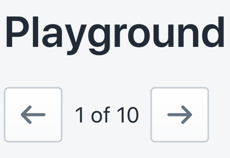
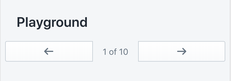
TL;DR: Adds a prop to insert text in between the backwards and forwards pagination buttons.
This PR addresses an issue opened by @Tetsuro who had created a version of the change for Shopify/online-store-ui and wanted to see the feature he built introduced into the standard Polaris react library.
The new label prop aims to provide users more context for what the pagination component is representing by adding descriptive text in between the backwards and forwards button. The example @Tetsuro used in the original issue was text indicating how many pages there were to cycle between but the prop could be used for anything a user wants.
Example of a Pagination component using the new label prop
Desktop

Mobile
How to 🎩
🖥 Local development instructions
🗒 General tophatting guidelines
📄 Changelog guidelines
Playground.tsxfile and pass in alabelpropCopy-paste this code in
playground/Playground.tsx:🎩 checklist