Skip to content

Conversation

@BPScott
Copy link
Member

@BPScott BPScott commented Oct 12, 2019

WHY are these changes introduced?

Preliminary theming work is rad. Having an easy way to preview it on existing stories would be even radder.

And while I'm playing with contexts, being able to disable react strict mode so I can get accurate counts of how often things get rerendered when debugging would be super useful too.

WHAT is this pull request doing?

Use storybook's addon-contexts addon to allow for theme toggling, and react strict mode toggling

  • Add addon-contexts and remove addon-backgrounds
  • Configure context to allow toggling React strict mode on/off
  • Configure context to allow configuring theme setups. There is a
    choice of default, global theming light mode and global theming dark
    mode

How to 🎩

Themes

Visit a story of a component that is themed, e.g. Banner. Click through the options available in the theme button (the paintbrush in the Storybook topbar, sorry I can't fix the the mystery meat navigation) and marvel at new colors.

Alternatively use this playground that has lots of them on:

Copy-paste this code in playground/Playground.tsx:
import React, {useState, useCallback} from 'react';
import {
  ArrowLeftMinor,
  HomeMajorMonotone,
  OrdersMajorTwotone,
  ProductsMajorTwotone,
  OnlineStoreMajorTwotone,
  CirclePlusOutlineMinor,
} from '@shopify/polaris-icons';
import {
  Page,
  Card,
  List,
  AppProvider,
  Checkbox,
  Frame,
  Banner,
  Stack,
  TextContainer,
  Button,
  Link,
  Badge,
  TopBar,
  ActionList,
  Navigation,
} from '../src';

export function Playground() {
  const [isUserMenuOpen, setIsUserMenuOpen] = useState(false);
  const [isSearchActive, setIsSearchActive] = useState(false);
  const [searchValue, setSearchValue] = useState('');

  const toggleIsUserMenuOpen = useCallback(
    () => setIsUserMenuOpen((isUserMenuOpen) => !isUserMenuOpen),
    [],
  );

  const handleSearchResultsDismiss = useCallback(() => {
    setIsSearchActive(false);
    setSearchValue('');
  }, []);

  const handleSearchChange = useCallback((value) => {
    setSearchValue(value);
    setIsSearchActive(value.length > 0);
  }, []);

  const handleNavigationToggle = useCallback(() => {
    console.log('toggle navigation visibility');
  }, []);

  const userMenuMarkup = (
    <TopBar.UserMenu
      actions={[
        {
          items: [{content: 'Back to Shopify', icon: ArrowLeftMinor}],
        },
        {
          items: [{content: 'Community forums'}],
        },
      ]}
      name="Dharma"
      detail="Jaded Pixel"
      initials="D"
      open={isUserMenuOpen}
      onToggle={toggleIsUserMenuOpen}
    />
  );

  const searchResultsMarkup = (
    <Card>
      <ActionList
        items={[
          {content: 'Shopify help center'},
          {content: 'Community forums'},
        ]}
      />
    </Card>
  );

  const searchFieldMarkup = (
    <TopBar.SearchField
      onChange={handleSearchChange}
      value={searchValue}
      placeholder="Search"
    />
  );

  const topBarMarkup = (
    <TopBar
      showNavigationToggle
      userMenu={userMenuMarkup}
      searchResultsVisible={isSearchActive}
      searchField={searchFieldMarkup}
      searchResults={searchResultsMarkup}
      onSearchResultsDismiss={handleSearchResultsDismiss}
      onNavigationToggle={handleNavigationToggle}
    />
  );

  return (
    <Frame
      topBar={topBarMarkup}
      navigation={
        <Navigation location="/">
          <Navigation.Section
            rollup={{
              after: 3,
              view: 'view',
              hide: 'hide',
              activePath: '/',
            }}
            items={[
              {
                url: '/path/to/place',
                label: 'Home',
                icon: HomeMajorMonotone,
                selected: true,
              },
              {
                url: '/path/to/place',
                label: 'Home 2',
                icon: HomeMajorMonotone,
                secondaryAction: {
                  url: '/admin/orders/add',
                  accessibilityLabel: 'Add an order',
                  icon: CirclePlusOutlineMinor,
                },
              },
              {
                url: '/path/to/place',
                label: 'Orders',
                icon: OrdersMajorTwotone,
                selected: true,
                badge: (
                  <Badge status="new" size="small">
                    46
                  </Badge>
                ),
                subNavigationItems: [
                  {
                    url: '/path/to/place',
                    label: 'All orders',
                    selected: true,
                  },
                  {url: '/path/to/place', label: 'Drafts'},
                  {
                    url: '/path/to/place',
                    label: 'Abandoned checkouts',
                    disabled: true,
                  },
                ],
              },
              {
                url: '/path/to/place',
                label: 'Products',
                icon: ProductsMajorTwotone,
                disabled: true,
              },
            ]}
          />
          <Navigation.Section
            separator
            title="Sales channels"
            items={[
              {
                url: '/path/to/place',
                label: 'Online Store',
                icon: OnlineStoreMajorTwotone,
              },
            ]}
            action={{
              accessibilityLabel: 'Add sales channel',
              icon: CirclePlusOutlineMinor,
              onClick: () => {},
            }}
          />
        </Navigation>
      }
    >
      <Page title="Playground">
        <TextContainer>
          <Banner status="info" title="Info">
            <p>
              Add weights to show accurate rates at checkout and when buying
              shipping labels in Shopify.
            </p>
          </Banner>
          <Banner status="warning" title="Warning">
            <p>
              Add weights to show accurate rates at checkout and when buying
              shipping labels in Shopify.
            </p>
          </Banner>
          <Banner status="critical" title="Critical">
            <p>
              Add weights to show accurate rates at checkout and when buying
              shipping labels in Shopify.
            </p>
          </Banner>
          <Banner status="success" title="Success">
            <p>
              Add weights to show accurate rates at checkout and when buying
              shipping labels in Shopify.
            </p>
          </Banner>
          <Banner title="Neutral">
            <p>
              Add weights to show accurate rates at checkout and when buying
              shipping labels in Shopify.
            </p>
          </Banner>
          <Card
            title="Shipment 1234"
            secondaryFooterActions={[{content: 'Edit shipment'}]}
            primaryFooterAction={{content: 'Add tracking number'}}
          >
            <Card.Section>
              <Banner status="info">
                <p>
                  Add weights to show accurate rates at checkout and when buying
                  shipping labels in Shopify.
                </p>
              </Banner>
              <Banner status="warning">
                <p>
                  Add weights to show accurate rates at checkout and when buying
                  shipping labels in Shopify.
                </p>
              </Banner>
              <Banner status="critical">
                <p>
                  Add weights to show accurate rates at checkout and when buying
                  shipping labels in Shopify.
                </p>
              </Banner>
              <Banner status="success">
                <p>
                  Add weights to show accurate rates at checkout and when buying
                  shipping labels in Shopify.
                </p>
              </Banner>
              <Banner>
                <p>
                  Add weights to show accurate rates at checkout and when buying
                  shipping labels in Shopify.
                </p>
              </Banner>
            </Card.Section>
            <Card.Section title="Items">
              <TextContainer>
                <Stack>
                  <Badge>Fulfilled</Badge>
                  <Badge status="info" progress="partiallyComplete">
                    Published
                  </Badge>
                  <Badge status="warning" progress="partiallyComplete">
                    SSL unavailable
                  </Badge>
                  <Badge status="success" progress="partiallyComplete">
                    Funds recovered
                  </Badge>
                  <Badge progress="incomplete">Unfulfilled</Badge>
                  <Badge progress="partiallyComplete">
                    Partially fulfilled
                  </Badge>
                  <Badge progress="complete">Fulfilled</Badge>
                </Stack>
                <List>
                  <List.Item>1 × Isis Glass, 4-Pack</List.Item>
                  <List.Item>1 × Anubis Cup, 2-Pack</List.Item>
                </List>
              </TextContainer>
            </Card.Section>
          </Card>
        </TextContainer>
      </Page>
    </Frame>
  );
}

Strict mode

To test the React strict mode toggle works, use the following sandbox: When in strict mode (the default) clicking the increment button should result in two console logs from the render method (as strict mode double invokes render() calls in class components.

Click the strict mode context toggle (the speedometer looking thing in the storybook ui, next to the zoom buttons, alas I can't fix the mystery meat navigation). and disable strict mode. Clicking the increment button should now console log one item.

Copy-paste this code in playground/Playground.tsx:
import React from 'react';
import {Page, Button} from '../src';

export function Playground() {
  const [count, setCount] = React.useState(1);

  const increment = React.useCallback(() => setCount((cnt) => cnt + 1), []);
  return (
    <Page title="Playground">
      <Button onClick={increment}>Increment</Button>

      <ClassyItem text={count.toString()} />
    </Page>
  );
}

class ClassyItem extends React.Component<any> {
  render() {
    console.log(
      'classy render! (I shall be logged twice in React Strict Mode because it double invokes render() functions',
    );
    return <div>{this.props.text}</div>;
  }
}

🎩 checklist

@github-actions
Copy link
Contributor

github-actions bot commented Oct 12, 2019

💦 Potential splash zone of changes introduced to src/**/*.tsx in this pull request:

Files modified7
Files potentially affected6

Details

All files potentially affected (total: 6)
📄 .storybook/addons.js (total: 0)

Files potentially affected (total: 0)

📄 .storybook/config.js (total: 0)

Files potentially affected (total: 0)

📄 .storybook/preview-head.html (total: 0)

Files potentially affected (total: 0)

📄 UNRELEASED.md (total: 0)

Files potentially affected (total: 0)

📄 package.json (total: 0)

Files potentially affected (total: 0)

🧩 src/components/Select/Select.tsx (total: 6)

Files potentially affected (total: 6)

📄 yarn.lock (total: 0)

Files potentially affected (total: 0)


This comment automatically updates as changes are made to this pull request.
Feedback, troubleshooting: open an issue or reach out on Slack in #polaris-tooling.

@BPScott
Copy link
Member Author

BPScott commented Oct 12, 2019

uugh failures.

  • TS type checking is failing because the update brought in @types/webpack-env and it has a declaration of NodeModule that disagrees with the one provided by @shopify/typescript-configs. Compare the Hot interface in https://unpkg.com/browse/@types/webpack-env@1.14.0/index.d.ts#L121 vs https://github.com/Shopify/sewing-kit/blob/master/packages/typescript-configs/definitions/module.d.ts. @beefchimi had the same issue with this when he was updating online-store-ui to latest storybook. @michenly might have some thoughts on how to fix this as she was the mastermind behind the tsconfigs package. Either updating the type to mimic the webpack-env package or removing our definition and making sewing-kit depend upon webpack-env might be the way to go

  • The disabled select story is failing accessibility checks. This is a legit failure that was never picked up before as we unset the body background-color that polaris set, and instead relied upon the color defined in addon-backgrounds shining through from behind the iframe. This meant the a11y tests were unaware of the actual background color. The test passed because it was comparing against a white background, instead of the actual sky light color. Ping @amrocha, @alex-page for thoughts on what to do here to fix that test (that ideally isn't bring back the shitlist for one last hurrah).

@tmlayton
Copy link
Contributor

The disabled select story is failing accessibility checks

Bump up the text darkness imo

@tmlayton
Copy link
Contributor

tmlayton commented Oct 12, 2019

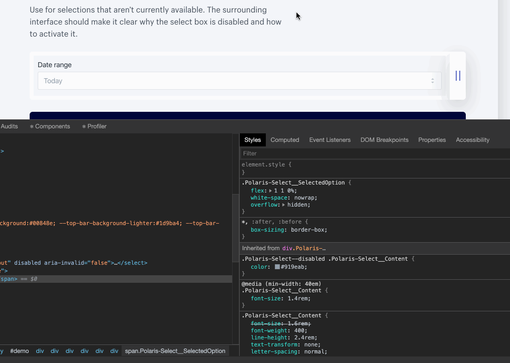
Just poked at it a bit more—the a11y test for disabled select is not exactly right as it calculates the text contrast against the body instead of the select background. Regardless, it still fails with a 2.62 instead of a 2.52. Looks like we’d need to update the color to #647380 (or something close in our palette) for this to pass (4.5) against the body, although it would really be 4.61.

a11y

Copy link
Contributor

@tmlayton tmlayton left a comment

Choose a reason for hiding this comment

The reason will be displayed to describe this comment to others. Learn more.

Love this! Went ahead a pushed a fix for the disabled select a11y failure.

Other than a changelog entry for the strict mode change (we haven’t been adding changelog entries for anything related to global theming) and fixing the types, I’m good with this 👍

Copy link

@danrosenthal danrosenthal left a comment

Choose a reason for hiding this comment

The reason will be displayed to describe this comment to others. Learn more.

This is fantastic! Thanks so much for doing this @BPScott, it's going to have a big impact on this project.

Regarding the disabled contrast check failure, I'm a bit surprised that even fails. WCAG's own documentation states that disabled UI elements don't need to meet contrast ratios. That said, the color change seems like a fine solution from my perspective.

Also, a special request. It would be incredibly powerful to be able to have a couple of CI checks run with these provider settings in place. In particular, it would be useful to have a non-blocking pally check run for color contrast on both light mode and dark mode. It would also be great to have non-blocking Percy checks for both modes as well. This would help with review, and help us deliver an accessible themed experience. Thoughts on that as a possibility?

@tmlayton
Copy link
Contributor

WCAG's own documentation states that disabled UI elements don't need to meet contrast ratios.

I get why it was failing then. The display content is not part of the select so a11y tests didn’t know it was supposed to be a disabled element. I added another commit which reverts the text color change and instead sets aria-disabled on the content node which passes the a11y tests.

@BPScott BPScott force-pushed the storybook-contexts branch from 7fa6480 to 674646a Compare October 15, 2019 17:52
@BPScott
Copy link
Member Author

BPScott commented Oct 15, 2019

Great sleuthing on the select stuff. To fix the type issue I've reverted back to storybook 5.2.1 (same as master). We're still blocked on updating to newer versions, but we don't need to update right now anyway.

@BPScott BPScott force-pushed the storybook-contexts branch from 105f221 to 60b0840 Compare October 15, 2019 17:59
BPScott and others added 3 commits October 15, 2019 11:02
- Add addon-contexts and remove addon-backgrounds
- Configure context to allow toggling React strict mode on/off
- Configure context to allow configuring theme setups. There is a
  choice of default, global theming light mode and global theming dark
  mode
@BPScott BPScott force-pushed the storybook-contexts branch from 60b0840 to 5821826 Compare October 15, 2019 18:03
@BPScott BPScott merged commit da15713 into master Oct 15, 2019
@BPScott BPScott deleted the storybook-contexts branch October 15, 2019 18:27
@BPScott
Copy link
Member Author

BPScott commented Oct 15, 2019

Also, a special request. It would be incredibly powerful to be able to have a couple of CI checks run with these provider settings in place. In particular, it would be useful to have a non-blocking pally check run for color contrast on both light mode and dark mode. It would also be great to have non-blocking Percy checks for both modes as well. This would help with review, and help us deliver an accessible themed experience. Thoughts on that as a possibility?

Strong agree that being able to test these things would be very powerful. The good news is that contexts works by adding a query string to the preview pane so we can hit https://polaris-react.herokuapp.com/iframe.html?id=playground-playground--playground&contexts=Themes=Global%20Theming%20Enabled%20-%20Light%20Mode to give us the playground in light mode for instance, so these urls are available to be used.

I'm a bit wary of what you mean by "non-blocking check run" do you mean:

  • A new check that fails but does not block merging - in which case we train people to ignore failed checks, which I don't think we want to get people in the habit of that.
  • Optional steps in the existing check that show stuff in the build logs but don't trigger a failure - in which case that info is easy to overlook and we don't realize there are issues.

Got to admit, I don't really like either of those options, I'd rather stick with failing when we encounter problems and making sure they get fixed.

Adding these checks to the existing pa11y check should be pretty easy - we'd need to rejig how we built the list of urls to check to include adding the extra context variations we desire.

Adding these checks to Percy will be a bit more tricky as it currently doesn't support those arbitrary extra params for each story. I'll raise an issue with them - supporting an official addon that is a general-case solution to their existing "rtl" solution seems like something they'd go for.

@danrosenthal
Copy link

I'm in agreement with you on the non-blocking stuff. Let's just make the checks fail.

@BPScott
Copy link
Member Author

BPScott commented Oct 15, 2019

Percy issue created: percy/percy-storybook#146

Sign up for free to join this conversation on GitHub. Already have an account? Sign in to comment

Labels

None yet

Projects

None yet

Development

Successfully merging this pull request may close these issues.

3 participants