openui5-chartjs is a custom OpenUI5 library that wraps Chart.js. SAPUI5 already offer a chart library called VizFrame, but it does not come for free and it's a little bit outdated if compared to rest of others web framework/library.
Why I choosed ChartJS?
- Open source: it's a community maintained project
- 8 chart types: visualize data in 8 different ways; each of them animated and customisable
- HTML5 Canvas: great rendering performance across all modern browsers (IE9+)
- Responsive: redraws charts on window resize for perfect scale granularity
- Huge and detailed documentation
Here you can find a complete demo of all chart types.
- Upgrade to ChartJS 2.7.17
- Update the documentation to ChartJS 2.7.1
- Cover all Chart types
- Refactor code and add more options
ChartJS support 8 chart types:
- Line
- Bar
- Radar
- Doughnut and Pie
- Polar Area
- Bubble
- Scatter
- Area
NB: at the current library state we only support the first 6 chart types. The full coverage will come in the next few releases.
This component is the base that you should use if you want to create a new Chart type. All other charts extends and inherit from this control.
| Name | Type | Default | Description |
|---|---|---|---|
| datasets | Object | null | Data to be displayed by the Chart. Data structure will change based on the current Chart type. |
| labels | Object | null | Labels of the Chart |
| responsive | Boolean | true | Resizes the chart canvas when its container does. |
| responsiveAnimationDuration | Number | 0 | Duration in milliseconds it takes to animate to new size after a resize event. |
| maintainAspectRatio | Boolean | true | Maintain the original canvas aspect ratio (width / height) when resizing |
| events | Array[String] | ["mousemove", "mouseout", "click", "touchstart", "touchmove", "touchend"] |
Events that the chart should listen to for tooltips and hovering |
| layoutPadding | Number or Object | 0 | The padding to add inside the chart. If this value is a number, it is applied to all sides of the chart (left, top, right, bottom). If this value is an object, the left property defines the left padding. Similarly the right, top, and bottom properties can also be specified. |
| titleDisplay | Boolean | false | Display the title block |
| titlePosition | String | 'top' | Position of the title. Possible values are 'top', 'left', 'bottom' and 'right'. |
| titleFullWidth | Boolean | true | Marks that this box should take the full width of the canvas (pushing down other boxes) |
| titleFontSize | Number | 12 | Font size inherited from global configuration |
| titleFontFamily | String | "'Helvetica Neue', 'Helvetica', 'Arial', sans-serif" | Font family inherited from global configuration |
| titleFontColor | Color | "#666" | Font color inherited from global configuration |
| titleFontStyle | String | 'bold' | Font styling of the title. |
| titlePadding | Number | 10 | Number of pixels to add above and below the title text |
| titleText | String | '' | Title text |
| legendDisplay | Boolean | true | Is the legend displayed |
| legendPosition | String | 'top' | Position of the legend. Possible values are 'top', 'left', 'bottom' and 'right'. |
| legendFullWidth | Boolean | true | Marks that this box should take the full width of the canvas (pushing down other boxes) |
| legendReverse | Boolean | false | Legend will show datasets in reverse order |
| legendLabelBoxWidth | Number | 40 | Width of coloured box |
| legendLabelFontSize | Number | 12 | Font size inherited from global configuration |
| legendLabelFontStyle | String | "normal" | Font style inherited from global configuration |
| legendLabelFontColor | Color | "#666" | Font color inherited from global configuration |
| legendLabelFontFamily | String | "'Helvetica Neue', 'Helvetica', 'Arial', sans-serif" | Font family inherited from global configuration |
| legendLabelPadding | Number | 10 | Padding between rows of colored boxes |
| legendLabelUsePointStyle | Boolean | false | Label style will match corresponding point style (size is based on fontSize, boxWidth is not used in this case). |
| tooltipEnabled | Boolean | true | Are tooltips enabled |
| tooltipMode | String | 'nearest' | Sets which elements appear in the tooltip. |
| tooltipIntersect | Boolean | true | if true, the tooltip mode applies only when the mouse position intersects with an element. If false, the mode will be applied at all times. |
| tooltipPosition | String | 'average' | The mode for positioning the tooltip. 'average' mode will place the tooltip at the average position of the items displayed in the tooltip. 'nearest' will place the tooltip at the position of the element closest to the event position. New modes can be defined by adding functions to the Chart.Tooltip.positioners map. |
| tooltipaBckgroundColor | Color | 'rgba(0,0,0,0.8)' | Background color of the tooltip |
| tooltipTitleFontFamily | String | "'Helvetica Neue', 'Helvetica', 'Arial', sans-serif" | Font family for tooltip title inherited from global font family |
| tooltipTitleFontSize | Number | 12 | Font size for tooltip title inherited from global font size |
| tooltipTitleFontStyle | String | "bold" | |
| tooltipTitleFontColor | Color | "#fff" | Font color for tooltip title |
| tooltipTitleSpacing | Number | 2 | Spacing to add to top and bottom of each title line. |
| tooltipTitleMarginBottom | Number | 6 | Margin to add on bottom of title section |
| tooltipBodyFontFamily | String | "'Helvetica Neue', 'Helvetica', 'Arial', sans-serif" | Font family for tooltip items inherited from global font family |
| tooltipBodyFontSize | Number | 12 | Font size for tooltip items inherited from global font size |
| tooltipBodyFontStyle | String | "normal" | |
| tooltipBodyFontColor | Color | "#fff" | Font color for tooltip items. |
| tooltipBodySpacing | Number | 2 | Spacing to add to top and bottom of each tooltip item |
| tooltipFooterFontFamily | String | "'Helvetica Neue', 'Helvetica', 'Arial', sans-serif" | Font family for tooltip footer inherited from global font family. |
| tooltipFooterFontSize | Number | 12 | Font size for tooltip footer inherited from global font size. |
| tooltipFooterFontStyle | String | "bold" | Font style for tooltip footer. |
| tooltipFooterFontColor | Color | "#fff" | Font color for tooltip footer. |
| tooltipFooterSpacing | Number | 2 | Spacing to add to top and bottom of each footer line. |
| tooltipFooterMarginTop | Number | 6 | Margin to add before drawing the footer |
| tooltipXPadding | Number | 6 | Padding to add on left and right of tooltip |
| tooltipYPadding | Number | 6 | Padding to add on top and bottom of tooltip |
| tooltipCaretSize | Number | 5 | Size, in px, of the tooltip arrow |
| tooltipCornerRadius | Number | 6 | Radius of tooltip corner curves |
| tooltipMultiKeyBackground | Color | "#fff" | Color to draw behind the colored boxes when multiple items are in the tooltip |
| tooltipDisplayColors | Boolean | true | if true, color boxes are shown in the tooltip |
| hoverMode | String | 'nearest' | Sets which elements appear in the tooltip. |
| hoverIntersect | Boolean | true | if true, the hover mode only applies when the mouse position intersects an item on the chart |
| hoverAnimationDuration | Number | 400 | Duration in milliseconds it takes to animate hover style changes |
| animationDuration | Number | 1000 | The number of milliseconds an animation takes. |
| animationEasing | String | "easeOutQuart" | Easing function to use. Available options are: 'linear', 'easeInQuad', 'easeOutQuad', 'easeInOutQuad', 'easeInCubic', 'easeOutCubic', 'easeInOutCubic', 'easeInQuart', 'easeOutQuart', 'easeInOutQuart', 'easeInQuint', 'easeOutQuint', 'easeInOutQuint', 'easeInSine', 'easeOutSine', 'easeInOutSine', 'easeInExpo', 'easeOutExpo', 'easeInOutExpo', 'easeInCirc', 'easeOutCirc', 'easeInOutCirc', 'easeInElastic', 'easeOutElastic', 'easeInOutElastic', 'easeInBack', 'easeOutBack', 'easeInOutBack', 'easeInBounce', 'easeOutBounce', 'easeInOutBounce'. See Robert Penner's easing equations. |
| arcBackgroundColor | Color | 'rgba(0,0,0,0.1)' | Default fill color for arcs. Inherited from the global default |
| arcBorderColor | Color | '#fff' | Default stroke color for arcs |
| arcBorderWidth | Number | 2 | Default stroke width for arcs |
| lineTension | Number | 0.4 | Default bezier curve tension. Set to 0 for no bezier curves. |
| lineBackgroundColor | Color | 'rgba(0,0,0,0.1)' | Default line fill color |
| lineBorderWidth | Number | 3 | Default line stroke width |
| lineBorderColor | Color | 'rgba(0,0,0,0.1)' | Default line stroke color |
| lineBorderCapStyle | String | 'butt' | Default line cap style. See MDN |
| lineBorderDash | Array | [] |
Default line dash. See MDN |
| lineBorderDashOffset | Number | 0.0 | Default line dash offset. See MDN |
| lineBorderJoinStyle | String | 'miter' | Default line join style. See MDN |
| lineCapBezierPoints | Boolean | true | If true, bezier control points are kept inside the chart. If false, no restriction is enforced. |
| lineFill | Boolean or String | true | If true, the fill is assumed to be to zero. String values are 'zero', 'top', and 'bottom' to fill to different locations. If false, no fill is added |
| lineStepped | Boolean | false | If true, the line is shown as a stepped line and 'tension' will be ignored |
| pointRadius | Number | 3 | Default point radius |
| pointStyle | String | 'circle' | Default point style |
| pointBackgroundColor | Color | 'rgba(0,0,0,0.1)' | Default point fill color |
| pointBorderWidth | Number | 1 | Default point stroke width |
| pointBorderColor | Color | 'rgba(0,0,0,0.1)' | Default point stroke color |
| pointHitRadius | Number | 1 | Extra radius added to point radius for hit detection |
| pointHoverRadius | Number | 4 | Default point radius when hovered |
| pointHoverBorderWidth | Number | 1 | Default stroke width when hovered |
| rectangleBackgroundColor | Color | 'rgba(0,0,0,0.1)' | Default bar fill color |
| rectangleBorderWidth | Number | 0 | Default bar stroke width |
| rectangleBorderColor | Color | 'rgba(0,0,0,0.1)' | Default bar stroke color |
| rectangleBorderSkipped | String | 'bottom' | Default skipped (excluded) border for rectangle. Can be one of bottom, left, top, right |
| Name | Description |
|---|---|
| onClick | Called if the event is of type 'mouseup' or 'click'. Called in the context of the chart and passed the event and an array of active elements |
| onHover | Called when any of the events fire. Called in the context of the chart and passed the event and an array of active elements (bars, points, etc) |
| onResize | Called when a resize occurs. Gets passed two arguments: the chart instance and the new size. |
| onLegendItemClick | A callback that is called when a 'click' event is registered on top of a label item |
| onLegendItemHover | A callback that is called when a 'mousemove' event is registered on top of a label item |
| onAnimationProgress | Callback called at the end of an animation. Passed the same arguments as onProgress |
| onAnimationComplete | Callback called on each step of an animation. Passed a single argument, an object, containing the chart instance and an object with details of the animation. |
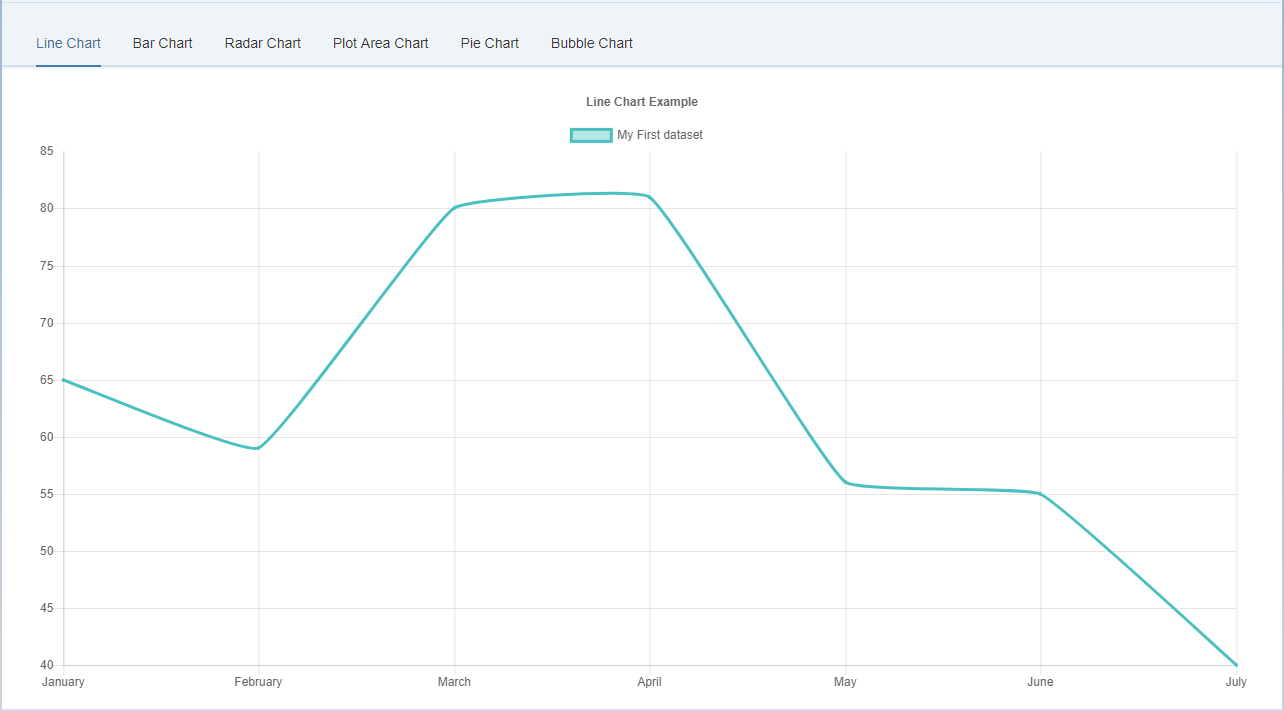
A line chart is a way of plotting data points on a line. Often, it is used to show trend data, and the comparison of two data sets.
<lab:LineChartJS
	id="line_chart"
	datasets="{temp>/lineChart/datasets}"
	labels="{temp>/lineChart/labels}"
	titleDisplay="true"
	titleText="Line Chart Example"
	onLegendItemClick="onLegendItemClick"
	onLegendItemHover="onLegendItemHover"
	onClick="onClick"
	onHover="onHover"
	tooltipEnabled="true"
	onAnimationProgress="onAnimationProgress"
	onAnimationComplete="onAnimationComplete"
	showLines="true"
	spanGaps="true">
</lab:LineChartJS>The following options can be included in a line chart dataset to configure options for that specific dataset.
All point* properties can be specified as an array. If these are set to an array value, the first value applies to the first point, the second value to the second point, and so on.
| Property | Type | Usage |
|---|---|---|
| data | The data to plot in a line | |
| label | String |
The label for the dataset which appears in the legend and tooltips |
| xAxisID | String |
The ID of the x axis to plot this dataset on |
| yAxisID | String |
The ID of the y axis to plot this dataset on |
| fill | Boolean |
If true, fill the area under the line |
| cubicInterpolationMode | String |
Algorithm used to interpolate a smooth curve from the discrete data points. Options are 'default' and 'monotone'. The 'default' algorithm uses a custom weighted cubic interpolation, which produces pleasant curves for all types of datasets. The 'monotone' algorithm is more suited to y = f(x) datasets : it preserves monotonicity (or piecewise monotonicity) of the dataset being interpolated, and ensures local extremums (if any) stay at input data points. If left untouched (undefined), the global options.elements.line.cubicInterpolationMode property is used. |
| lineTension | Number |
Bezier curve tension of the line. Set to 0 to draw straightlines. This option is ignored if monotone cubic interpolation is used. Note This was renamed from 'tension' but the old name still works. |
| backgroundColor | Color |
The fill color under the line. |
| borderWidth | Number |
The width of the line in pixels |
| borderColor | Color |
The color of the line. |
| borderCapStyle | String |
Cap style of the line. See MDN |
| borderDash | Array<Number> |
Length and spacing of dashes. See MDN |
| borderDashOffset | Number |
Offset for line dashes. See MDN |
| borderJoinStyle | String |
Line joint style. See MDN |
| pointBorderColor | Color or Array<Color> |
The border color for points. |
| pointBackgroundColor | Color or Array<Color> |
The fill color for points |
| pointBorderWidth | Number or Array<Number> |
The width of the point border in pixels |
| pointRadius | Number or Array<Number> |
The radius of the point shape. If set to 0, nothing is rendered. |
| pointHoverRadius | Number or Array<Number> |
The radius of the point when hovered |
| pointHitRadius | Number or Array<Number> |
The pixel size of the non-displayed point that reacts to mouse events |
| pointHoverBackgroundColor | Color or Array<Color> |
Point background color when hovered |
| pointHoverBorderColor | Color or Array<Color> |
Point border color when hovered |
| pointHoverBorderWidth | Number or Array<Number> |
Border width of point when hovered |
| pointStyle | String, Array<String>, Image, Array<Image> |
The style of point. Options are 'circle', 'triangle', 'rect', 'rectRounded', 'rectRot', 'cross', 'crossRot', 'star', 'line', and 'dash'. If the option is an image, that image is drawn on the canvas using drawImage. |
| showLine | Boolean |
If false, the line is not drawn for this dataset |
| spanGaps | Boolean |
If true, lines will be drawn between points with no or null data |
| steppedLine | Boolean |
If true, the line is shown as a stepped line and 'lineTension' will be ignored |
An example data object using these attributes is shown below.
var data = {
	labels: ["January", "February", "March", "April", "May", "June", "July"],
	datasets: [
		{
			label: "My First dataset",
			fill: false,
			lineTension: 0.1,
			backgroundColor: "rgba(75,192,192,0.4)",
			borderColor: "rgba(75,192,192,1)",
			borderCapStyle: 'butt',
			borderDash: [],
			borderDashOffset: 0.0,
			borderJoinStyle: 'miter',
			pointBorderColor: "rgba(75,192,192,1)",
			pointBackgroundColor: "#fff",
			pointBorderWidth: 1,
			pointHoverRadius: 5,
			pointHoverBackgroundColor: "rgba(75,192,192,1)",
			pointHoverBorderColor: "rgba(220,220,220,1)",
			pointHoverBorderWidth: 2,
			pointRadius: 1,
			pointHitRadius: 10,
			data: [65, 59, 80, 81, 56, 55, 40],
			spanGaps: false,
		}
	]
};| Name | Type | Default | Description |
|---|---|---|---|
| showLines | Boolean | true | If false, the lines between points are not drawn |
| spanGaps | Boolean | false | If true, NaN data does not break the line |
None
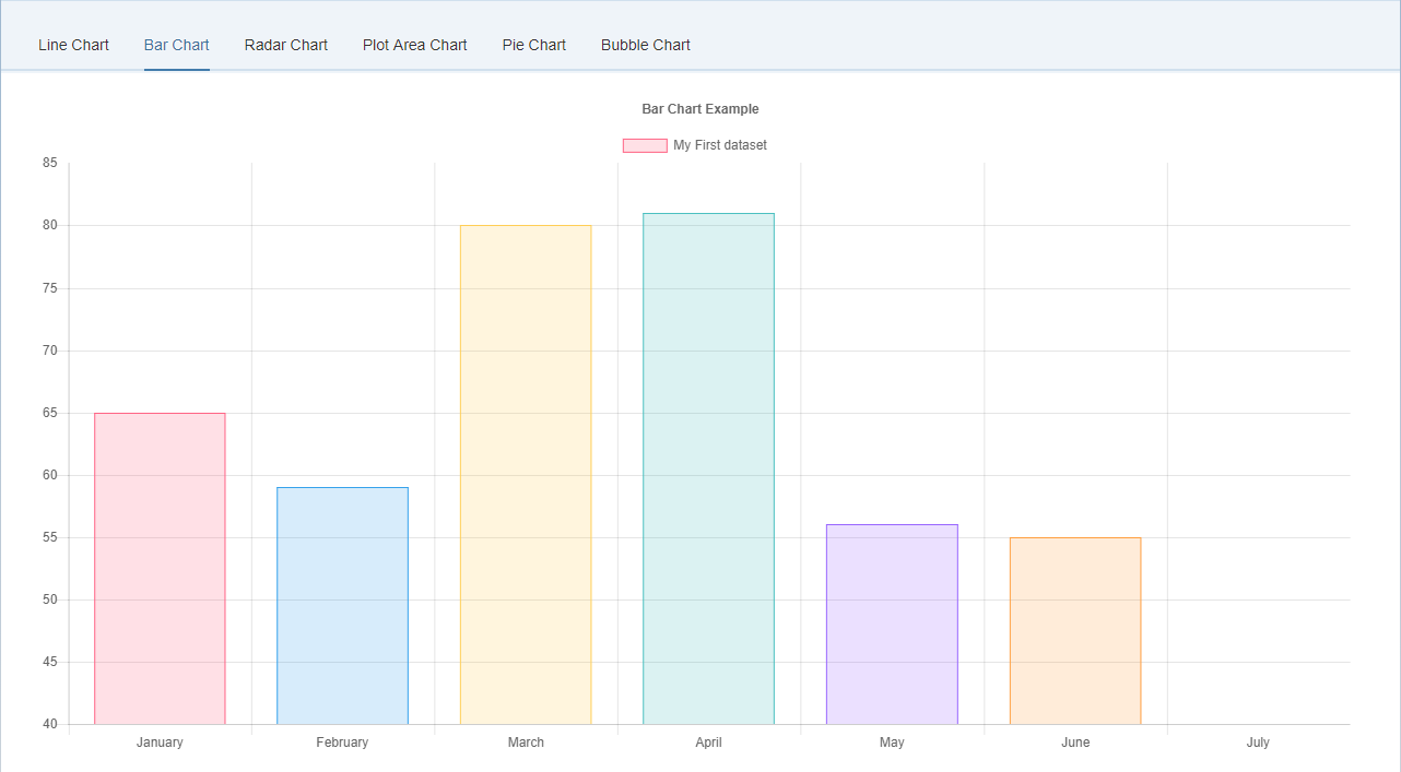
A bar chart provides a way of showing data values represented as vertical bars. It is sometimes used to show trend data, and the comparison of multiple data sets side by side.
<lab:BarChartJS
	id="bar_chart"
	datasets="{temp>/barChart/datasets}"
	labels="{temp>/barChart/labels}"
	titleDisplay="true"
	titleText="Bar Chart Example"
	onLegendItemClick="onLegendItemClick"
	onLegendItemHover="onLegendItemHover"
	onClick="onClick"
	onHover="onHover"
	tooltipEnabled="true"
	onAnimationProgress="onAnimationProgress"
	onAnimationComplete="onAnimationComplete"
	isHorizontal="false">
</lab:BarChartJS>The following options can be included in a bar chart dataset to configure options for that specific dataset.
Some properties can be specified as an array. If these are set to an array value, the first value applies to the first bar, the second value to the second bar, and so on.
| Property | Type | Usage |
|---|---|---|
| data | Array<Number> |
The data to plot as bars |
| label | String |
The label for the dataset which appears in the legend and tooltips |
| xAxisID | String |
The ID of the x axis to plot this dataset on |
| yAxisID | String |
The ID of the y axis to plot this dataset on |
| backgroundColor | Color or Array<Color> |
The fill color of the bars. |
| borderColor | Color or Array<Color> |
Bar border color |
| borderWidth | Number or Array<Number> |
Border width of bar in pixels |
| borderSkipped | String or Array<String> |
Which edge to skip drawing the border for. Options are 'bottom', 'left', 'top', and 'right' |
| hoverBackgroundColor | Color or Array<Color> |
Bar background color when hovered |
| hoverBorderColor | Color or Array<Color> |
Bar border color when hovered |
| hoverBorderWidth | Number or Array<Number> |
Border width of bar when hovered |
| stack | String |
The ID of the group to which this dataset belongs to (when stacked, each group will be a separate stack) |
An example data object using these attributes is shown below.
var data = {
	labels: ["January", "February", "March", "April", "May", "June", "July"],
	datasets: [
		{
			label: "My First dataset",
			backgroundColor: [
				'rgba(255, 99, 132, 0.2)',
				'rgba(54, 162, 235, 0.2)',
				'rgba(255, 206, 86, 0.2)',
				'rgba(75, 192, 192, 0.2)',
				'rgba(153, 102, 255, 0.2)',
				'rgba(255, 159, 64, 0.2)'
            ],
            borderColor: [
				'rgba(255,99,132,1)',
				'rgba(54, 162, 235, 1)',
				'rgba(255, 206, 86, 1)',
				'rgba(75, 192, 192, 1)',
				'rgba(153, 102, 255, 1)',
				'rgba(255, 159, 64, 1)'
			],
			borderWidth: 1,
			data: [65, 59, 80, 81, 56, 55, 40],
		}
	]
};| Name | Type | Default | Description |
|---|---|---|---|
| isHorizontal | Boolean |
false | If the Bar Chart is horizontal |
| hoverMode | String |
'label' | Sets which elements appear in the tooltip. |
None
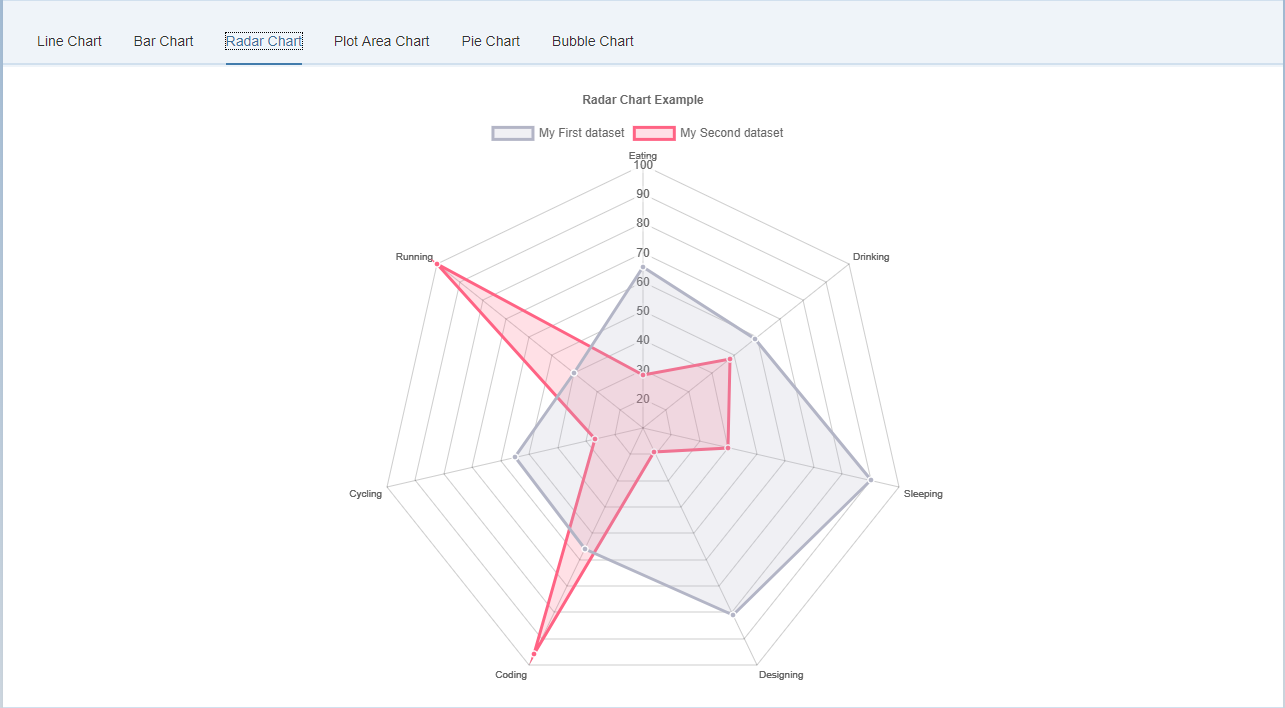
A radar chart is a way of showing multiple data points and the variation between them. They are often useful for comparing the points of two or more different data sets.
<lab:RadarChartJS
	id="radar_chart"
	datasets="{temp>/radarChart/datasets}"
	labels="{temp>/radarChart/labels}"
	titleDisplay="true"
	titleText="Radar Chart Example"
	onLegendItemClick="onLegendItemClick"
	onLegendItemHover="onLegendItemHover"
	onClick="onClick"
	onHover="onHover"
	tooltipEnabled="true"
	onAnimationProgress="onAnimationProgress"
	onAnimationComplete="onAnimationComplete">
</lab:RadarChartJS>The following options can be included in a radar chart dataset to configure options for that specific dataset.
All point* properties can be specified as an array. If these are set to an array value, the first value applies to the first point, the second value to the second point, and so on.
| Property | Type | Usage |
|---|---|---|
| data | Array<Number> |
The data to plot in a line |
| label | String |
The label for the dataset which appears in the legend and tooltips |
| fill | Boolean |
If true, fill the area under the line |
| lineTension | Number |
Bezier curve tension of the line. Set to 0 to draw straightlines. Note This was renamed from 'tension' but the old name still works. |
| backgroundColor | Color |
The fill color under the line. See Colors |
| borderWidth | Number |
The width of the line in pixels |
| borderColor | Color |
The color of the line. |
| borderCapStyle | String |
Cap style of the line. See MDN |
| borderDash | Array<Number> |
Length and spacing of dashes. See MDN |
| borderDashOffset | Number |
Offset for line dashes. See MDN |
| borderJoinStyle | String |
Line joint style. See MDN |
| pointBorderColor | Color or Array<Color> |
The border color for points. |
| pointBackgroundColor | Color or Array<Color> |
The fill color for points |
| pointBorderWidth | Number or Array<Number> |
The width of the point border in pixels |
| pointRadius | Number or Array<Number> |
The radius of the point shape. If set to 0, nothing is rendered. |
| pointHoverRadius | Number or Array<Number> |
The radius of the point when hovered |
| pointHitRadius | Number or Array<Number> |
The pixel size of the non-displayed point that reacts to mouse events |
| pointHoverBackgroundColor | Color or Array<Color> |
Point background color when hovered |
| pointHoverBorderColor | Color or Array<Color> |
Point border color when hovered |
| pointHoverBorderWidth | Number or Array<Number> |
Border width of point when hovered |
| pointStyle | String or Array<String> |
The style of point. Options include 'circle', 'triangle', 'rect', 'rectRounded', 'rectRot', 'cross', 'crossRot', 'star', 'line', and 'dash' |
An example data object using these attributes is shown below.
var data = {
	labels: ["Eating", "Drinking", "Sleeping", "Designing", "Coding", "Cycling", "Running"],
	datasets: [
		{
			label: "My First dataset",
			backgroundColor: "rgba(179,181,198,0.2)",
			borderColor: "rgba(179,181,198,1)",
			pointBackgroundColor: "rgba(179,181,198,1)",
			pointBorderColor: "#fff",
			pointHoverBackgroundColor: "#fff",
			pointHoverBorderColor: "rgba(179,181,198,1)",
			data: [65, 59, 90, 81, 56, 55, 40]
		},
		{
			label: "My Second dataset",
			backgroundColor: "rgba(255,99,132,0.2)",
			borderColor: "rgba(255,99,132,1)",
			pointBackgroundColor: "rgba(255,99,132,1)",
			pointBorderColor: "#fff",
			pointHoverBackgroundColor: "#fff",
			pointHoverBorderColor: "rgba(255,99,132,1)",
			data: [28, 48, 40, 19, 96, 27, 100]
		}
	]
};| Name | Type | Default | Description |
|---|---|---|---|
| startAngle | Number |
0 | The number of degrees to rotate the chart clockwise. |
None
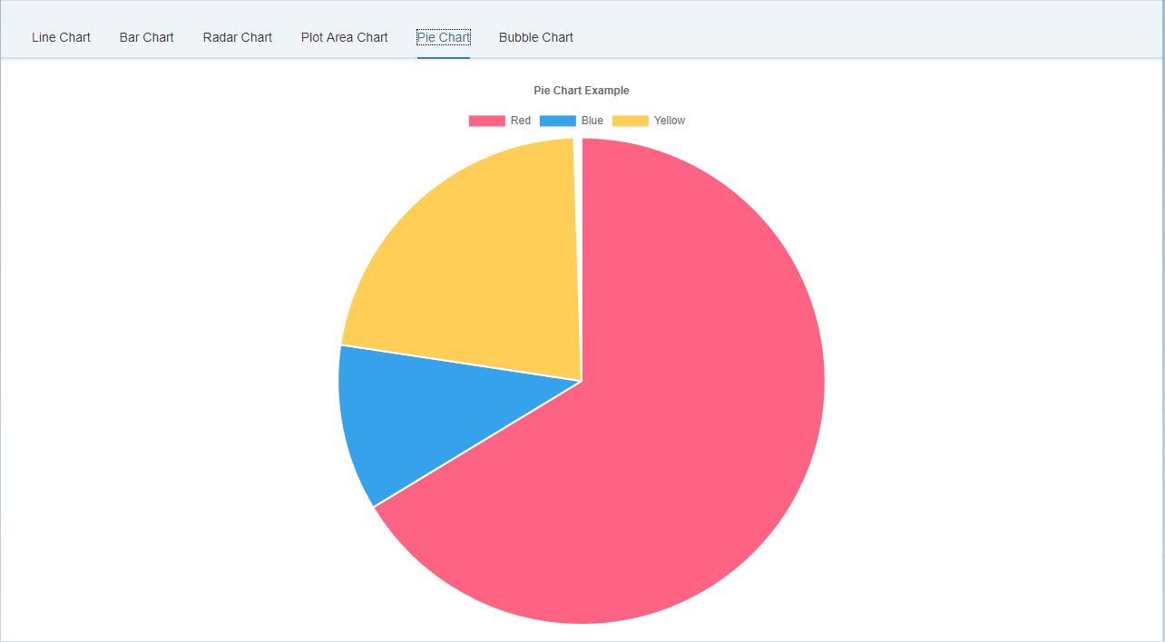
A radar chart is a way of showing multiple data points and the variation between them. They are often useful for comparing the points of two or more different data sets.
<lab:PieChartJS
	id="pie_chart"
	datasets="{temp>/pieChart/datasets}"
	labels="{temp>/pieChart/labels}"
	titleDisplay="true"
	titleText="Pie Chart Example"
	onLegendItemClick="onLegendItemClick"
	onLegendItemHover="onLegendItemHover"
	onClick="onClick"
	onHover="onHover"
	tooltipEnabled="true"
	onAnimationProgress="onAnimationProgress"
	onAnimationComplete="onAnimationComplete">
</lab:PieChartJS>| Property | Type | Usage |
|---|---|---|
| data | Array<Number> |
The data to plot as arcs |
| label | String |
The label for the dataset which appears in the legend and tooltips |
| backgroundColor | Array<Color> |
The fill color of the arcs. See Colors |
| borderColor | Array<Color> |
Arc border color |
| borderWidth | Array<Number> |
Border width of arcs in pixels |
| hoverBackgroundColor | Array<Color> |
Arc background color when hovered |
| hoverBorderColor | Array<Color> |
Arc border color when hovered |
| hoverBorderWidth | Array<Number> |
Border width of arc when hovered |
An example data object using these attributes is shown below.
var data = {
    labels: [
        "Red",
        "Blue",
        "Yellow"
    ],
    datasets: [
        {
            data: [300, 50, 100],
            backgroundColor: [
                "#FF6384",
                "#36A2EB",
                "#FFCE56"
            ],
            hoverBackgroundColor: [
                "#FF6384",
                "#36A2EB",
                "#FFCE56"
            ]
        }]
};| Name | Type | Default | Description |
|---|---|---|---|
| isDoughnut | Boolean |
false | If the Pie Chart doughnut style |
| cutoutPercentage | Number | 50 - for doughnut, 0 - for pie | The percentage of the chart that is cut out of the middle. |
| rotation | Number | -0.5 * Math.PI | Starting angle to draw arcs from |
| circumference | Number | 2 * Math.PI | Sweep to allow arcs to cover |
| animationAnimateRotate | Boolean | true | If true, will animate the rotation of the chart. |
| animationAnimateScale | Boolean | false | If true, will animate scaling the Doughnut from the centre. |
None
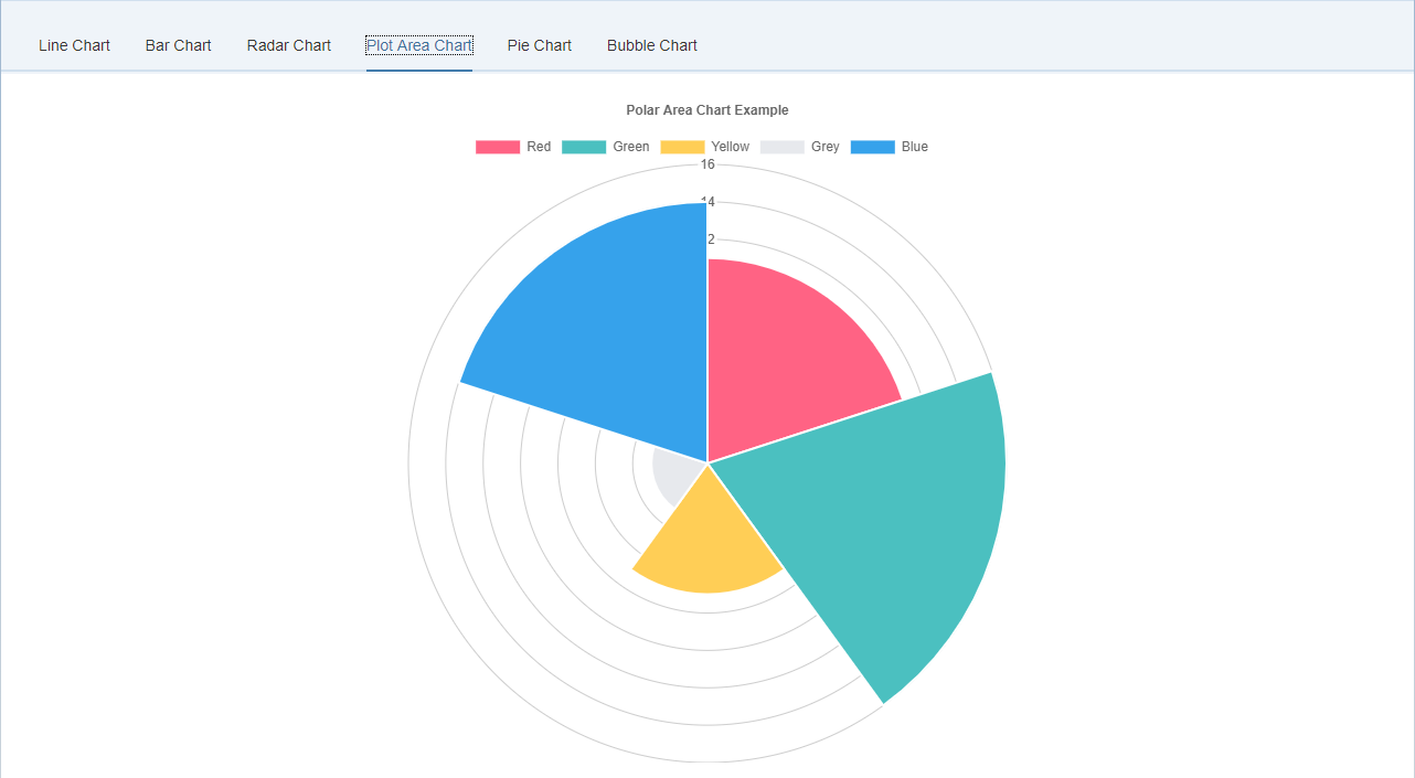
Polar area charts are similar to pie charts, but each segment has the same angle - the radius of the segment differs depending on the value. This type of chart is often useful when we want to show a comparison data similar to a pie chart, but also show a scale of values for context.
<lab:PolarAreaChartJS
	id="polar_area_chart"
	datasets="{temp>/polarAreaChart/datasets}"
	labels="{temp>/polarAreaChart/labels}"
	titleDisplay="true"
	titleText="Polar Area Chart Example"
	onLegendItemClick="onLegendItemClick"
	onLegendItemHover="onLegendItemHover"
	onClick="onClick"
	onHover="onHover"
	tooltipEnabled="true"
	onAnimationProgress="onAnimationProgress"
	onAnimationComplete="onAnimationComplete">
</lab:PolarAreaChartJS>The following options can be included in a polar area chart dataset to configure options for that specific dataset. Some properties are specified as arrays. The first value applies to the first bar, the second value to the second bar, and so on.
| Property | Type | Usage |
|---|---|---|
| data | Array<Number> |
The data to plot as arcs |
| label | String |
The label for the dataset which appears in the legend and tooltips |
| backgroundColor | Array<Color> |
The fill color of the arcs. |
| borderColor | Array<Color> |
Arc border color |
| borderWidth | Array<Number> |
Border width of arcs in pixels |
| hoverBackgroundColor | Array<Color> |
Arc background color when hovered |
| hoverBorderColor | Array<Color> |
Arc border color when hovered |
| hoverBorderWidth | Array<Number> |
Border width of arc when hovered |
An example data object using these attributes is shown below.
var data = {
	datasets: [{
		data: [
			11,
			16,
			7,
			3,
			14
		],
		backgroundColor: [
			"#FF6384",
			"#4BC0C0",
			"#FFCE56",
			"#E7E9ED",
			"#36A2EB"
		],
		label: 'My dataset' // for legend
	}],
	labels: [
		"Red",
		"Green",
		"Yellow",
		"Grey",
		"Blue"
	]
};| Name | Type | Default | Description |
|---|---|---|---|
| startAngle | Number | -0.5 * Math.PI | Sets the starting angle for the first item in a dataset |
| animationAnimateRotate | Boolean | true | If true, will animate the rotation of the chart. |
| animationAnimateScale | Boolean | true | If true, will animate scaling the chart. |
None
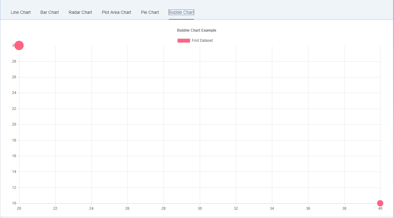
A bubble chart is used to display three dimensions of data at the same time. The location of the bubble is determined by the first two dimensions and the corresponding horizontal and vertical axes. The third dimension is represented by the size of the individual bubbles.
<lab:BubbleChartJS
	id="bubble_chart"
	datasets="{temp>/bubbleChart/datasets}"
	labels="{temp>/bubbleChart/labels}"
	titleDisplay="true"
	titleText="Bubble Chart Example"
	onLegendItemClick="onLegendItemClick"
	onLegendItemHover="onLegendItemHover"
	onClick="onClick"
	onHover="onHover"
	tooltipEnabled="true"
	onAnimationProgress="onAnimationProgress"
	onAnimationComplete="onAnimationComplete">
</lab:BubbleChartJS>| Property | Type | Usage |
|---|---|---|
| data | Array<BubbleDataObject> |
The data to plot as bubbles. See Data format |
| label | String |
The label for the dataset which appears in the legend and tooltips |
| backgroundColor | Color Array<Color> |
The fill color of the bubbles. See Colors |
| borderColor | Color or Array<Color> |
The stroke color of the bubbles. |
| borderWidth | Number or Array<Number> |
The stroke width of bubble in pixels. |
| hoverBackgroundColor | Color or Array<Color> |
The fill color of the bubbles when hovered. |
| hoverBorderColor | Color or Array<Color> |
The stroke color of the bubbles when hovered. |
| hoverBorderWidth | Number or Array<Number> |
The stroke width of the bubbles when hovered. |
| hoverRadius | Number or Array<Number> |
Additional radius to add to data radius on hover. |
An example data object using these attributes is shown below. This example creates a single dataset with 2 different bubbles.
var data = {
    datasets: [
        {
            label: 'First Dataset',
            data: [
                {
                    x: 20,
                    y: 30,
                    r: 15
                },
                {
                    x: 40,
                    y: 10,
                    r: 10
                }
            ],
            backgroundColor:"#FF6384",
            hoverBackgroundColor: "#FF6384",
        }]
};| Name | Type | Default | Description |
|---|---|---|---|
| startAngle | Number | -0.5 * Math.PI | Sets the starting angle for the first item in a dataset |
| animationAnimateRotate | Boolean | true | If true, will animate the rotation of the chart. |
| animationAnimateScale | Boolean | true | If true, will animate scaling the chart. |
None