Introduction
Data Science track
Web Development track
TerraViz is an interactive map visualization web-app that shows the immediate effects of climate change. Our team is composed of Kim and Timea, as web developers, and Florian, Lukas, and Bastian, as data scientists.
We depicted, that making the future of our planet tangible is one of the psychological barriers that have made climate change into an elusive problem. People fail to call for immediate action, because they can’t see and feel the immediate effects of it: climate change is too abstract, too far away.
Our vision was to make climate change tangible and build something that would clearly show how our planet is getting warmer every year. Our first approach was to display past and present occurring wildfires as an immediate result of climate change, however, we then decided to tackle the overarching problem itself - Climate Warming - to increase awareness by displaying the severity of it. Thus, we created a web application that displays the global temperature development over the past century. With an interactive map visualization we show climate warming for all major cities around the world.
The Data was obtained from a huge dataset on kaggle, which entailed earth temperature measurements for various locations from mid-1700 up until today (271 years in total!). The dataset, which originally comes from The Berkeley Earth Surface Temperature Study, combines 1.6 billion temperature reports from 16 pre-existing archives. As such, it makes up a huge amount of data ready to be explored.
The data comes in different location categories. There is one for Cities (entailing temp. measurements for about 3,500 cities), one for Major Cities (which is a subset of the City one, entailing 100 Cities), one for Countries (data for about 250 countries worldwide) as well as one for the global average land and global average sea surface temperature. Early on, we decided to leave out the global average ones, since they did not provide the granularity we wanted for out visualization. So we had a deeper look into the other three ones, using the Major City dataset mainly for testing purposes (smaller size makes computations easier and quicker - the City dataset was more than 500MB large! Wow!) other two ones for the final data delivery, as we planned to show temperature changes on our map for a city and a country category.
Exploring the data, we figured that not all years are as detailedly measured. Especially in the beginning, a large amount of data is missing:
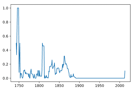
Overall, the data is somewhat noisy up until about 1880. From this point onwards, most data is available. Thus, our first take was to focus on these years. Moreover, the largest part of data missing for one specific city was 38% cumulated across all years - a lot for this single city, but still to much valuable information to drop. Thus, we decided on not ruling out total cities from the data. Apart from that, we found out that the Cities-dataset contains not only data for about 3,500 cities, but also for 159 countries - it was therefore reasonable to assume that we can get quite a wholesome world view with this dataset.
The data was ready to be downloaded as csv files, which we could easily load into python using the pandas function read_csv.
In our first iteration, we focused on getting the data ready in its general structure. This included dropping unnecessary information, adjusting non-numeric values to make them readable, and converting the data frame we had after loading the csv into the geojson format, which was required for our frontend to make the data visible.
As such, the first dataset contained 5 columns: 'date', 'city', 'lat', 'lon' and 'temp'. It was not yet aggregated for years but simply contained the average temperature locationwise on a monthly basis. Feedback from the WD-team was positive as they could load the data into the app without issues! So we were set to continue...
In the second iteration, we aggregated the monthly data on a yearly basis by calculating the average for a specific location and a specific year. We achieved this by using a sophisticated groupby function. The resulting dataset was far less bulky (as we aggregated 12 rows to one) and thus easier to handle. It still contained the same 5 columns as before, with 'date' now being a year instead of a month-year-combination. Moreover, for the country dataset, we merged in latitude and longitude values from an external dataset, as these values were missing in the original one.
In the third and final iteration, we achieved the rest we wanted. To calculate the temperature change, we wanted to take a 3-year-moving average (to rule out yearly noise) and benchmark it against the average temperature of the first 10 datapoints (i.e., years) we have for the respective location. Since the location changed throughout the raw dataset, we couldn't just iterate over it to calculate the rolling average. Thus, we came up with a more complicated loop, where we created subsets of respective locations first and then iterated over them. The computation works, but since we were using data frames all along the way, it was probably to the most efficient one. For the benchmark values, we used another sophisticated groupby-function. The change calculation in the end was simply a calculus operation between two data frame columns - here, pandas' properties came in very handy.
Some data cleaning and dropping in the end (e.g., we dropped the city column in order to save memory), and here we were, set with our dataset, appearing in the following format:
with the 'temp' being the percentage change in temperature of the rolling average compared to the first ten available date points.
After some feedback from the WD-team, which were mainly complaining about performance issues due to the large file type, we decided to go for data from 1900 onwards and city values only - from a visualization perspective, and from what our main goal was in the beginning, this was the most efficient way to go, as it created the most immersive visualisation we could get from the data (from 1900 onwards, most cities had values available - before, there were mainly datapoints for Europe and North America only).
As our tech-stack, we used python with the following libraries/ packages:
- Pandas
- Numpy
- Matplotlib
- mapboxgl.utils (for the data export as geojson)
There were some challenges that occurred on the way which deferred the delivery of the final dataset:
- Finding a way to aggregate the data on a yearly basis: It took us quite some some time to figure out to appropriately use the groupby-function - including some pretty long for loops, which at peaks took about 15min to run over the whole dataset. The groupby in the end was super easy and smooth.
- Finding a way to calculate the rolling average: Usually, calculating the rolling average in a dataset is pretty straightforward - here, however, the dependencies constantly changed as the locations did. Thus, we had to figure out how to deal with that. In the end, a sophisticated for loop would to the trick - probably not super efficient due to intensive calculations, but it works! And that's the most important thing at first when you're approaching the deadline...
- Loading in more precise coordinates: For the city dataset, the coordinates are rounded up until 2 decimals - way too imprecise for this kind of information (usually you use at least 6 digits!). We found a way to obtain more precise coordinates using an external API (OpenCage Geocoding) - however, with our amount of data, we crashed every payment barrier out there, leaving this problem unsolved.
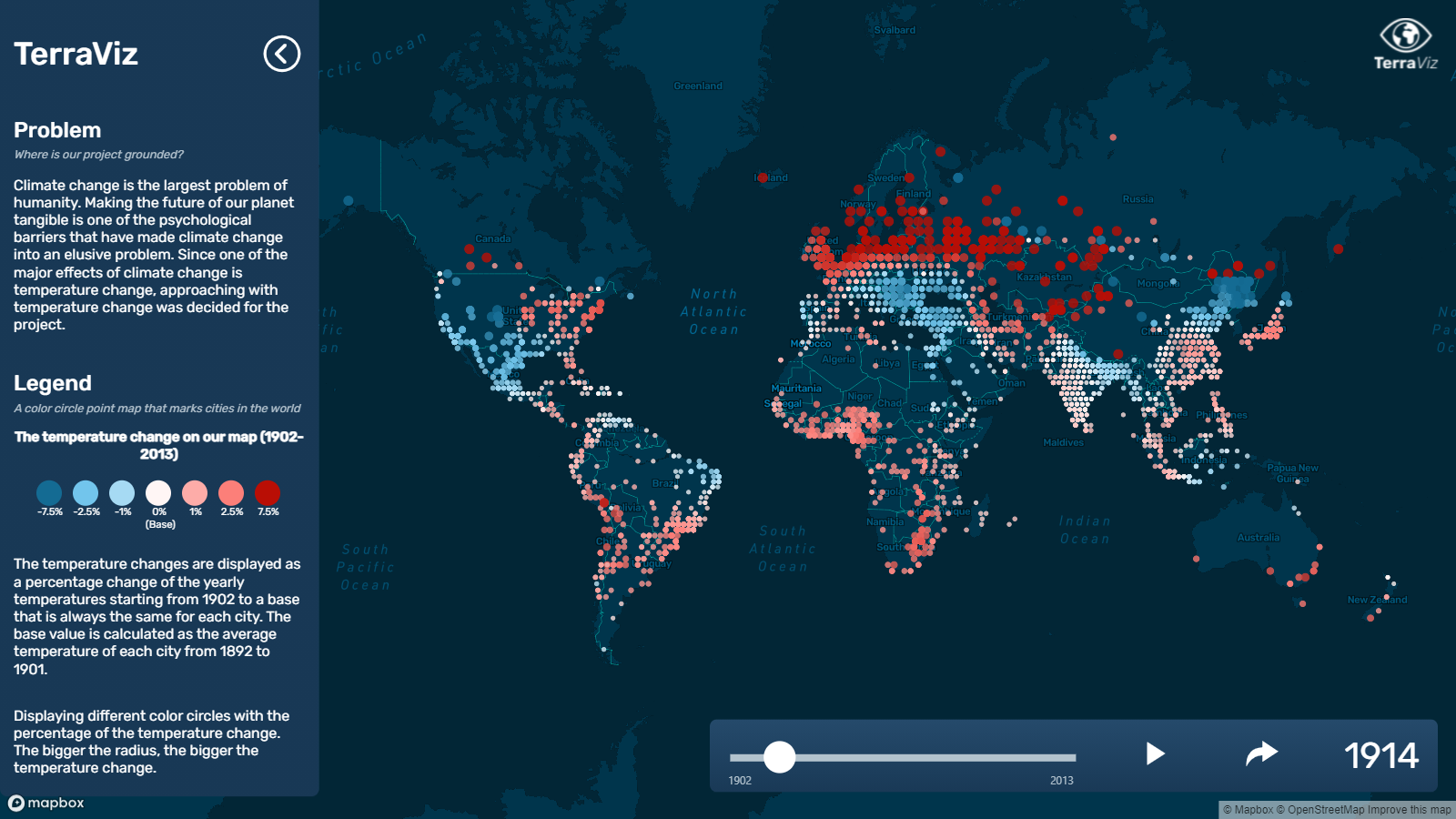
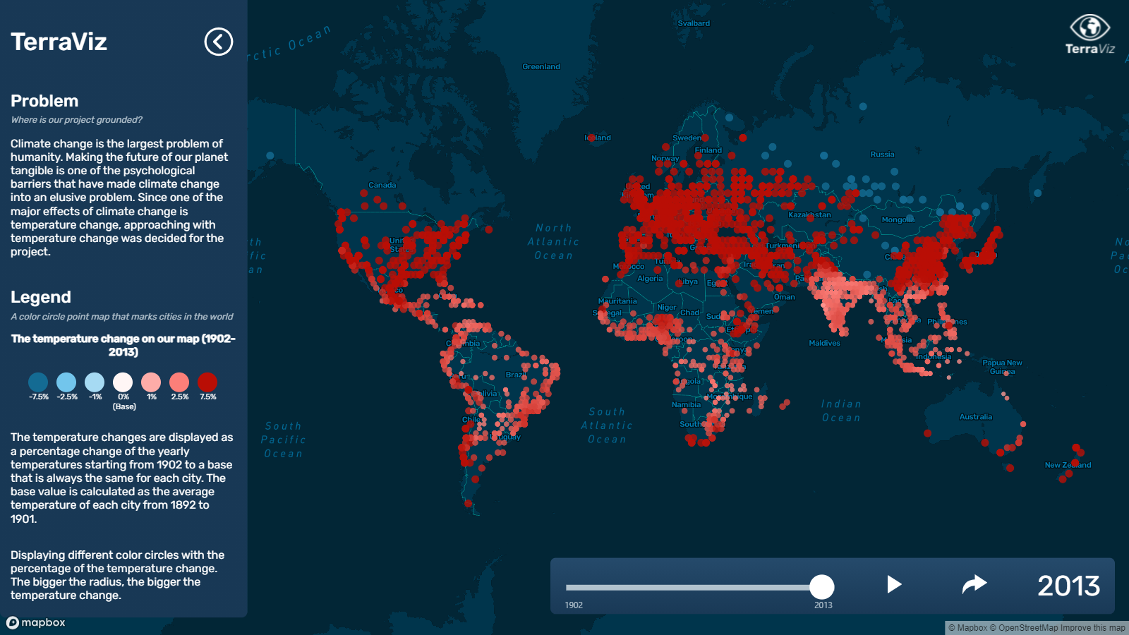
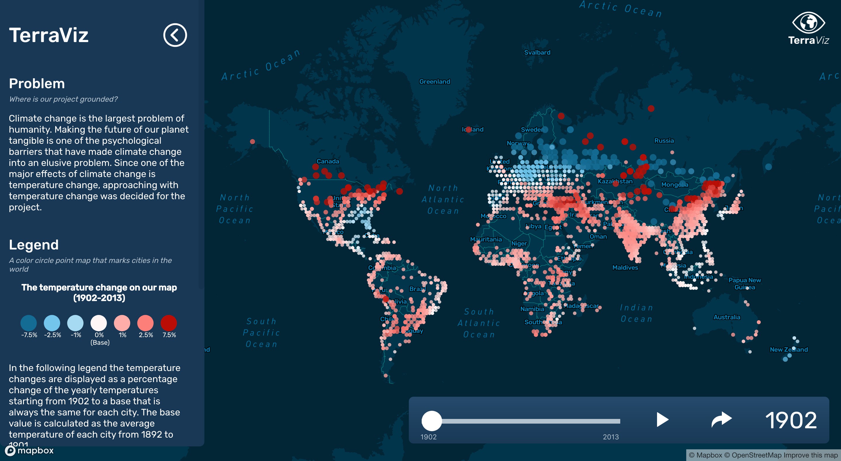
Sliding through the time from 1900 until 2013 shows the immersive effects of climate change already present in todays world - and especially, how they’re getting more severe by time.
| The first half of the 20th century, warmer periods are followed by colder ones in quite a constant exchange |
|---|
 |
| Cooling of Europe during World War II |
|---|
 |
| By 2013 the average temperature increase across all locations is at almost 14% |
|---|
 |
Early on in the project phase we decided to not set up a backend server, but store the data files locally. In retrospect, it was our first mistake. We both started to work on the frontend side, even though Kim studied the backend track during the academic phase.
After a long research into map visualization libraries and freely available maps, we chose to work with the Mapbox base maps and the Mapbox GL JS library.
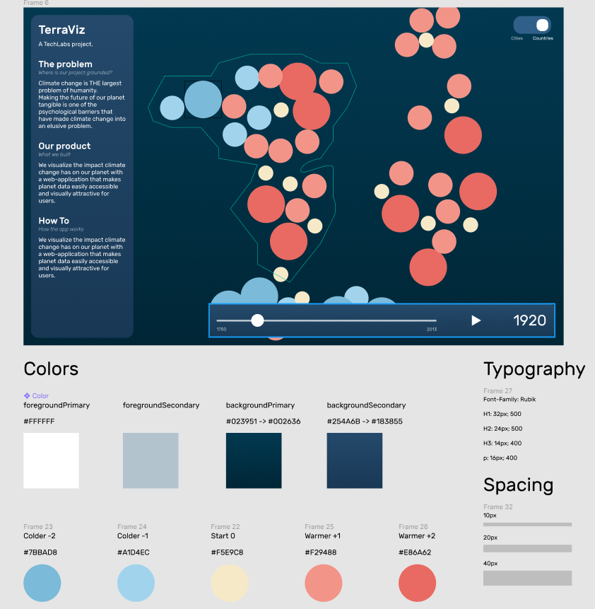
We started off with the disadvantage of not having a UX/UI designer in our team, coming up with a stylish and user friendly design was a big mental overload for us on top of our own coding tasks. Eventually we held a Design Session within our team, where we created a draft prototype and settled on our MVP.
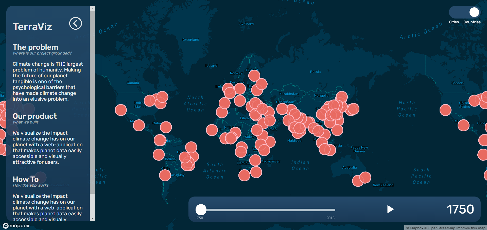
The main feature of the app is the data visualization part. We have a dataset on global land temperatures starting from the year of 1750 up until 2013, our goal is to calculate the change/anomalies from this dataset and show the temperature change on the map either in a major cities or countries view. We would represent the temperature anomalies with colored circles, year by year from 1750 until 2013. Each circle would sit on the actual location of the corresponding city. We would define 5 categories:
- negative bigger change (e.g. -2.0C) - darker blue color,
- negative small change (e.g. -1.0C) - lighter blue
- base temperature (e.g. 0C) - neutral yellow,
- positive small change (e.g. +1.0C) - light salmon color,
- positive bigger change (e.g. +2.0C) - darker salmon/coral color.
We had finished the frontend markup and styling before the mid-term of the project phase, but quickly realized that we never thought of a mobile version, and so our web app was initially not responsive. We asked the help of a drop-in UX mentor, to get a general feedback of our design and also some guidance for the mobile version.
At this stage the app was not functional, the components were visually there but none of them had proper functionality, since we were still waiting for the dataset. To unblock this, we generated small mock geojson files in order to practice fetching the data and connecting it to the time slider.
| v1 desktop version | v1 mobile version |
|---|---|
 |
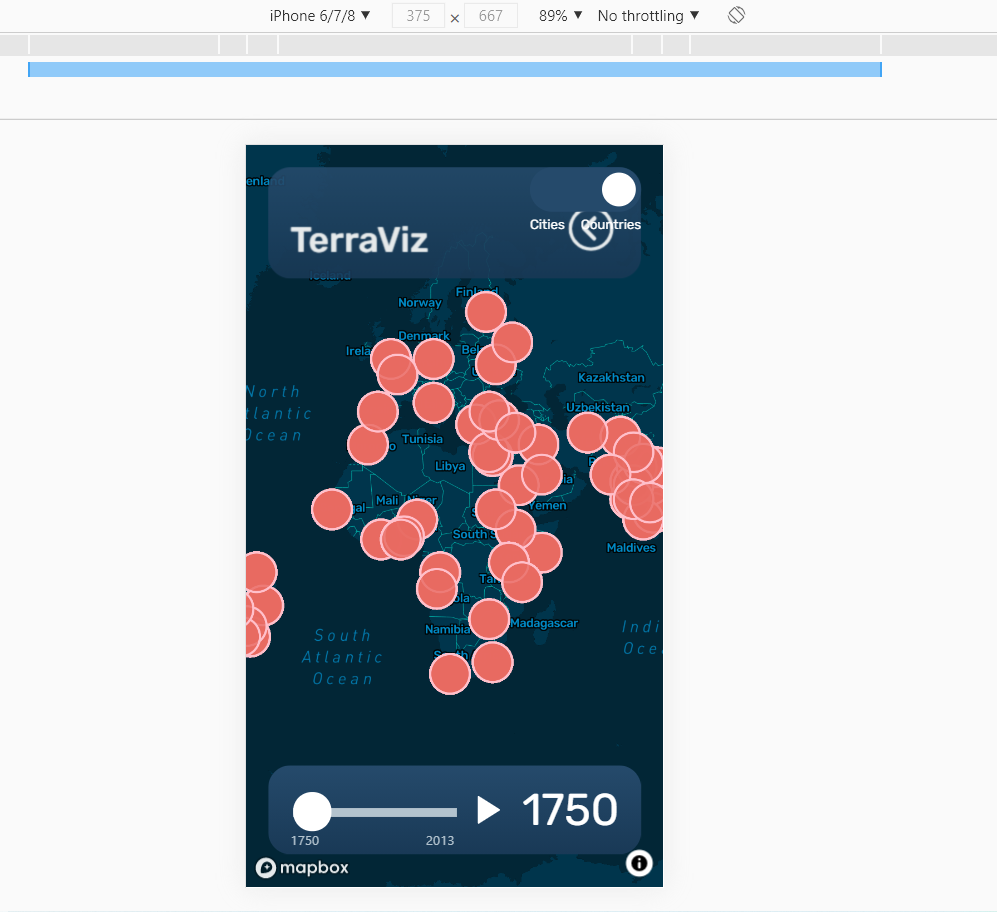 |
We further refined the design with custom scrollbar and minor UI adjustments, and one techie from another project offered to design our logo for us, which made our look complete. We also settled on a mobile version design, finally our web app was responsive and accessible from small screens as well.
| final finished desktop version | finished mobile version |
|---|---|
 |
 |
Even though Mapbox has a comprehensive documentation, it's badly organized, which makes it difficult to search for keywords and find what you are looking for. Also, most of the tutorials and examples available use vanilla JS, which could have been a warning sign for us, as React and usually the dataviz libraries are not made for each other.
We also realized after getting the final dataset that our current setup is not built to serve a ~50MB data. We could have solved the performance issues that the huge file size caused by slicing the data into smaller chunks and serving them from a backend, one by one, but we were already in the final week, and refactoring the frontend code plus building a backend was just simply not possible in such a short amount of time.
"If I could start over, I would opt for vanilla JS to build our app. By the time it became apparent how much struggle to build it all in React, and that our use case actually don't require dynamic rendering, it was already too late to refactor everything.
For me, though, the most challenging part was making the time slider work in React. At first I didn't want to use a library, instead I wanted to build it from scratch, as I thought it would be a nice practice. I opted to use
setInterval()for the timer, and so my struggles began: little did I know that React is not handling intervals nicely..Dan Abramov (creator of Redux, co-author of the Create React App) wrote in a blogpost: "If you played with React Hooks for more than a few hours, you probably ran into an intriguing problem: using setInterval just doesn’t work as you’d expect.", and Ryan Florence (creator of React Router) said: "I’ve had a lot of people point to setInterval with hooks as some sort of egg on React’s face".
I was able to make it work though, now the only problem was that the interval would not stop iterating after reaching the end of the slider (2013), even though I had set up a
clearInterval()in my original function. It only stopped by clicking on the pause button - which triggers a state update, so the clearInterval can run its course. The callback function in setInterval doesn't update state, meaning the first clearInterval can't actually clear the interval, since it only sees the old state.This is where I gained most of my knowledge about the peculiarities of React and how the rendering cycles work. This was also the point where I coined the term ADD - Anger Driven Development, as I had so many troubles trying to fix this issue and just couldn't wrap my head around it. The bug is sadly still there in the application, but I will not sleep in peace until I find the solution."
-Timea
- React (Create React App)
- Mapbox customized base map
- Mapbox GL JS → library for map visualizations
- React icons → icons
- Netlify → deployment