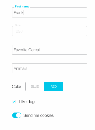
Customizable inputs with animated float labels, toggles, switches, and checkboxes for React.js.
#####TL;DR
You need the FancyField and FancyButton React components (src/fancy-field.js, src/fancy-button.js).
You need fancy-styles.scss, which requires mixins.scss and fancy-variables.scss.
#####The bizness
Fancy field and the fancy buttons assume that a parent component is tracking the form state (or passing it to the stores, or wherever else - I don't know, you're fancy).
Simply pass a function as an updateChange prop. When updated, the fancy item will pass an object with its value, property, and hasChanged.
LinkedState is for weirdos. You're too fancy for that.
For easy/important style customizations, reassign the variables in fancy-variables.scss. For individual styling, each fancy item has a class equaling its property name.
Scroll down for instructions to run the demo.
#####Fancy Field
The float label input of your dreams. The following props are required.
- label
- value: the value of the field. This must be set/updated by the parent.
- property: the property name associated with the field. Also sets the input id for styling selection.
- updateChange: function fired when the field is updated. Returns an object with value, property, and hasChanged.
Basic example:
var FancyDog = React.createClass({
    getInitialState: function() {
        return { dog: this.props.dog };
    },

    updateFormState: function(field) {
        var obj = {};
        obj[field.property] = field.value;
        this.setState(obj);
    },

    render: function() {
        return (
            <FancyField
                label='Dog breed'
                property='dog'
                value={ this.state.dog }
                updateChange={ this.updateFormState } />
        )
    }
});
The following props are available to level-up fanciness.
- focused: boolean; sets cursor focus on mount.
- placeholder: define to make the placeholder text different from the float label.
- type: input type. defaults to 'text' if unspecified.
- errors: treated as a boolean to show error styles. If set as a string, object, or array, will reveal an error message.
- unit: displays a unit (eg, 'minutes') when the field has a value.
- persistLabel: keeps the magic label revealed even when empty and unfocused.
- focusText: message will be revealed while focused on the field.
- disabledClickText: text will show for 2 seconds after clicking on disabled field.
- initialValue: required if you want to use
hasChanged. hasChanged is passed via the updateChange prop and indicates when the value becomes newly changed, or when it returns to its original value.
Fancy field will attribute any extra props to the input. Eg, if you want to set a max length on the field, adding a maxLength prop will do the trick.
#####Fancy Buttons
'Button' is misleading, for fancy buttons are much more than that. They can handle booleans in 3 different fancy ways. Choose from a toggle, switch, or a classic checkbox.
The buttons only handle true/false values, but it's easy to obscure that. (value == 'blue' or nah?)
Required props:
- label
- value: current boolean value.
- property: the property associated with the button.
- updateChange: fired when the button is clicked. Returns an object with value, property, and hasChanged.
Optional props:
- checkbox: boolean; show the button as a checkbox.
- switch: boolean; show the button as a switch. requires a 'trueLabel' and 'falseLabel'.
- disabled
- initialValue
###To run the demo
Clone this repo.
npm install
npm start
Demo was whipped together with react-hot-boilerplate.
Bonus!!! Enjoy a carat mixin, popup message component that accepts multiple prop types, styles to change fancy message positioning, and more!!!