Modal component #458
Comments
|
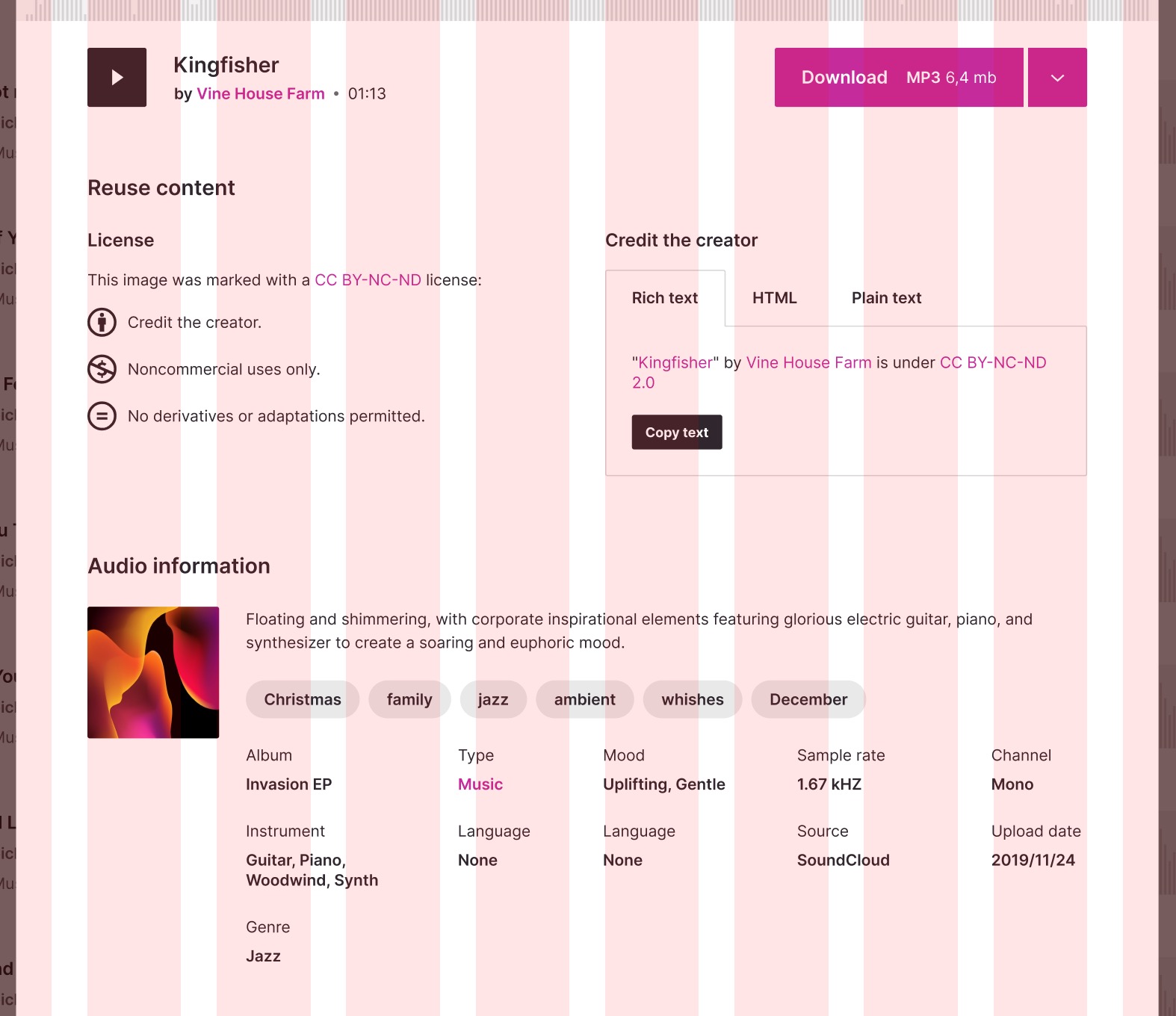
One issue I always run into when building modals is the width/height. This is perhaps an implementation detail for specific instances of the modal, but some open questions I have:
|
|
I think you're right, those would be details of specific modals rather than the general modal component. Good to keep in mind that those variables need to be easily configurable by the implementation site. My plan right now, after poking around at the Popover and comparing it to how Reakit organizes things, I think it would be good to split some of the Popover stuff into a generic "dialog" like Reakit has. Then our Modal component would be a thin implementation on top of that and Popover would be too albeit with the I also found a Vue 2 implementation of teleport that could be useful to make sure that the modal content doesn't get rendered in the middle of the page content and we can append it to the end. |
|
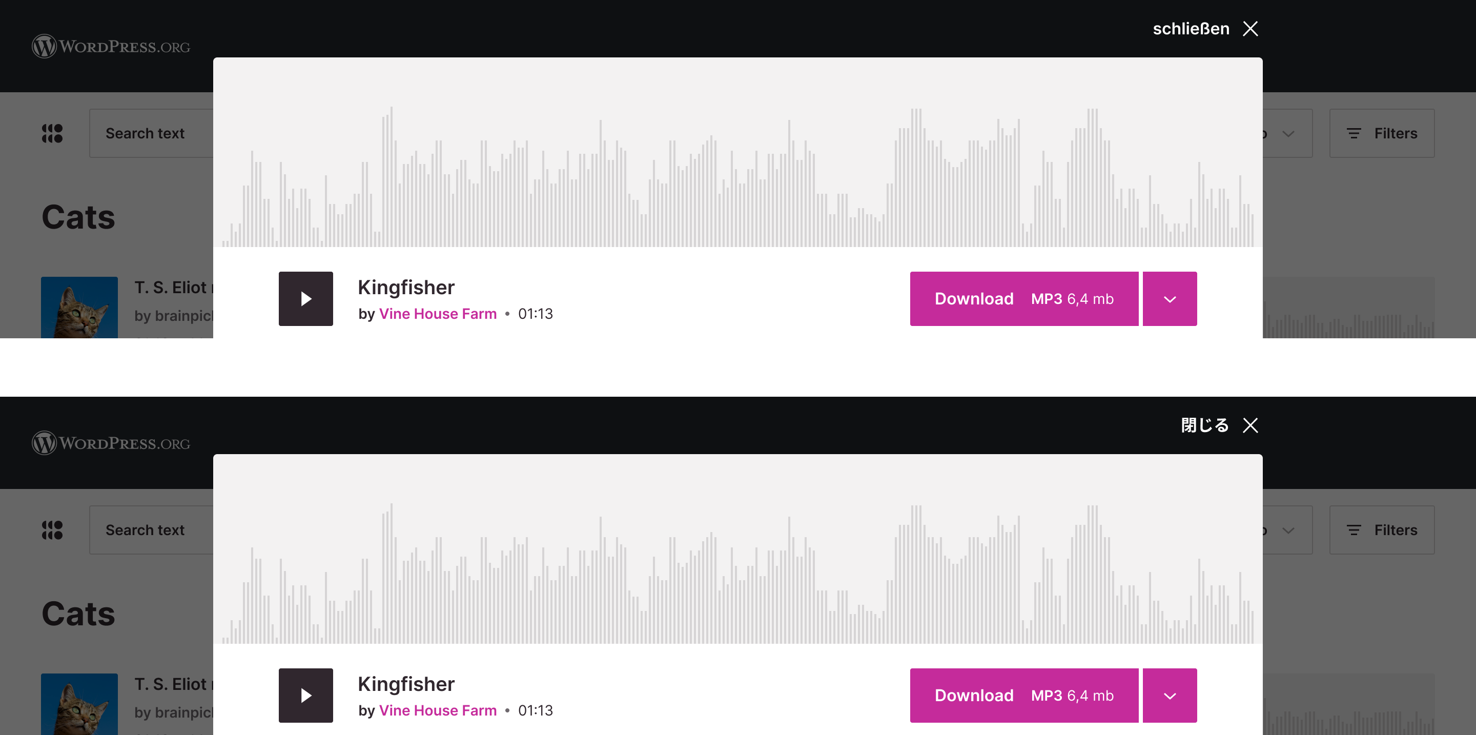
@panchovm Could you provide some designs for the modal at various viewport widths? I'm struggling to figure out what to do with the close button in particular when the viewport is constrained. Specifically, I'm wondering what to do with the potential for variable widths on the close button text itself. If the text of the button grows (for example |
|
@sarayourfriend Sure. I will add mockups for clarity. Still describing my ideal scenario to see your thoughts. Having a modal following the parent scroll sounds good to me. However, I wonder if, in some cases, the modal height might be larger than the parent page (search results). Regarding the modal width, I think we should set a fixed value. Otherwise, the For the close action, I think that moving it to be above and top-right aligned will solve the i18n aspect. Let me add a quick sketch to illustrate my point. The translation might be incorrect, it's just for the mockup purpose. |
|
The close actions looks really nice on the top, and that definitely fixes any accessibility issues and simplifies the code to implement the modal. Awesome. |


We need to add an accessible modal component that can be used for the single result view in the redesign.
There's a lot of reading to keep in mind while working on this:
https://www.w3.org/TR/wai-aria-practices/#dialog_modal
https://www.w3.org/TR/wai-aria-practices/examples/dialog-modal/dialog.html
There are some good React implementations to keep in mind:
https://assortment.io/posts/accessible-modal-component-react-portals-part-2
https://reakit.io/docs/dialog/
Avoid referencing the Vue 2 modal example in the docs as it is not an accessible modal implementation.
A lot of the behavior that is needed for an accessible modal can be extracted from the
usePopoverContentcomposable. Most of the composables that composable references should be able to be abstracted to handle a modal as well. Because a lot of it is inspired by Reakit, it'd be a good idea to see what Reakit is doing for the base Dialog component whenmodal=true.One thing we can ignore from the Reakit implementation is multiple dialog handling I think... we should make sure to test having a popover inside the modal and that it behaves as expected (escape when the popover is open should only close the popver, not the modal; but clicking outside the modal should close everything). Seems like a real can of worms!
Usage example
The text was updated successfully, but these errors were encountered: