| Prefix | Method |
|---|---|
imp→ |
import moduleName from 'module' |
imn→ |
import 'module' |
imd→ |
import { destructuredModule } from 'module' |
ime→ |
import * as alias from 'module' |
ima→ |
import { originalName as aliasName} from 'module' |
exp→ |
export default moduleName |
exd→ |
export { destructuredModule } from 'module' |
exa→ |
export { originalName as aliasName} from 'module' |
enf→ |
export const functionName = (params) => { } |
edf→ |
export default (params) => { } |
met→ |
methodName = (params) => { } |
fre→ |
arrayName.forEach(element => { } |
fof→ |
for(let itemName of objectName { } |
fin→ |
for(let itemName in objectName { } |
anfn→ |
(params) => { } |
nfn→ |
const functionName = (params) => { } |
dob→ |
const {propName} = objectToDescruct |
dar→ |
const [propName] = arrayToDescruct |
sti→ |
setInterval(() => { }, intervalTime |
sto→ |
setTimeout(() => { }, delayTime |
prom→ |
return new Promise((resolve, reject) => { } |
cmmb→ |
comment block |
cp→ |
const { } = this.props |
cs→ |
const { } = this.state |
| Prefix | Method |
|---|---|
imr→ |
import React from 'react' |
imrd→ |
import ReactDOM from 'react-dom' |
imrc→ |
import React, { Component } from 'react' |
imrcp→ |
import React, { Component } from 'react' & import PropTypes from 'prop-types' |
imrpc→ |
import React, { PureComponent } from 'react' |
imrpcp→ |
import React, { PureComponent } from 'react' & import PropTypes from 'prop-types' |
imrm→ |
import React, { memo } from 'react' |
imrmp→ |
import React, { memo } from 'react' & import PropTypes from 'prop-types' |
impt→ |
import PropTypes from 'prop-types' |
imrr→ |
import { BrowserRouter as Router, Route, NavLink} from 'react-router-dom' |
imbr→ |
import { BrowserRouter as Router} from 'react-router-dom' |
imbrc→ |
import { Route, Switch, NavLink, Link } from react-router-dom' |
imbrr→ |
import { Route } from 'react-router-dom' |
imbrs→ |
import { Switch } from 'react-router-dom' |
imbrl→ |
import { Link } from 'react-router-dom' |
imbrnl→ |
import { NavLink } from 'react-router-dom' |
imrs→ |
import React, { useState } from 'react' |
imrse→ |
import React, { useState, useEffect } from 'react' |
redux→ |
import { connect } from 'react-redux' |
rconst→ |
constructor(props) with this.state |
rconc→ |
constructor(props, context) with this.state |
est→ |
this.state = { } |
cwm→ |
componentWillMount = () => { } DEPRECATED!!! |
cdm→ |
componentDidMount = () => { } |
cwr→ |
componentWillReceiveProps = (nextProps) => { } DEPRECATED!!! |
scu→ |
shouldComponentUpdate = (nextProps, nextState) => { } |
cwup→ |
componentWillUpdate = (nextProps, nextState) => { } DEPRECATED!!! |
cdup→ |
componentDidUpdate = (prevProps, prevState) => { } |
cwun→ |
componentWillUnmount = () => { } |
gdsfp→ |
static getDerivedStateFromProps(nextProps, prevState) { } |
gsbu→ |
getSnapshotBeforeUpdate = (prevProps, prevState) => { } |
ren→ |
render() { return( ) } |
sst→ |
this.setState({ }) |
ssf→ |
this.setState((state, props) => return { }) |
props→ |
this.props.propName |
state→ |
this.state.stateName |
rcontext→ |
const ${1:contextName} = React.createContext() |
cref→ |
this.${1:refName}Ref = React.createRef() |
fref→ |
const ref = React.createRef() |
bnd→ |
this.methodName = this.methodName.bind(this) |
- All hooks from official docs are added with hook name prefix.
| Prefix | Method |
|---|---|
imrn→ |
import { $1 } from 'react-native' |
rnstyle→ |
const styles = StyleSheet.create({}) |
| Prefix | Method |
|---|---|
rxaction→ |
redux action template |
rxconst→ |
export const $1 = '$1' |
rxreducer→ |
redux reducer template |
rxselect→ |
redux selector template |
| Prefix | Method |
|---|---|
pta→ |
PropTypes.array |
ptar→ |
PropTypes.array.isRequired |
ptb→ |
PropTypes.bool |
ptbr→ |
PropTypes.bool.isRequired |
ptf→ |
PropTypes.func |
ptfr→ |
PropTypes.func.isRequired |
ptn→ |
PropTypes.number |
ptnr→ |
PropTypes.number.isRequired |
pto→ |
PropTypes.object |
ptor→ |
PropTypes.object.isRequired |
pts→ |
PropTypes.string |
ptsr→ |
PropTypes.string.isRequired |
ptnd→ |
PropTypes.node |
ptndr→ |
PropTypes.node.isRequired |
ptel→ |
PropTypes.element |
ptelr→ |
PropTypes.element.isRequired |
pti→ |
PropTypes.instanceOf(name) |
ptir→ |
PropTypes.instanceOf(name).isRequired |
pte→ |
PropTypes.oneOf([name]) |
pter→ |
PropTypes.oneOf([name]).isRequired |
ptet→ |
PropTypes.oneOfType([name]) |
ptetr→ |
PropTypes.oneOfType([name]).isRequired |
ptao→ |
PropTypes.arrayOf(name) |
ptaor→ |
PropTypes.arrayOf(name).isRequired |
ptoo→ |
PropTypes.objectOf(name) |
ptoor→ |
PropTypes.objectOf(name).isRequired |
ptsh→ |
PropTypes.shape({ }) |
ptshr→ |
PropTypes.shape({ }).isRequired |
ptany→ |
PropTypes.any |
ptypes→ |
static propTypes = {} |
| Prefix | Method |
|---|---|
graphql→ |
import { compose, graphql } from react-apollo' |
expgql-> |
export default compose(graphql($1, { name: $2 }))($3) |
| Prefix | Method |
|---|---|
clg→ |
console.log(object) |
clo→ |
console.log("object", object) |
ctm→ |
console.time("timeId") |
cte→ |
console.timeEnd("timeId") |
cas→ |
console.assert(expression,object) |
ccl→ |
console.clear() |
cco→ |
console.count(label) |
cdi→ |
console.dir |
cer→ |
console.error(object) |
cgr→ |
console.group(label) |
cge→ |
console.groupEnd() |
ctr→ |
console.trace(object) |
cwa→ |
console.warn |
cin→ |
console.info |
Omi Snippets
Try it Now! Visual Studio Code syntax highlighting for single-file Omi.js components (enabled by omil). Or Download Vsix! to install in Visual Studio Code
下载地址 & Download: https://marketplace.visualstudio.com/items?itemName=Wscats.eno
项目地址 & Source Code : https://github.com/Wscats/omi-snippets
详细文档 & Document: https://github.com/Wscats/omi-docs
- 介绍 && Introduce
- 安装 && Install
- 配合Omi Snippets插件 && Cooperative plugin with Omi Snippets
- 配合React开发 && Cooperative with React
- 语言块规范 && Language Block Specification
- JSX
- Props
- 事件处理 && Event
- 生命周期 && Lifecycle
- 更新方法 && Update
- Ref
- Store
- CSS
- 高阶组件 && HOC
- Install Omi Snippets.
- Try it with omil✌️😜, a Omi.js components loader based on webpack.
- Via Marketplace Control: search for
Omi Snippetsand click install. - Manual: clone this repo and install
omi-snippets.vsixinto your Visual Studio Code.
In addition, if you want to build and install the extension from source, you need to install vsce, like this.
# Then, clone the repository and compile it.
git clone https://github.com/Wscats/omi-snippets
cd omi-snippets
yarn
vsce package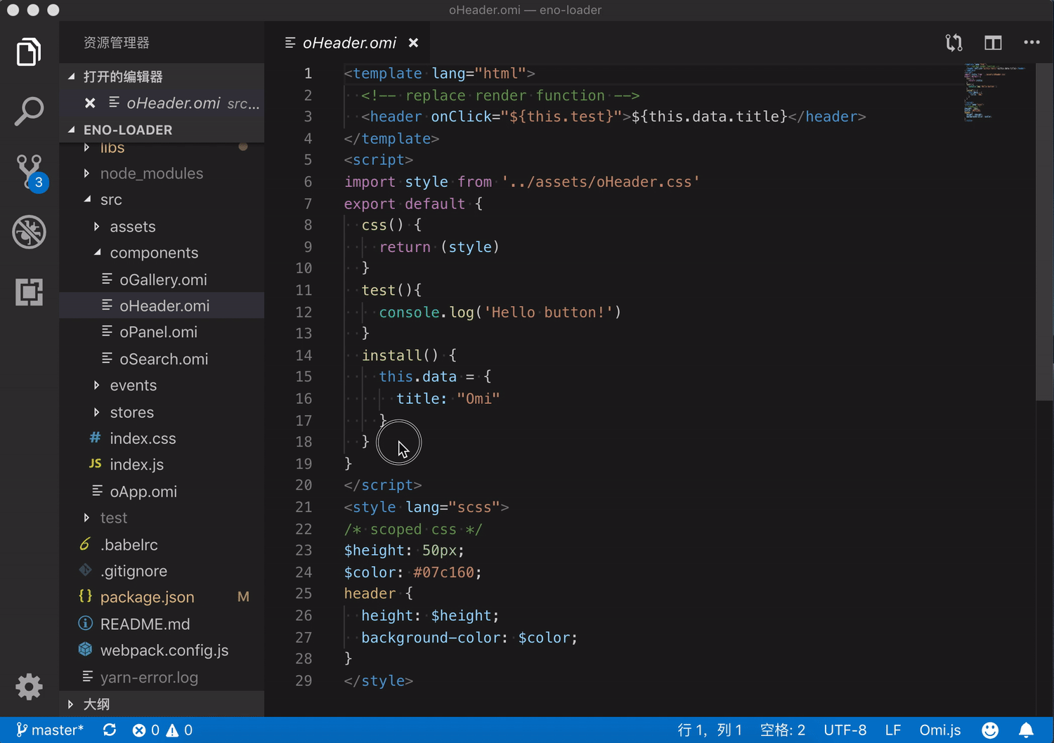
This will setup a basic webpack + omil project for you, with *.omi or *.eno files and hot-reloading working out of the box!
For example, you can create test.omi in Visual Studio Code before install Omi Snippets
<!-- test.omi -->
<template name="component-name">
    <div>{this.data.name}</div>
</template>
<script>
import style from './style.css';
export default class {
    static css = style
    install(){
        this.data = {
            name: 'Eno Yao',
        }
    }
}
</script>
<style lang="scss">
    div{ color:red; }
</style>
After you save the code in editor(Ctrl+S), it will be converted into test.js
// test.js
import { WeElement, define, h } from "omi";
import style from "./style.css";
const componentName = class extends WeElement {
  render() { return h("div", null, this.data.name); }
  static css =
    `div{color:red;}` + style;
  install() {
    this.data = { name: "Eno Yao" };
  }
};
define("component-name", componentName);A *.omi file is a custom file format that uses HTML-like syntax to describe a Omi component. Each *.omi file consists of three types of top-level language blocks: <template>, <script>, and <style>, and optionally additional custom blocks:
<template lang="html" name="component-name">
  <!-- replace render function -->
  <header onClick="${this.test}">${this.data.title}</header>
</template>
<script>
import style from './_oHeader.css'
export default class {
  static css = style + `p{color:red}` // it will combine scoped css,only support static css = xxx
  test(){ console.log('Hello Eno!') }
  install() {
    this.data = { title: 'Omi' }
  }
}
</script>
<style>
/* scoped css */
header {
  height: 50px;
  background-color: #07c160;
  color: white;
  text-align: center;
  line-height: 50px;
  width: 100%;
}
</style>It also supports JSX, if you want to do that, you only write <template> without lang="html" attribute in your component like this:
<template>
  <header onClick={this.test}>{this.data.title}</header>
</template>omil supports using non-default languages, such as CSS pre-processors and compile-to-HTML template languages, by specifying the lang attribute for a language block. For example, you install node-sass after you can use Sass for the style of your component like this:
<style lang="scss">
$height: 50px;
$color: #07c160;
header {
  height: $height;
  background-color: $color;
}
</style>npm install styled-components --saveYou can also use an ES6 class to define a class component by omil.
<template name="ComponentName">
    <p>{this.state.title}</p>
</template>
<script>
    export default class {
        constructor(props) {
            super(props)
            this.state.title = "Eno Yao"
        }
    }
</script>
<style lang="scss">
    p {color: #58bc58;}
</style>A higher-order component (HOC) is an advanced technique in React for reusing component logic. HOCs are not part of the React API. Here's a concrete example.
<template name="ComponentName">
    <div><p>{this.state.title}</p></div>
</template>
<script>
    const HOC = (props) => {
        return (WraooedComponent) => {
            return class HOC extends WeElement {
                state = {
                    name: 'Eno Yao',
                    ...props
                }
                render() {
                    return (
                        <div>Hello World<WraooedComponent name={{ ...this.state }} /></div>
                    )
                }
            }
        }
    }
    export default HOC({
        age: 18
    })(class {
        constructor(props) {
            super(props)
            this.state = { title: 'Lemon' }
        }
        componentDidMount() { console.log(this) }
        handleChange() {}
    })
</script>
<style lang="scss">
    p { color: #58bc58; }
</style>A static type system can help prevent many potential runtime errors, especially as applications grow. You can use Single File Components(SFC) cooperate with Higher Order Components(HOC) to get support with TypeScript
<template name="Eno">
    <div><p>{this.state.name}</p></div>
</template>
<script>
    // TypeScript Support
    import EnoType from './EnoType.tsx'
    export default EnoType(class {
        constructor(props) {
            super(props);
            this.state = { name: 'abc', age: 18}
        }
    })
</script>
<style lang="scss">
    p { color: #58bc58; }
</style>
Now, you can create EnoType.tsx in editor which provides TypeScript inference inside SFCs and many other great features.
// EnoType.ts
import React from 'react';
interface EnoTypeProps { }
interface EnoTypeState { name: string }
export default (Component: React.ComponentType) => {
    return class EnoType extends React.Component<EnoTypeProps, EnoTypeState> {
        constructor(props: EnoTypeProps) {
            super(props)
            this.state = { name: 'Eno Yao' }
        }
        render() { return <Component /> }
    }
}There are many cool features provided by omil:
- Allows using other webpack loaders for each part of a Omi component, for example Sass for
<style lang="scss">and JSX/HTML for<template lang="html">and ES5+ for<script type="text/babel">; - Allows custom blocks in a
.omior.enofile that can have custom loader chains applied to them Here Online Demo; - Treat static assets referenced in
<style>and<template>as module dependencies and handle them with webpack loaders (Such as htm, to-string-loader); - Simulate scoped CSS for each component (Use Shadow DOM);
- State-preserving hot-reloading during development.
In a nutshell, the combination of webpack and omil gives you a modern, flexible and extremely powerful front-end workflow for authoring Omi.js applications.
Automatically compiles sass/scss files to .css saving. You may also quickly compile sass/scss files in your project.
| trigger | snippet |
|---|---|
| !omi/t-omi | <template><script><style> |
| !react/t-react | <template><script><style> |
| import | import { * } from 'omi' |
| export default | export default {} |
| modult.export" | modult.export = {} |
| render | render(){} |
| css | css(){} |
| template | <template></template> |
| templateLang | <template lang></template> |
| script | <script></script> |
| style | <style></style> |
| styleLang | <style lang></style> |
| scaffold/t | <template><script><style> |
| ... | ... |
NOTE: You still need to install corresponding packages for pre-processors (e.g. JSX, SASS, TypeScript) to get proper syntax highlighting for them.
The <script> block uses the syntax highlighting currently active for you normal .js files. To support JSX highlighting inside Omi files, just set Babel javascript highlighting package, which supports JSX, as your default JS highlighting.
Note you may need to explicitly disable Sublime's default
JavaScriptpackage to make it work.
 Eno Yao |
 Aaron Xie |
 DK Lan |
 Yong |
 Li Ting |
 Xin |
 Lemon |
 Jing |
 Lin |
 Tian Fly |
|---|
If you think it's useful, you can leave us a message and like it, Your support is our driving force😀
- omi
- omil
- babel
- prettier
- html-snippets
- vsc-css-snippets
- vscode-javascript
- vscode-javascript-snippets
- vscode-es7-javascript-react-snippets
Omi Snippets is released under the MIT