RFC for Pull Request Review #1706
Conversation
|
Okay, I think the prose here is in a state that accurately represents the contents of my head about this. I drew pretty heavily from our existing work (and used @simurai's existing excellent design graphics!) but I've also tried to "fill in the gaps" as I went. Specifically, I've added:
And I've omitted for now:
Next, I'm going to try to do some UI mocks for the missing diagrams so you don't have to puzzle out when I mean from the text alone for the new bits. But I think this is far enough along that others could help me with reviews that:
Once we're satisfied with the state of the vision described here, we can fill out the "implementation phases" list and figure out the best places to get started 🚀 |
docs/rfcs/XXX-pull-request-review.md
Outdated
|
|
||
| How do we represent the resolution of a comment thread? Where can we reveal this progress through each review, and of all required reviews? | ||
|
|
||
| Are there any design choices we can make to lessen the emotional weight of a "requests changes" review? Peer review has the most value when it discovers issues for the pull request author to address, but accepting criticism is a vulnerable moment. |
There was a problem hiding this comment.
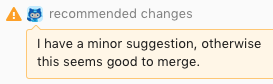
- The icon could change from "error" to "warning".
- Replace "Request changes" with "Recommend changes". It's less demanding, but still with a slight urge. In the end it's up to the PR author to follow the recommendation (or not).

There was a problem hiding this comment.
Yeah!! Some friends of mine wrote a Chrome extension to change the "request changes" icon on dotcom to 🙏. Changing the icon can help a lot here to improve the tone.
There was a problem hiding this comment.
Okay, I kind of want to use the 🙏 emoji now...
There was a problem hiding this comment.
I think @simurai's icon choices above are great too! .As long as we're not using the red icon dotcom uses, which feels pretty heavy handed to me, I'm open to a wide range of options.
There was a problem hiding this comment.
I love this question. And I love these suggestions. This sort of discussion and exploration makes me so happy :)
docs/rfcs/XXX-pull-request-review.md
Outdated
|
|
||
| ### Non-current pull request tiles | ||
|
|
||
| Pull request tiles other than the current pull request display a one-line review summary, showing the number of accepting, comment, and change-request reviews made on each. Clicking the review summary opens the `IssueishPaneItem` for that pull request and opens the reviews tab. |
There was a problem hiding this comment.
Is the main purpose to have a quick way to navigate to the "Reviews" tab? Or to keep an eye on new reviews? For the later, some sort of "new comments since I last visited", might be handy, but comes with its own challenges. It also looks a bit crowded with all the icons and numbers.
There was a problem hiding this comment.
Is the main purpose to have a quick way to navigate to the "Reviews" tab? Or to keep an eye on new reviews?
Yes 😆 It's also to start using the PR result tiles to show a bit more information without having to click through, and to give a little symmetry to the information you see for current and non-current PRs.
I'm not 100% sold on it myself though mostly because:
It also looks a bit crowded with all the icons and numbers.
So if it's just too messy we can yank it.
Sidenote:
For the later, some sort of "new comments since I last visited", might be handy, but comes with its own challenges.
I'm deliberately punting anything related to notifications about new information arriving from this RFC. It's still important and a place we can add a ton of value, but I believe it's something we should address in a consistent way across the package as a whole (controls that let you opt-in to Atom notifications? Blue-bars to signal "there's something new here"?). It's also something that's going to take a lot of us getting it wrong before we figure out how to get it right.
There was a problem hiding this comment.
It's also to start using the PR result tiles to show a bit more information without having to click through
Maybe we could show the "reviews" progress bar?

And maaaaybeeee also a "tasks" bar.

Then you can glance over the PRs and get a sense of their progress. Like " 😱 Oh, this looks almost ready, I better add my review."
There was a problem hiding this comment.
Okay, I definitely like yours better than my mockup, but I'm still not convinced we shouldn't just leave non-current PR tiles alone. I'm kind of leaning toward not touching it I guess?
There was a problem hiding this comment.
I updated a bunch of mockups, but not quite sure about the difference between "Changes" and "Reviews" tab. I guess they are for:
- Changes tabs are for reviewers. In order to review a PR, they need to see the whole diff.
- Reviews tab are for PR authors. A place with all reviews to respond to.
I guess that separation is nice, but maybe also confusing? Like you click on Reviews but not realizing that some of the changes (diff) are missing. Anyways, I'll sleep over it. 💤
|
I believe both "Changes" and "Reviews" tabs provide distinct value for both scenarios. Here's the bit from the Alternative section:
So basically:
I'll also note that the "Changes" tab as written doesn't give us an easy way to show the summary comments and 👍 / 👎 associated with existing reviews or correlate a summary comment to its diff comments. Dotcom basically mixes the "Reviews" tab into the PR timeline, and puts the checklist/progress bit in the box at the top:
|
|
Also, to be clear: totally open to combining "Reviews" and "Changes" if we can. I think the only must-have that the "Reviews" tab gives us is the ability to see the review summary comments, so maybe if we can find a way to do that on "Changes"? |
|
... Also, @simurai, your mocks for the two tabs are almost exactly how I pictured them. You are a mindreader! |
Co-Authored-By: Katrina Uychaco <katrina@github.com>
I also rolled in @sguthal's suggestion to allow you to create a new
review here while I was at it.

Co-Authored-By: Katrina Uychaco <katrina@github.com>
Co-Authored-By: Sarah Guthals <sguthals@github.com>
Co-Authored-By: Sarah Guthals <sguthals@github.com>
|
Okay, I've updated to include @sguthals's suggestion of permitting users to initiate new reviews from the current pull request tile or what used to be the changes view. |
docs/rfcs/XXX-pull-request-review.md
Outdated
|
|
||
| If there is no pending review, the tile instead displays a control to create one. | ||
|
|
||
| ### IssueishDetailItem |
There was a problem hiding this comment.
@kuychaco One big question based on this section. Where do we put the conversation timeline?
Co-Authored-By: simurai <simurai@users.noreply.github.com>
Co-Authored-By: Ash Wilson <smashwilson@gmail.com>
Co-Authored-By: Tilde Ann Thurium <annthurium@github.com>
Co-Authored-By: Ash Wilson <smashwilson@gmail.com>
Update RFC to reflect editor-first design
|
I think we're all on the same page in terms of our rough design direction and scope for this work 🎉 🎆 Thank you everyone for weighing in and hashing this out together. Coming to consensus on something like this is really challenging and there's a super long trail of fine details that we'll hash out as we're building it. But it's already really really improved from the write-up I started at the beginning of this week, when it was just an expression of what was in my head. Some expectations:
|
I've started to collect the design work that @simurai, myself, and others have been collaborating on off and on over the past few months into a single document about the pull request review experience we want to support in Atom. I'm hopeful that by putting it all in one place, we can have a clearer picture about the pieces we'll need to put in place to make it a reality.
This is highly WIP - I literally just through up a few paragraphs the other day. I'm pushing it now so that all of you can see how far along I am 😄
/cc @kuychaco, @annthurium, @vanessayuenn, @simurai
/cc @sguthals
🌠 🦄(rendered) 🦄 🌠