Size of all components combined:
NB: Some sections are only readable if you expand them. Some of them contain my scattered thoughts on topics well outside my areas of expertise. Have salt shaker handy.
p-et-alia (pronounced "petalia") is a web component "peer-to-peer" framework shell. It consists of simple "connector" components that can progressively bind native DOM / web components together, regardless of how the elements got there.
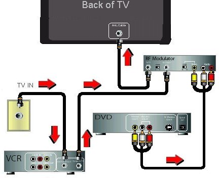
These components emphasize simplicity and small size -- to be used for 30,000 ft. above the ground component connecting. Think connecting a TV to a Roku, rather than connecting tightly coupled micro chips together. See the sections "Limitations" for more discussion about this.
Use cases
- If you just need to connect some elements of a mostly static or server-rendered web site, these components provide a light weight way of doing that.
- These components allow you to keep code-centric builds at bay as much as possible. Why is this important? Because browsers can process HTML significantly faster than JS. That doesn't mean you have to edit HTML files. Theoretically, you could edit in JavaScript, or some other language, and benefit from the tooling (type checks, etc.), but compile to HTML for optimum performance.
- Note that there are some far more mature solutions worth exploring whose aims partly match these. Some of them build around a framework, like Vue or React or Svelte, that can glue components together, and that's just ... awesome.

"p-d" is the main component, and stands for "pass down." "p-d" agrees with the ancient (and modern) wisdom "all streams flow to the sea because it is lower than they are. Humility gives it its power."
"p-u" stands for "pass-up," and is to be used sparingly as a last resort.
Both p-d and p-u have an attribute/property, "on" that specifies an event to monitor for. They both attach an event listener for the specified event to the first previous element sibling without attribute "on". You can alternatively specify the criteria for which previous element to observe, as will be discussed later.
When this event monitoring is enabled, if the previous element is disabled, the disabled attribute is removed (more on that later).
p-d passes information from that previous sibling's event down the p-d instance's sibling list. It stops event propagation (by default). Sample markup is shown below:
<!--- verbose syntax -->
<div style="display:grid">
    <input>
    <p-d on="input" to="url-builder" prop="input" val="target.value" m="1"></p-d>
    <url-builder prepend="api/allEmployees?startsWith="></url-builder>
    <p-d on="value-changed" to="fetch-data" prop="url" val="detail.value" m="1"></p-d>
    <fetch-data></fetch-data>
    <p-d on="fetch-complete" to="my-filter" prop="input" val="detail.value" m="2"></p-d>
    <my-filter select="isActive"></my-filter>
    <p-d on="value-changed"  to="#activeList" prop="items" val="detail.value" m="1"></p-d>
    <my-filter select="!isActive"></my-filter>
    <p-d on="value-changed"  to="#inactiveList" prop="items" val="target.value" m="1"></p-d>
    <h3>Active</h3>
    <my-grid id="activeList"></my-grid>
    <h3>Inactive</h3>
    <my-grid id="inactiveList"><my-grid>
</div>"m" is an optional attribute/property that indicates the maximum number of matching elements that are expected to be found. If not specified, all the downstream siblings are checked, which can be wasteful.
"on" specifies the name of the event to listen for.
"to" is a CSS selector, similar to CSS selectors in a CSS file. Only the way that selector is used is as a test on each of the next siblings after the p-d element. The code uses the "matches" method to test each element for a match.
"prop" refers to the name of a property on the matching elements which need setting. (An optional property/attribute, propFromEvent/prop-from-event provides a setting a dynamic property on the target elements based on a value found in the event object -- useful when using a single p-d element to handle events from multiple elements that bubble.)
"val" is a JavaScript path / expression for where to get the value used for setting. The path is evaluated from the JavaScript event that gets fired. For example "a.b.c" type expressions are allowed. No ! or other JavaScript expressions is currently supported. If the path is a single ., then it will pass the entire event object.
If any of the sub-expressions evaluate to null or undefined, then the target element(s) aren't modified.
All the components described in this document support an attribute/property, "debug". If the attribute is present, the code will break every time the event it is monitoring for fires. Adding a debug attribute to a target element will also cause the processing to break every time a new value is about to be set.
Another attribute/property, "log" logs whenever the event fires.
Note that we are suggesting, in the markup above, the use of the CSS grid (display: grid). The CSS grid allows you to specify where each element inside the CSS Grid container should be displayed.
It appears that the CSS flex/grid doesn't count elements with display:none as columns or rows. So all the non visual components, which haven't seen the light on the benefit of setting display:none, could be marked with an attribute, nv (non visual) and apply a style for them, i.e.:
<style>
[nv]{
    display: none;
}
</style>
Since p-* are all non visual components, they are given display:none style by default.
Another benefit of making this explicit: There is likely less overhead from components with display:none, as they may not get added to the rendering tree.
Accessibility?
NB This document highlights the fact that there may be a growing tension between the amazing flexibility css now allows as far as layout, vs the ideal screen reader and keyboard navigation experience. I agree a browser solution seems warranted here. But do consider this issue carefully. Given the cycling capabilities discussed below, it should be possible to balance these concerns, generally speaking.
One can't help noticing quite a bit of redundancy in the markup above. We can reduce this redundancy if we apply some default settings.
- If no CSS specifier is defined, it will pass the properties to the next element.
- If no value is specified, it will try target.value.
We can also forgo quotes when not needed.
What we end up with is shown below:
<!-- abbreviated syntax -->
<style>
[nv]{
    display:none;
}
</style>
<div style="display:grid">
    <input>
    <p-d on=input prop=input></p-d>
    <url-builder prepend="api/allEmployees?startsWith=" nv></url-builder>
    <p-d on=value-changed  prop=url></p-d>
    <fetch-data></fetch-data>
    <p-d on=fetch-complete to=my-filter prop=input m=2></p-d>
    <my-filter select=isActive nv></my-filter>
    <p-d on=value-changed  to=#activeList prop=items m=1></p-d>
    <my-filter select=!isActive nv></my-filter>
    <p-d on=value-changed  to=#inactiveList prop=items m=1></p-d>
    <h3>Active</h3>
    <my-grid id=activeList></my-grid>
    <h3>Inactive</h3>
    <my-grid id=inactiveList><my-grid>
</div>
A spoonful of syntactic sugar
One of the beauties of html / attributes vs JavaScript is that attributes can be defined in such a way that configuring a web component can almost read like English:
<visual-ize display calendar with-time-period=year as mobius-grid with dali-esque clocks></visual-ize>If the attributes need to be dynamic, it is easiest to read if the binding syntax can express those attributes directly, "pulling in" the values from somewhere:
//Pseudo code
/* html */`<visual-ize display?=${showOrhide} ${directObjectType} with-${scope}
    as ${displayType} with ${themed} ${decorationType}></visual-ize>`
But p-* elements, as demonstrated so far, operate more on a "push values down to specified targets when events are fired" approach, rather than "push values up to specified state (either declaratively or via event handlers), and pull values down from state declaratively into target properties." The latter approach seems more natural to read, especially as the communication appears more "mutual," and looking at either tag (source vs destination) gives a clue as to what is going on.
We want to accomplish this with something that is actually meaningful, and that doesn't add superfluous, non verifiable syntax, while sticking to unidirectional data flow.
So we provide support for a slight variation in the syntax:
<label for=lhs>LHS:</label><input id=lhs>
<p-d on=input to=[-lhs] m=1></p-d>
<label for=rhs>RHS:</label><input id=rhs>
<p-d on=input to=[-rhs] m=1></p-d>
...
<if-diff if -lhs equals -rhs data-key-name=lhs-matches-rhs></if-diff>
...
<div data-lhs-matches-rhs="0">
    <template>

    </template>
</div>
What does p-d do with this syntax?
Since
- No "prop" attribute is found, and
- Since the "to" attribute follows a special pattern, where
- the expression ends with an attribute selector, and where
- that attribute starts with a dash (or data-)
then the "prop" attribute defaults to the attribute following the first dash i.e. "lhs" or "rhs." lisp-case to camelCase property setting is supported. I.e. to="[data-my-long-winded-property-name]" will set the property with name "myLongWindedPropertyName."
Furthermore, no match will be found if if-diff does not contain the -lhs (or -rhs) "pseudo" attribute.
Setting attributes (discouraged)
If you want to set the attribute value, rather than the property, use the following syntax: <button data-test="hello">Click me</button>
<p-d on=click to=[-my-attrib] val=target.dataset.test skip-init as-attr></p-d>
<div -my-attrib>test</div>Passing down attributes
The value can come from an attribute:<button aria-role="hello">Hello</button>
<p-w on="click" to=[-text-content] val=aria-role skip-init m=1></p-w>
<div -text-content></div>Bad code smells with p-u
I would suggest that for most applications, most of the time, data will naturally flow in one direction. Those of us who read and write in a downward direction will probably want to stick with that direction when arranging our elements. But there will inevitably be points where the data flow must go up -- typically in response to a user action.
That's what p-u provides. As the name suggests, it should be used sparingly.
p-u can pass data in any direction, but the primary intent is to pass it up the DOM tree to a precise single target. What was the CSS selector, before the opening brace, now becomes a simple ID. No # before the ID is required (in fact it will assume the ID starts with # if you do this). If the selector starts with a slash, it searches for an element with that ID from (root) document, outside any shadow DOM. If it starts with ./, it searches within the shadow DOM it belongs to ../ goes up one level. ../../ goes up two levels, etc. Basically we are emulating the path syntax for imports.
Sample markup:
<p-u on="click" to="/myTree" prop="toggledNode" val="target.node"></p-u>An alternative to the to property/attribute is the property/attribute toClosest/to-closest, which uses the closest function to find the single element to pass the value to.
Unlike p-d, p-u doesn't worry about DOM nodes getting created after any passing of data takes place. If you are using p-u to pass data to previous siblings, or parents of the p-u element, or previous siblings of the parent, etc, then it is quite likely that the DOM element will already have been created, as a natural result of how the browser, and frameworks, typically render DOM. If, however, you choose to target DOM elements out of this range, it's more of a crapshoot, and do so at your own risk.
Another objection to this approach is that there needs to be coordination between these potentially disparate areas of the DOM, as far as what the agreed ID should be. This is obviously not a good approach if you are designing a generic component. Do you really want to tell the person using your component that they need to plop a DOM element with a specific ID, in order to receive the data? I didn't think you would. So p-u should probably not be used for this use case.
For that we have:
<p-unt on=click dispatch to=myEventName prop=toggledNode val=target.node composed bubbles cancelable></p-unt>p-unt creates a custom event with name specified by the "to" attribute, and passes a detail object based on the prop and val attributes. It also adds the original target element to the detail object.
p-unt can make data "cycle," by placing a p-* element at the beginning -- if no previous non p-* elements are found, the event handler is attached to the parent.
Packaging your component with free connector cable
These connector components are a bit unusual in the realm of web development -- most binding "frameworks" add event handlers within the tag that spawns the event. Putting aside questions about performance (which hasn't yet been determined), or IDE support (which I'm sure could accommodate either way with enough grunt work) I'm on the fence which is better.
Among the advantages of inlining the event handler, is that it is easier to keep the event handling coupled with the tag -- if you need to move the component, you are less likely to leave behind stray event handler tags by accident.
With separate (non rendering) tags, it's easier to add commentary, and I think there are debugging benefits. It feels more "physical." Plus there's no concern about applying non standard, non validating attributes, without resorting to the clunky data- solution (which itself is not foolproof).
At any rate, some support for inline event handling is provided.
First, suppose you have a great web component, <monitor-blink-rate> that emits an event every time the user blinks more than 30 times per minute. Providing a pure web component that does that, and only that, makes a lot of sense.
But you, the web component author, or one of your fans, can enhance that web component with built-in support for passing the event down:
import {Pixin} from '../p-ixin.js';
export class MonitorBlinkRatePXN extends Pixin(MonitorBlinkRate){

}
customElements.define('monitor-blink-rate-pxn', MonitorBlinkRatePXN);
Then you don't need a separate connector component:
<monitor-blink-rate-pxn data-recommended-squirt-size="3μl"  p-d='{"on":"blinks-too-much", "to": "eyedrop-spitter[-both]", "val": "target.dataset.recommendedSquirtSize"}'></monitor-blink-rate-pxn>
...
<eyedrop-spitter -left -right -both></eyedrop-spitter>Passing through DOM borders
Consider the following markup:
<details>
	<summary>my-custom-element Editor</summary>
	<input>
	<p-d on=input to=my-custom-element[-my-prop] m=1></p-d>
</details>
<my-custom-element -my-prop></my-custom-element>
Clearly, "my-custom-element" is below the p-d element. The problem is p-d wasn't born on planet Krypton, and can't see that. To allow p-d to cross the details wall, provide the "from" attribute:
<details>
	<summary>my-custom-element Editor</summary>
	<input>
	<p-d on=input from=details to=[-my-prop] m=1></p-d>
</details>
<my-custom-element -my-prop></my-custom-element>To keep performance optimal and scalable, the p-d element only tests downstream siblings -- not children of siblings. However, the use case for being able to drill down inside a DOM node is quite high.
This requirement is actually the most vexing case to consider. Here are a bunch of scenarios:
<label for=myPropEditor>My Prop:</label>
<input id=myPropEditor>
<details>
    <summary>my-custom-element in the flesh</summary>
    <my-custom-element -my-prop></my-custom-element>
</details>
How can we allow the input from myPropEditor to be passed into my-custom-element?
We can use the "observe" attribute:
<label for=myPropEditor>My Prop:</label>
<input disabled id=myPropEditor>
<details>
    <summary>my-custom-element in the flesh</summary>
    <p-d observe=#myPropEditor on=input to=[-my-prop] m=1></p-d>
    <my-custom-element -my-prop></my-custom-element>
</details>
The observe attribute is a css match query, and the test is done on previous element siblings, followed by its parent, followed by previous element siblings of the parent, etc., until a match is found. The search stops at any shadow DOM boundary.
<fieldset>
	<legend>my-custom-element Editor</legend>
    <label for=myPropEditor>My Prop:</label>
    <input id=myPropEditor>
</fieldset>
<details>
    <summary>my-custom-element in the flesh</summary>
    <my-custom-element -my-prop></my-custom-element>
</details>
Note that the input event bubbles by default, so it will pass through "fieldset". We can then connect the components thusly:
<fieldset disabled>
	<legend>my-custom-element Editor</legend>
    <label for=myPropEditor>My Prop:</label>
    <input id=myPropEditor>
</fieldset>
<details>
    <summary>my-custom-element in the flesh</summary>
    <p-d observe=fieldset on=input to=[-my-prop] m=1></p-d>
    <my-custom-element -my-prop></my-custom-element>
</details>Often, events don't bubble, like the focus event. We can use "observe" attribute again if we create a bubbling event via p-unt.
<fieldset disabled>
	<legend>my-custom-element Editor</legend>
    <label for=myPropEditor>My Prop:</label>
    <input id=myPropEditor>
    <p-unt on=focus dispatch to=focus-happened bubbles></p-unt>
</fieldset>
<details>
    <summary>my-custom-element in the flesh</summary>
    <p-d observe=fieldset on=focus-happened to=[-my-prop] m=1></p-d>
    <my-custom-element -my-prop></my-custom-element>
</details><header>
<button data-val=true>Expand all</button>
</header>
<main>
<details>
<summary>Door 1</summary>
I am Thing One
</details>
<details>
<summary>Door 2</summary>
I am Thing Two
</details>
</main>We want to declaratively specify that clicking on the button should cause all the doors to open.
p-et-alia provides an easy way and a hard way to do that.
The "easy way" uses the "care-of" attribute:
Consider the following:
<header>
    <toggle-button>Expand all</toggle-button>
    <p-d on=click from=header to=main care-of=[-open] val=target.checked skip-init></p-d>
</header>
<main>
    <details -open>
        <summary>Door 1</summary>
        I am Thing One
    </details>
    <details -open>
        <summary>Door 2</summary>
        I am Thing Two
    </details>
</main>
"care-of" finds all matches, using querySelectorAll.
p-d watches for DOM mutations, in case the set of matching downstream siblings changes, and also caches things in memory for quicker updates. But the "care-of" attribute assumes (for now) that the DOM structure has "settled." This may be fine for static markup derived from a template. Also, it requeries for matching elements each time (since no mutation observers are watching for changes), and that may be costly (depending on how effective browsers are at caching repeated queries.)
But if you are working with streaming / fluid html, and you want to apply recursive DOM monitoring (via mutationObserver), and benefit from direct reference updates, use...
So this is the hard way, but it is more thorough and more performant (I think). An extending component, "p-d-r" can be used ("pass down recursively").
Permission to enter inside a node must be granted explicitly, using the p-d-if attribute on elements where drill-down is needed. The value of the attribute is used to test against the p-d element (hence you may want to specify some marker, like an ID, on the p-d-r element, which can be used to validate the invitation.) For most simple scenarios however, p-d-if=p-d-r should do the trick:
<header>
    <toggle-button>Expand all</toggle-button>
    <p-d-r on=click from=header to=[-open] val=target.checked skip-init></p-d-r>
</header>
<main p-d-if=p-d-r>
    <details -open>
        <summary>Door 1</summary>
        I am Thing One
    </details>
    <details -open>
        <summary>Door 2</summary>
        I am Thing Two
    </details>
</main>
The benefits of taking this difficult path, is that mutation observers are set up along all DOM paths which have been "invited". That way, if DOM elements are added dynamically, they will be synchronized based on the binding rules.
Although for this simple example the two approaches may look equally hard, the p-d-r approach gets more challenging as the nesting levels increase, especially if the content comes from non tightly coupled sources.
- You can specify adding / removing a css class if the value of prop starts with a dot (".") (untested).
- You can specify a nested path that needs setting:
<!-- Save key to history.draft.key -->
<p-d on=input to=xtal-state-update[-history] with-path=draft.key val=target.value m=1 skip-init></p-d>An extending web component, p-d-x, contains experimental additional feature(s):
- You can copy all properties of the source to the target if you specify prop="." and val="." (partly tested many refactorings ago).
To convert from a string to other formats, use property/attribute parseValAs/parse-val-as. Current options are "int", "float", "bool", "truthy", "falsy" and "date."
It is easy to extend the p-d element, and provide your own way of deriving the value to be passed via an event. Simply override the method:
valFromEvent(e: Event){
    return {whatever:['you', 'want']};
}
A convenience function is made available to override valFromEvent and create an extending web component. For example:
import {extend} from 'p-et-alia/p-d-x.js';

extend({
    name: 'slot-bot'
    valFromEvent: function(e: Event){
        ...
        return customVal;
    }
})
This will define a custom element with name p-d-x-slot-bot:
    <!-- Options to vote on, passed in as a data-list element via light children.  -->
    <slot name="options"></slot>
    <p-d-x-slot-bot on="slotchange" prop="innerHTML"></p-d-x-slot-bot>
    <xtal-radio-group-md name="pronoun" data-flag="voted" data-allow-voting="-1"></xtal-radio-group-md>
The danger of defining small little custom elements to do these small tasks, is, if you are working with loosely coupled teams and integrating web components together, a strict naming convention needs to be established (pending standards are being considered to address this.)
If you are generating your markup dynamically, you can let "extend" come up with a unique name for you:
import {extend} from 'p-et-alia/p-d-x.js';

extend({
    valFromEvent: (e: Event) =>{
        ...
    },
    insertAfter: myElement
})Debugging and editing on a shoestring budget
What follows requires support for dynamic import and has been tested in Chrome and Firefox. I must say that Firefox has a number of subtle features here not found in Chrome. Bravo!
In the browser console, import the "xtal-shell" console utility:
import('https://unpkg.com/xtal-shell@0.0.21/$hell.js');
The loaded library will make debugging your p-et-alia based applications easier, and figuring out how to add connections between components as well.
Debugging Support
Although the p-* tags result in a little more verbose syntax than standard ways of adding event handlers, it does have some benefits. If you do view the live elements, you can sort of "walk through" the DOM elements and custom elements, and see how data is transformed from step to step. This would be particularly easy if there were a nice browser extension that can quickly view web component properties, regardless of their flavor. Unfortunately, existing extensions don't seem to support that yet.
But I am quite excited to see Firefox has made some giant leaps forward in supporting universal web component debugging.
In addition, now that you've imported the xtal-shell, you might find the following helpful.
Make sure you select the Elements / Inspector tab in the dev tools (right-clicking on an element and selecting "Inspect" should get you there), in such a way that you can see both the elements and the console at the same time.
Then, as you inspect custom elements, you can type this in the console:
$hell.getProperties($0)
You should see an object, which you will want to expand. This will list the values of Polymer properties, as well as observedAttributes, as well as Object.getOwnProperties. It also displays the constructor, which you can right-click on, and go to definition to see the code for the web component.
Now as you select other elements in the elements tab, in the console, hit the up arrow and enter (so you don't have to keep typing "$hell.getProperties($0)" each time). You will have to keep expanding the result.
Editing support
One of the biggest challenges of binding elements together based on events, is it isn't obvious what custom events a custom element fires, especially if the element is not well documented.
The instructions below work well in Chrome. Firefox is a little harder.
In the Elements (Inspector) tab click first on the element you want to act as a source element, then on the element below, which you want to pass data to.
Then, in the console, type:
const pc = $hell.connect($1, $0);
$1 is the first element you clicked on, $0 is the second. (Firefox doesn't support this.)
Now, as you do things in the source element, which triggers custom events, the xtal-shell will log to the console suggested markup for the p-d element.
To specify the target property you want to populate, type:
pc.destProp = pc.destProps.input
for example. The value "input" will be suggested by the autocomplete as you type.
p-d can be configured to test the event target to make sure it matches a css test. This is done with the "if-target-matches" attribute / property:
<div>
    <a href="link1">Link 1</a>
    <a href="link2">Link 2</a>
</div>
<p-d on="click" if-target-matches="a"></p-d>
So are essentially filtering out some of the events.
If you need some alternative reason to filter out some events, which if-target-matches doesn't cover, it is easy to override the default event filtering capability, with something more powerful in a derived class. For example, if you want to limit passing to every third event, or add debouncing (similar to RxJS), etc, you will need to define your own filter by overriding:
filterEvent(e: Event) : boolean{
    ...
}
The extend function mentioned above also allows you to define an event filter with less fuss.
By default, no attempt is made to yield the main thread when responding to an event. The event object itself often contains information that would be lost after yielding the thread. Web component designers should ensure that when a property is passed in, which may result in an expensive use of CPU, that it yields the thread before launching the expensive operation, at a minimum.
But for those cases where the sentiment above is insufficient, an attribute / property, "async" supports yielding the thread before passing the message down. In that case, don't be surprised if the event object has "degraded" a bit, as it is no longer a live event at that point. A copy of the original event is passed, with the property "isFake" added on for clarity.
Data-passing chain vs centralized control
These components provide a kind of "thingamajig built with web components." It's far less encompassing than traditional frameworks, because it is only designed to glue web components together, so the bulk of the complex logic will be found inside other web components.
Unlike traditional frameworks, these components don't depend on the existence of a controlling component which manages state. Instead, it is a little more JQuery like. Why not let each component decide how best to manage its own state?

It is a "peer-to-peer binding framework."
What if one of the components in your data passing chain is an unreliable dog of a component? Perhaps the complexity of your application is such that limiting a unified "state" to simply passing data between components doesn't seem practical. Who should rule state then? Redux? Mobx? Standardizing, forevermore, on setState of some framework you will be stuck with forever, version after version, no matter what cruel and stupid twists and turns it takes? What better thing to bind components together than the keeper of all history, history.state?

One candidate for providing a hand with managing history.state is the AMP's amp-bind component, which appears to rely on history.state as its unifying system of record.
The functionality discussed below is provided as an alternative.
A special element, p-h-d, stands for "pass history down". It monitors for history.state changes, and passes them down.
For example, if this markup is present:
<p-h-d to=[-text-content] from-path=val m=1></p-h-d>
<div -text-content></div>
And then the following code is executed:
window.history.pushState({val:100}, '');Then the div will display value "100".
Unlike the other components here, p-h-d doesn't latch on to any (previous) DOM Elements (and hence is not impacted by whether those DOM elements are disabled or not).
p-w extends p-d, but has the capability of causing the side effect of passing the value to history.state, location specified by optional attributes / properties state-path and guid.
The component that cannot be named.
Giving a name to this element has been tricky.
I first tried p-d-and-cc-state, but that's too long.
Then I tried p-d-f, short for "pass down and file with the state". That seems easy to remember, due to prior use. However, PDF has too many religious overtones.
So I've finally settled on "p-w". It is entirely up to you what it stands for -- whatever makes it easier to remember.
Suggestions for what p-w could stand for:
- pass withal
- pass wherewith
- planted weirwood
- pass w[hatever you want w to stand for]
- pass wynd

<button data-val="hello">Hello</button>
<p-w on="click" to=[-text-content] val=target.dataset.val skip-init push state-path="a.b.c" m=1></p-w>
<div -text-content></div>
This will cause history.state = {a:{b:{c:'hello'}}} on clicking the button. It will also act just like p-d, and set the div's textContent to "hello."
For both p-h-d and p-w, you can specify a "guid" attribute, which will write to an iframe outside any ShadowDOM with id equaling the specified guid, and if no such iframe exists, it creates one. The attribute "push" will cause another entry to be added in history (i.e. pushState as opposed to replaceState.)
Note that by using history.state in this manner, the flow of data can easily become circular and infinite.
An option to limit updates from state to the initial value + popstate events can be achieved with attribute "init-and-popstate-only" on p-h-d;
<!-- ==========================  UI Input Fields ===================================-->
<!-- If history.state initializes or popstates, repopulate input and artificially raise input event
"p-h-d" stands for "pass history.state down"
-->
<p-h-d init-and-popstate-only to=[-value] m=1 from-path=draft.key fire-event=input></p-h-d>
<input -value placeholder=key disabled>
<!-- Pass key to aggregator that creates key / value object and cc history.state (draft.key) -->
<!-- "p-w" stands for "pass w[hatever you want w to stand for]"  -->
<p-w on=input to=[-key] cc state-path=draft.key push val=target.value m=1></p-w>Please expand below.
TodoMVC or not TodoMVC?
These "connector components" would be useless if there were no, you know, components to connect.
It would be like blockchain without people actually engaging in trade.
Blockchain?
Admittedly, the parallels with blockchain are a bit tenuous, but this is an attempt to apply what I believe to be the spirit behind blockchain in both how it works and its desired outcome, to the world of DOM elements. p-et-alia is trying to bind entities together on the web page with a passive, aloof, technology agnostic "framework" that everyone can "trust" -- in order to lower the barrier to entry and level the playing field and allow friendly, unfettered competition (nice presentation / accessible / good performance, etc.) between different component "vendors," without any unfair limitations on which technologies they choose to use.
As such, the p-et-alia family of components want you to know that they are all very pro web component, even if they are also perfectly content gluing components together on a UI that is just a composition of components, without any central component controller managing state.
Recursively, some parts of a web component may also involve gluing loosely coupled sub-components together, so these connector components could also be used there to reduce boilerplate, expensive JavaScript, especially in a setting where HTML is imported, though careful measurements will need to be made when there's something concrete to test.
However, there are many scenarios where some UI functionality is sufficiently complex and intricate that "gluing together" loosely coupled components isn't the right mindset. Instead of connecting a Roku to a TV, think implementing a new design of a swiss watch.

An example of this is the classic TodoMVC functionality.
This is the type of functionality best built with a component helper library or two.
But it is worth examining the question: What is the least amount of "central control" needed to implement the TodoMVC, without triggering a gag reflex?
What follows is a discussion of what that might look like.
The main issue is that we want to be able to work with a list of objects using an intuitive, easy api that specializes in managing lists of objects. Namely our good curly braced friend. And maybe those objects should be stored outside of RAM, like IndexedDB, and manipulated via web workers (for example, but certainly not required) so as to not block the main thread.
What we want to "outsource" and make as painless as possible is mapping this beautiful JS to the UI.
This could all be done with a single self-contained component, but another option is to break down the core functionality into two key components -- a non visual view model component and a component that displays the view model. Since we only want to add a task when you hit enter, an enhanced input component would also make sense:
<div disabled=2>
    <p-d on=item-deleted to=[-delete-task] m=1></p-d>
    <p-d on=item-edited to=[-update-task] m=1></p-d>
    <enhanced-input placeholder="What needs to be done?"></enhanced-input>
    <p-d on=commit to=[-new-task]></p-d>
    <my-non-visual-to-do-list-view-model -new-task -delete-task -update-task></my-non-visual-to-do-list-view-model>
    <p-d on=list-changed to=[-items] m=1></p-d>
    <my-visual-to-do-list -items></my-visual-to-do-list>
</div>
Here, we assume the component "my-visual-to-do-list" is designed in such a way that when you click on some delete button inside that component, it emits an event "item-deleted" and if you edit an item, it emits an event "item-edited", both of which bubble up.
There are some web component libraries (lightning, for example), which discourage having events bubble up by default, due to performance concerns.
If that's the case, try using the "capture" option:
<div disabled=2>
    <p-d capture on=item-deleted to=[-delete-task] m=1></p-d>
    <p-d capture on=item-edited to=[-update-task] m=1></p-d>
    ...
</div>
Splitting up the todo composition into these three sub components could allow one or more pieces to be re-used with or without the other. For example, maybe in one scenario we want the list to display as a simple list, but elsewhere we want it to display inside a calendar. Or both at the same time.
But are my-non-visual-to-do-list-view-model and my-visual-to-do-list really loosely coupled? To a degree. But they must agree to a common contract as far as the expected format of the events.
To allow for even more loosely coupled integrations, the simple but sweet p-d can be replaced with a more specialized translator/mediator, by using computed values, mentioned above, either by overriding the valFromEvent method, or using the extend function, like the slot-bot example.
You could consider it a local "smart contract mediator" in the blockchain analogy.

NB: An avante-garde, non-gag-inducing approach to the todo problem is available here.
One of the goals of these components is they can load asynchronously, and the output should, as much as possible, not depend on when these components load.
So what happens if an element fires an event, before p-d has loaded and started listening? What if you want to monitor a property that starts out with some initial value?
To accommodate these difficulties, by default, a "fake" event is "emitted" just before the event connection is made. I believe this default choice greatly improves the usefulness of these components. However, there are situations where we definitely don't want to take action without actual user interaction (for example, with button clicks). To prevent that from happening, add attribute skip-init.
Another subtle feature you might find useful: It was mentioned before that p-d removes the disabled attribute after latching on the event handler. But what if you want to utilize multiple p-d's on the same element? We don't want to remove the disabled attribute until all of the elements have latched on.
You can specify the "depth" of disabling thusly:
    <!-- Parse the address bar -->
    <xtal-state-parse disabled=2 parse=location.href level=global
        with-url-pattern="id=(?<storeId>[a-z0-9-]*)">
    </xtal-state-parse>
    <!-- If no id found in address bar, create a new record ("session") -->
    <p-d on=no-match-found to=purr-sist[write] prop=new val=target.noMatch  m=1 skip-init></p-d>
    <!-- If id found in address bar, pass it to the persistence reader and writer -->
    <p-d on=match-found to=purr-sist prop=storeId val=target.value.storeId m=2 skip-init></p-d>
    <!-- Read stored history.state from remote database if saved -->
    <purr-sist read></purr-sist>
What if you want your element to remain disabled after all the p-d's have latched? Just set the number one higher than the number of next sibling p-d's.
p-d, by itself, is not exactly turing-complete. Even a simple "counter" is beyond its abilities. A previous attempt to pile in enough hooks to do this proved clumsy.
A nice companion custom element that works well together with p-d is xtal-decorator.
With these two combined the counter would look like:
<xtal-deco><script nomodule>({
    on: {
        click:{
            this.counter++;
        }
    },
    props:{
        counter: 0
    }
})</script></xtal-deco>
<button>Increment</button>
<p-d on=counter-changed prop=textContent></p-d>
<div></div>
Defining a piping custom element
The usefulness of this feature has gone down considerably, with the introduction of computed values above.
A convenience function is provided, that allows you to generate a "pipe" or "action" custom element with as few keystrokes as possible.
Here's what the syntax looks like in a JavaScript file:
import {PDQ} from 'p-d.p-u/PDQ.js';
PDQ.define('my-pipeline-action', input => {
    // do stuff
    return myProcessedResult;
});
This will create a custom element with name "my-pipeline-action". It applies the second argument, a function, to the "input" property of the custom element, every time the input changes. It then stores the result in property "value", and emits an event with name "value-changed":
<my-pipeline-action></my-pipeline-action>
<p-d on="value-changed" prop="input">
As with all custom element definitions, some care should be taken to ensure that the custom element names are unique. This could be challenging if generating lots of small custom elements, like shown above, to be used in a large application, especially if that large application combines somewhat loosely coupled content from different teams, who also generate many custom elements. Hopefully, the "Scoped Custom Element Registries" will help make this issue disappear in the future.
PDQ also supports multiple parameters:
    <script type="module">
        import {PDQ} from '../PDQ.js';
        PDQ.define('a-b', ({alpha, beta, gamma}) =>{
            return alpha + beta + gamma;
        })
    </script>
<a-b></a-b>If the issue of mixing JavaScript script tags inside markup is not a serious concern for you, but you do want to reap the benefits from making the data flow unidirectionally, without having to jump away to see the code for one of these piping custom elements, you can "inline" the code quite close to where it is needed. For now, this will only work if you essentially "hard code" the location of PDQ to a CDN with support for bare import specifiers:
<p-d on="selected-root-nodes-changed" prop="input" val="target"></p-d>
<script type="module">
    import {PDQ} from 'https://unpkg.com/p-et-alia@0.0.4/PDQ.js?module';
    PDQ.define('selected-node-change-handler', (input) =>{
        if((typeof(nodeList) === 'undefined') || !nodeList.items) return;
        const idx = nodeList.firstVisibleIndex;
        nodeList.items = nodeList.items.slice();
        nodeList.scrollToIndex(idx);
    })
</script>
<selected-node-change-handler></selected-node-change-handler>
With package name map support, the import statement could look more like the previous example:
import {PDQ} from 'p-et-alia/PDQ.js';NB There is now a nice polyfill for import maps.
Now if you add a breakpoint, it will take you to the code, where you can see the surrounding markup. But you will only see the markup, not the actual live elements, unfortunately. Just saying.
$ npm run serve
$ npm tests
Auto-generated via wca analyzer