- System requirements
- Installing the app
- User interface
- Mouse operation
- Configuring the application
- Adding components to the project
- Moving components around
- Control points
- Editing component properties
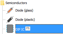
- Assigning keyboard shortcuts to components
- Using component variants
- Grouping components together
- Using building blocks
- Working with layers
- Using the status bar
- Using 'Highlight Connected Areas' Feature
- Drawing and Analyzing Guitar Wiring Diagrams
- Java JRE/JDK 1.8 or newer
- 1GB free RAM memory is recommended, 2GB or more is ideal
- Mac OSX users must allow 3rd party apps before installing DIYLC. This document covers how to do it.
Download the windows installer build (ending with -win.exe) and follow the wizard to install it. Java JRE is not required as it comes bundled with the installation. The universal build will also run as a portable version if this is a preferred way of using DIYLC.
Download the OSX build (ending with -osx.zip) and unpack it into the Applications folder. Java JRE is not required as it comes bundled with the app. Run the app.
If you are getting the error saying that the application is damaged, you need to either whitelist DIYLC with the Gatekeeper or temporarily disable Gatekeeper altogether.
In sone OSX versions, it is sufficient to go to Apple -> System Preferences -> Security & Privacy and allow DIYLC to run after it as blocked by the Gatekeeper.
If that is not an option, you can try some of the options below.
To disable Gatekeeper run this command in the terminal
sudo spctl --master-disable
to enable it back, run
sudo spctl --master-enable
To whitelist DIYLC, run this command in the terminal (assuming that DIYLC is unpacked into Applications directory)
sudo spctl --add /Applications/DIYLC.app
Since version 4.0.0, DIYLC runs on Java 8 which helps with newer Mac machines, but can cause issues on older Sierra and El Captain Macs. If the OSX application bundle "diylc-4.X.Y-osx.zip" fails on Sierra and El Captain, but you can still run the multi-platform version. Just download the latest "diylc-4.X.Y.zip" (without the "osx" in the name), extract it somewhere and go to the Terminal.
Change the permissions of run.sh file to be able to run it using
sudo chmod 755 run.sh
and finally run the app using
./run.sh
If it stills fails to start, try double clicking on diylc.jar file to start the app.
For most Linux distributions, the easiest way to get DIYLC installed is through Flatpak. To install DIYLC run the following command
flatpak install flathub com.diy_fever.DIYLayoutCreator
and to run it
flatpak run com.diy_fever.DIYLayoutCreator
If Flatpak is not an option for any reason, running the universal build should work.
This should work on any Linix/Unix machine as well as MacOS, as long as there is Java JRE installed. Just follow these steps:
- Extract the entire diylc-[version number].ZIP file into a separate directory
- Open the terminal
- Change the directory to the directory where all the files are extracted (cd
<path to diylc3>) - Set the file run.sh to be executable by typing chmod +x run.sh
- Type ./run.sh which is the same as sh run.sh
User interface can be separated into 4 major sections:
- Canvas is used as a WYSIWYG editor for the project.
- Component tree (or toolbar) lists all available components and allows you to pick the one you want to add to the project.
- Main menu offers file operations, such as saving, loading and exporting, clipboard operations, etc.
- Status bar: shows selection related information, zoom control, update information and memory consumption.
Use left mouse button for:
- single click to select a component on the canvas
- Ctrl + single click for adding a component on the canvas to the existing selection
- selecting component types in the Toolbox or the Toolbar
- dragging a component type from the Toolbox to the canvas to add it to the project
- drawing a rectangle on the canvas to multi-select components
- double click on a component to edit its properties
Use right button for:
- single click on an empty space on the canvas for the project context menu
- single click on a component for the component context menu
Use middle button for
- click on the canvas and drag to pan the visible area of the canvas, following the cursor
Application configuration may be changed from Config menu. It contains the following items:
- Anti-Aliasing: when checked, objects and text will look smoother but it takes more time to render anti-aliased graphics. If you suffer from performance issues, try turning this option off.
- Auto-Create Pads: when checked, application will automatically create solder pads whenever a component is added to the layout.
- Auto-Edit Mode: when checked, the component edit dialog will appear after each component is created, the same way version 1.x works.
- Continuous Creation: when checked, the last selected component type will remain active after you create a component, allowing you to create many components of the same type rapidly.
- Enable Cache Boost: significantly improves the speed of rendering at the cost of memory consumption. It is recommended to keep this checked unless there are some issues with the memory or the rendering
- Export Grid: controls whether the grid lines should be exported when saving the project to a file or printer.
- Extra Working Area: enables extra space around the project boundaries for auxiliary components to be placed without going into the final render.
- Hi-Quality Rendering: when checked, image quality will improve slightly, but it may decrease performance.
- Highlight Connected Areas: in this mode the project switches to read-only mode and the cursor switches to the crosshairs indicating a different mode of operation. When clicked on a component, the application will highlight all the components that are connected to it directly through wires, traces, copper, etc.
- Language: translates the UI to a different language.
- Mouse Wheel Zoom: in this mode, mouse wheel controls the zoom instead of scroll.
- Outline Mode: when checked, components are drawn only as the the outline with no fill color or decorations.
- Renumber on Paste: when checked, any pasted components will be assigned a new name instead of keeping the original one.
- Show Rulers: controls whether the rulers should be displayed.
- Show Grid: controls whether the grid lines should be shown while working on the project.
- Snap to: controls whether control points should snap to the grid, to other components or not snap at all. Hold Ctrl + Shift while dragging to temporarily disable 'Snap to Grid' functionality and move the selected components freely.
- Sticky Points: when checked, components are allowed to stick to each other when moved. Hold Ctrl key while dragging to temporarily toggle the Sticky Point mode. See Control points for more info on control points.
- Theme: allows selecting a theme. Themes are read from themes directory under the DIYLC root and they include background color and grid line color. You can create your own themes by adding an XML file to themes directory. It's easiest to start with a copy of one of the existing files.
This sections explains how to add an existing component to the project. To learn how to develop your own components follow this tutorial. To instantiate a component, follow these steps:
- Locate the component in the toolbox. Components are categorized into several folders, so make sure you're looking into the right one. To speed up the process, search box at the top of the component tree can be used to narrow down the list of displayed component types.
- Click on the desired component type. Note that text in the status bar changes to reflect this action.
- Click on the desired location on the canvas to create the component. Some components (solder pads, trace cuts, etc) will be created on single click, while others (like resistors, jumpers, etc) require two clicks to set both ending points. Instructions in the status bar will guide you through the process. Component will be drawn semi-transparent until the creation process is finalized.
Tip: pressing the tilde ('~') key repeats the last added component and places it at the current mouse location.
Method 1: drag the selected component(s) across the canvas by clicking on the selection and moving the mouse to the desired location. When mouse cursor is over a component, it will change to "hand pointer" and status bar will read name of the component that will be dragged.
Method 2: move the selected components is using arrow keys with "Ctrl" key pressed.
For methods 1 and 2 note that:
- if more than one component is selected, all of them will be moved
- moving one (or more) components will move/stretch any components that are stuck to them. Status bar will inform you which components will be affected. Hold Ctrl to unstuck the selected components and move only the selected components.
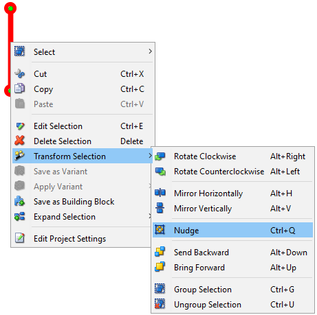
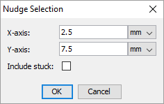
Method 3: using the "Nudge" function from the "Transform" menu (or using the "Ctrl + Q" shortcut). It opens a dialog where you can type in the exact offset on both X and Y axis and specify whether to include stuck components or not.
A component may have one or more control points. Control points determine component's position on the layout and in some cases allows the component to get connected with other components. For some components, such as resistors, wires, etc, individual control points can be moved around when the component is selected.
Note that:
- status bar lists all the components that will be affected by the drag&drop operation.
- you can drag control points only when they turn green.
Newly added components are assigned with default parameters (size, color, value, name, etc), but it is possible to edit them in a few different ways. The simples way to edit properties of a single component is to double click on the component. Another way to do it is to select "Edit Selection" from the context menu aciton or press "Ctrl + E" on the keyboard. The second approach also allows editing multiple components at the same. When editing multiple components at the same time, only properties common for all the selected properties will be shown. If we, for example, want to edit a resistor and a capacitor at the same time, we will not be able to edit capacitance or resistance because they apply on to one of the selected components. Input boxes that represent properties that have mixed values are highlighted in yellow to designate that we cannot see all values from the selection. Changing a value in the yellowed box will appply it to all the selected components.
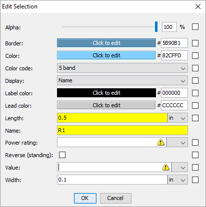
Checking the "Default" checkbox on the right side will make the value for that property a default for the component. In other words, all the components created after that will inherit that value instead of the factory default value.

Input boxes that represent measures (size, resistance, capacitance, etc) can take math expressions in addition to constants. For instance you can type 3/32 and it will be automatically converted to decimal. Even more complicated expressions with parenthesis and 4 basic numerical operators are possible.
To speed up the workflow, it is possible to assign keyboard shortcuts to up to 12 most commonly used components and create them quickly without having to move the mouse away from the canvas. Only "F" keys can be assigned as keyboard shortcuts at the moment. To assign one of the "F" keys to a component, use "Assign Shortcut" menu from the drop down menu in the component toolbox.
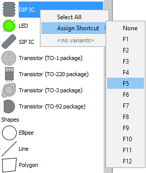
Components that have keyboard shortcuts assigned show a visual indicator on the right side of the component name to designate the corresponding key.
To remove a keyboard shortcut, just select "None" from the "Assign Shortcut" menu.
Each component is created using default values for size, color, etc. Users can make their own variants of components with different properties. After the component is edited to the desired state, it can be saved as a variant using the context menu action.
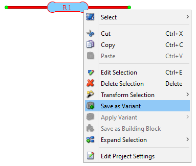
After saving, the existing component variants can be employed in few different ways. One way would be to apply the variant to the existing component by using the context menu.
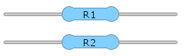
Applying a variant will copy all the properties associated with the variant to the selected component and transform it to conform the variant.
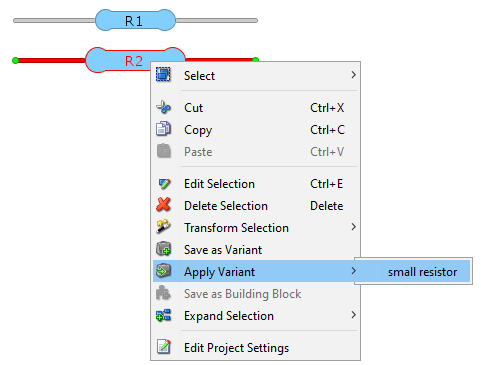
Another way to use variants is to add a component to the project using a saved variant as a blueprint. This can be done by right clicking on a component icon in the component tree and selecting a desired variant from the context menu.
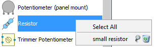
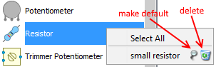
Furthermore, a variant can be set as default and all components created after that will inherit their properties from the default variant. That can be done by using the pin button in the aforementioned context menu. Next to the pin button is the delete button we can use to delete a variant.
Component grouping works similarly to the way object grouping works in most vector-based drawing tool. The idea is to keep two or more components together and move/edit/delete them at the same time. To group components, select them and press Ctrl+G (or select "Group Selection" from the menu). Double click on one of the grouped components will open the editor with all the mutual properties of selected components and allow editing them at the same time. Note that while the components are grouped, you cannot edit drag their individual control points. To un-group the components, select them and press Ctrl+U (or select "Ungroup Selection" from the menu).
Note that:
- nested groups are not currently supported. If you group two groups of components together you'll end up with one large group instead of a group that contains two groups.
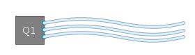
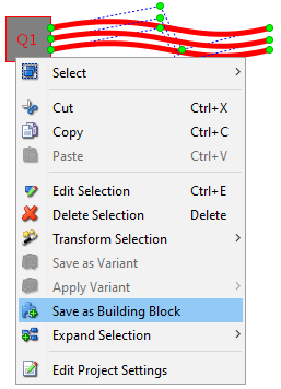
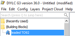
Often times we use a cluster of components arranged and configured in a certain way repetitively. To speed up the process, DIYLC allows for a group of components to be saved as a building block and recalled simply by one click. This saves time needed to add each individual component and configure it to look the way we want. Suppose we want to make a leaded TO92 component. DIYLC provides enough pieces to build one. We can add a folded TO92 body together with three separate wires.
To save this as a building block that we can use later, we need to select all four components and select "Save as Building Block" action from the context menu
The newly created building block appears immediately under "(Building Blocks)" folder in the component tree and can be used just like any other component.
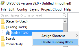
To delete an existing building block, use the context menu action.
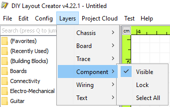
Component position is specified not only in X and Y axis, but also in Z axis, allowing us to control which components will be displayed on top of other components. Unlike Corel or Photoshop, Z-order of components in DIYLC is not completely free-form. Based on their nature, components are categorized into 6 "layers": Chassis, Board, Trace, Component, Wiring, Text. All components in the "Board" layer will be assigned with lower Z-order than components in the "Trace" level, all components in the "Component" level will be put on top of components from "Trace" level, etc. 'Send to Back' and 'Bring to Front' operations typically operate within the given layer, but it is possible to force the component to move across other layers. DIYLC will prompt you to confirm this operation when selected component reaches the bounds of its layer.
DIYLC offers few functionalities for working with layers:
- Temporarily hide the whole layer, helping to work at other layers if the drawing is getting crowded.
- Lock/unlock the whole layer, keep all the components visible, but unable to select
- Select all components beloging to a layer
Status bar contains the following sections (going left to right):
- Information bar shows context related information and guidance through the app.
- Selection size shows the dimensions of the minimal bounding rectangle that contains all the selected components. It takes default size units (in or cm) into account.
- Zoom control allows you to zoom in or out.
- Announcements shows public announcements if there are any posted.
- Auto-update notification. When the bulb is on, there are updates available. Click on it for more information.
- Memory bar is the blue-ish icon on the right side that shows the amount of memory occupied by the application. Move the mouse over it to see more details or click on it to try to cleanup as much memory as possible. Color will turn red when memory consumption is running high.
Since version 3.42.0, DIYLC includes a feature that can follow traces, leads and all other conductive components with (theoretical) zero-resistance and highlight the area that is connected to the desired point on the layout. This can be useful when debugging circuits, especially with stripboard/vero layouts, PCBs, breadboard, but also point-to-point circuits. To activate this mode, use 'Config' -> 'Highlight Connected Areas' option from the main menu. Click on any component or part of a component that needs to be traced. A transparent green highlight will cover any connected areas.
Please note that once in this mode, components on the layout cannot be moved or edited, we can only debug the circuit. To continue with editing, 'Highlight Connected Areas' option from the 'Config' menu must be turned back OFF.
DIYLC can also be used to draw and analyze guitar wiring diagrams. Drawing the wiring digrams is the same as drawing anything else in DIYLC, so we won't be going into too much detail. It's worth mentioning that guitar-specific components can be found in "Guitar" component package, while some of the general-purpose components, such as jacks and toggle switches can be found under "Electro-Mechanical".
We will focus on analyzing guitar wiring diagrams, as it is a relatively new and very powerful feature that can help us understand how guitars work and also help us design guitar wirings that do what we want and debug them when they do not.
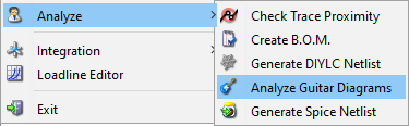
Guitar Wiring Analyzer tool can be found under File > Analyze menu and can be used only when the diagram is fully drawn. The diagram should contain at least one guitar pickup with its terminals wired to optional switches and potentiometers and ultimately leading to an output jack which is mandatory. Guitar Wiring Analyzer can do the following:
- identifies all the switches in the diagram and analyzes how the circuit behaves in each of the combination of switch positions. For example, if we have a 3-way Les Paul switch and one push-pull potentiometer, the diagram will show six different switch combinations and would analyze all of them in detail
- in each switch position, it checks which of the pickup coils are activated,
- checks whether they are in split-coil mode or full humbucking (in case of humbucking pickups),
- checks if the coils are wired in series or parallel mode,
- checks the phase of each coil and in case there is more than one active coil, checks if the coils are in-phase or out-of-phase,
- checks if the current pickup combination is noise-cancelling or not,
- checks if any of the potentiometers are wired as volume or tone controls
- checks if there is a treble bleed network installed on a volume control
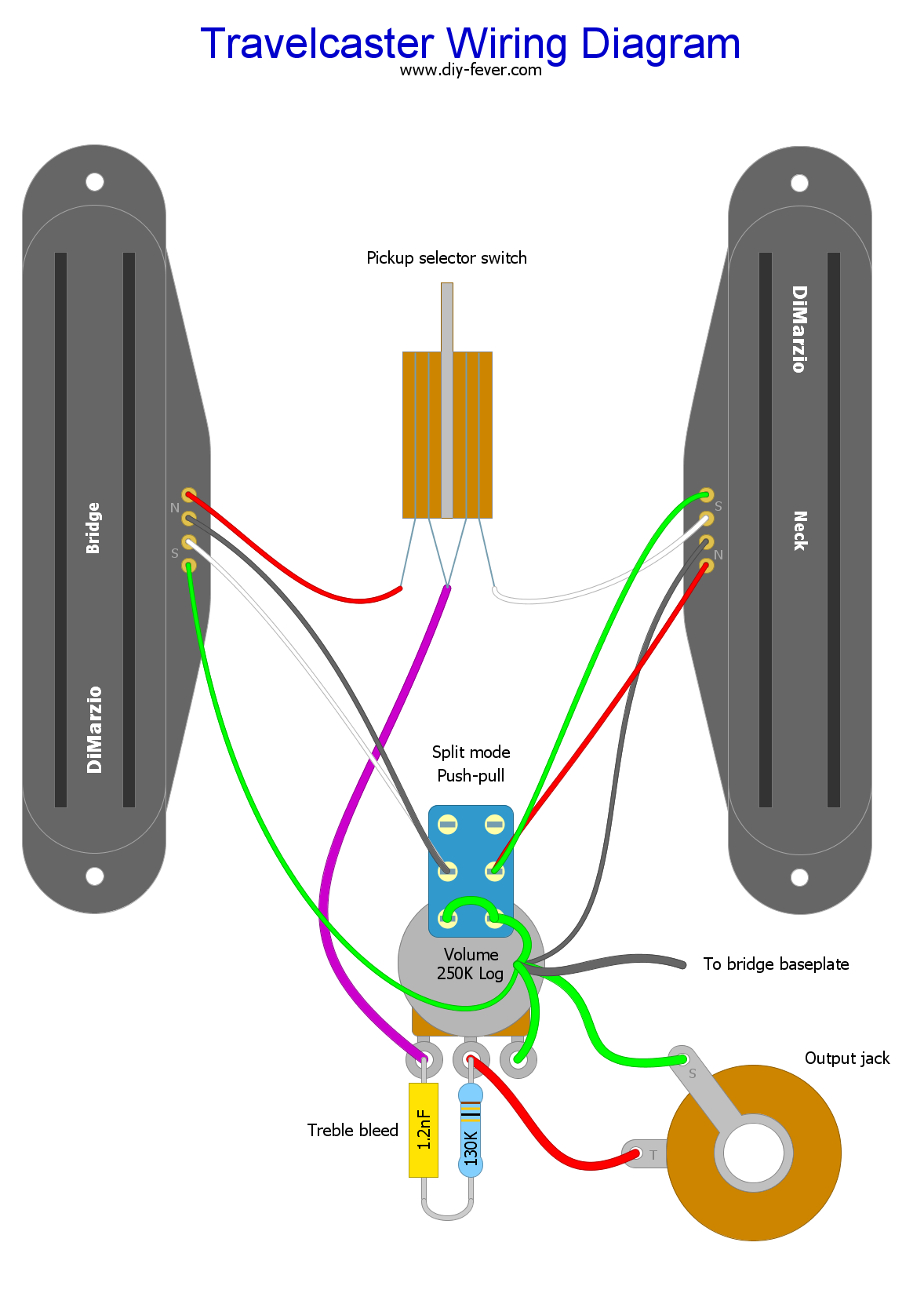
Below is an example of a functioning guitar diagram, consisting two rail humbucker pickups, a 3-way switch, one push-pull volume control that splits the humbuckers when engaged with treble bleed circuit.
Right click here and click "Save link as..." to download the sample DIY file.
We can run the analyzer by running the Analyze Guitar Diagrams tool from the File > Analyze menu
The output will have six sections - one for each switch configuration. Below is how analysis of one of the positions looks like. This is the middle position of the 3-way switch and coil-splitting push/pull is not engaged.
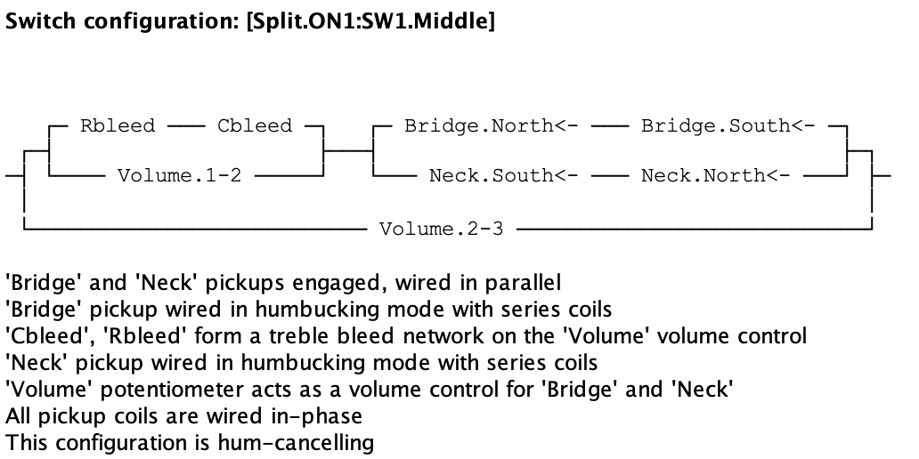
Parallel/Series connectivity tree is basically how our circuit looks like in this switch configuration, from the perspective of the output jack. It uses parethesys to achive hierarchy, + sign for series connection and || sign for parallel connection. Pickup coils are shown in the PickupName.South or PickupName.North format with an arrow next to the name, designating the polarity.
Below the connectivity tree, DIYLC will list the notes that it was able to deduce by analyzing the connectivity tree. That's where all the magic happens.
For the full output follow this link