Menu & Protection screens UI improvements #253
Comments
|
Hi, here is one more thing
|
|
Hi, in "stake" window please make the button which is not available (where is coming soon) grey D0D7DF (like all the rest inactive buttons). Thanks
|
|
|
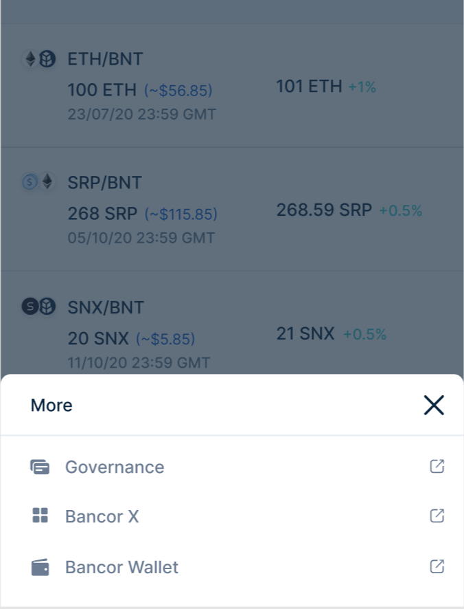
Mobile menu
|
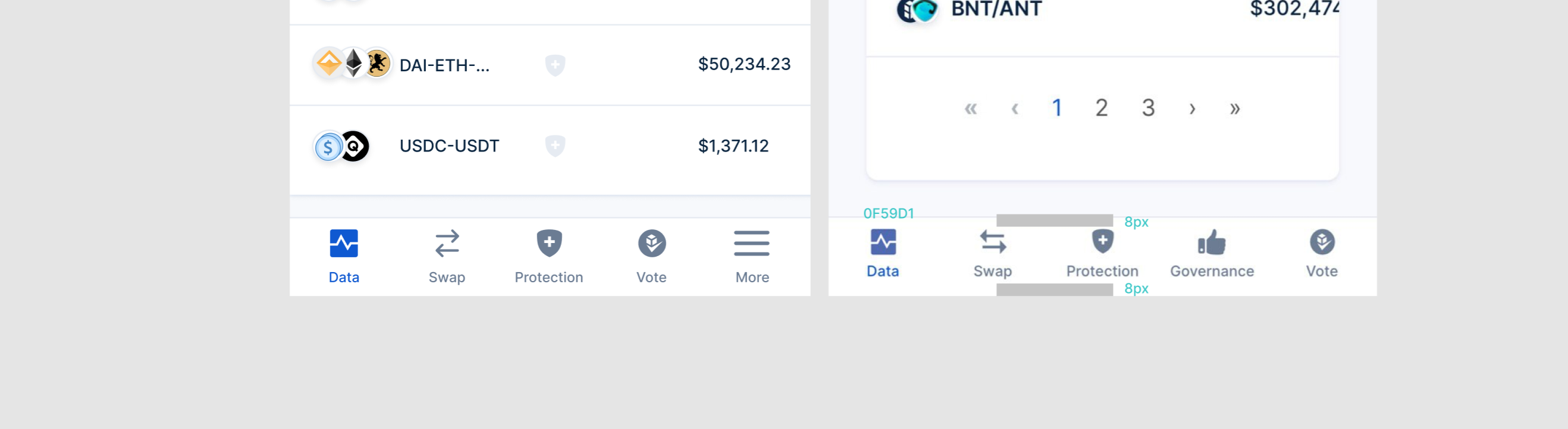
|
@ashachaf
It will look like this Should we close this? |
Hi @Velua ,
Here are a few small UI fixes that aren't critical, but should be added at some point.
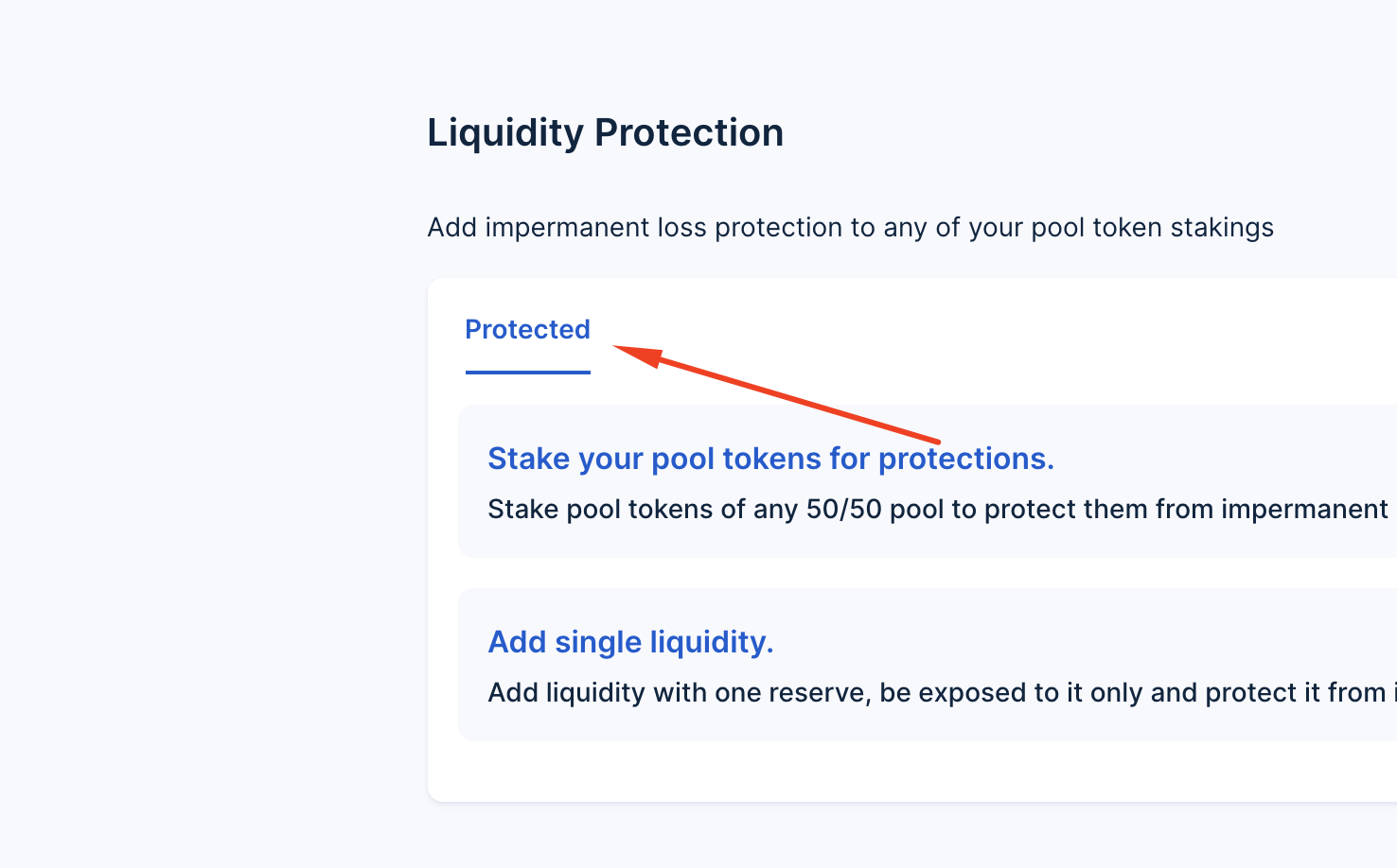
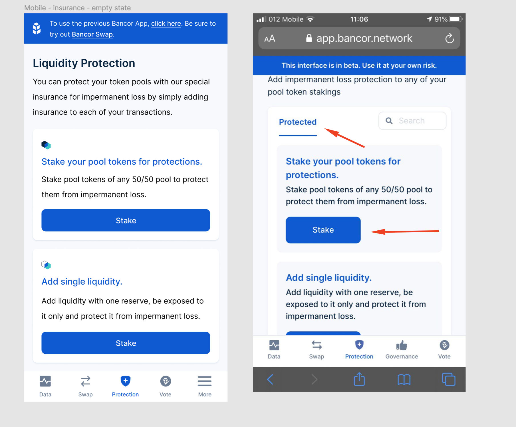
Tabs Menu (screenshot attached):
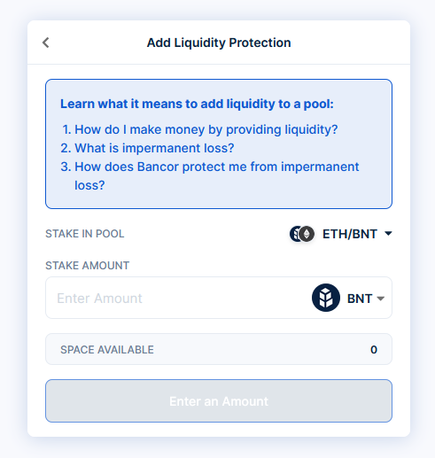
Protection main screen: (screenshot attached):
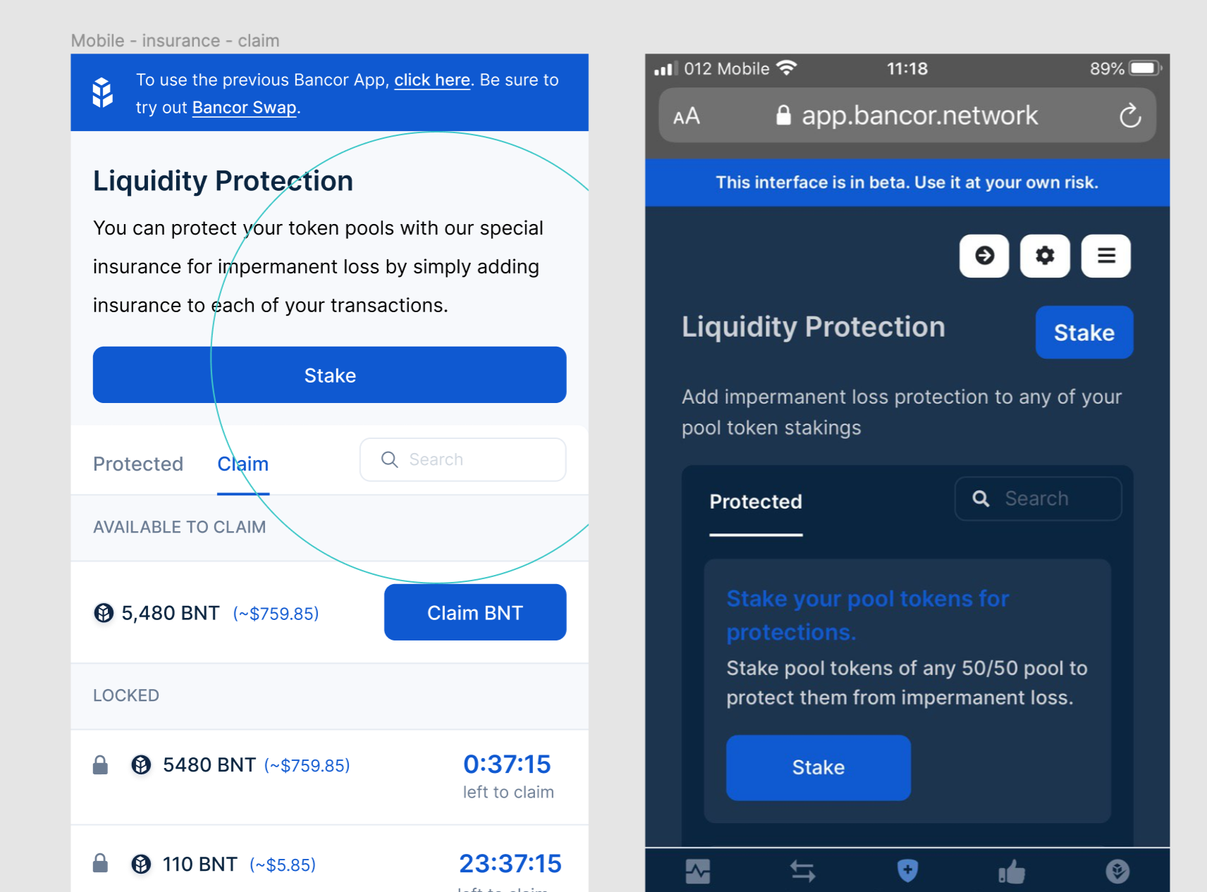
Claim (screenshot attached):
Stake:
Thank you!
The text was updated successfully, but these errors were encountered: