


EasyTipView is a fully customisable tooltip view written in Swift that can be used as a call to action or informative tip.
| |
| |
|----------|-------------|------|
|
|----------|-------------|------|
- Features
- Installation
- Supported OS & SDK versions
- Usage
- Customising the appearance
- Customising the presentation and dismissal animations
- Public interface
- License
- Contact
## Features
- Can be shown pointing to any
UIBarItemorUIViewsubclass. - support for any arrow direction
←, →, ↑, ↓ - Automatic orientation change adjustments.
- Fully customisable appearance.
- Fully customisable presentation and dismissal animations.
CocoaPods is a dependency manager for Cocoa projects.
CocoaPods 0.36 adds supports for Swift and embedded frameworks. You can install it with the following command:
$ gem install cocoapodsTo integrate EasyTipView into your Xcode project using CocoaPods, specify it in your Podfile:
pod 'EasyTipView', '~> 1.0.2'Then, run the following command:
$ pod installIn case Xcode complains ("Cannot load underlying module for EasyTipView") go to Product and choose Clean (or simply press ⇧⌘K).
Carthage is a decentralized dependency manager that builds your dependencies and provides you with binary frameworks.
You can install Carthage with Homebrew using the following command:
$ brew update
$ brew install carthage
To integrate Alamofire into your Xcode project using Carthage, specify it in your Cartfile:
github "teodorpatras/EasyTipView"
Run carthage update to build the framework and drag the built EasyTipView.framework into your Xcode project.
If you prefer not to use either of the aforementioned dependency managers, you can integrate EasyTipView into your project manually.
- Supported build target - iOS 8+ (Xcode 8)
- First you should customize the preferences:
var preferences = EasyTipView.Preferences()
preferences.drawing.font = UIFont(name: "Futura-Medium", size: 13)!
preferences.drawing.foregroundColor = UIColor.whiteColor()
preferences.drawing.backgroundColor = UIColor(hue:0.46, saturation:0.99, brightness:0.6, alpha:1)
preferences.drawing.arrowPosition = EasyTipView.ArrowPosition.Top

/*
 * Optionally you can make these preferences global for all future EasyTipViews
 */
EasyTipView.globalPreferences = preferences- Secondly call the
show(animated: forView: withinSuperview: text: preferences: delegate:)method:
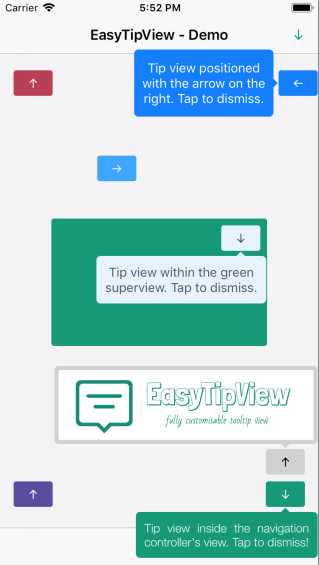
EasyTipView.show(forView: self.buttonB,
withinSuperview: self.navigationController?.view,
text: "Tip view inside the navigation controller's view. Tap to dismiss!",
preferences: preferences,
delegate: self)
Note that if you set the EasyTipView.globalPreferences, you can ommit the preferences parameter in all calls. Additionally, you can also ommit the withinSuperview parameter and the EasyTipView will be shown within the main application window.
Alternatively, if you want to dismiss the EasyTipView programmatically later on, you can use one of the instance methods:
let tipView = EasyTipView(text: "Some text", preferences: preferences)
tipView.show(forView: someView, withinSuperview: someSuperview)

// later on you can dismiss it
tipView.dismiss()In order to customise the EasyTipView appearance and behaviour, you can play with the Preferences structure which encapsulates all the customizable properties of the EasyTipView. These preferences have been split into three structures:
Drawing- encapsulates customisable properties specifying howEastTipViewwill be drawn on screen.Positioning- encapsulates customisable properties specifying whereEasyTipViewwill be drawn within its own bounds.Animating- encapsulates customisable properties specifying howEasyTipViewwill animate on and off screen.
| Drawing attribute | Description |
|----------|-------------|------|
|cornerRadius| The corner radius of the tip view bubble.|
|arrowHeight| The height of the arrow positioned at the top or bottom of the bubble.|
|arrowWidth| The width of the above mentioned arrow.|
|foregroundColor| The text color.|
|backgroundColor| The background color of the bubble.|
|arrowPosition| The position of the arrow. This can be:
+ .top: on top of the bubble
+ .bottom: at the bottom of the bubble.
+ .left: on the left of the bubble
+ .right: on the right of the bubble
+ .any: use this option to let the EasyTipView automatically find the best arrow position.
If the passed in arrow cannot be applied due to layout restrictions, a different arrow position will be automatically assigned.|
|textAlignment| The alignment of the text.|
|borderWidth| Width of the optional border to be applied on the bubble.|
|borderColor| Color of the optional border to be applied on the bubble. In order for the border to be applied, borderColor needs to be different that UIColor.clear and borderWidth > 0|
|font| Font to be applied on the text. |
| Positioning attribute | Description |
|----------|-------------|------|
|bubbleHInset| Horizontal bubble inset witin its container.|
|bubbleVInset| Vertical bubble inset within its container.|
|textHInset| Text horizontal inset within the bubble.|
|textVInset| Text vertical inset within the bubble.|
|maxWidth| Max bubble width.|
| Animating attribute | Description |
|----------|-------------|------|
|dismissTransform| CGAffineTransform specifying how the bubble will be dismissed. |
|showInitialTransform| CGAffineTransform specifying the initial transform to be applied on the bubble before it is animated on screen. |
|showFinalTransform| CGAffineTransform specifying how the bubble will be animated on screen. |
|springDamping| Spring animation damping.|
|springVelocity| Spring animation velocity.|
|showInitialAlpha|Initial alpha to be applied on the tip view before it is animated on screen.|
|dismissFinalAlpha|The alpha to be applied on the tip view when it is animating off screen.|
|showDuration|Show animation duration.|
|dismissDuration|Dismiss animation duration.|
|dismissOnTap|Prevents view from dismissing on tap if it is set to false. (Default value is true.)|
The default animations for showing or dismissing are scale up and down. If you want to change the default behaviour, you need to change the attributes of the animating property within the preferences. An example could be:
preferences.animating.dismissTransform = CGAffineTransform(translationX: 0, y: -15)
preferences.animating.showInitialTransform = CGAffineTransform(translationX: 0, y: -15)
preferences.animating.showInitialAlpha = 0
preferences.animating.showDuration = 1.5
preferences.animating.dismissDuration = 1.5
This produces the following animations:
For more animations, checkout the example project.
Once you configured the animations, a good idea would be to make these preferences global, for all future instances of EasyTipView by assigning it to EasyTipView.globalPreferences.
###Delegate
EasyTipViewDelegate is a custom protocol which defines one method to be called on the delegate after the EasyTipView has been dismissed.
public protocol EasyTipViewDelegate {
    func easyTipViewDidDismiss(_ tipView : EasyTipView)
}
###Public methods
/**
 Presents an EasyTipView pointing to a particular UIBarItem instance within the specified superview

 - parameter animated:    Pass true to animate the presentation.
 - parameter item:        The UIBarButtonItem or UITabBarItem instance which the EasyTipView will be pointing to.
 - parameter superview:   A view which is part of the UIBarButtonItem instances superview hierarchy. Ignore this parameter in order to display the EasyTipView within the main window.
 - parameter text:        The text to be displayed.
 - parameter preferences: The preferences which will configure the EasyTipView.
 - parameter delegate:    The delegate.
*/
public class func show(animated: Bool = true, forItem item: UIBarItem, withinSuperview superview: UIView? = nil, text: String, preferences: Preferences = EasyTipView.globalPreferences, delegate: EasyTipViewDelegate? = nil)

 /**
 Presents an EasyTipView pointing to a particular UIView instance within the specified superview

 - parameter animated:    Pass true to animate the presentation.
 - parameter view:        The UIView instance which the EasyTipView will be pointing to.
 - parameter superview:   A view which is part of the UIView instances superview hierarchy. Ignore this parameter in order to display the EasyTipView within the main window.
 - parameter text:        The text to be displayed.
 - parameter preferences: The preferences which will configure the EasyTipView.
 - parameter delegate:    The delegate.
*/
public class func show(animated: Bool = true, forView view: UIView, withinSuperview superview: UIView? = nil, text:  String, preferences: Preferences = EasyTipView.globalPreferences, delegate: EasyTipViewDelegate? = nil)

/**
 Presents an EasyTipView pointing to a particular UIBarItem instance within the specified superview

 - parameter animated:  Pass true to animate the presentation.
 - parameter item:      The UIBarButtonItem or UITabBarItem instance which the EasyTipView will be pointing to.
 - parameter superview: A view which is part of the UIBarButtonItem instances superview hierarchy. Ignore this parameter in order to display the EasyTipView within the main window.
*/
public func show(animated: Bool = true, forItem item: UIBarItem, withinSuperView superview: UIView? = nil)

/**
 Presents an EasyTipView pointing to a particular UIView instance within the specified superview

 - parameter animated:  Pass true to animate the presentation.
 - parameter view:      The UIView instance which the EasyTipView will be pointing to.
 - parameter superview: A view which is part of the UIView instances superview hierarchy. Ignore this parameter in order to display the EasyTipView within the main window.
*/
public func show(animated: Bool = true, forView view: UIView, withinSuperview superview: UIView? = nil)

/**
 Dismisses the EasyTipView

 - parameter completion: Completion block to be executed after the EasyTipView is dismissed.
*/
public func dismiss(withCompletion completion: (() -> ())? = nil)EasyTipView is developed by Teodor Patraş and is released under the MIT license. See the LICENSE file for details.
Logo was created using Bud Icons Launch graphic by Budi Tanrim from FlatIcon which is licensed under Creative Commons BY 3.0. Made with Logo Maker.
You can follow or drop me a line on my Twitter account. If you find any issues on the project, you can open a ticket. Pull requests are also welcome.