UI improvement for file properties in list view / tile view #1170
Description
Is your feature request related to a problem? Please describe.
When a user browses through the files in a file explorer, they try to identify the file based on two things:
- Name of the file
- Icon/thumbnail of the file
In the current app, all the properties shown are of the same importance (name, size, file type...)
While yes, the information is helpful and is displayed at all times, they are only necessary when the user wants to know it.
Describe the solution you'd like
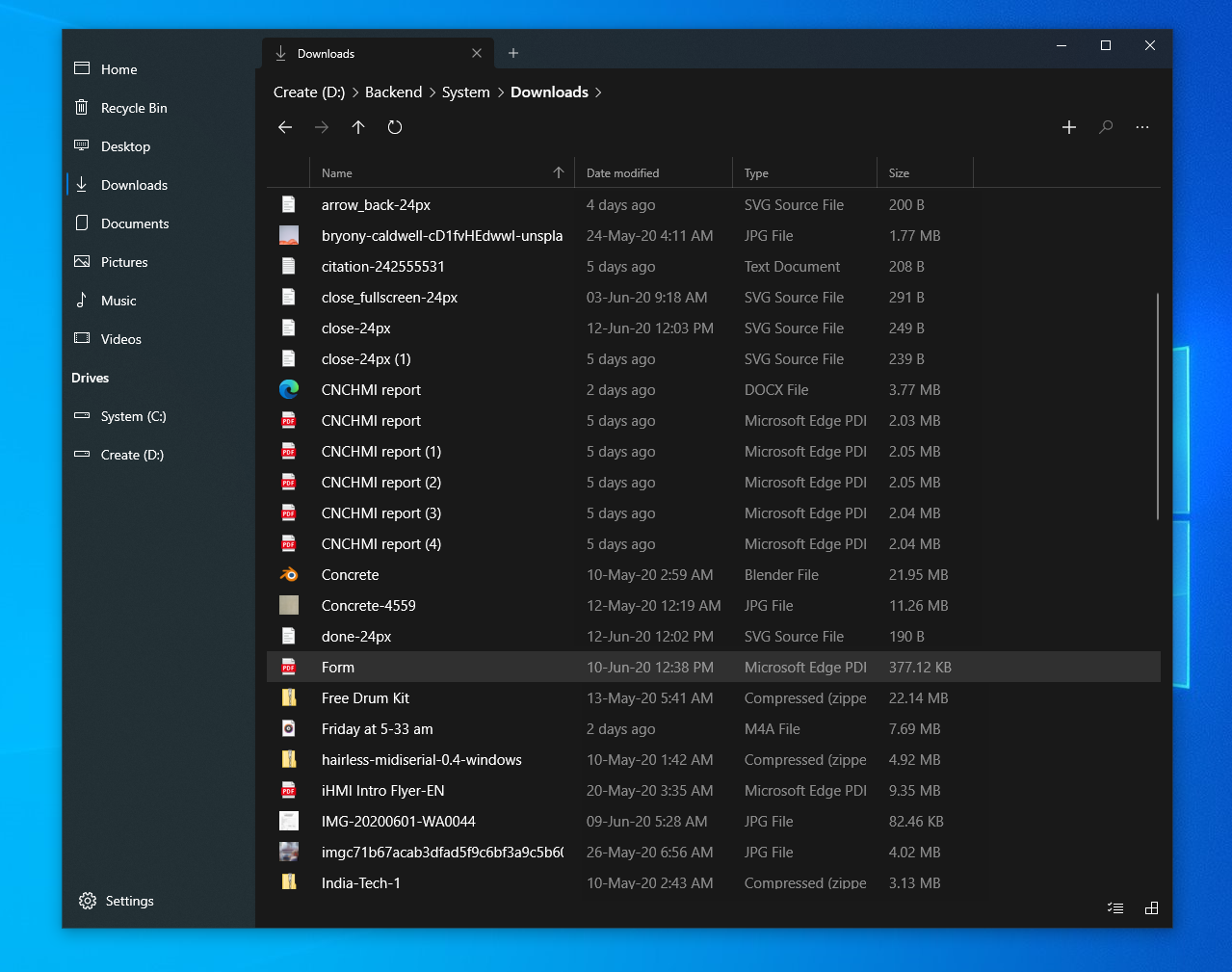
Except for the name, other properties can be of a lesser opacity, so that the name and icon/thumbnail stand out better.
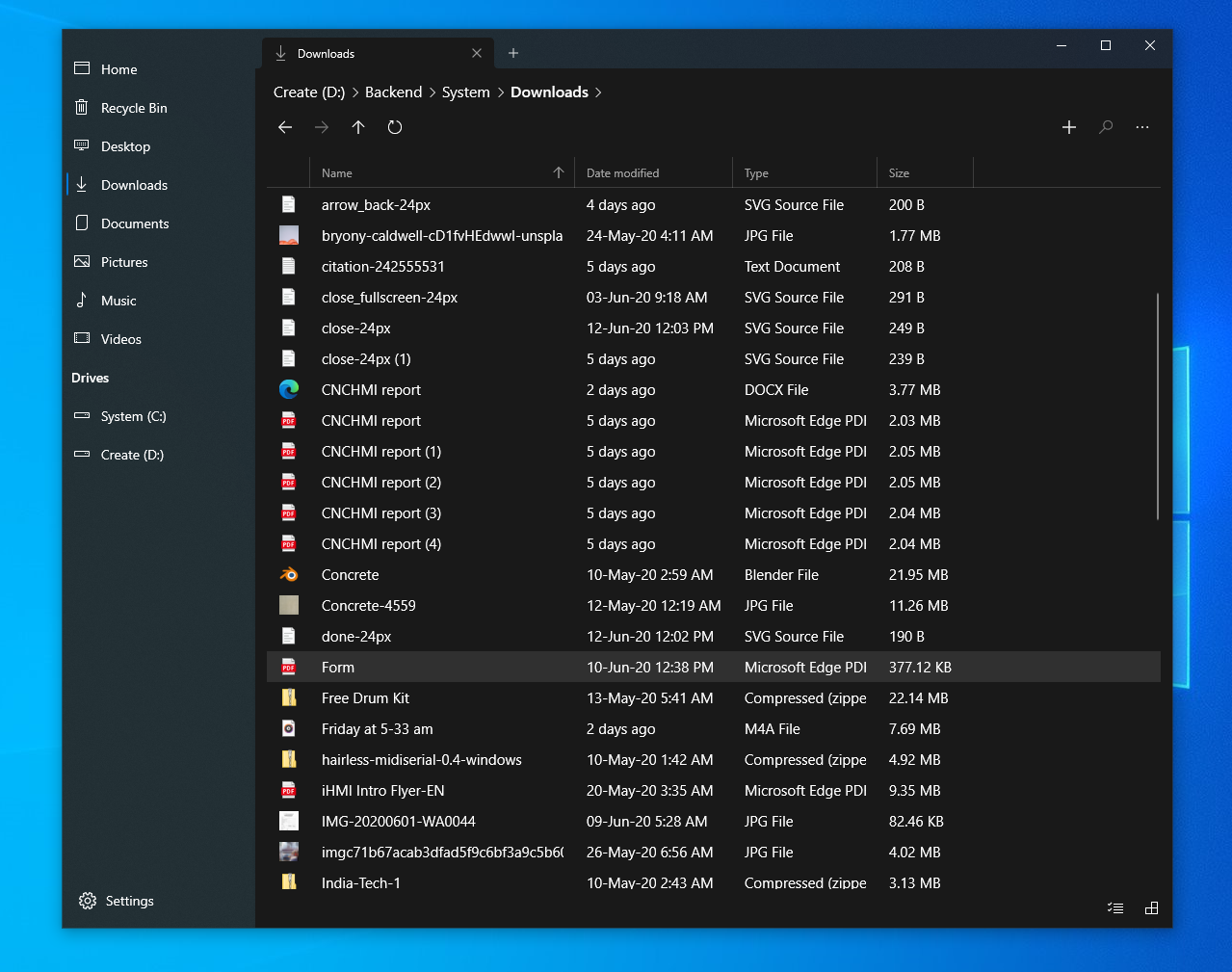
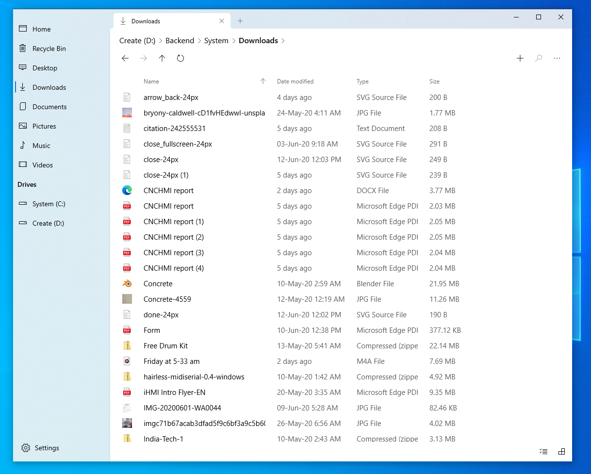
Current implementation
Proposed implementation
While the exact color values are up for further discussion, I immediately notice that there is a huge improvement in the visual quality of the screen.

Current implementation
Proposed implementation
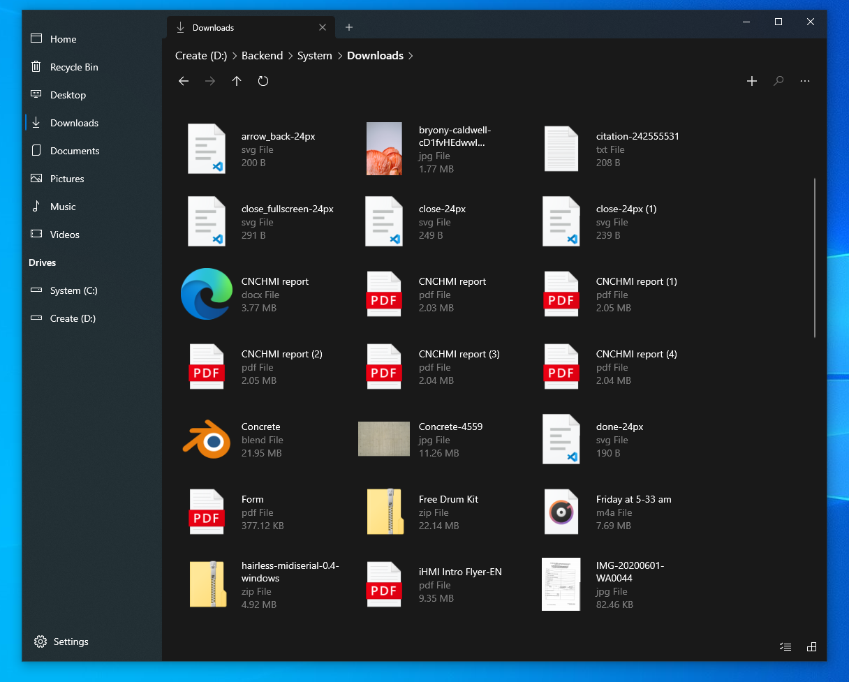
The same applies to the light theme as well, though the difference it makes seems lesser compared to the dark theme.
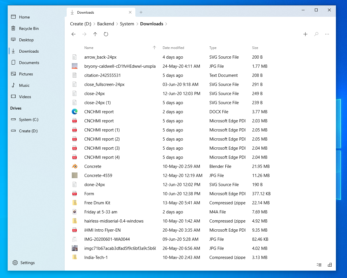
Current implementation
Proposed implementation
Describe alternatives you've considered
This is a generic UI improvement and there are no alternatives I could think of.
Instead of making secondary information less prominent (reducing opacity/grey out), the primary information can be made more prominent (by making the name bolder/bigger) but that doesn't seem visually elegant and results in unnecessarily complicated UI.