Repository navigation
[JENKINS-67846] Icon alignment of build status is wrong (regression in 2.335) #17883
Description

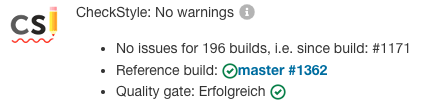
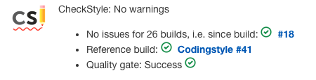
Since 2.335 the vertical alignment of the build status icon is not correctly anymore.
before:

2.335:

Originally reported by  drulli, imported from: Icon alignment of build status is wrong (regression in 2.335)
- assignee: frankie699
- status: Closed
- priority: Minor
- component(s): core
- label(s): regression, ux
- resolution: Fixed
- resolved: 2022-06-02T16:26:28+00:00
- votes: 0
- watchers: 3
- imported: 2025-11-24
Raw content of original issue
Since 2.335 the vertical alignment of the build status icon is not correctly anymore.
before:
2.335:


Activity
jenkins-infra-bot commentedon Feb 18, 2022
Remote links associated with this issue:
jenkins-infra-bot commentedon May 20, 2022
Raw content of original comment:
Seems that this is again broken in 2.348
Now the vertical alignment is broken.
jenkins-infra-bot commentedon May 23, 2022
Raw content of original comment:
Tested locally with core-pr-tester. Looks ok, but the icons is closer to the text than before (but on the same vertical line). So it fixes the problem to me, but could be improve to have some space between the icon and the text.
jenkins-infra-bot commentedon May 24, 2022
Raw content of original comment:
Git bisect pointed me to 6279122 which was introduced by
JENKINS-67515.