MonoTouch.Dialog is a foundation to create dialog boxes and show table-based information without having to write dozens of delegates and controllers for the user interface. Table support Pull-to-Refresh as well as built-in searching.
In addition to being a simple way to create dialogs, it also has been growing to contains a number of utility functions that are useful for iPhone development.
MonoTouch.Dialog is a retained system for implementing UITableViews as opposed to the on-demand nature of UITableView.
Currently this supports creating Dialogs based on navigation controllers that support both basic and advanced cells.
Some basic cells include:
- On/Off controls
- Slider (floats)
- String informational rendering
- Text Entry
- Password Entry
- Jump to HTML page
- Radio elements
- Dates, Times and Dates+Times
- Pull-to-refresh functionality.
- Activity indicators
Advanced cells include:
- Container for arbitrary UIViews
- Mail-like message displays
- Styled cells, with optional image downloading
The entire UI for TweetStation (http://github.com/migueldeicaza/TweetStation) an app published on the AppStore was built entirely using MonoTouch.Dialog.
You can download the app from the AppStore, and read the code to learn about some advanced used cases of MonoTouch.Dialog.
Miguel (miguel@gnome.org)
This screenshot was created with this code
MonoTouch.Dialog core entry point is a UIViewController called the MonoTouch.Dialog.DialogViewController. You initialize instances of this object from an object of type "RootElement".
RootElements can be created either manually with the "Elements" API by creating the various nodes necessary to render the information. You would use this if you need control, if you want to extend the features supported by MonoTouch.Dialogs or if you want to dynamically generate the content for your dialog. This is what is used for example in TweetStation for the main timeline views.
Additionally, there is a trivial Reflection-based constructor that can be used for quickly putting together dialogs, for example, creating an account page is as trivial as:
class AccountInfo {
    [Section]
    public bool AirplaneMode;

    [Section ("Data Entry", "Your credentials")]

    [Entry ("Enter your login name")]
    public string Login;

    [Caption ("Password"), Password ("Enter your password")]
    public string passwd;

    [Section ("Travel options")]
    public SeatPreference preference;
}
void Setup ()
{
    account = new AccountInfo ();

    var bc = new BindingContext (this, account, "Seat Selection");
}
Which produces this UI:

This is what the Elements API usage looks like, it is a more flexible API and the one I suggest you use for anything that requires customizations and goes beyond the basics of the Reflection-based attributes:
    var root = new RootElement ("Settings") {
      new Section (){
        new BooleanElement ("Airplane Mode", false),
        new RootElement ("Notifications", 0, 0) {
          new Section (null,
              "Turn off Notifications to disable Sounds\n" +
              "Alerts and Home Screen Badges for the."){
            new BooleanElement ("Notifications", false)
          }
        }},
      new Section (){
        new RootElement ("Brightness"){
          new Section (){
            new FloatElement (null, null, 0.5f),
            new BooleanElement ("Auto-brightness", false),
	new UILabel ("I am a simple UILabel!"),
          }
        },
      },
      new Section () {
        new EntryElement ("Login", "enter", "miguel"),
        new EntryElement ("Password", "enter", "password", true),
        new DateElement ("Select Date", DateTime.Now),
        new TimeElement ("Select Time", DateTime.Now),
      },
Also see this screenshot was created with this code
To create nested UIs that provide automatic navigation, you would just create an instance of that class.
Autorotation is supported by default by setting the Autorotate property in the DialogViewController. Setting this value will propagate to the various components that are shiped with MonoTouch.Dialog like the WebView and the date and time pickers
Pull to Refresh is a visual effect originally found in Tweetie2 which became a popular effect among many applications.
To add automatic pull-to-refersh support to your dialogs, you only need to do two things: hook up an event handler to be notified when the user pulls the data and notify the DialogViewController when the data has been loaded to go back to its default state.
Hooking up a notification is simple, just connect to the RefreshRequested event on the DialogViewController, like this:
dvc.RefreshRequested += OnUserRequestedRefresh;
Then on your method OnUserRequestedRefresh, you would queue some data loading, request some data from the net, or spin a thread to compute the data. Once the data has been loaded, you must notify the DialogViewController that the new data is in, and to restore the view to its default state, you do this by calling ReloadComplete:
dvc.ReloadComplete ();
To support searching, set the EnableSearch property on your DialogViewController. You can also set the SearchPlaceholder property to use as the watermark text in the search bar.
Searching will change the contents of the view as the user types, it searches the visible fields and shows those to the user. The DialogViewController exposes three methods to programatically initiate, terminate or trigger a new filter operation on the results:
StartSearch, FinishSearch, PerformFilter
The system is extensible, so you can alter this behavior if you want, details are below.
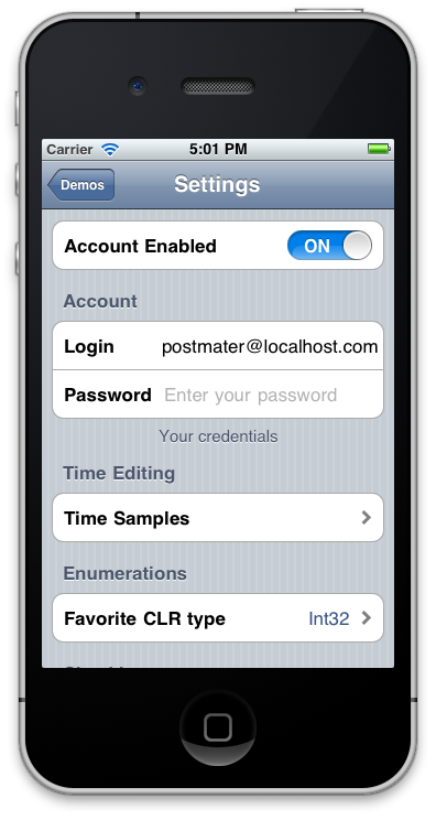
The sample program exercises various features of the API and should be a useful guide on how to implement certain features. One of the demos uses the Elements API to replicate the "Settings" application on the iPhone.
The Reflection-based dialog construction is used by creating an object of class MonoTouch.Dialog.BindingContext, the method takes three parameters:
-
An object that will be used to resolve Tap targets.
-
The object that will be edited.
A very simple dialog that contains a checkbox is shown here:
class Settings {
    public bool AirplaneMode;
}
The above will generate a page that contains a single item with the caption "Airplane Mode" and a on/off switch. The caption is computed based on the field name. In this case "AirplaneMode" becomes "Airplane Mode". MonoTouch.Dialogs supports other conventions so "AirplaneMode", "airplaneMode" and "airplane_mode" all produce the same caption "Airplane Mode".
If you need to control the actual caption (for example to include special characters, use a different spelling or you are reusing an existing class) you just need to attach the [Caption] attribute to your variable, like this:
    [Caption ("Your name is:")]
    string userName;
The dialog contents are rendered in the same order that the fields are declared in the class. You can use the [Section] attribute to group information in sections that make sense. You can use the [Section] attribute in a few ways:
[Section]
Creates a new section, with no headers or footers.
[Section (header)]
Creates a new section, with the specified header and no footer.
[Section (header, footer)]**
Creates a new section with the specified header and footer.
These are the current widgets supported by the Reflection API:
Use the string type. If the type has a value, in addition to showing the caption, it will render its value on the right.
You can add the [OnTap] attribute to your string to invoke a method on demand.
You can add the [Multiline] attribute to your string to make the cell render in multiple lines. And you can use the [Html] attribute on a string, in that case the value of the string should contain the url to load in the embedded UIWebView.
The [Aligntment] attribute takes a parameter a UITextAlingment that determines how the string should be rendered
Examples:
    public string Version = "1.2.3";

    [OnTap ("Login")]
    public string Login;

    [Caption ("(C) FooBar, Inc")]
    string copyright;

    [Caption ("This is a\nmultiline caption")]
    [Multiline]
    string multiline;

    [Caption ("Date")]
    [Alignment (UITextAlignment.Center)]
    string centered;
Use the string type for your field and annotate the string with the [Entry] attribute. If you provide an argument to the [Entry] attribute, it will be used as the greyed-out placeholder value for the UITextField.
Use the [Password] attribute instead of [Entry] to create a secure entry line.
Examples:
    [Entry ("Your username")]
    public string Login;

    [Entry]
    public string StreetName;

    [Password, Caption ("Password")]
    public string passwd;
You can also specify both the Placeholder and the keyboard type to use on the Entry using a few of the Entry attributes:
[Entry (KeyboardType=UIKeyboardType.NumberPad,Placeholder="Your Zip code")]
public string ZipCode;
Use a bool value to store an on/off setting, by default you will get an On/off switch, but you can change this behavior to just show a checkbox instead by using the [Checkbox] attribute:
Examples:
    bool OnOffSwitch;

    [Checkbox]
    bool ReadyToRun;
Using a float in your source will provide a slider on the screen. You can control the ranges of the values by using the [Range (low,high)] attribute. Otherwise the default is to edit a value between 0 and 1.
Examples:
    float brightness;

    [Range (0, 10), Caption ("Grade")]
    float studentGrade;
Use a "DateTime" object in your class to present a date picker.
By default this will provide a date and time editor, if you only want to edit the date, set the [Date] attribute, if you only want to edit the time, set the [Time] attribute:
Examples:
    [Date]
    DateTime birthday;

    [Time]
    DateTime alarm;

    [Caption ("Meeting Time")]
    DateTime meetingTime;
Monotouch.Dialogs will automatically turn an enumeration into a radio selection. Merely specify the enumeration in your file:
Examples:
      enum SeatPreference { Window, Aisle, MiddleSeat }

      [Caption ("Seat Preference")]
      SeatPreference seat;
Variables with type UIImage will render the image as a thumbnail and will invoke the image picker if tapped on.
Examples:
UIImage ProfilePicture;
If you want to ignore a particular field just apply the [Skip] attribute to the field.
Examples: [Skip] Guid UniquId;
To create nested dialogs just use a nested class, the reflection binder will create the necessary navigation bits based on the container model.
The value for a nested dialog must not be null.
Examples:
class MainSettings {
    string Subject;
    string RoomName;
    TimeRange Time;
}

class TimeRange {
    [Time] DateTime Start;
    [Time] DateTime End;
}
To initialize:
new MainSettings () {
    Subject = "Review designs",
    RoomName = "Conference Room II",
    Time = new TimeRange {
        Start = DateTime.Now,
	End   = DateTime.Now
        }
    }
You can use any type that implements IEnumerable, including generics (which implement IEnumerable) as a source of values for creating a one-of-many selector, similar to the radio-like selection that you get from an enumeration.
To use this, you will need an int value that has the [RadioSelection] attribute set to hold the value that will be selected on startup and also to hold the new value when done.
For example:
    class MainSettings {
    [RadioSelection ("Themes")]
    public int CurrentTheme;
    public IList<string> Themes;
}
The value rendered is the value rendered by calling ToString() on the value returned by IEnumerable.
Once you have created your class with the proper attributes, you create a binding context, like this:
    BindingContext context;

    public void Setup ()
    {
        // Create the binder.
        context = new BindingContext (this, data, "Settings");

        // Create our UI
        // Pass our UI (context.Root) and request animation (true)
        var viewController = new DialogViewController (context.Root, true);

        navigation.PushViewController (viewController, true);
    }
This will render the information. To fetch the values back after editing you need to call context.Fetch (). You can do this from your favorite handler, and at that point you can also call context.Dispose() to assist the GC in releasing any large resources it might have held.
All that the Reflection API does is create a set of nodes from the Elements API.
First a sample of how you would create a UI taking advantage of C# 3.0 initializers:
    var root = new RootElement ("Settings") {
      new Section (){
        new BooleanElement ("Airplane Mode", false),
        new RootElement ("Notifications", 0, 0) {
          new Section (null,
              "Turn off Notifications to disable Sounds\n" +
              "Alerts and Home Screen Badges for the."){
            new BooleanElement ("Notifications", false)
          }
        }},
      new Section (){
        new RootElement ("Brightness"){
          new Section (){
            new FloatElement (null, null, 0.5f),
            new BooleanElement ("Auto-brightness", false),
			new UILabel ("I am a simple UILabel!"),
          }
        },
      },
      new Section () {
        new EntryElement ("Login", "enter", "miguel"),
        new EntryElement ("Password", "enter", "password", true),
        new DateElement ("Select Date", DateTime.Now),
        new TimeElement ("Select Time", DateTime.Now),
      },
You will need a RootElement to get things rolling. The nested structure created by Sections() and Elements() are merely calls to either RootElement.Add () or Section.Add() that the C# compiler invokes for us.
The basic principle is that the DialogViewController shows one RootElement, and a RootElement is made up of Sections which in turn can contain any kind of Element (including other RootElements).
RootElements inside a Section when tapped have the effect of activating a nested UI on a new DialogViewController.
The hierarchy of Elements looks like this:
    Element
       BadgeElement
       BoolElement
          BooleanElement       - uses an on/off slider
          BooleanImageElement  - uses images for true/false
       EntryElement
       FloatElement
       HtmlElement
       ImageElement
       MultilineElement
       RootElement (container for Sections)
       Section (only valid container for Elements)
       StringElement
          CheckboxElement
          DateTimeElement
              DateElement
              TimeElement
          ImageStringElement
          RadioElement
          StyleStringElement
      UIViewElement
Additionally notice that when adding elements to a section, you can use either Elements or UIViews directly. The UIViews are just wrapped in a special UIViewElement element.
You can also create your own Elements by subclassing one of the above elements and overriding a handful of methods.
RootElements are responsible for showing a full configuration page.
At least one RootElement is required to start the MonoTouch.Dialogs process.
If a RootElement is initialized with a section/element value then this value is used to locate a child Element that will provide a summary of the configuration which is rendered on the right-side of the display.
RootElements are also used to coordinate radio elements. The RadioElement members can span multiple Sections (for example to implement something similar to the ring tone selector and separate custom ring tones from system ringtones). The summary view will show the radio element that is currently selected. To use this, create the Root element with the Group constructor, like this:
var root = new RootElement ("Meals", new RadioGroup ("myGroup", 0))
The name of the group in RadioGroup is used to show the selected value in the containing page (if any) and the value, which is zero in this case, is the index of the first selected item.
Root elements can also be used inside Sections to trigger loading a new nested configuration page. When used in this mode the caption provided is used while rendered inside a section and is also used as the Title for the subpage. For example:
var root = new RootElement ("Meals") {
    new Section ("Dinner"){
            new RootElement ("Desert", new RadioGroup ("desert", 2) {
                new Section () {
                    new RadioElement ("Ice Cream", "desert"),
                    new RadioElement ("Milkshake", "desert"),
                    new RadioElement ("Chocolate Cake", "desert")
                }
            }
        }
    }
In the above example, when the user taps on "Desert", MonoTouch.Dialog will create a new page and navigate to it with the root being "Desert" and having a radio group with three values.
In this particular sample, the radio group will select "Chocolate Cake" in the "Desert" section because we passed the value "2" to the RadioGroup. This means pick the 3rd item on the list (zero-index).
Sections are added by calling the Add method or using the C# 4 initializer syntax. The Insert methods are provided to insert sections with an animation.
Additionally, you can create RootElement by using LINQ, like this:
    new RootElement ("LINQ root") {
        from x in new string [] { "one", "two", "three" }
           select new Section (x) {
              from y in "Hello:World".Split (':')
                select (Element) new StringElement (y)
           }
    }
If you create the RootElement with a Group instance (instead of a RadioGroup) the summary value of the RootElement when displayed in a Section will be the cummulative count of all the BooleanElements and CheckboxElements that have the same key as the Group.Key value.
Sections are used to group elements in the screen and they are the only valid direct child of the RootElement. Sections can contain any of the standard elements, including new RootElements.
RootElements embedded in a section are used to navigate to a new deeper level.
Sections can have headers and footers either as strings, or as UIViews. Typically you will just use the strings, but to create custom UIs you can use any UIView as the header or the footer. You can either use a string or a view, you would create them like this:
var section = new Section ("Header", "Footer")
To use views, just pass the views to the constructor:
    var header = new UIImageView (Image.FromFile ("sample.png"));
    var section = new Section (image)
MonoTouch.Dialog comes with various standard elements that you can use:
- BooleanElement
- CheckboxElement
- FloatElement
- HtmlElement (to load web pages)
- ImageElement (to pick images)
- StringElement To render static strings To render strings with a read-only value. To be used as "buttons", pass a delegate for this.
- StyledStringElement Similar to StringElement but allows for the Font, TextColor, images and accessories to be set on a per-cell basis.
- MultilineElement Derives from StringElement, used to render multi-line cells.
- RadioElements (to provide a radio-button feature).
- EntryElement (to enter one-line text or passwords)
- DateTimeElement (to edit dates and times).
- DateElement (to edit just dates)
- TimeElement (to edit just times)
- BadgeElement To render images (57x57) or calendar entries next to the text.
Elements that are used to capture user input expose a public "Value" property that holds the current value of the element at any time. It is automatically updated as the user uses the application and does not require any programmer intervention to fetch the state of the control.
This is the behavior for all of the Elements that are part of MonoTouch.Dialog but it is not required for user-created elements.
You can use this element to show static strings as a cell in your table, and it is possible to use them as buttons by providing the constructor with an NSAction delegate. If the cell is tapped, this method is invoked for example:
var l = new StringElement ("Calculate Total", delegate { ComputeTotal (); });
The cost of a StringElement is very low, it uses 8 bytes: 4 for the label alignment information, and 4 for the text to be displayed.
This class derives from StringElement but lets developers customize a handful of properties like the Font, the text color, the background cell color, the line breaking mode, the number of lines to display and whether an accessory should be displayed.
For example:
 var l = new StyleStringElement ("Report Spam") {
	BackgroundUri = new Uri ("file://" + Path.GetFullPath ("cute.png"),
	TextColor = UIColor.White
 };
The StyledStringElement also can be configured at creation time to pick one of the four standard cell types to render information, for example:
 new StyledStringElement ("Default", "Invisible value", UITableViewCellStyle.Default),
 new StyledStringElement ("Value1", "Aligned on each side", UITableViewCellStyle.Value1),
 new StyledStringElement ("Value2", "Like the Addressbook", UITableViewCellStyle.Value2),
 new StyledStringElement ("Subtitle", "Makes it sound more important", UITableViewCellStyle.Subtitle),
 new StyledStringElement ("Subtitle", "Brown subtitle", UITableViewCellStyle.Subtitle) {
 	 DetailColor = UIColor.Brown
 }
See the Styled element sample for more information.
The EntryElement is used to get user input and is initialized with three values: the caption for the entry that will be shown to the user, a placeholder text (this is the greyed-out text that provides a hint to the user) and the value of the text.
The placeholder and value can be null, the caption can not.
At any point, the value of the EntryElement can be retrieved by accessing its Value property.
Additionally the KeyboardType property can be set at creation time to the keyboard type style desired for the data entry. This can be used to configure the keyboard for numeric input, phone input, url input or email address input (The values of UIKeyboardType).
Use this element to quickly add a standard UIView as cell in a UITableView, you can control whether the cell can be selected or whether it is transparent by passing one of the CellFlags to the constructor.
This element shows a UIActivity indicator in the view, use this while your application is loading data and you want to provide the user with some visual feedback that your application is busy.
Use this element to allow users to load more items in your list. You can customize the normal and loading captions, as well as the font and text color. The UIActivity indicator starts animating, and the loading caption is displayed when a user taps the cell, and then the NSAction passed into the constructor is executed. Once your code in the NSAction is finished, the UIActivity indicator stops animating and the normal caption is displayed again.
This element must be subclassed as it is an abstract class. You should override the Height(RectangleF bounds) method in which you should return the height of the element, as well as Draw(RectangleF bounds, CGContext context, UIView view) in which you should do all your customized drawing within the given bounds, using the context and view parameters. This element does the heavy lifting of subclassing a UIView, and placing it in the Cell to be returned, leaving you only needing to implement two simple overrides. You can see a better sample implementation in the Sample app in the DemoOwnerDrawnElement.cs file.
Here's a very simple example of implementing the class: public class SampleOwnerDrawnElement : OwnerDrawnElement { public SampleOwnerDrawnElement (string text) : base(UITableViewCellStyle.Default, "sampleOwnerDrawnElement") { this.Text = text; }
	public string Text
	{
		get;set;
	}

	public override void Draw (RectangleF bounds, CGContext context, UIView view)
	{
		UIColor.White.SetFill();
		context.FillRect(bounds);

		UIColor.Black.SetColor();
		view.DrawString(this.Text, new RectangleF(10, 15, bounds.Width - 20, bounds.Height - 30), UIFont.BoldSystemFontOfSize(14.0f), UILineBreakMode.TailTruncation);
	}

	public override float Height (RectangleF bounds)
	{
		return 44.0f;
	}
}
The BoolElement is the base class for both the UISwitch-based boolean rendered image as well as the BooleanImageElement which is a boolean that can render the stage using a string.
Elements do not provide validation themselves as the models that are well suited for web pages and desktop applications do not map directly to the iPhone interaction model.
If you want to do data validation, you should do this when the user triggers an action with the data entered. For example a "Done" or "Next" buttons on the top toolbar, or some StringElement used as a button to go to the next stage.
This is where you would perform basic input validation, and perhaps more complicated validation like checking for the validity of a user/password combination with a server.
How you notify the user of an error is application specific: you could pop up a UIAlertView or show a hint.
You can create your own element by deriving from either an existing Element or by deriving from the root class Element.
To create your own Element, you will want to override the following methods:
    // To release any heavy resources that you might have
    void Dispose (bool disposing);

    // To retrieve the UITableViewCell for your element
    // you would need to prepare the cell to be reused, in the
    // same way that UITableView expects reusable cells to work
    UITableViewCell GetCell (UITableView tv)

    // To retrieve a "summary" that can be used with
    // a root element to render a summary one level up.
    string Summary ()

    // To detect when the user has tapped on the cell
    void Selected (DialogViewController dvc, UITableView tableView, NSIndexPath path)

    // If you support search, to probe if the cell matches the user input
    bool Matches (string text)
If your element can have a variable size, you need to implement the IElementSizing interface, which contains one method:
	// Returns the height for the cell at indexPath.Section, indexPath.Row
    float GetHeight (UITableView tableView, NSIndexPath indexPath);
If you are planning on implemeneting your GetCell method by calling "base.GetCell(tv)" and customizing the returned cell, you need to also override the CellKey property to return a key that will be unique to your Element, like this:
    static NSString MyKey = new NSString ("MyKey");
    protected override NSString CellKey {
        get {
            return MyKey;
        }
    }
This works for most elements, but not for the StringElement and StyledStringElement as those use their own set of keys for various rendering scenarios. You would have to replicate the code in those classes.
Both the Reflection and the Elements API use the same DialogViewController. Sometimes you will want to customize the look of the view or you might want to use some features of the UITableViewController that go beyond the basic creation of UIs.
The DialogViewController is merely a subclass of the UITableViewController and you can customize it in the same way that you would customize a UITableViewController.
For example, if you wanted to change the list style to be either Grouped or Plain, you could set this value by changing the property when you create the controller, like this:
    var myController = new DialogViewController (root, true){
        Style = UITableViewStyle.Grouped;
    }
For more advanced customizations, like setting the default background for the DialogViewController, you would need to create a subclass of it and override the proper methods.
This example shows how to use an image as the background for the DialogViewController:
class SpiffyDialogViewController : DialogViewController {
    UIImage image;

    public SpiffyDialogViewController (RootElement root, bool pushing, UIImage image)
        : base (root, pushing)
    {
        this.image = image;
    }

    public override LoadView ()
    {
        base.LoadView ();
        var color = UIColor.FromPatternImage(image);
        TableView.BackgroundColor = UIColor.Clear;
        ParentViewController.View.BackgroundColor = color;
    }
}
Another customization point is the following virtual methods in the DialogViewController:
public override Source CreateSizingSource (bool unevenRows)
This method should return a subclass of DialogViewController.Source for cases where your cells are evenly sized, or a subclass of DialogViewController.SizingSource if your cells are uneven.
You can use this override to capture any of the UITableViewSource methods. For example, TweetStation uses this to track when the user has scrolled to the top and update accordingly the number of unread tweets.
Editing cells is one of those cases where you will need to customize the UITableView source. To do this, you need to create a subclass of DialogViewController and override the CreateSizingSource method to return instances of custom versions of DialogViewController.Source or DialogViewController.SizingSource.
In these methods you will need to override three methods:
    bool CanEditRow (UITableView tableView, NSIndexPath indexPath)

    UITableViewCellEditingStyle EditingStyleForRow (UITableView tableView, NSIndexPath indexPath)

    void CommitEditingStyle (UITableView tableView, UITableViewCellEditingStyle editingStyle, NSIndexPath indexPath)
See the DemoEditing.cs sample for an example that shows what these methods should do.
MonoTouch.Dialog now incorporates TweetStation's image loader. This image loader can be used to load images in the background, supports caching and can notify your code when the image has been loaded.
It will also limit the number of outgoing network connections.
The image loader is implemented in the ImageLoader class, all you need to do is call the DefaultRequestImage method, you will need to provide the Uri for the image you want to load, as well as an instance of the IImageUpdated interface which will be invoked when the image has been loaded.
The ImageLoader exposes a "Purge()" method that you can call when you want to release all of the images that are currently cached in memory. The current code has a cache for 50 images. If you want to use a different cache size (for instance, if you are expecting the images to be too large that 50 images would be too much), you can just create instances of ImageLoader and pass the number of images you want to keep in the cache.