Version Selector #4386
Version Selector #4386
Conversation
|
/unassign |
|
/assign @chenopis |
|
@zoidbergwill do you mind deleting your kubernetes docs site? These get indexed on search engines and compete with the kubernetes.io website. Your Pull Request automatically gets a Netlify site if you click "Show all checks". |
|
@ahmetb In my branches I have https://github.com/zoidbergwill/kubernetes.github.io/commit/f3c8c3c8a801a9112ca38d6ddc4aea9ad8689231 and I was using them to test before I created the PR, but they're deleted now. |
|
Ah no worries, then. |
|
@zoidbergwill Thanks for working on this! Can you do me a favor and check the "Allow edits from maintainers" (see image below) so that I can make changes? I want to switch the URL paths to the subdomains I am setting up.
|

|
@chenopis Done, sorry, thought I'd done that. |
|
@zoidbergwill No worries. Thanks! |
|
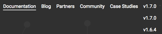
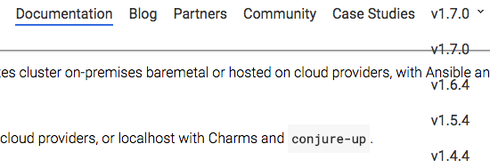
@zoidbergwill It works for me, but I think there needs to be some sort of background for the dropdown so that the version numbers don't get drowned out. This is what it looks like for me: Top of Page
Mid-page Scroll
|
|
Deploy preview ready! Built with commit 9d81192 https://deploy-preview-4386--kubernetes-io-master-staging.netlify.com |
|
@zoidbergwill I'm going to implement this in the other release branches before I release this on |
|
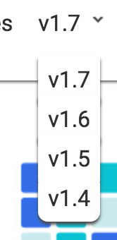
@zoidbergwill, @chenopis, When you scroll down on a page, the background color of the dropdown changes from black to white. Is that the intention? The white background doesn't do a very good job of separating the dropdown from the page content. Seems like keeping the black background would be better. |
|
@chenopis Awesome, I was thinking about doing some active/hover stuff, but it's difficult with how the padding and positioning currently works. |
|
@steveperry-53 It's what the navbar does and is just matching that. Because of how the positioning and padding stuff is currently happening, it's hard to add a box-shadow that would look good. I've played with it a bit here, but I think it'd be difficult to get it to match the navbar properly: I could maybe move it up a bit though and make it look like border/shadow just around the dropdown. I also tried to do hover colour changing over the links in the dropdown but they look a bit gross because of the same padding stuff. |
|
@zoidbergwill, A border would be nice to have, but I'd say the dropdown is also OK as is. Thanks for your work on this. |
|
I'm deploying this now. |
|
closes #3992 |
|
closes #322 |
* Show current version of docs in nav

* Branch in edit link

* WIP version selector

* An actual working but not pretty version dropdown

* update URLs for versions

v1.7: https://kubernetes.io/docs/home/
v1.6: https://v1-6.docs.kubernetes.io/docs/home/
v1.5: https://v1-5.docs.kubernetes.io/docs/home/
v1.4: https://v1-4.docs.kubernetes.io/docs/home/

* fix v1.4 and v1.5 paths

* Tidier drop downs

* Make font visible always

* Make background match main nav always

* change to major.minor version number

* show only major.minor version in drop down list

* switch from githubbranch to docsbranch

* update githubbranch

* update githubbranch values

* Border radius for bottom of dropdown

* Tabs are hard
Fixes #322, fixes #3992
Visible here: https://kubernetes-docs.zoidbergwill.com/docs/home/
To do:
This change is