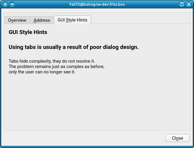
Make Qt tabs looks great again #20
Comments
|
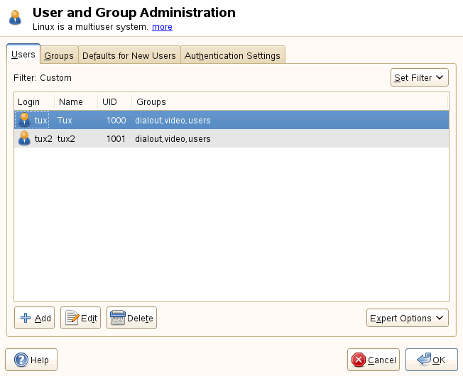
Sad but true. Reviewing that yast2-users screen in SLE11 -> SLE12 -> SLE15... it looks to me like it gets both uglier and less intuitive on each iteration. |
|
Labeled as "tracked" since I created this https://trello.com/c/WaSOYCD3/4683-make-qt-tabs-looks-great-again |
|
The width of those individual tabs is most likely (99%) determined by the QStyle deep inside Qt. That might have changed between SLE-12 and SLE-15. Not sure, but it might still have been Qt4 in SLE-12; right now we use Qt5, and Qt6 is on its way. You can try to use a different QStyle with the |
|
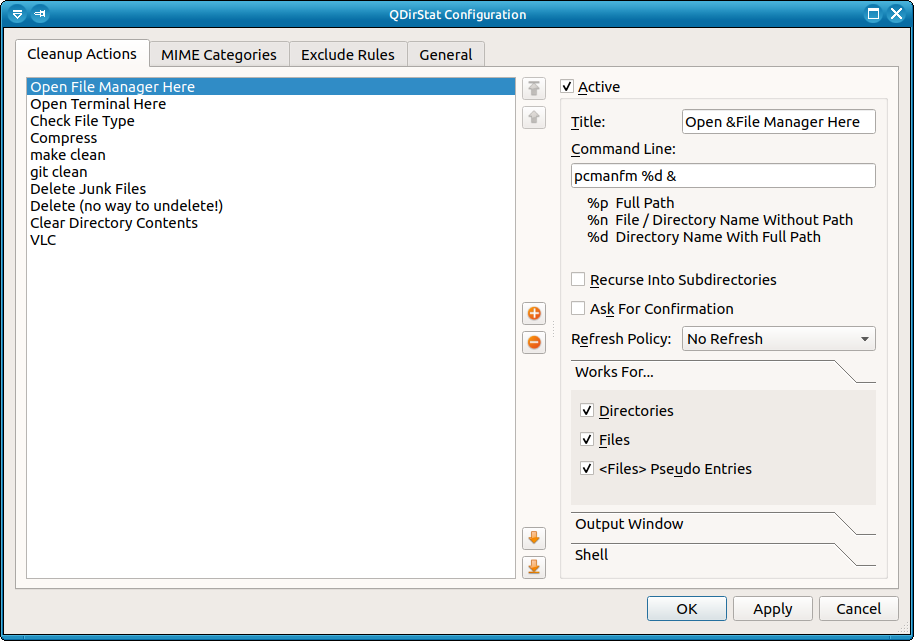
The code in libyui/libyui-qt: https://github.com/libyui/libyui/blob/master/libyui-qt/src/YQDumbTab.cc#L76-L87 Each tab page corresponds to one YItem, for which this I didn't find any special property in the QTabBar that we could use to easily change this "fill the entire width of the tab bar" behaviour. |
|
Testing styles on my Xubuntu 18.04 LTS (Xfce4) desktop with
|

|
Testing in my up-to-date Tumbleweed VM with the
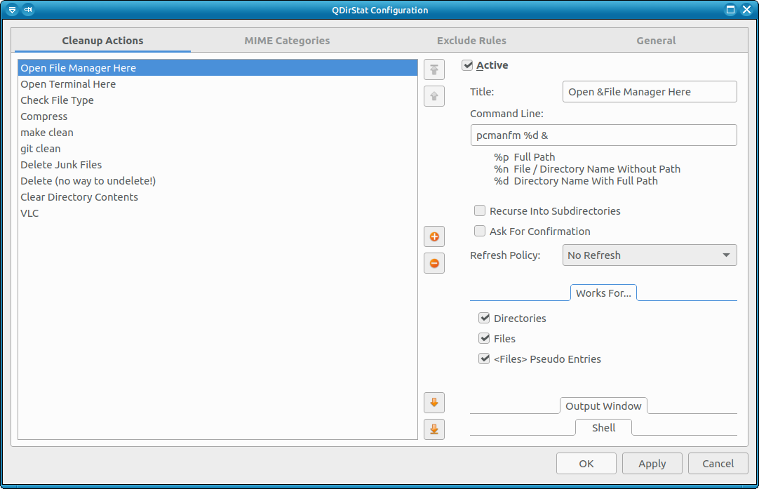
So it always stretches the entire width of the tab bar. On that same VM, QDirStat behaves the same as in the previous comment, i.e. some styles stretch the tabs all over the tab bar, some don't. |


diff --git a/libyui-qt/src/YQDumbTab.cc b/libyui-qt/src/YQDumbTab.cc
index 48e620d9..ee0b6622 100644
--- a/libyui-qt/src/YQDumbTab.cc
+++ b/libyui-qt/src/YQDumbTab.cc
@@ -59,6 +59,7 @@ YQDumbTab::YQDumbTab( YWidget *       parent )
     Q_CHECK_PTR( _tabBar );

     _tabBar->setSizePolicy( QSizePolicy( QSizePolicy::Preferred, QSizePolicy::Preferred ) ); // hor/vert
+    _tabBar->setExpanding( false );
     setFocusProxy( _tabBar );
     setFocusPolicy( Qt::TabFocus );
|

|
So maybe the default for this |
|
Duh; I had looked at the documentation of QTabWidget, but we are using a QTabBar here: https://doc.qt.io/qt-5/qtabbar.html#expanding-prop
|
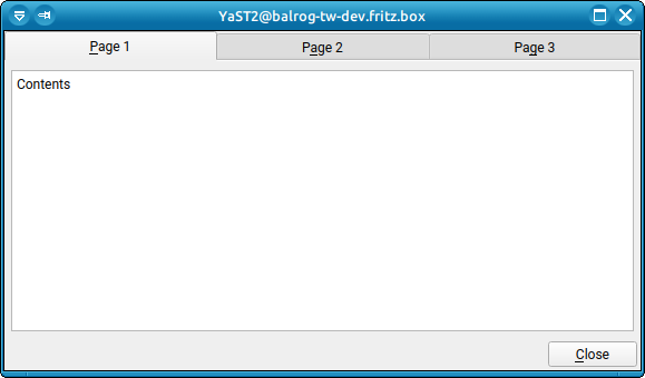
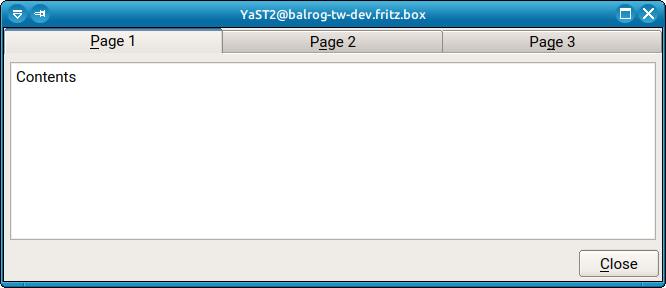
Note: In your QDirStat examples, the tab is visually wrapping its content too. |
I don't quite understand?! |
My fault 😅 I meant that the select tab is delimiting its content better (by using a different background and even a border). See your first screenshots And compare it with the includes ones in the PR's description. |
|
That might be one difference between the QTabWidget and the QTabBar. We could also experiment with those other properties of QTabBar: |
|
I did a little software archaeology and a trip down Memory Lane and found out / remembered why we are using a QTabBar and not a full-fledged QTabWidget: Our widget is called the DumbTab for a reason: It's very dumb. It just acts like a row of buttons on the top of the page, and replacing the content when the user switches to another page has to be done manually on the application level: The DumbTab just sends an event, and the application has to use an internal ReplacePoint to exchange the content. This was the compromise to make tabs possible in the first place in the context of our YaST UI engine: Geometry management is done on the libyui level, so libyui has to manage the widgets, query their preferred size, add up the sizes of the individual widgets in the hierarchy, calculate how much space is left over or missing, and resize the child widgets accordingly. This is the basic premise of being able to bring the GUI (Qt) and text (NCurses) worlds together. When we started YaST2, we had no tabs of any kind; it was contrary to the entire idea of YaST which was to provide a simple user interface, collecting information in a sequence of very simple wizard pages. Of course it didn't take long until somebody wanted tabs, and we had a HUGE discussion about it: On one side those (including myself) advocating simplicity and arguing that a UI that needs tabs is really out of place in the YaST environment, on the other side those who wanted the user to be able to micromanage everything. The micromanagers won that dispute, and we had to come up with tabs somehow. I offered a compromise: To retain our UI-independent layout engine, provide only very dumb tabs that would act very much like buttons, and use a ReplacePoint so the application can exchange the tab page content. Thus, the DumbTab was born. It was an accepted compromise that it would be dumb; and oh boy, it was; and it is! Being dumb was the premise to make tabs possible at all. Being dumb meant we could work around the complications and limitations that a high-level GUI toolkit like Qt would impose on us. But being dumb also meant a certain extent of ugliness; and that's what we see here. |
|
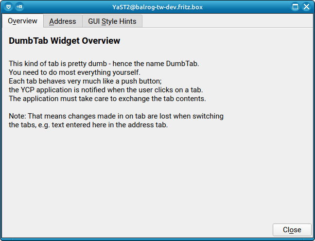
The problem with using a full-fledged QTabWidget is that a QTabWidget uses a QTabBar for the tabs (just like we do) and a QWidgetStack to manage the pages that the tabs correspond to. The QTabWidget manages everything else completely by itself: Geometry management, bringing the right page to the foreground when the corresponding tab is clicked; all those things. And it adds a little eye candy: Some margin around itself with a slightly contrasting color (a darker color in our default light grey color scheme); and some 3D borders to give the impression of cardboard filing register cards. It's quite subtle, but as you observed, it works to give some visual impression. And that is what we don't have. We have only the QTabBar and a plain empty widget below; no subtle 3D effect, no different shading. The inactive tabs have a slightly darker shade of color, but it doesn't give much of a visual cue. It looks ugly. There is no other way of saying that. It's the archetypical case of "if you put lipstick on a pig, it's still a pig". ;-) |
|
So I experimented a bit with putting at least some lipstick on that pig. I used the First I changed only the dialog size to something reasonable, but that's all: DumbTab2.rb
Yikes. That thing sure is ugly. Adding some VSpacing
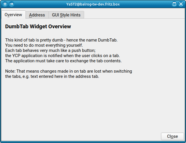
This just adds some little Adding a MarginBox
Now it's obvious that we don't have any 3D effect around the content. This looks very much out of place. Adding a Frame Outside
This is a bit better, but it doesn't feel right: The 3D impression of the cardboard filing card is just not there. The impression falls apart at the top. And of course we just introduced yet another case of the button not properly lining up with other lines; in this case the frame we just added. This is not a pixel-perfect science. Adding a Frame Inside
This also doesn't look right, and it has even more alignment problems. VerdictPutting lipstick on the pig really didn't magically turn it from a pig into a diva (Miss Piggy might disagree). As a simple measure, adding a subtle VSpacing just above the DumbTab appears to be the best approach; it doesn't cost us much, and it gives us some improvement. Mid-term, we could do that in YQDumbTab.cc. |


Emulate a QTabWidget on the libyui-qt Level?It's tempting to think along the lines of "wait, we could do that ourselves": YDumbTab already is a children manager widget, albeit only with one single child which is usually a subtree with a YReplacePoint that is used by the application. It already does some layout management: It has to consider the height of the tab bar and add it to its single child's preferred height. So we could extend that concept a bit and also reserve some more screen space around the content, and the concrete UI's implementation (YQDumbTab) could draw that 3D border around it to give the proper impression of that cardboard filing card. It could also use a different fill color on the outside to give a better 3D impression. To do that, we'd have to go down to the low-level widget drawing routines of QStyle and its derived classes and do low-level Qt painting with QPainter and QStyleHints. This is possible, but not easy, and it involves a ton of subtle problems when Qt takes its style from the current desktop's theme, be it KDE Plasma, GNOME or whatever. So, we could give the pig cosmetic surgery and turn it into a FrankenPig; but even a FrankenPig is still a pig... ;-) Nevermind the screws on the forehead... ;-) |
|
Thanks a lot for the detailed explanations. If I understood them correctly, after the DumbTab was born, YaST always has been using it when to place content in tabs Right? If so, why did they look better in SLE 11? What else changed? Sorry if I overlooked some key detail that already answered those questions. |
|
After the tab width is fixed, it acutally doesn't look that much different between SLE-11 and now. SLE-11 for sure used Qt4, and there were probably some subtle QStyle changes between Qt4 and today's Qt5. If you look closely, they used more contrasting colors for the inactive tabs; but other than that, it's not much different from today. Edit: I just had another look, and in that yellowish theme they use the same color for the active tab as for the tab content (i.e. for normal widgets), whereas that newer theme in your screenshots has a much lighter color for the active tab. But that's just a matter of that theme; if you look at my screenshots further below, that theme also uses the same color for both (which is what I would expect). |
I see a few more differences: a border and a different background for the selected tab content (the same background that the one used for the title)
|

Ah, you updated your comment at the same time I was writing mine :) :) That's what I meant.
So, it'd be nice to know how to fix it at theme level (if possible). |
|
Yes, but that's entirely QStyle-related. Some of them are just plain ugly in certain aspects. They gave up a lot of 3D effects; at SLE-11 times it looked much more like the Windows style (see above). 3D effects fell out of fashion in the designer world; today's mantra is flat and monochrome (yuck). |
|
Thanks @shundhammer, great explanation! I agree, the "Adding a MarginBox" version seems to be a good option for improving the current dialogs. Stretching the tabs and using the same color for the active tab as for the content help a lot. Anyway, delimiting the tab content with a border could be useful too, for example, for visually associating the buttons with the tab content (e.g., Add, Edit and Delete buttons). BTW, I see you have a PR #31 for stretching tabs. Do we need more code changes to accomplish the rest of improvements (add extra margins and use the same colors)? Or is it a matter of adapting styles? Do you know what styles (class names, element id, etc) we have to adapt in order to add visual borders in the content of the tab like SLE-11? Thanks! |
|
@joseivanlopez : Do you really mean "adding a MarginBox", or "adding a VSpacing"? I find the MarginBox version irritating; it's visually more confusing than doing nothing at all since the 3D effect morphs into a flat grey area. |
|
These two look ok to me (at least, better than we have now): |
|
Added to Bugzilla as https://bugzilla.opensuse.org/show_bug.cgi?id=1186705 |
|
PR: #31 |
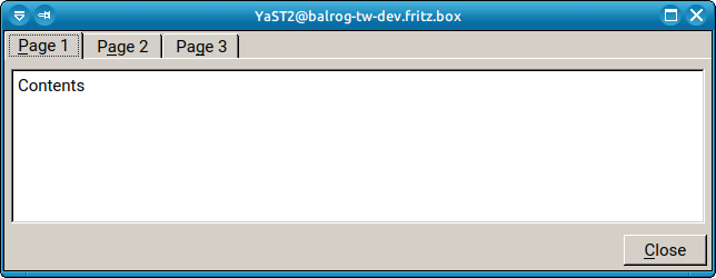
Screenshots with the Fix
|


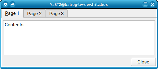
Currently, the libyui Qt tabs feature two styles issues
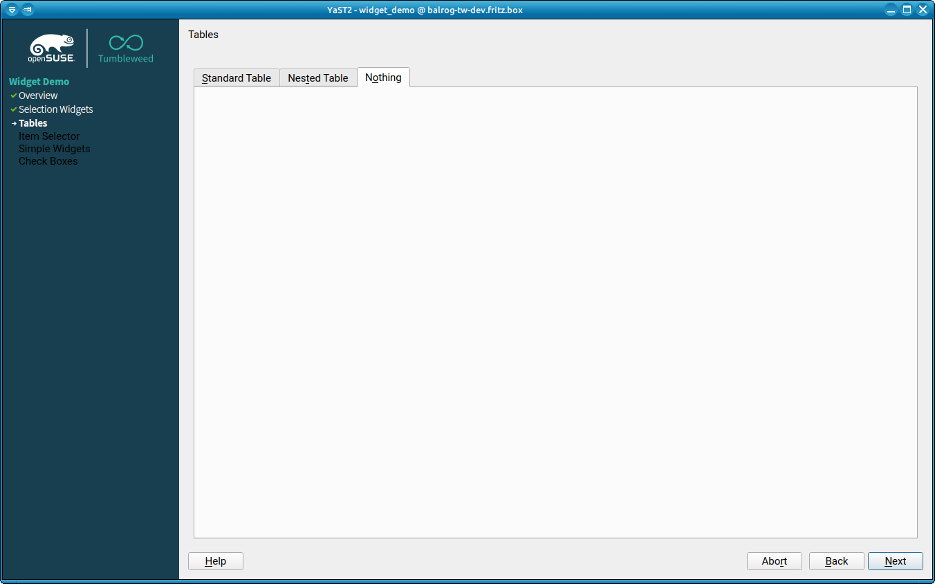
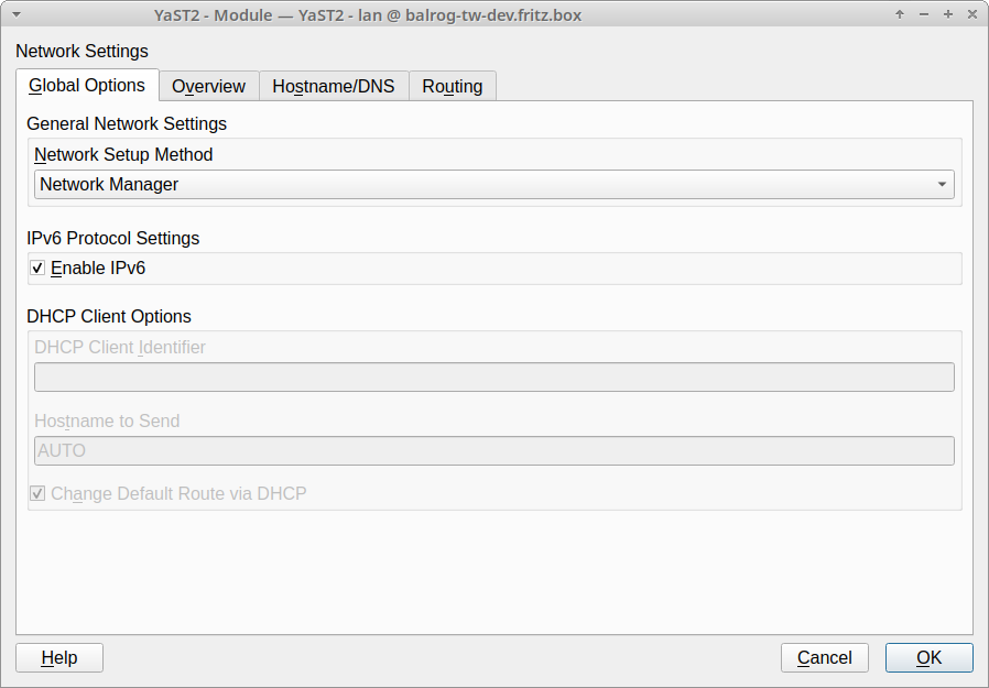
The tab texts fill all content's width evenly distributed among them. This usually results in unnecessary wide tabs, especially when there is just a couple of them.
The content does not take the same background of the selected tab, which produces some lack of context since the background is the same for the whole dialog.
Taking a look to SLE 11 and SLE 12 documentation those issues are more evident. See below yast2-users screenshots, which talk by themselves.
I was trying to fix them via QSS, but it didn't work. I suspect that some changes are needed in the library, but for me it's hard to say where even after looking at https://github.com/libyui/libyui/blob/master/libyui-qt/src/YQDumbTab.cc and https://doc.qt.io/qt-5/qtabwidget.html.
So, IMHO it would be nice to have the same behavior as it had back in SLE 11. It helps to identify better the elements and their relations in the UI.
The text was updated successfully, but these errors were encountered: