Theme Editor Tech Documentation
The theme editor applys a simple style property, embodied by a set of styling rules contained within one or more styling files, to a widget which encapsulates a complex set of objects, represented by a Document Object Model (DOM) or equivalent structure. With HTML and CSS, it is simple to apply a style change, such as a change in background color, to a single node. However, when a visual entity is represented by a widget, it is no longer obvious where to apply the change. The widget may involve many HTML nodes, and applying visual changes to the top node in the structure may not have the desired visual effect or any effect at all. A system comprising metadata defines the relationship between the style information and the underlying DOM representation such the changes may be applied at runtime or applied to regenerate the styling files representing an overall styling theme.
RIA toolkits (Rich Internet Applications) that allow rich user interfaces using browser-based technologies have been around for many years. For HTML-based RIAs, toolkits such as Dojo, jQuery and YUI, typical toolkit construction is based on HTML, JavaScript Cascading Style Sheets and images (png, jpg, etc…). RIA toolkits often provide “widgets” that at application development time are coded as a single element. For HTML-based systems, this single element is usually an HTML element (e.g., an HTML <div> element):
Figure 1 - Example of Widget Declaration.

When the application is executed, the scripting logic provided by the RIA toolkit transforms the widget declaration into the complete runtime document object model (DOM) to implement the widget’s function and structure.
Figure 2 - Runtime Widget HTML

The visual style of the widget is provided by the styling system used by the RIA toolkit. For many HTML-based RIA toolkits, the toolkit will be Cascading Style Sheets (CSS). In common practice, the toolkit provides one or more visual styling themes, which define styling rules across multiple widgets such that the appearance of the widgets are visually consistent. Each theme typically consists of one or more styling files. For HTML-based toolkits, often a theme consists of a combination of CSS files and images referenced by the CSS files. The RIA toolkit places styling directives on the widget markup (e.g., the HTML elements) for the runtime elements within the DOM for the widgets. For HTML-based systems, common practice in RIA toolkits is to make extensive use of CSS class names through the ‘class’ attribute on HTML elements. The class names correspond to selector rules defined in the theme files that are packaged with the RIA toolkit.
Figure 3 - Widget CSS File

The advantage of using an RIAtoolkit is that the developer of the RIA can add the widget to their application with a single line of code that if done in native HTML, JavaScript and CSS would take hundreds of lines of code to accomplish. However, one limitation of using RIA toolkits is the difficulty of modifying the pre-packaged themes. If the developer of the application would like to change the appearance of a widget of the web toolkit that developer would need to locate each runtime DOM element, and the corresponding styling Rule, this is made even more complex with the addition of runtime appearance modification such as “Hovering”, “Disabling”, and “Selection” of widgets to name a few.
Conceptually, applying styles to a widget abstraction should be like applying styles to a simple element. However, as seen in Figure 4, this presents several challenges. First, a property like “font-size” may in fact apply to particular nodes in the generated DOM. Which node does it apply to? Can it simply be applied to the top node? In this case, the rule is not on the top node, but on nodes tagged with classes like “dijitCalendarMonthLabel” and othes. The widget may be comprised of floating elements or other structures where the top node is not the appropriate place to apply changes. Second, consider a user of a tool wishing to modify the background-color element of a widget. How is this even defined? There are in fact several different visual portions of the widget here (which we will call subwidgets) where such a change may be applied.
Figure 4 - RIA Toolkit widget

Integration of a RIA toolkit with the theme editor consists of:
- Adding your toolkit, and themes to daVinci.
- Creating a theme definition file with a “.theme” extension.
- Creating a theme metadata file.
- Create a theme editor presentation file.
one or more theme metadata files that provide a detailed cross-reference between widgets, widget sub-components (“sub-widgets”), and widget interactive states, and the various styling rule selectors found in the styling files (e.g., CSS) within a particular theme. The theme metadata provides sufficient information such as an authoring tool can provide an easy-to-use visual authoring system that allows designer/developers to modify the theme by selecting widgets and modifying the styling values in a way similar to how HTML elements styles are modified.
This file container the needed information to integrate your RIA toolkit theme.
|
myTheme.theme file – Theme definition file example |
|
({
name : " mytheme ", /* name of the theme */ version : "1.8", /* Toolkit version */ specVersion : "1.0", /* Theme editor version */ files : ["mytheme.css"], /* CSS files used by this theme */ meta : ["myTheme.json"], /* file name of the theme metadata file */ themeEditorHtmls: [" dojo -theme-editor.html"] /* file name of the theme editor presentation file */ helper : "maq-metadata-dojo/dojox/mobile/ThemeHelper", /* optional helper class */ type : "dojox.mobile", /* optional theme type, defaults to dojo.desktop */ base : "", /* optional: use in mobile theme editor in order to propagate the properties found on the BODY onto particular widgets in the mobile theme editor.*/ useBodyFontBackgroundClass : "useBodyFontBg", /* optional: use in mobile theme editor in order to propagate the properties found on the BODY onto particular widgets in the mobile theme editor. */
}) |
The theme definition file should be located in the top level folder of the theme that will be coped to the users workspace.
Figure 5 – Example Theme Definition File Location.

The presentation file displays the widgets that are selected and used to visually display the modification made to the theme.
Figure 6 - Example Theme Presentation File

The format of the presentation file is HTML, any valid HTML may be used in the file. To distinguish between elements of the file that are functional and those that are used for styling add the CSS class class=’dvThemeWidget’ Attribute to the HTML.
Figure 7 - Example HTML

The presentation file should be located in the top level folder of the theme that will be coped to the users workspace.
Figure 8 - Location of Theme Presentation File

The theme metadata file contains information that describes the construction of RIA toolkit widgets needed by the theme styling tool for editing theme styling.
Figure 9 – Example of Metadata file for Dojo Web Toolkit.

The designer/developer opens the theme styling tool, and then selects a RIA toolkit widget. The widget that has been selected to be styled is interrogated to determine the web toolkit it belongs to and the names of the widget. For example if the widget selected to be styled is the ComboBox from the Dojo web toolkit the toolkit would be Dijit and the widget name would be ComboBox. The metadata is then accessed to retrieve the “Dijit” toolkit object. Once the toolkit object is obtained from the metadata that object is inspected and the ComboBox object is accessed, this object contains all the metadata needed to style the widget. Now that the widget object is located, the behaviors or “states” object is accessed and supported behaviors can be presented to the designer/developer. Once a “state” or behavior has been selected by the designer/developer the object corresponding to that behavior is retrieved from the “states” object for example if the “Hover” behavior is selected then the “Hover” object is retrieved from the “states” object. Once the state object has been retrieved the value of the “state” objects “query” property is used to locate the HTML DOM element that is to be used to simulate the visual behavior of the widget the user would experience at application runtime. The value of the “state” objects “simulate” property is applied to the HTML DOM element located that was located by the query above to stimulate the widgets visual feedback for the behavior. The “selector” object of the “state” object contains properties that are the style rules that define the visual appearance of the widget for the behavior or “state”.
Figure 10 - Style rule example

The “selector” properties are used to retrieve the current style values, the values for all the “selector” properties are combined and presented to the designer/developer as single element to be styled.
Figure 11 - Dojo ComboBox Example
If we use the Dojo ComboBox “Normal” state as an example, the visual styling of this widget is accomplished by two selectors “.mytheme .dijitComboBox .dijitButtonNode” which controls the visual styling of the box that contains the down arrow and “.mytheme .dijitTextBox” which controls the visual styling of the textbox. In order to change the border color of the widgets the border-color property must be changed in both style selector rules.
When the designer/developer specifies a new value for a style property, each selector property array is checked to determine if the style property is valid for the selector property. If the style property is determined to be valid for the selector property the corresponding selector is updated in the theme.
While it is preferable to combine as many styling selectors as possible creating one “virtual” styling selector this is not always possible. If we continue using Dojo ComboBox as an example, the ComboBox is constructed of multiple HTML Elements and styling rules where identical styling properties contain different values. For example the arrow is accomplished by adding a background image to the box on the right where as we do not want the arrow in the box on the left. The widget object in the metadata can contain an optional “subwidget” object; the object structure of the subwidget is identical to the widget object. By separating the conflicting styling properties into subwidgets the theme tooling has flexibility in how it will support the modification of these styling properties. For example once a widget has been selected the designer/developers could then select a subwidget and the styling process would be the same as the owning widget.
The file format is json, so we user the “.json” file extension for clarity. The file name must match the value specified by the meta property in the theme definition file. The file should be located in the top level folder of the theme that will be coped to the users workspace.
Figure 12 - Location of metadata file

The toolkit object is the name of the toolkit that the object contains metadata for.
Figure 13 Toolkit definition
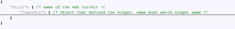
Figure 14 Object definitions

Figure 14a Object rootSelectors definitions

Figure 14b Page designer properties palette

The example in figure 14 defines objects for Dojo’s dijit.form.ComboBox and dijit.layout.AccordionContainer. The “$all” keyword contains definitions for a special type of “virtual” widget. This “virtual all” widget defines state and selector information to be used by the theme styling tool to make global changes to the widgets selectos and states defined in this object based on color relationships. Widget object properties:
- displayName- the text displayed to user if different that the Object name (optional)
- startState – this is the state that the widget is initialized to by the toolkit, in most cases this is the “Normal” state. If omitted then Normal state is implied.
- rootSelectors – (figure 14a) an array of CSS Selectors that is to be used by the properties palette if the selector is in the rootSelectors array then apply this prop to the node element by default in the style cascade of the page designer (figure 14 b). (optional)
The states object of the widget object contains the state definitions for the widget.
Figure 15 - States Object Example

The states object contains object for each state that the widget supports. For example the Dojo ComboBox “supports “Normal” and “Hover” states. The names of the states can be whatever you decide to use. The theme styling tool has a “state” palette the states presented in this palette is a union of all the states from all the widgets and subwidgets defined in the metadata.
The state object of the states object contains information about the specific state of the widget. The state object has the following properties:
- query – Is a CSS selector that is used as a parameter to the Document.querySelector(), Part of the W3C Selectors API. The returned elements DOM element is used in conjunction with the simulate property to emulate visual behavior if the widget for state. If the property is omitted or contains the key word “$auto” a query will be generated in the format ".toolkitNameSpaceWidgetName" in this example ".dijitComboBox". If the "query" specifies "$function=someFunction(widgetType,node)", then the metadata is supplying a callback function which returns an array of nodes in the widget in the theme editor canvas. Example "query": "$function=findWidget('TextBox',node)"
- simulate – Contains CSS class names to be applied to the DOM element returned from the query as describe above. When the classes are applied to the DOM element the widgets appearance is altered to simulate the visual appearance of the widget at runtime. If the property is omitted or contains the key word “$auto” one will be generated in the format "toolkitNameSpaceWidgetNameState toolkitNameSpaceState" in this example"dijitComboBoxHover dijitHover". If the "simulate" specifies "$function=someFunction(nodeArray, widgetType,state)", then the metadata is supplying a callback function which will apply the correct styling to the correct node in the node array to cause the widget in the theme editor canvas to visually simulate the state. Example "simulate": "$function=simulateState(nodes,'ComboBox', 'Hover')"
The selectors object of the state object contains properties that are named to correspond to the CSS selector rule that will be used to modify the widgets style. If the selectors object is omitted from the state object or if the "$auto" is specified, a selector rule will be generated in the format ".themeName .toolkitNameSpaceWidgetName[state]" for example ".myTheme .dijitTextBoxError". "Normal" state is not append to the end. The value of the property contains an Array of CSS properties that are valid for the CSS selector rule specified by the name. If the keyword is "$std_10", where $std_10 represents the list of properties in Standard View within the daVinci Styling Palette (i.e., 'font*', 'color', 'text-align', 'background*', 'border*', 'margin*', 'padding*'…). In most cases you will want to combine as many selectors as possible to reduce the number of elements that the designer/developer will need to style. As a guide try to combine selectors for a widget that support the same state, have common property values, or is the only selector that supports that property. If use Dojo ComboBox as an example for the “Normal” state we would want the the border properties for the text box and arrow box to have the same values so it appeas as one visual element on the canvas, so they should be combined as illustrated in figure 15.
Figure 15a - element Object Example

Figure 15b Page designer properties palette

The element object of the widget object contains a $root array (figure 15a). The $root array contains an array of CSS style property names that are to default to the element of the widget when the widget is selected in the page designer . This can be seen in the properties palette cascade (figure 15b).
The subwidgets object of the widget object contains one or more widget objects. The widget object definition is that same for a subwidget as for a widget with one exception. Widget objects that define metadata for subwidgets can not contain subwidget objects. While it is desirable to combine as many HTML elements and CSS selectors as possible the complexity of some widget require that we define some of the visual elements as subwidgets. A factor in determining if subwidgets are needed is if a widget has a common CSS properly with two or more different values for two or more CSS selector rules for a common state.
Figure 16 - Subwidget Object Example

The example in figure 13 demonstrates the need for a subwidget, both the ".mytheme .dijitTextBox" and the “.mytheme .dijitArrowButtonInner” support the CSS background image property. But in one rule we would like an image of an arrow and in the other a highlighting image. One CSS property two values, for the same state.
Figure 17 - Web Toolkit widget

In most cases the designer/developer of the RIA would need to modify the theme to incorporate the colors of the organization the RIA is to be developed for, for example from the bluish colors above to a particular combination of greenish colors that match a organizations visual branding standards. For clarity I will focus our description on the DOJO web toolkit but the concepts apply to all RIA toolkits. The designer of the RIA currently need to edit all the visual styling files that make up the theme, locating each styling rule that corresponds to each visual element that is part of the web toolkit. If we use the DOJO Calendar widget displayed above as an example of the complexity of modifying the theme color, the designer would need to locate and modify 6 different CSS Selector Rules and change the background-color and border-color properties. But it becomes even more complex, the background-color and border-color properties cannot be set to the same value on every CSS Selector Rule. Look closely at the calendar widget, notice that the color of the main area is a slightly darker blue that the background-color of the previous months dates (27, 28, 29…) and that the current date (9) background-color is slightly darker. Also notice that the border-color is slightly different for the overall calendar container, current date, and the lines under all the date numbers. The designer/developer must painstakingly find each of these color variations in order to reproduce the rich visual experience provided by the pre-package theme. The steps described for the calendar widget would need to be reproduced for most if not all the widgets that make up the web toolkit, in the case of DOJO 1.5 that is in excess of 40 widgets. To add even more complexity to this task, many of the widgets that comprise web toolkits provide visual feedback for user interaction. If the user moves the mouse pointer over a widget the background-color and border-color of the widget change to slightly darker color, if the user clicks on the widget the background-color and border-color are changed again. Each of these user events corresponds to another CSS Selector Rule that must be located and change. Needless to say the process of change a themes color scheme is time consuming and error prone.
DaVinci’s theme styling tool provides a feature that enables the changing of all colors defined by the “$all” widget. The user choices a new “Normal” color using the styling palette. Color calculation are preformed using the new “Normal” color and default colors defined in the metadata to determine the new color to apply.
Figure 18 -"$all" Object Example

The “$all” object of the widget toolkit object contains a states object.
The states object of the “$all” object contains objects that define visual behavior or “state”, the “Normal” for the toolkit. A object with the name “Normal” is required.
The state object of the $all.states object contains a “selectors” object and a “defaults” object. The name of these objects are not included in the states displayed to the user in daVinci’s States View but it is suggested to use names that are descriptive of the visual behavior.
The defaults object contains a cssPropery object.
The cssPropery Object defines the default values for a CSS property, theses values are used for color calculations. For example he the user changes the border-color from a bluish to a greenish color the color calculation uses the value $all.states.Normal.defaults.cssPropery.border-color, and $all.states.Hover.defaults.cssPropery.border-color and the new border-color value to calculate the new color to apply to all CSS selector rules in the “Hover” object that have the border-color property.
The selectors object is similar to the selectors object described above.
The selector object is similar to the selector object described above, but currently only supports border-color and background-color properties.