simplify the UI of Notebook Editor #1493
Description
The new Notebook Editor is an amazing new data science feature in vscode for sure. I'd like to make some suggestions in terms of its user interface, however.
-
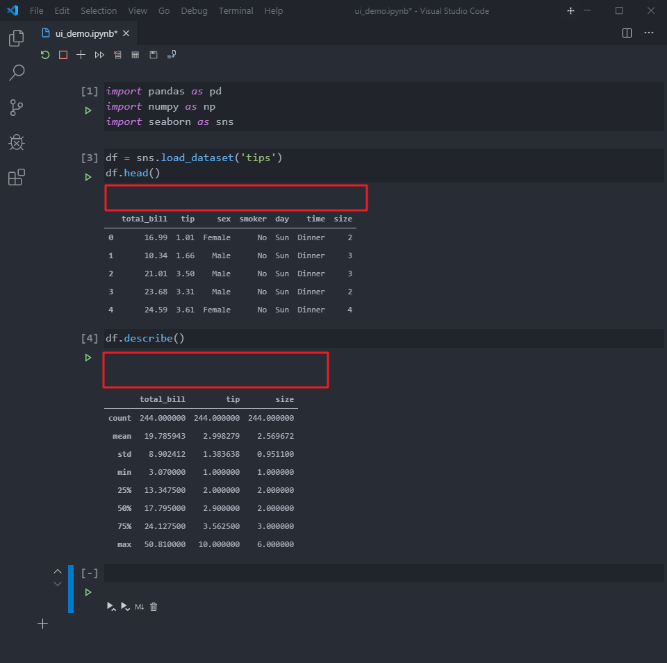
the buttons between the input and output cells is very disturbing
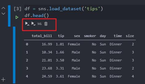
The gap between them also looks a little bit weird. I haven't seen any Jupyter user interface designs that put something between the inputs and outputs. Could you guys please consider moving them to the top?
-
I don't think it is necessary to break the vertical bar into two bars and add an indentation for the output cell. I think the background color of the cell already indicates one is cell and another one is the output area. The color change while editing a cell also seems unnecessary since you literally can see your cursor there. I suggest we align them like Jupyter Lab or add a shadow like Colab.


There are just way too many elements in the Editor.

Please consider making it as simple as Jupyter Lab where all the buttons are on the top and nothing is around your code and output except the runtime order number.
