Here, I'll be making a bar plot with bootstrapped confidence intervals.
The dataset (`/scratch/research/projects/genomewide_recombination/data/correlates/all_correlates_cis.csv`) looks like this:
"","p.value","estimate","conf.low","conf.high","correlate","rho","total_count"
"1",6.92288327379856e-195,0.00570333679801353,0.00540730373583787,0.00599936986018918,"upstream",0.00570690093733234,2050594
"2",2.95601912059888e-269,0.00536611200652104,0.00515213061813458,0.0055800933949075,"both",0.00543925875008304,5497388
"3",7.06562669521312e-246,0.00525739478798351,0.00503076683335003,0.00548402274261699,"downstream",0.00538416535442113,2041026
"4",0,0.00483644031056368,0.00479782597127492,0.00487505464985244,"CDS",0.00483843365189866,38681267
"7",0,0.00420911266977731,0.00417811798807778,0.00424010735147685,"intronic",0.00421139580131447,36575756
"8",3.67251206016631e-147,0.00387451816172604,0.00362785716499298,0.0041211791584591,"intergenic",0.00389249775707112,5908272
"9",0,0.00375568986391992,0.00366866152355848,0.00384271820428136,"utr3",0.00372154025862828,14272615
"10",0,0.00345589018913649,0.00334652323732789,0.00356525714094509,"utr5",0.00349780994644219,4162588
Before we get to plotting, let's identify what features will be used for the different components of the plot.
- `correlate` will be on the x axis
- `rho` will be on the y axis
- `conf.low` and `conf.high` determine the error bar
Let's load in our dataset, as well as some requisite packages:
library(readr)

d <- read_csv('data/correlates/all_correlates_cis.csv')

head(d)
And now we can get to creating a basic plot.
Let's first define the basic properties of the plot as an object called p. We can add further layers to this as we go along.
library(ggplot2)

p <- ggplot(d, aes(x = correlate, y = rho))

p
You'll notice that this returns an empty plot -- this is because even though we've defined our x and y aesthetics, we still have yet to tell R how exactly to plot the data.
Since we want to make a bar plot, let's add geom_bar() to our plot with the + operator:
p + geom_bar(stat = 'identity')Note that this is equivalent to
ggplot(d, aes(x = correlate, y = rho)) +
    geom_bar(stat = 'identity')
The only difference is that we've saved the base ggplot command to p.
Additionally, the stat = 'identity' argument tells R that we want the bar heights to be our rho values for each correlate.
We now have a plot!
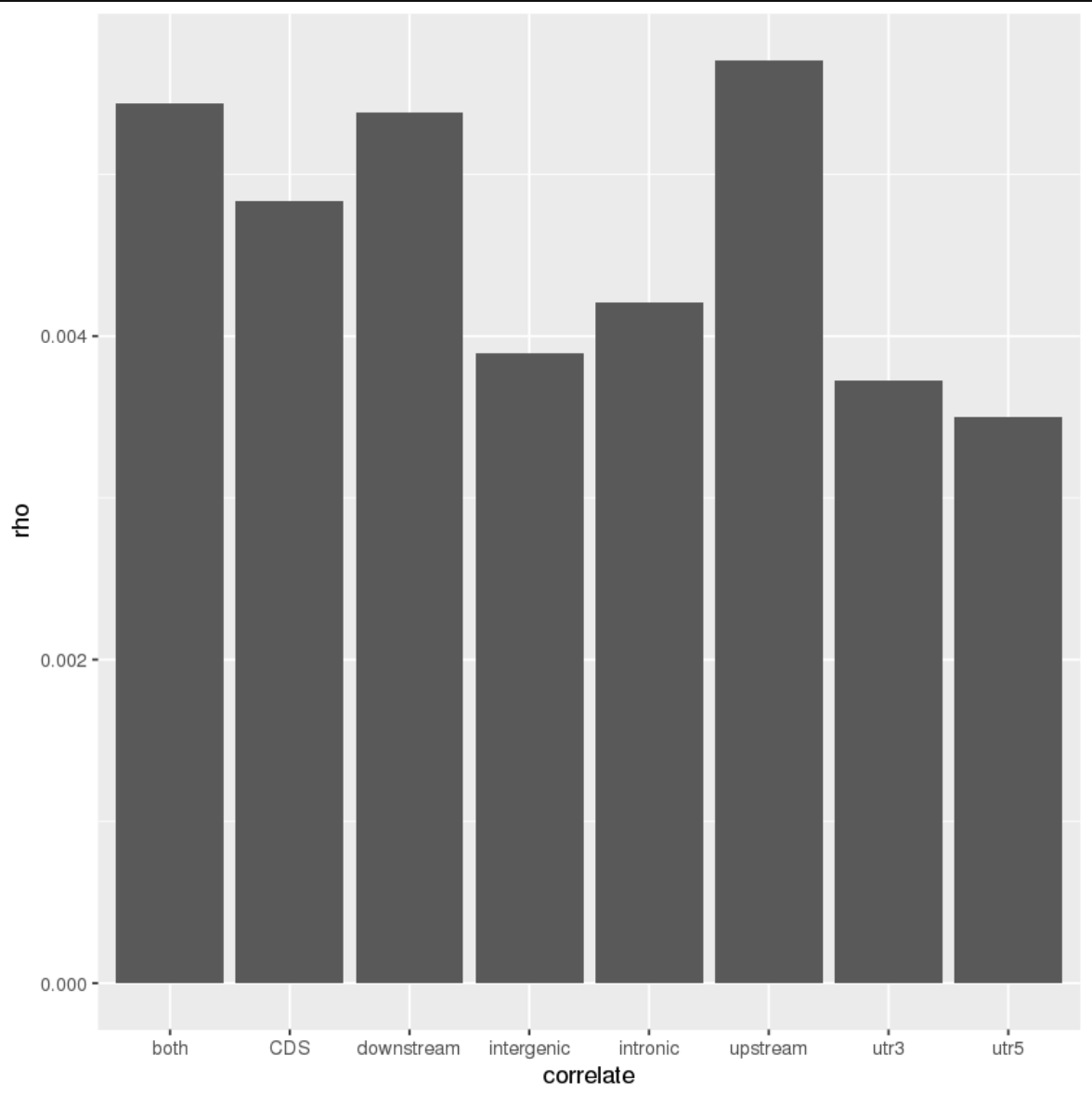
...but it's not the best looking plot in the world. Let's clean it up a bit. This can be done by providing some custom settings to theme() and tacking that onto our chain of ggplot commands.
p +
geom_bar(stat = 'identity') +
theme_bw() + # black and white theme
theme(axis.title = element_text(family = 'Helvetica', size = 16),
      axis.text.x = element_text(family = 'Helvetica', size = 16),
      axis.text.y = element_text(family = 'Helvetica', size = 14))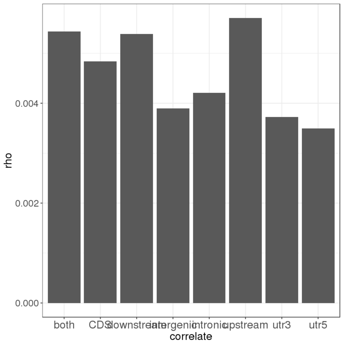
This is a bit better, but our x axis labels are crowding on top of each other! Let's modify that text element to make things a bit more readable. In this instance, we could place the x-axis labels at an angle.
p +
geom_bar(stat = 'identity') +
theme_bw() +
theme(axis.title = element_text(family = 'Helvetica', size = 16),
      axis.text.x = element_text(family = 'Helvetica', size = 16, angle = 45, hjust = 1),
      axis.text.y = element_text(family = 'Helvetica', size = 14))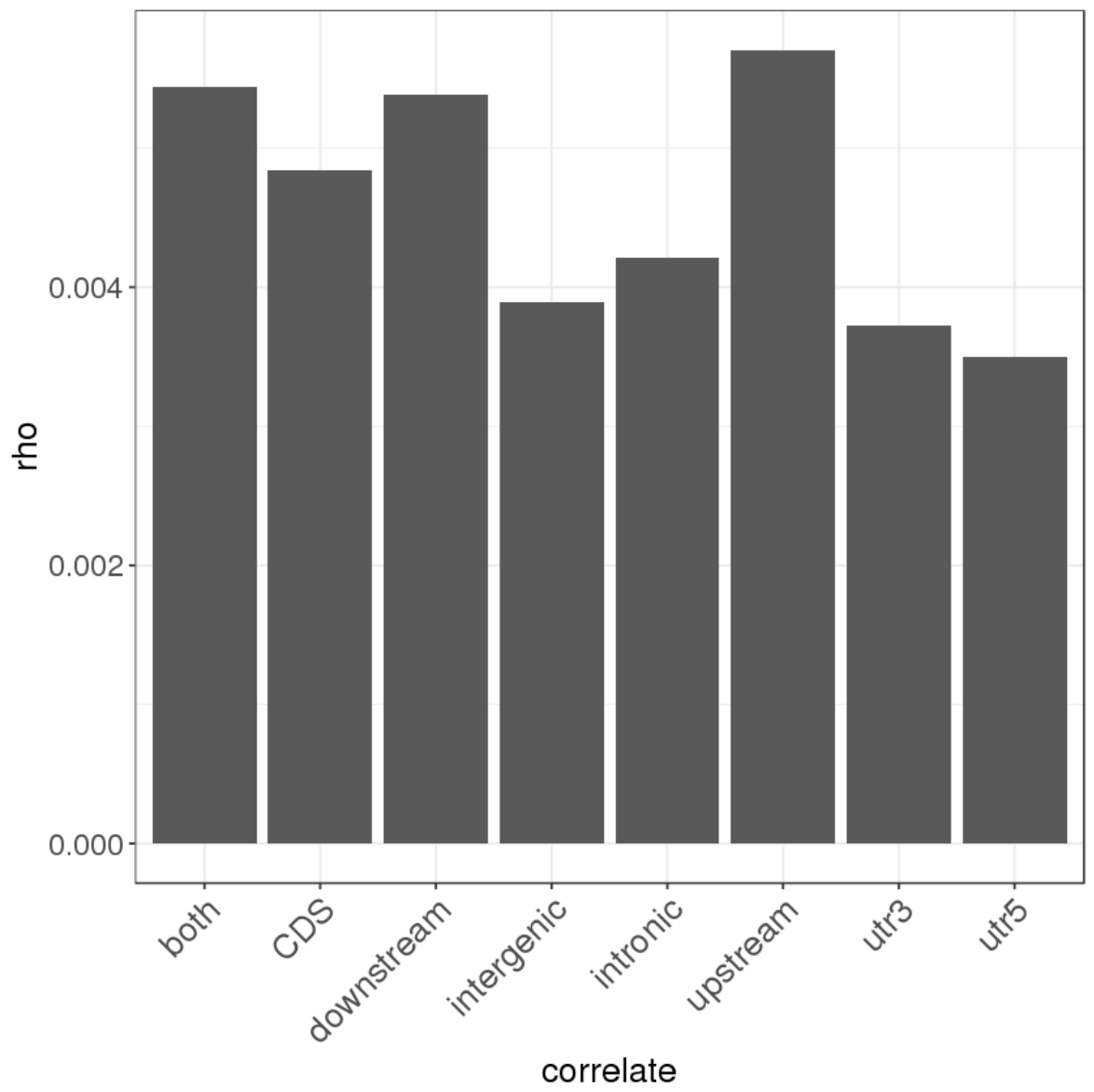
That's better!
A few more changes we might want to make:
- The 'correlate' label under the x-axis isn't super useful - might as well nuke it entirely.
- It'd be nice if our y-axis label was a bit more descriptive, and also used the Greek symbol for rho.
- Some people are a big fan of the gridlines in the back - myself not so much, especially in the case of bar plots. Perhaps we could get rid of those.
- The axis ticks on the x-axis are pretty pointless. Let's get rid of those as well.
p +
geom_bar(stat = 'identity') +
theme_bw() +
theme(axis.title = element_text(family = 'Helvetica', size = 16),
      axis.text.x = element_text(family = 'Helvetica', size = 16, angle = 45, hjust = 1),
      axis.text.y = element_text(family = 'Helvetica', size = 14),
      axis.line = element_line(colour = 'black', linetype = 'solid'),
      panel.grid.major = element_blank(), panel.grid.minor = element_blank(),
      axis.ticks.x = element_blank()) +
xlab('') +
ylab(expression(paste('mean ', rho, 'LD')))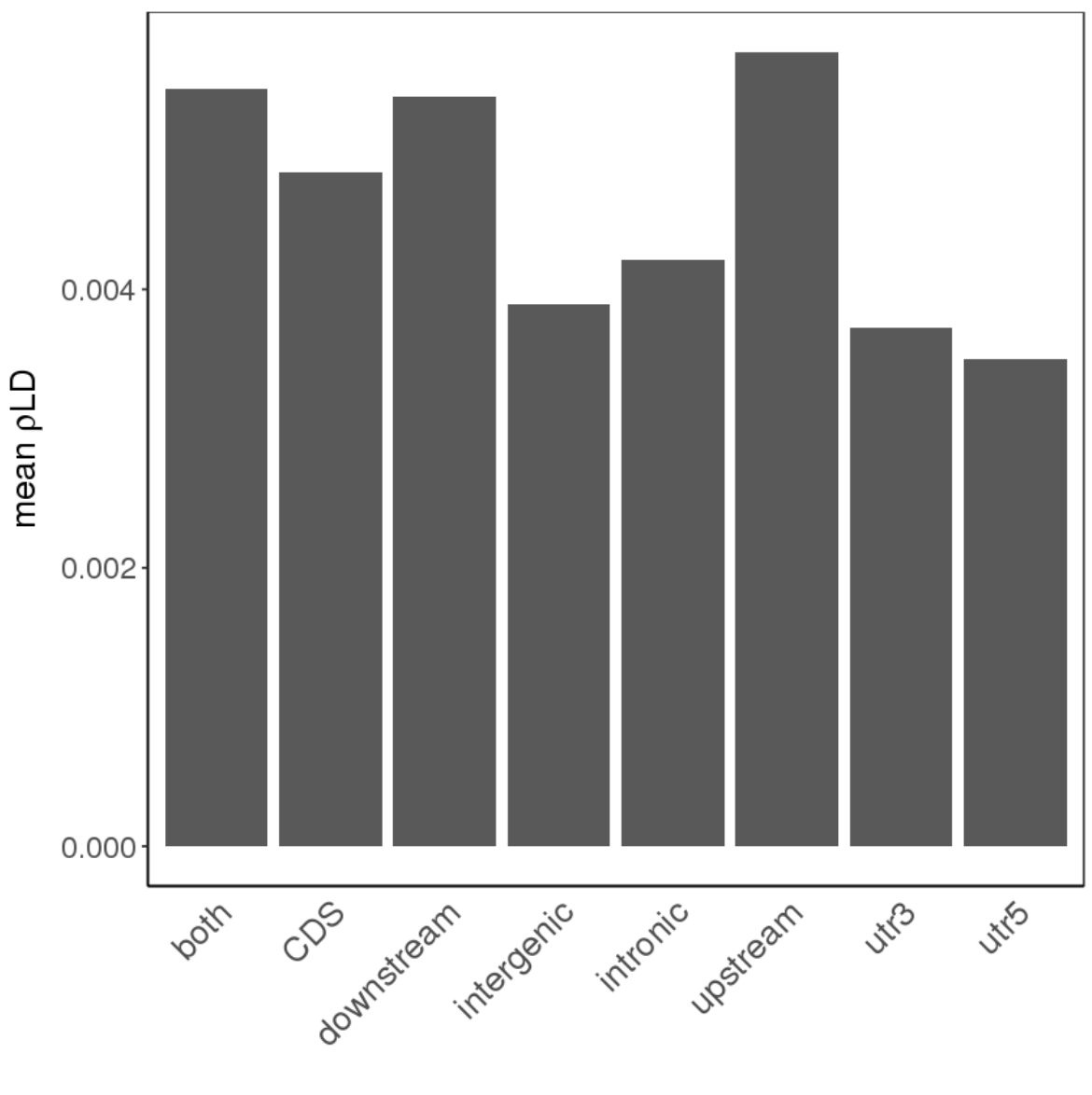
Notice that in ylab(), we've used the expression function alongside paste to put together our new label. expression takes in the names of symbols such as rho as input, and also passes strings (such as 'mean' in this instance) through unchanged, which means expression(paste()) together is a very handy way to create those fancier axis labels.
Some more additions we could make:
- Black bars make for a boring plot - let's add some colors to the plot as well.
- Still need to add the error bars!
- Perhaps we could reorder the x-axis labels to match the actual structure of a gene - would make more sense, wouldn't you think?
We can add a uniform colour to the plot within geom_bar, like so:
p +
geom_bar(stat = 'identity', fill = 'dodger blue', color = 'black') +
theme_bw() +
theme(axis.title = element_text(family = 'Helvetica', size = 16),
      axis.text.x = element_text(family = 'Helvetica', size = 16, angle = 45, hjust = 1),
      axis.text.y = element_text(family = 'Helvetica', size = 14),
      axis.line = element_line(colour = 'black', linetype = 'solid'),
      panel.grid.major = element_blank(), panel.grid.minor = element_blank(),
      axis.ticks.x = element_blank()) +
xlab('') +
ylab(expression(paste('mean ', rho, 'LD')))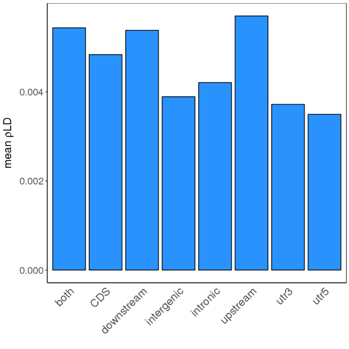
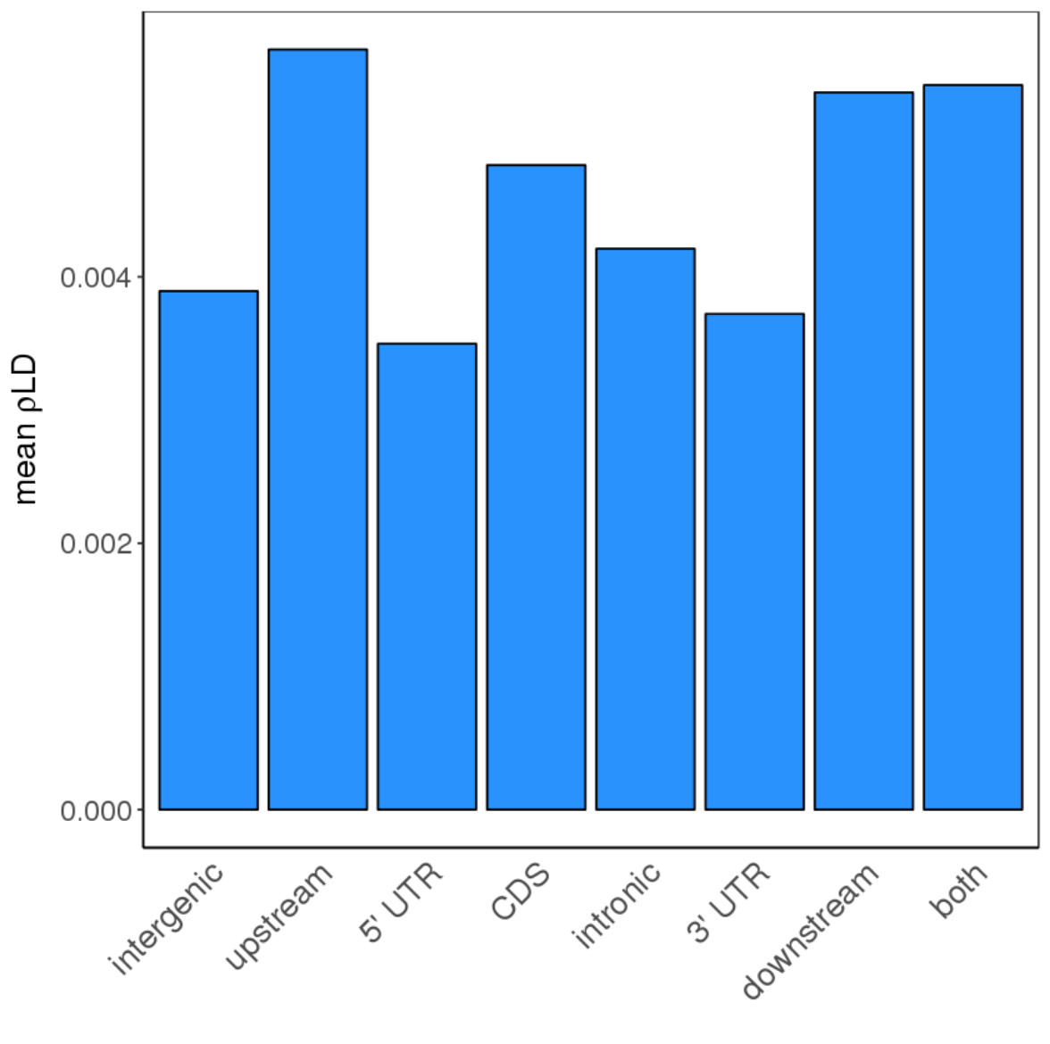
We could also reorder the x-axis labels manually:
p +
geom_bar(stat = 'identity', color = 'black', fill = 'dodger blue') +
theme_bw() +
theme(axis.title = element_text(family = 'Helvetica', size = 16),
      axis.text.x = element_text(family = 'Helvetica', size = 16, angle = 45, hjust = 1),
      axis.text.y = element_text(family = 'Helvetica', size = 14),
      axis.line = element_line(colour = 'black', linetype = 'solid'),
      panel.grid.major = element_blank(), panel.grid.minor = element_blank(),
      axis.ticks.x = element_blank()) +
xlab('') +
ylab(expression(paste('mean ', rho, 'LD'))) +
scale_x_discrete(labels = c('utr3' = "3' UTR", 'utr5' = "5' UTR"),
                 limits = c('intergenic', 'upstream', 'utr5', 'CDS', 'intronic', 'utr3', 'downstream', 'both')) +
Notice that scale_x_discrete also allows us to rename features on top of determining their order.
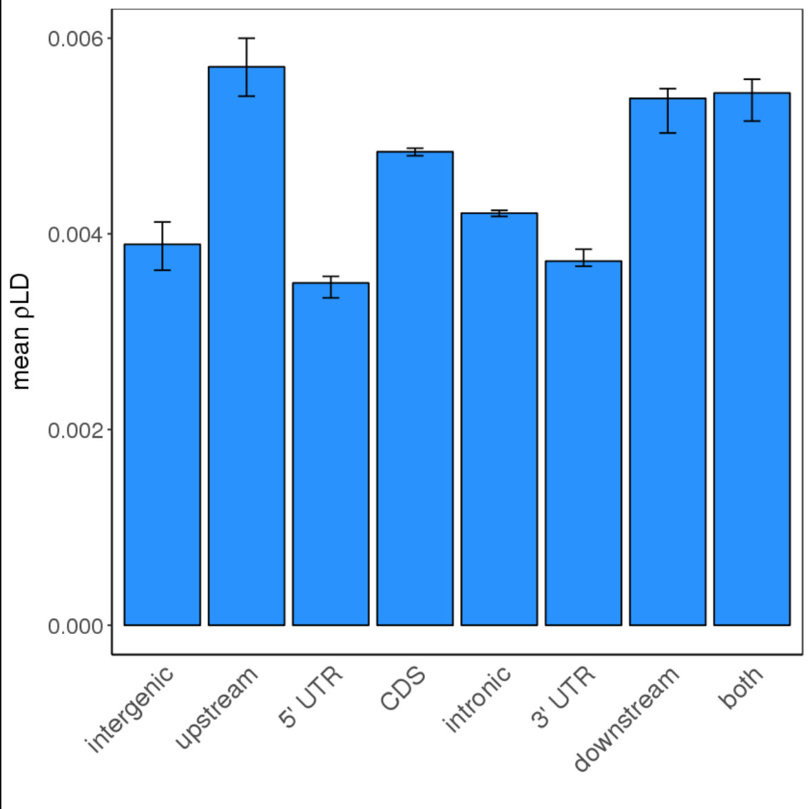
Let's now add our error bars:
p +
geom_bar(stat = 'identity', color = 'black', fill = 'dodger blue') +
theme_bw() +
theme(axis.title = element_text(family = 'Helvetica', size = 16),
      axis.text.x = element_text(family = 'Helvetica', size = 16, angle = 45, hjust = 1),
      axis.text.y = element_text(family = 'Helvetica', size = 14),
      axis.line = element_line(colour = 'black', linetype = 'solid'),
      panel.grid.major = element_blank(), panel.grid.minor = element_blank(),
      axis.ticks.x = element_blank()) +
scale_x_discrete(labels = c('utr3' = "3' UTR", 'utr5' = "5' UTR"),
                 limits = c('intergenic', 'upstream', 'utr5', 'CDS', 'intronic', 'utr3', 'downstream', 'both')) +
xlab('') +
ylab(expression(paste('mean ', rho, 'LD'))) +
geom_errorbar(aes(x = correlate, ymin = conf.low, ymax = conf.high), width = 0.2, color = 'black')
Here, we define the aesthetics of geom_errorbar similarly to how we did with our basic ggplot command. This time, however, we have ymin and ymax thrown into the mix as well.
Finally, let's get rid of the bounds at the top and right side of the plot, so that we're left with just the axes. To do this, we'll actually have to get rid of theme_bw, which forces those - instead, now that we're more familiar with modifying theme() itself, we can just get to changing whatever else we need to in order to have that black-and-white look anyways.
p +
geom_bar(stat = 'identity', color = 'black', fill = 'dodger blue') +
theme(axis.title = element_text(family = 'Helvetica', size = 16),
      axis.text.x = element_text(family = 'Helvetica', size = 16, angle = 45, hjust = 1),
      axis.text.y = element_text(family = 'Helvetica', size = 14),
      axis.line = element_line(colour = 'black', linetype = 'solid'),
      panel.grid.major = element_blank(), panel.grid.minor = element_blank(),
      axis.ticks.x = element_blank()) +
scale_x_discrete(labels = c('utr3' = "3' UTR", 'utr5' = "5' UTR"),
                 limits = c('intergenic', 'upstream', 'utr5', 'CDS', 'intronic', 'utr3', 'downstream', 'both')) +
xlab('') +
ylab(expression(paste('mean ', rho, 'LD'))) +
geom_errorbar(aes(x = correlate, ymin = conf.low, ymax = conf.high), width = 0.2, color = 'black')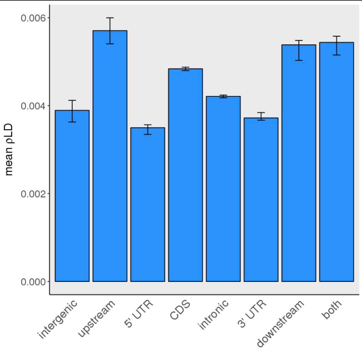
Now that we've removed theme_bw, we have that annoying grey background again. Luckily for us, it can be removed by modifying the panel.background element (i.e. setting it to element_blank()):
p +
geom_bar(stat = 'identity', color = 'black', fill = 'dodger blue') +
theme(axis.title = element_text(family = 'Helvetica', size = 16),
      axis.text.x = element_text(family = 'Helvetica', size = 16, angle = 45, hjust = 1),
      axis.text.y = element_text(family = 'Helvetica', size = 14),
      axis.line = element_line(colour = 'black', linetype = 'solid'),
      panel.grid.major = element_blank(), panel.grid.minor = element_blank(),
      axis.ticks.x = element_blank(),
      panel.background = element_blank()) +
scale_x_discrete(labels = c('utr3' = "3' UTR", 'utr5' = "5' UTR"),
                 limits = c('intergenic', 'upstream', 'utr5', 'CDS', 'intronic', 'utr3', 'downstream', 'both')) +
xlab('') +
ylab(expression(paste('mean ', rho, 'LD'))) +
geom_errorbar(aes(x = correlate, ymin = conf.low, ymax = conf.high), width = 0.2, color = 'black')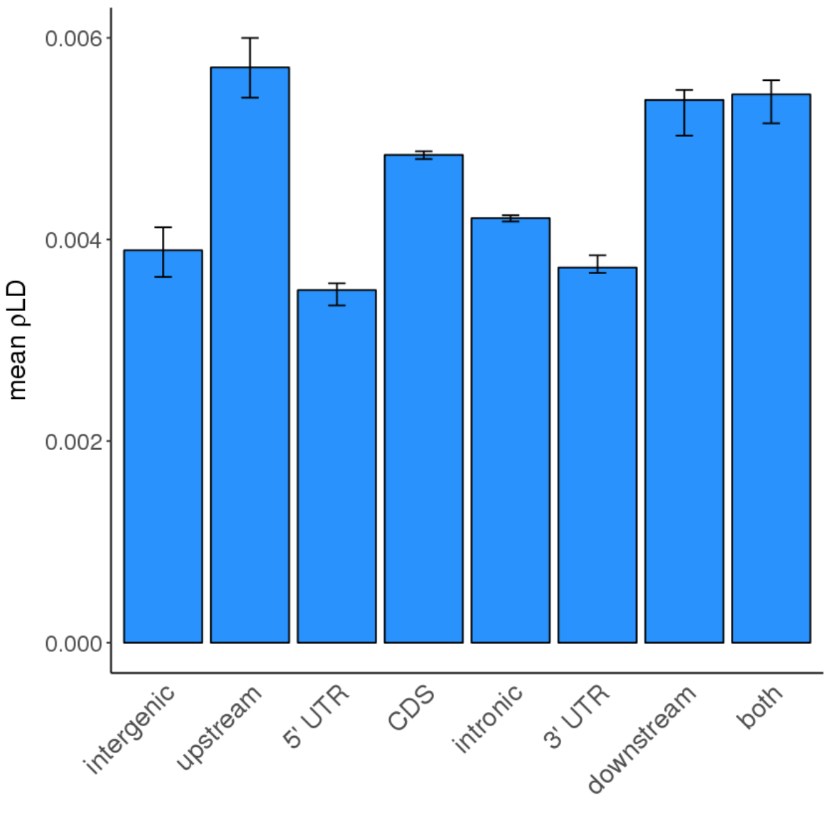
You get the idea!
There are, of course, tons more modifications you can make to your ggplots that won't necessarily be covered here, but are a quick Google search away. For instance, here's what the final version of this plot looks like, following some more micro-modifications:
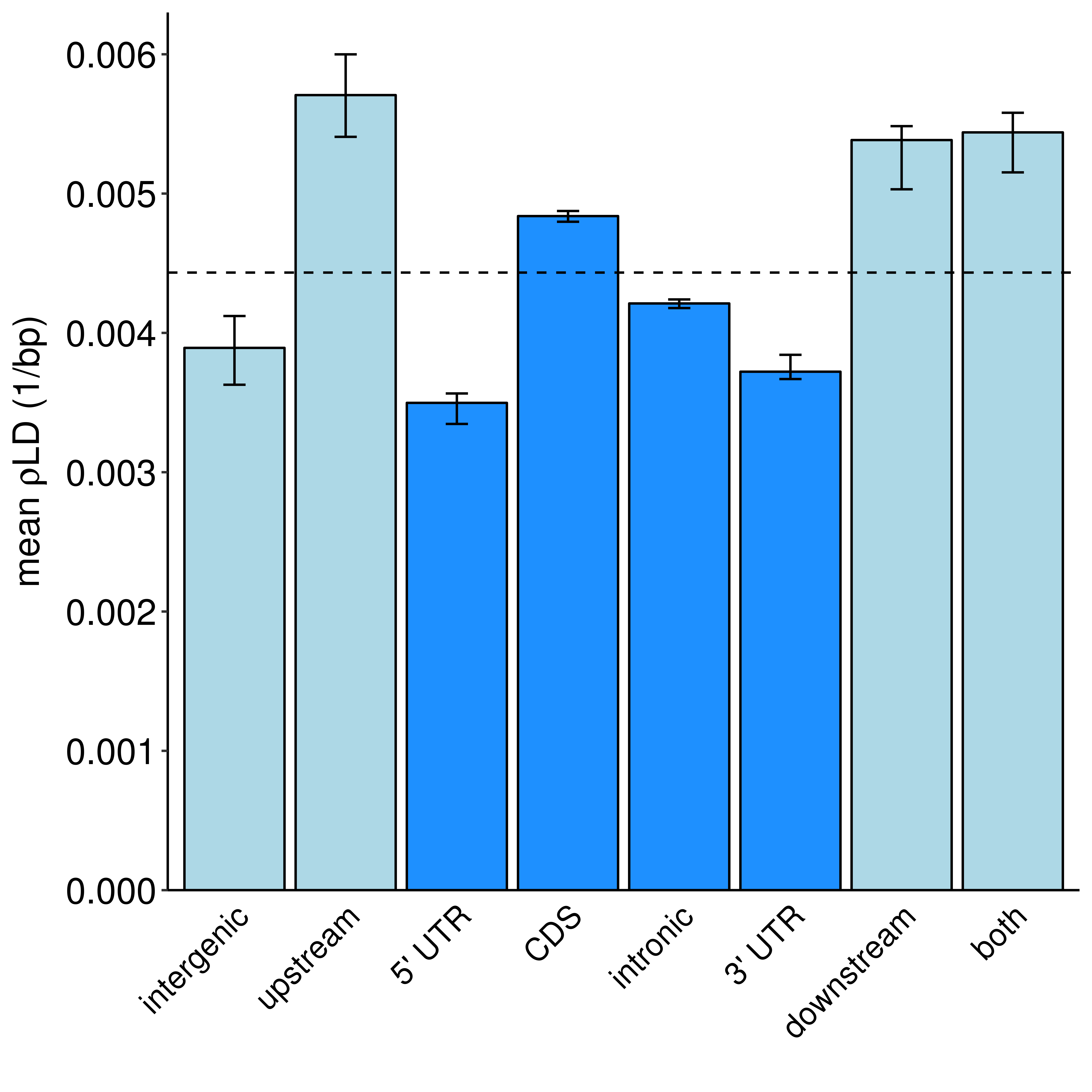
ggplot(d, aes(x = correlate, y = rho, fill = correlate)) +
    geom_bar(stat = 'identity', color = 'black') +
    xlab('') + ylab(expression(paste('mean ', rho, 'LD (1/bp)'))) +
    geom_errorbar(aes(x = correlate, ymin = conf.low, ymax = conf.high), width = 0.2, color = 'black') +
    scale_x_discrete(labels = c('is_genic' = 'genic', 'utr3' = "3' UTR", 'utr5' = "5' UTR"),
                     limits = c('intergenic', 'upstream', 'utr5', 'CDS', 'intronic', 'utr3', 'downstream', 'both')) +
    scale_fill_manual(values = cols) +
    theme(plot.title = element_text(family = "Helvetica", hjust = 0.5)) +
    theme(axis.title.y = element_text(family = "Helvetica", size = 16),
          axis.title.x = element_text(family = 'Helvetica', size = 16),
          axis.ticks.x = element_blank()) +
    theme(axis.text.x = element_text(family = "Helvetica", size = 14, color = 'black', angle = 45, hjust = 1)) +
    theme(axis.text.y = element_text(family = "Helvetica", size = 16, color = 'black'),
          panel.grid.major = element_blank(), panel.grid.minor = element_blank(),
          axis.line = element_line(colour = 'black', linetype = 'solid'),
          panel.background = element_blank()) +
    geom_hline(aes(yintercept = 0.00443298965947912), linetype = 'dashed') + # genomewide mean
    scale_y_continuous(expand = c(0, 0), limits = c(0, 0.0063), breaks = seq(0.000, 0.006, 0.001)) +
    guides(fill = FALSE)
Attachments:
 Screen Shot 2018-07-04 at 5.23.14 PM.png (image/png)
Screen Shot 2018-07-04 at 5.29.30 PM.png (image/png)
Screen Shot 2018-07-04 at 5.31.42 PM.png (image/png)
Screen Shot 2018-07-04 at 5.45.16 PM.png (image/png)
Screen Shot 2018-07-04 at 5.54.54 PM.png (image/png)
Screen Shot 2018-07-04 at 5.55.37 PM.png (image/png)
Screen Shot 2018-07-04 at 6.00.09 PM.png (image/png)
Screen Shot 2018-07-04 at 6.00.41 PM.png (image/png)
Screen Shot 2018-07-04 at 6.01.19 PM.png (image/png)
context_genplot_large_colour.png (image/png)
Screen Shot 2018-07-04 at 5.23.14 PM.png (image/png)
Screen Shot 2018-07-04 at 5.29.30 PM.png (image/png)
Screen Shot 2018-07-04 at 5.31.42 PM.png (image/png)
Screen Shot 2018-07-04 at 5.45.16 PM.png (image/png)
Screen Shot 2018-07-04 at 5.54.54 PM.png (image/png)
Screen Shot 2018-07-04 at 5.55.37 PM.png (image/png)
Screen Shot 2018-07-04 at 6.00.09 PM.png (image/png)
Screen Shot 2018-07-04 at 6.00.41 PM.png (image/png)
Screen Shot 2018-07-04 at 6.01.19 PM.png (image/png)
context_genplot_large_colour.png (image/png)