Show confirmation dialog before stopping test #156
Conversation
|
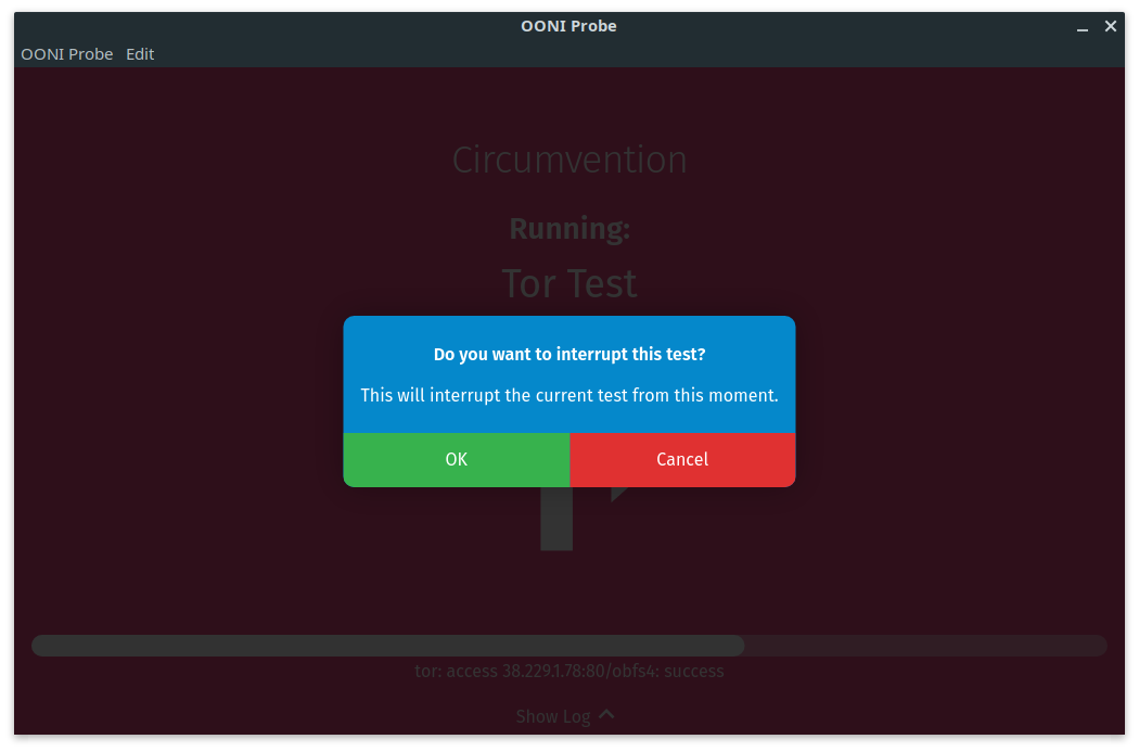
We should be using a different modal styling for this. The pattern for the modal in the onboarding is specific for the quiz. Here is what needs to change:
The copy also is a bit weird. Did @agrabeli review it? |
|
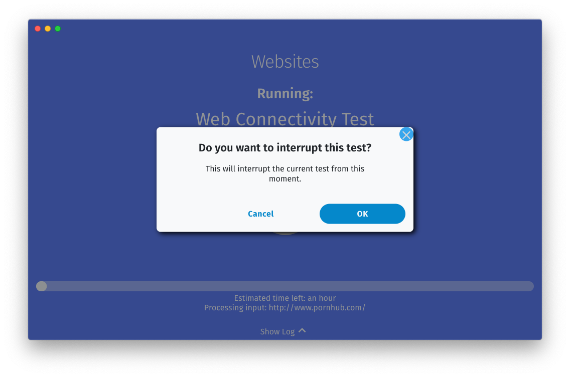
Here is a quick mockup of how it should look like:
Important things to keep in mind for the implementation:
|
|
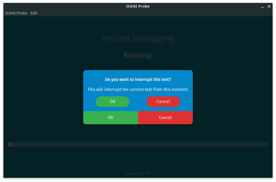
Are we not using the |
Yes, if you already have a button component, use that. |
There was a problem hiding this comment.
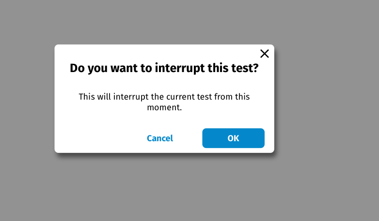
As mentioned in my previous comment:
• Invert the buttons to have OK on the right and cancel on the left.
• Make the background color of the modal be white
• Primary button (OK) should be blue background with white text, secondary button (cancel) should be blue on white
• Text should all be black
• The copy also is a bit weird. Did @agrabeli review it?
|
Replaced with a custom one with pointer cursor and light color change on hover.
|

Fixes ooni/probe#1205
I used the same style we use in the onboarding screens. I tried using the buttons from our design system, but dropped it later.
Also fixes the bug where the currently running test name wasn't being shown.
