FAQ/unicode_entry Unicode characters that look alike #1444
Comments
|
Unicode has data about which glyphs are confusable, and recommendations how to deal with them. Confusability data will occasionally be extended, i.e. glyphs that are not considered confusable now might be considered confusable by future Unicode revisions. |
|
BTW on http://unicode.org/cldr/utility/confusables.jsp you can enter a text and see how many confusables the Unicode Consortium detects. |
|
What is the recommendation? Use a single form? Or something else? |
|
Well, the recommendation is to not use nonsense in your source code, but from time to time you'll stumble upon code (maybe as a form of a joke) that produces some weird error message simply because it contains some character that looks like something else. So question is how can you configure your editor so that it renders nonsense in a distinguishable way :) |
|
There's also stuff like the obfuscated C contest, Perl golf. Some fonts are designed to minimize confusability. Slashed or dotted zeroes are an early approach, but with more glyphs there are more confusables of course. |
|
No need to complicate things. There are confusables for almost any character out there, so it doesn't help. IMO the simplest way is to colorize all non-ascii characters. Here's an example on how Emacs renders non-breaking space (by default):
Just adding a slight tint to non-ascii characters should be good enough. And it must be possible in most editors (with custom config). |

|
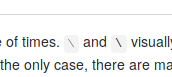
Well, looking at rakudo/rakudo#2003, I think this isn't that much of a doc issue then. Although ∖ and \ most likely won't be covered when that issue is resolved. We can take the list of editors and start submitting tickets (for highlighting of non-ascii chars). After that's done we'd still need a FAQ entry for those who use editors that don't have this feature (yet). |
This issue was mentioned a couple of times.
∖and\are visually too similar. Worse, sometimes they are even rendered identically. But this is not the only case, there are many non-ascii characters that look like something else. How to deal with this stuff?As an example, here are some screenshots of how it's rendered for me:
Emacs:

Firefox:
You'll notice that my emacs screenshot clearly shows that these characters are different. However, there's nothing clever about this:
Anyway, I think that the proper solution would be to configure your editor to highlight characters out of ascii range (similarly to how people highlight whitespace). After some experiments I'll write about it.
The text was updated successfully, but these errors were encountered: