Develop for mobile first is a common theme you hear today. I use three libraries for preprocessing css to help with this process. They make it easy to get a responsive site running fairly quick.
- Stylus - CSS pre-processor.
- Jeet - Flexible ratio grid system for stylus.
- Rupture - Simple media queries in stylus.
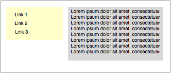
Below is a sample design I'll be working with. There is a sidebar and a content area. I've decided to make a breakpoint at 600 pixels. Once the browser screen size is below 600 pixels the layout will change.
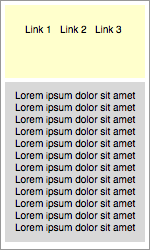
This is how the screen will display once the size is below 600 pixels. I've stacked the sidebar and content area. I also display the links horizontally instead of vertically.
I'll use the following stylus code to accomplish the above:
@import 'jeet'

#root
	center(960px)
	.sidebar
		col(1/3)
		background-color: #FFFFCC

		ul
			list-style: none
			li
				display: none
				margin: 0 0 10px 0

		+below(600px)
			stack()
			ul
				center(200px)
				li
					display: inline
					margin: 0 15px 0 0
	.main
		col(2/3)
		background-color: #CCCCCC
		+below(600px)
			stack()
To summarize what I'm doing:
- Center the document within 960 pixels.
- Set the
.sidebarelement to take up 1/3 of the screen size. - Each
.sidebar > ul > liwill be displayed vertically and have a bottom margin of 15 pixels. - Set the
.mainelement to take up 2/3 of the screen size.
When the screen size is below 600 pixles:
- Stack the
.sidebarand.mainelements vertically. - Center the
.sidebar > ulwithin 200 pixels. - Each
.sidebar > ul > liwill be displayed horizontally and have a right margin of 15 pixels.
For under 30 lines of code I accomplished a lot and set a good foundation for a responsive design. I'll need to create a build step for the above code to be processed into css. That's pretty easy too:
$ stylus -u jeet -u rupture css/*.styl --out static/bundle.cssThat one liner takes the stylus file and creates a css file, bundle.css, in the directory static. I can then include the bundle.css in my html.