Redesign "welcome message dialog" #1706
Comments
|
Looks better to me. Please also make the change to Turtle Blocks JS, on which Music Blocks is based. Here's what it looks like at https://rawgit.com/sugarlabs/turtleblocksjs/master/index.html
|

|
I’ve been able to make changes(mock up) on TB using your screenshot. But the welcome dialog doesn’t show when I open Tb on my browser. I tried using 3 browsers (chrome, Firefox and Safari). |
|
The dialog did not show until I pressed the question-mark button. It was with Firefox 64 on Ubuntu 16.04 Xenial LTS.
|
|
Okay, seen. I'll create an issue right away on tb. but I think the tour should appear the way it does on mb, without having to click on the "?" first |
|
What I see in these pictures looks very nice. Great work! I do not see a PR for this, nor do I see it in your repo on GH (https://github.com/perriefidelis/musicblocks). Please send a PR with this change. An aside, it seems from the pictures like the turtle in Turtle Blocks has unintentionally become a mouse. Maybe this needs fixed? |
|
@perriefidelis Any PR for this? |
|
Not yet. I’m not really good at writing codes, I’m trying to look for ways to implement it though but if anyone wants to work on it, they should |
|
How did you make the mockup without changing the code? |
|
I used a design tool for the mockup |
|
Which design tool? |
|
@pikurasa @quozl Hi! |
|
Btw kudos @perriefidelis that's a really subtle and simplistic design yet it suits the website nicely 👍 |
|
@quozl I used “FIGMA” (a design tool that helps you to prototype before writing actual codes) |
|
@jshreyans551, that would be great! You can pick from where I stoped: https://github.com/perriefidelis/musicblocks Thanks. |
|
Great! Thanks a lot |
|
@perriefidelis I've worked on the welcome tab but I'm facing certain problems:
I tried to make it look better with some temporary mods: |

I like the idea of putting it on the left or right side. /me wonders if "up/down" arrow makes more sense than "left/right"...? |
I don't think that would matter too much at this stage since there are no animations (like sliding right/left or up/down) when the page content changes. If for instance, there would have been a horizontal slide animation for the content, then the arrow direction would have mattered.
Should I implement it? |
|
I think the charm and simplicity of Perrie's design is what we are striving for. If the buttons on the side cannot extend outside of the div, then expand the div to make room for them??? |
|
the drop shadow is as well too dark, I'm thinking maybe this could help? https://www.figma.com/file/0ntRQHqYNilzMzSBpOBaUK0J/Musicblocks?node-id=0%3A1 gives you the properties of every element. steps:
|
|
@perriefidelis Corrected shadow in latest commit
|

|
@walterbender Sure I will try to reach as close as possible to the design. Thanks! |
|
@perriefidelis Are the rounded corners looking fine? I thought it would be good addition but I'm not sure. Since it your design after all. |
|
Hi! Done with the final view of the welcome tab.
|

|
Hi @jshreyans551 sorry for the late reply. design observations:
|
|
We should be consistent with the fonts used everywhere else. |
|
@perriefidelis Not a problem, thanks for the feedback.
|

|
As far as I can tell, we have merged all the pertinent changes for this issue -- is there something remaining? If so, can someone please enumerate them for clarity? |
|
All features have been merged by @walterbender. You can refer to the pull request thread here. |
|
I think there is still the issue of white icons on white background not being visible. |
|
Should be all set. |
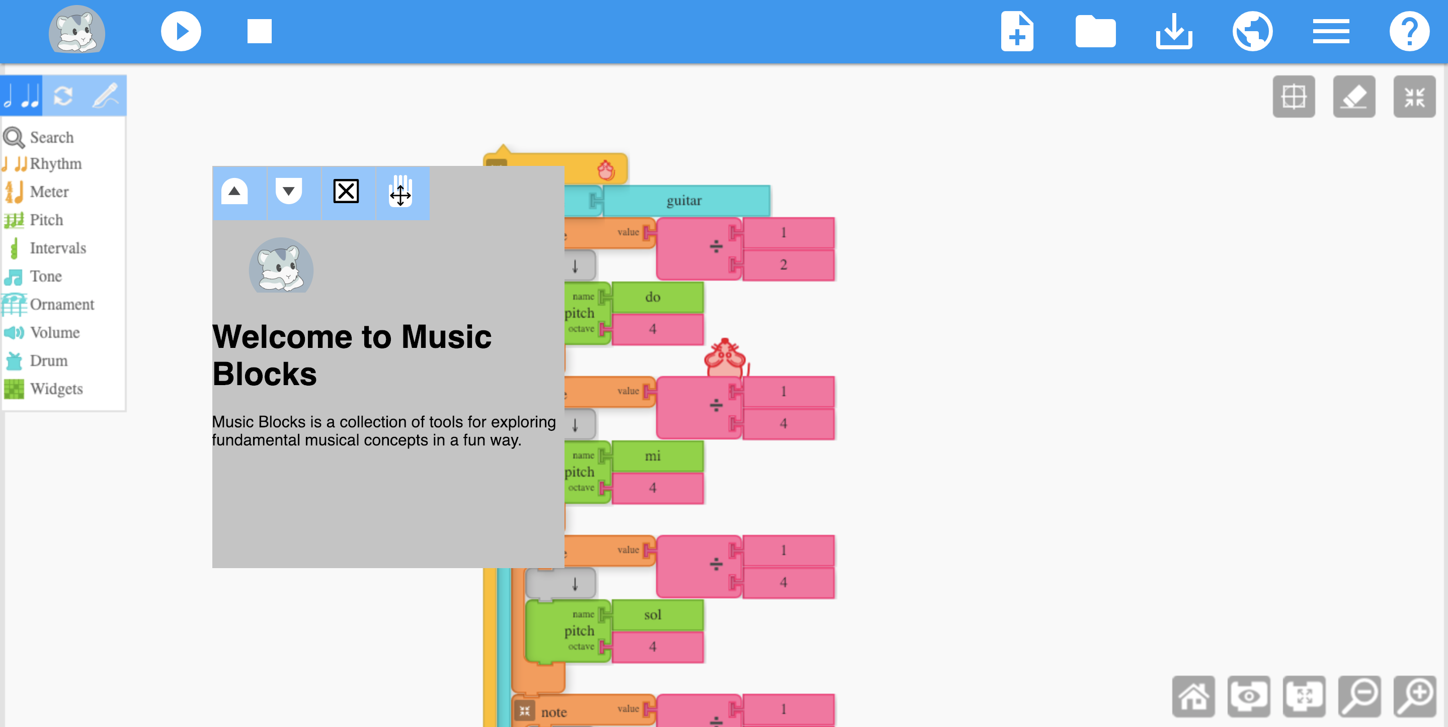
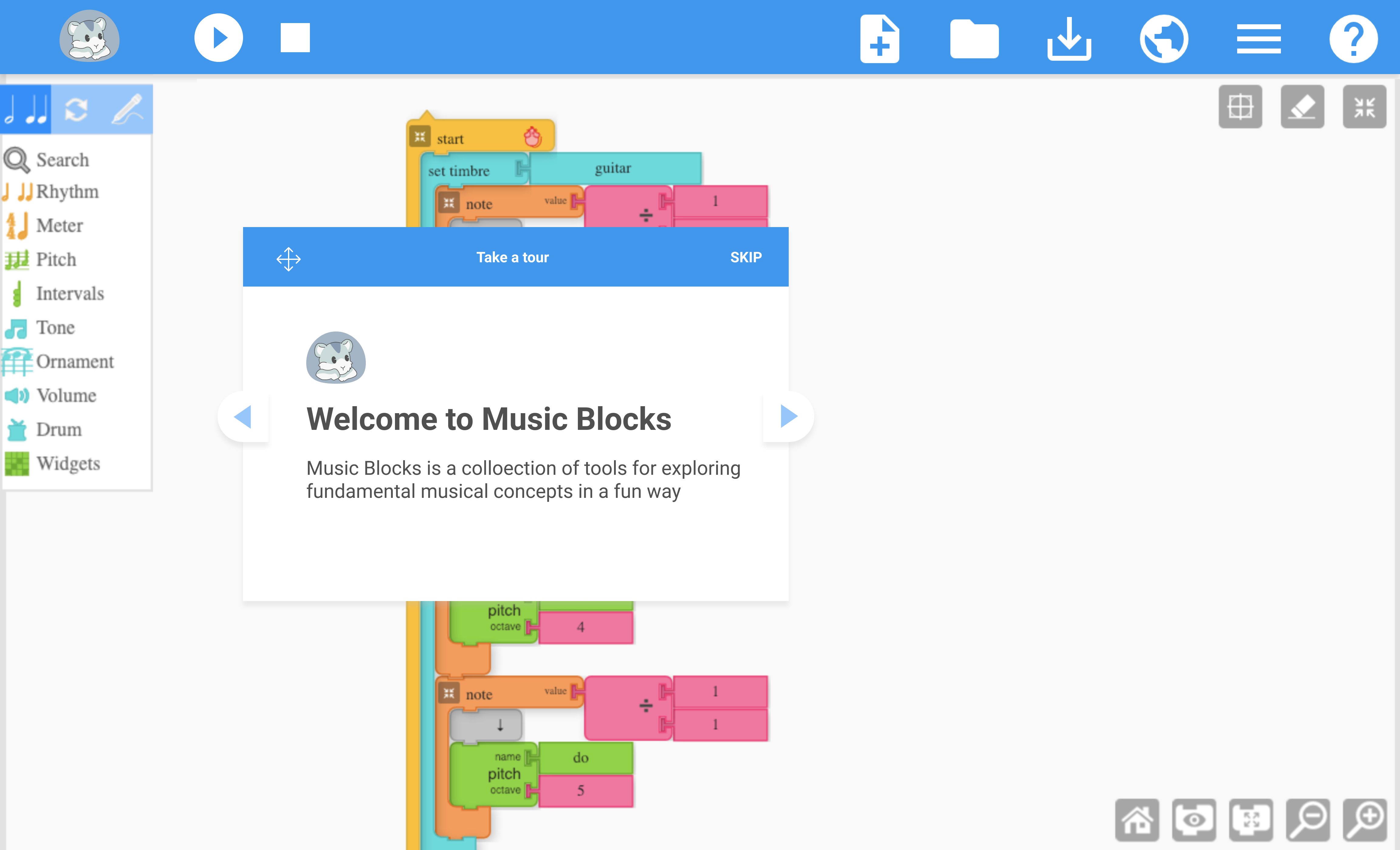
The current welcome dialog doesn't look to good with the colours and all. So made a redesign in a mockup of a much better look.
current look
redesign
In my honest opinion we don't have to indicate the move with an icon, once the user uses the mouse on the blue div he/she should be able to change the location of the helpDiv
here is how it looks

The text was updated successfully, but these errors were encountered: