Examples
Below are some example visualizations from the organizers' own research. Additional papers in the spirit of the DGFS workshop can be found on the website of the EACL 2012 Workshop and on the website of the AVML Conference 2012.
Cartograms obtain more space for regions with a high point density by distorting regions such that their size corresponds to a statistical feature (Bak et al. 2009). In this map the size of the regions corresponds to the number of languages spoken in these areas. The degree of distortion in the middle of the cartogram can be seen from the curve of the line which represents the equator from the original map. The distortion uses an equal-sized hexagon-grid, as opposed to regular cartograms, which normally use polygons (such as country borders).
The cartogram above was rendered with Vismap 2.2 (University of Konstanz) and shows the areal distribution of languages. The language data comprising 4,334 languages with their geographic location (blue dots in the map) are taken from the ASJP database (Wichmann et al. 2010). Particularly noticeable is the degree of distortion in the middle and the right of the cartogram, visualizing the number of languages in Africa and Papua New Guinea, respectively.
References:
- Bak, Peter, Matthias Schaefer, Andreas Stoffel, Daniel Keim, Itzhak Omer. 2009. Density equalizing distortion of large geographic point sets. Journal of Cartographic and Geographic Information Science (CaGIS), 36(3):237–250.
- Wichmann, Søren, André Müller, Viveka Velupillai, Cecil H. Brown, Eric W. Holman, Pamela Brown, Matthias Urban, Sebastian Sauppe, Oleg Belyaev, Zarina Molochieva, Annkathrin Wett, Dik Bakker, Johann-Mattis List, Dmitry Egorov, Robert Mailhammer, Helen Geyer. 2010. The ASJP database (version 12). URL: http://email.eva.mpg.de/~wichmann/ASJPHomePage.htm
Visualizations can also help in the area of lexical semantics. The figure below shows a new approach to detecting and tracking changes in word meaning by visually modeling and representing diachronic development in word contexts, where the sense development of "to browse" and "to surf" is modelled from 1997 to 2007. For this case study, seven senses are learned with LDA. Each sense corresponds to one row and is described by the top five terms identified by LDA. The higher the gray area at a certain x-axis point, the more of the contexts of the corresponding year belong to the specific sense. Each shade of gray represents 10% of the overall data.
 Sense e for "to browse" and sense k for "to surf" pattern quite similarly. Inspecting their contexts reveals that both senses appear with the invention of web browsers, peaking shortly after the introduction of Netscape Navigator (1994). For "to browse", another broader sense (sense f) concerning browsing in both the internet and digital media collections shows a continuous increase over time, dominating in 2007.
The figure below shows pairwise comparisons of word senses of "to browse" and "to surf" with respect to the contexts they share, i.e. contexts that cannot unambiguously be assigned to one or the other. Each context is represented by one dot colored according to its time stamp. It can be seen that senses d (animals that browse) and e (browsing the web) share no contexts at all. Senses d (animals that browse) and f (browsing files) share only few contexts. In turn, senses e and f share a fair number of contexts, which is to be expected, as they are closely related.

Reference:
- Christian Rohrdantz, Annette Hautli, Thomas Mayer, Miriam Butt, Daniel A. Keim and Frans Plank. 2011. Towards Tracking Semantic Change By Visual Analytics. In Proceedings of the 49th Annual Meeting of the Association for Computational Linguistics, pages 305–310, Portland, OR, USA. [Link to full paper]
This example deals with vowel harmony from a cross-linguistic perspective, with the aim of visualizing the distribution of vowels in corpora so that languages with vowel harmony can be distinguished from those lacking it. For this purpose vowel successions within words are statistically analyzed. The figures below show the tables of phi values for all vowel pairs on the basis of their occurrence in VCV sequences (left: Turkish, right: Spanish).


These tables serve as the input for a matrix visualization whose rows and columns are sorted according to the distribution of vowels in the corpus, with more similar vowels occurring closer together. The phi values have been mapped to saturation levels of red (for negative phi values) and blue (for positive phi values). The matrices below show the visualizations for Turkish (left) and Spanish (right). The matrix for the vowel-harmonic language Turkish shows clear blocks of vowel pairs which correspond to the harmony groups, whereas Spanish reveals a less clear-cut picture of vowel blocks.

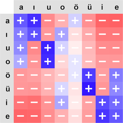

The advantage of a visualization approach to investigating vowel harmony can be seen when comparing the tables of numbers with the matrix visualizations. Both contain the same information about vowel sequences in the language, but in the latter case interesting patterns can be detected at-a-glance.
Reference:
- Mayer, Thomas, Christian Rohrdantz, Miriam Butt, Frans Plank and Daniel Keim. Visualizing Vowel Harmony. Journal of Linguistic Issues in Language Technology (LiLT), Vol. 4 Issue 2. [Link to full paper]
In the domain of lexical semantics, we present a quantitative investigation of the cross-linguistic usage of some (relatively) newly minted derivational morphemes. In particular, we examine the lexical semantic content expressed by three suffixes originating in English: -gate, -geddon and -athon. Using data from newspapers, we look at the distribution and lexical semantic usage of these morphemes
not only within English, but across several languages and also across time, with a time-depth of 20 years.
Using the New York Times Annotated Corpus and data from the EMM news service, we can extract the contexts of the suffixes. Looking at the data from a frequency point of view, the total 7,500 -gate appearances,
Rubygate – the affair of Italian’s ex prime minister Silvio Berlusconi with an under-aged girl from Morocco – was the most frequent word with 1558 matches, followed by Angolagate with 1025 matches and Climategate with 752 matches. The NYT corpus has 1,000 matches of -gate words, the top ones were Iraqgate with 148, Travelgate with 122, and Irangate with 105 matches. The frequency of -geddon and -athon was much lower.
The lexical semantic content of the suffixes is modelled by looking at the surrounding words of the suffixed expression, the employed topic model is LDA (Blei et al 2003). Thereby we want to determine from the word contexts whether -gate words share context features with words such as scandal or affair. The following figure shows the contexts where -gate appears, namely in the domain of society, art and culture (interpersonal affairs), economy (some financial scandals), foreign policy, sports and domestic politics.

To investigate the cross-linguistic productivity of the new coinages we customized a visualization with the Tableau software.3 Figure 3 shows the appearances of the 15 most frequent -gate coinages across the three languages over time. Along the y-axis the data is divided according to -gate coinages and languages, whereas the x-axis encodes the time. Whenever a certain coinage appears in a certain language at a certain point in time, a colored triangle is plotted to the corresponding position. The color redundantly encodes the language for easier interpretation.
The most salient patterns are the following:
-
No language barrier: The top -gate coinages belong to scandals that are of international interest and once they are coined in English they immediately spread to the other languages, see Rubygate, Climategate, Cablegate, Antennagate, and Crashgate.
-
Pertinacity partly depends on language: Some -gate-coinages re-appear over and over again only in individual languages. This especially holds for words that were coined before the monitoring started, e.g. Sachsgate, Oilgate, Troopergate, and Travelgate which all persist in English.
-
Some coinages are language-specific: Some of the recent coinages such as Memogate, Asiagate, and Weinergate reach an extremely high frequency within very short time ranges, but can be found almost exclusively in English.

References:
- David M. Blei, Andrew Y. Ng, and Michael I. Jordan. 2003. Latent dirichlet allocation. Journal of Machine
Learning Research, 3:993–1022.
- Christian Rohrdantz, Andreas Niekler, Annette Hautli, Miriam Butt and Daniel A. Keim. 2012. Lexical Semantics and Distribution of Suffixes — A Visual Analysis. In Proceedings of the EACL 2012 Joint Workshop of LINGVIS and UNCLH, pages 7-15, Avignon, France.
-
http://www.tableausoftware.com/
This visualization helps linguistic researchers to explore the world’s languages with respect to several important tasks: (1) The comparison of manually and automatically extracted language features across languages and within the context of language genealogy, (2) the exploration of inter- relations among several of such features as well as their homogeneity and heterogeneity within subtrees of the language genealogy, and (3) the exploration of genealogical and areal influences on the features.
The visualization below shows the World's Languages Explorer, which provides the required functionalities in one single Visual Analytics environment. Contributions are made for different parts of the system: The explorer includes an extended Sunburst visualization (left part of the figure below) whose so-called feature-rings allow for a cross-comparison of a large number of features at once, within the hierarchical context of the language genealogy. It suggests a mapping of homogeneity measures to all levels of the hierarchy. In addition, an integration of information from the areal data space into the hierarchical data space (right part of the figure below) is provided.

The example shows for 27 Indo-European languages 19 language features that were automatically extracted from parallel Bible texts.
Reference:
- C. Rohrdantz, M. Hund, T. Mayer, B. Wälchli and D. A. Keim. 2012. The World's Languages Explorer: Visual Analysis of Language Features in Genealogical and Areal Contexts. Computer Graphic Forum (The definitive version is available at http://diglib.eg.org/ and http://onlinelibrary.wiley.com/), 31(3):935-944, 2012.