

GOEL is an SCSS library, which consists of multiple placeholders, build in utility/functional/atomic style.
- Description
- Highlights
- Install
- Placeholder
- Code comparison
- Utility placeholder implementation
- Usage
- Output
- License
Goel is a sass placeholder library, allowing to marry functional and semantic approach in css. It will help you write clean, easy to read code, with DRY output.
This approach comes with multiple benefits for front-end / ui developers.
- match semantic and functional CSS
- create developer-friendly class names using well-known methodologies like BEM, OOCSS
- use a functional approach to CSS
- use well-known architecture like ITCSS
- write clean CSS without unnecessary repetition
- write clean HTML without cluttering it with unnecessary classes
- stop wasting time to set up additional dependencies
- placeholders are not included in output = DRY code
- Tailwind CSS naming convention
- easy to set up and compose as you like
- easy to control how things look
- easy to extend (new placeholders, mixins, variables, etc.)
- clean and beautiful output, configure as you wish
- simple and minimal syntax
npm install @michu1234/goel
Import GOEL.scss from @import 'node_modules/@michu1234/goel/GOEL/GOEL' to your SASS file
Sass has a special kind of selector known as a “placeholder”. It looks and acts a lot like a class selector, but it starts with a % and it's not included in the CSS output. In fact, any complex selector (the ones between the commas) that even contains a placeholder selector isn't included in the CSS, nor is any style rule whose selectors all contain placeholders,
// placeholders
%purple {
  color: purple;
}
%red {
 color: red;
}

p {
  @extend %purple;
}

span {
  @extend %purple;
}

h2 {
  @extend %purple;
}

h1 {
  @extend %purple;
}
👇
h1, h2, span, p {
  color: purple;
}
Let's compare functional and semantic approach
%flex-row {
  flex-direction: row;
}
%flex-row-reverse {
  flex-direction: row-reverse;
}
%flex-col {
  flex-direction: column;
}
%visible {
  visibility: visible;
}
%invisible {
  visibility: hidden;
}
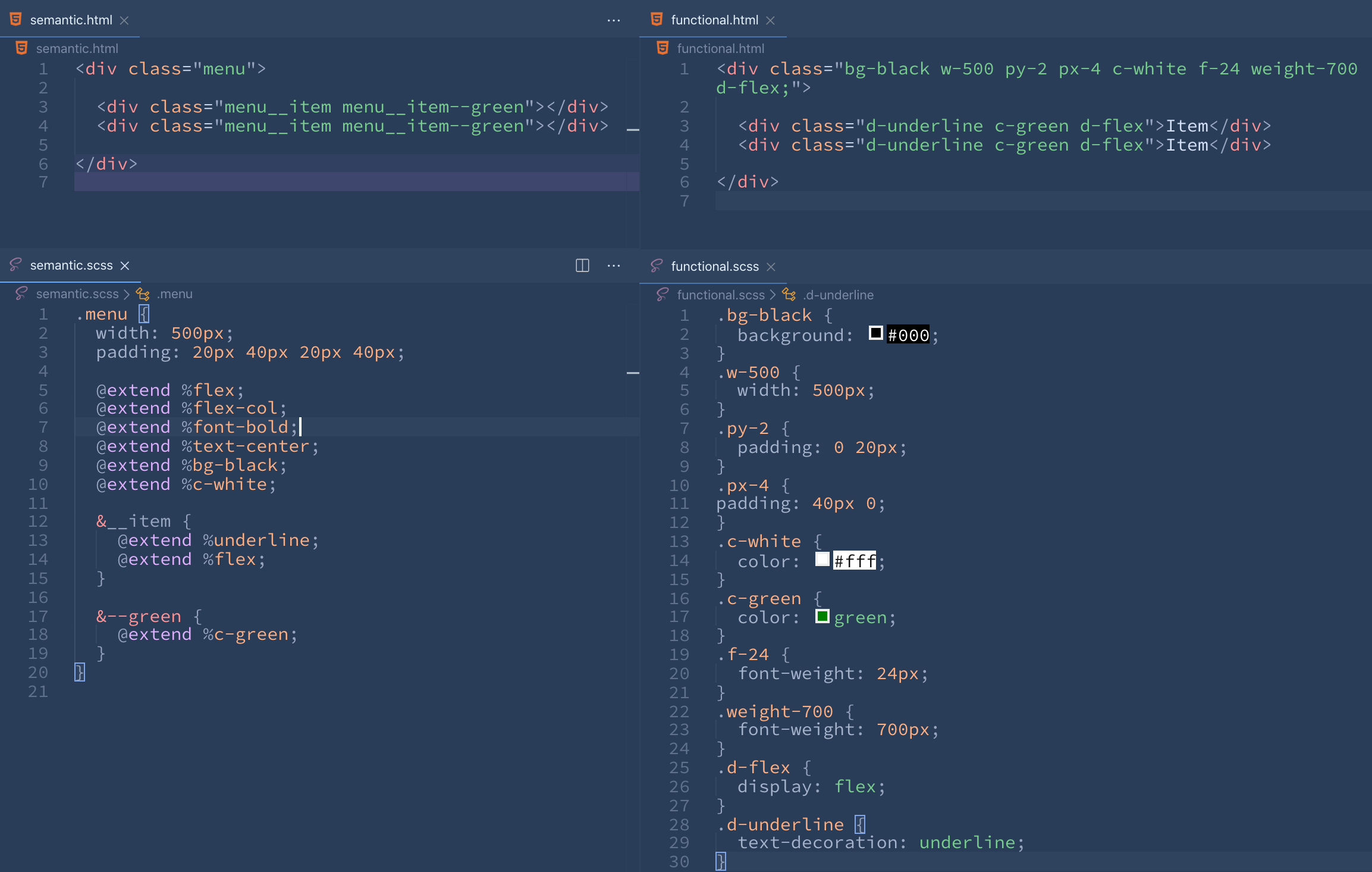
<div class="menu">

	<div class="menu__item menu__item--green"></div>
	<div class="menu__item menu__item--green"></div>

</div>
.menu {
width: 500px;
padding: 20px 40px 20px 40px;
@extend %flex;
@extend %flex-col;
@extend %font-bold;
@extend %text-center;
@extend %bg-black;
@extend %c-white;
&__item {
@extend %underline;
@extend %flex;
}
&--green {
@extend %c-green;
}
}
.menu {
  @extend %flex;
}
.menu__block {
  @extend %flex;
}
.menu__wrapper {
@extend %flex;
}
.menu__list {
  @extend %flex;
}
.menu__list-item {
  @extend %flex;
}
👇
.menu, .menu__block, .menu__wrapper, .menu__list, .menu__list-item {
  display: flex;
}