This npm is to help react native developers animating and customizing switchs for both ios and android devices.
npm i react-native-animated-switchimport { DarkmodeSwitch } from "react-native-animated-switch";import React, { useState } from "react";
import { View } from "react-native";
import {
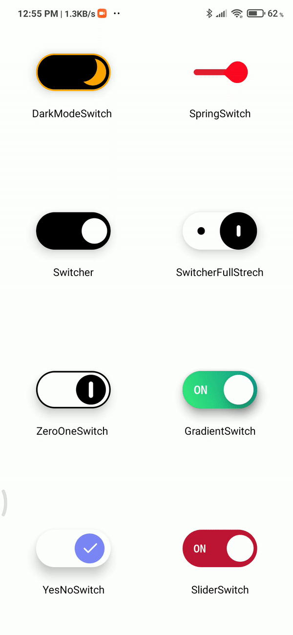
DarkModeSwitch,
GradientSwitch,
SliderSwitch,
SpringSwitch,
Switcher,
YesNoSwitch,
SwitcherFullStrech,
ZeroOneSwitch,
} from "react-native-animated-switch";
export default function App() {
const [isOn, setIsOn] = useState(false);
const onChange = () => {
setIsOn((d) => !d);
};
return (
<View style={styles.container}>
<View style={styles.col}>
<View style={styles.cell}>
<DarkModeSwitch
size={100}
value={isOn}
animationSpeed={"fast"}
elevation={10}
activeColor={"white"}
inActiveColor={"black"}
borderWidth={2}
onChange={() => onChange()}
knobColor={"orange"}
borderColor={"orange"}
/>
<Type name={"DarkModeSwitch "} />
</View>
<View style={styles.cell}>
<Switcher
size={100}
value={isOn}
onChange={onChange}
activeColor={"black"}
inActiveColor={"white"}
borderWidth={2}
animationSpeed={"fast"}
elevation={10}
/>
<Type name={"Switcher"} />
</View>
<View style={styles.cell}>
<ZeroOneSwitch
size={100}
value={isOn}
onChange={() => onChange()}
knobColor={"black"}
borderColor={"black"}
indicatorColor={"white"}
backgroundColor={"white"}
borderWidth={2}
animationSpeed={"fast"}
elevation={10}
/>
<Type name={"ZeroOneSwitch "} />
</View>
<View style={styles.cell}>
<YesNoSwitch
size={100}
value={isOn}
onChange={() => onChange()}
borderColor={"#7e86f7"}
inActiveColor={"gray"}
activeColor={"#7e86f7"}
backgroundColor={"white"}
animationSpeed={"fast"}
elevation={10}
/>
<Type name={"YesNoSwitch"} />
</View>
</View>
<View style={styles.col}>
<View style={styles.cell}>
<SpringSwitch
size={100}
value={isOn}
onChange={() => onChange()}
activeColor={"#11998e"}
inActiveColor={"#cb2d3e"}
/>
<Type name={"SpringSwitch"} />
</View>
<View style={styles.cell}>
<SwitcherFullStrech
size={100}
value={isOn}
onChange={() => onChange()}
activeColor={"white"}
inActiveColor={"black"}
animationSpeed={"fast"}
elevation={10}
/>
<Type name={"SwitcherFullStrech"} />
</View>
<View style={styles.cell}>
<GradientSwitch
size={100}
value={isOn}
onChange={() => onChange()}
animationSpeed={"fast"}
elevation={10}
knobColor={"white"}
fontSize={15}
activeGradientColors={["#38ef7d", "#11998e"]}
inActiveGradientColors={["#777", "#434343"]}
/>
<Type name={"GradientSwitch"} />
</View>
<View style={styles.cell}>
<SliderSwitch
size={100}
value={isOn}
onChange={() => onChange()}
knobColor={"#7e86f7"}
activeColor={"#c31432"}
inActiveColor={"#4286f4"}
animationSpeed={"fast"}
elevation={10}
/>
<Type name={"SliderSwitch"} />
</View>
</View>
</View>
);
}
const Type = ({ name }) => (
<View
style={{
top: 20,
}}
>
<Text>{name}</Text>
</View>
);
const styles = StyleSheet.create({
container: {
flex: 1,
justifyContent: "center",
alignItems: "center",
flexDirection: "row",
},
col: {
flex: 1,
justifyContent: "center",
alignItems: "center",
},
cell: {
flex: 1,
justifyContent: "center",
alignItems: "center",
},
});
| props | default | type | description | reqired |
|---|---|---|---|---|
| Size | 100 | number | size of switch in pixels | yes |
| value | false | bool | state of switch | yes |
| onChange | null | func | onChange funtion for switch | yes |
| animationSpeed | fast | fast;medium;slow |
animation speed of transition | no |
| props | default | type | description | reqired |
|---|---|---|---|---|
| inActiveColor | black | string(hex color/rgb) | color when value is false | no |
| activeColor | white | string(hex color/rgb) | color when value is true | no |
| borderColor | orange | string(hex color/rgb) | border color of switch | no |
| borderWidth | 2 | Number | border width of switch (make sure its lower then 3) | no |
| knobColor | orange | string(hex color/rgb) | knob color | yes |
| props | default | type | description | reqired |
|---|---|---|---|---|
| inActiveColor | black | string(hex color/rgb) | color when value is false | no |
| activeColor | white | string(hex color/rgb) | color when value is true | no |
| props | default | type | description | reqired |
|---|---|---|---|---|
| inActiveColor | black | string(hex color/rgb) | color when value is false | no |
| activeColor | white | string(hex color/rgb) | color when value is true | no |
| props | default | type | description | reqired |
|---|---|---|---|---|
| inActiveColor | black | string(hex color/rgb) | color when value is false | no |
| activeColor | white | string(hex color/rgb) | color when value is true | no |
| props | default | type | description | reqired |
|---|---|---|---|---|
| inActiveColor | black | string(hex color/rgb) | color when value is false | no |
| activeColor | white | string(hex color/rgb) | color when value is true | no |
| borderColor | orange | string(hex color/rgb) | border color of switch | no |
| borderWidth | 2 | Number | border width of switch (make sure its lower then 3) | no |
| knobColor | black | string(hex color/rgb) | knob color | yes |
| indicatorColor | white | string(hex color/rgb) | Zero one symbol color | yes |
| props | default | type | description | reqired |
|---|---|---|---|---|
| inActiveGradientColors | ["#777", "#434343"] | Array | color when value is false | no |
| activeGradientColors | ["#38ef7d", "#11998e"] | string(hex color/rgb) | color when value is true | no |
| borderWidth | 2 | Number | border width of switch (make sure its lower then 3) | no |
| knobColor | white | string(hex color/rgb) | knob color | no |
| indicatorColor | orange | string(hex color/rgb) | knob color | no |
| props | default | type | description | reqired |
|---|---|---|---|---|
| inActiveGradientColors | ["#777", "#434343"] | Array | color when value is false | no |
| activeGradientColors | ["#38ef7d", "#11998e"] | Array | color when value is true | no |
| borderColor | orange | string(hex color/rgb) | border color of switch | no |
| borderWidth | 2 | Number | border width of switch (make sure its lower then 3) | no |
| knobColor | white | string(hex color/rgb) | knob color | no |
| indicatorColor | orange | string(hex color/rgb) | knob color | no |