APCA is very similar to WCAG 2.x contrast with a higher value for ambient light #651
Comments
|
Hi @xi I am reviewing your analysis, and as an initial statement, I do not agree with your assessment. The use of a 0.4 addition to clamp the Weber is a reverse engineering of the perception curves we developed, which are firmly rooted in vision science, CAMs, and our empirical studies here in our lab—studies that are continuing and that will be part of up coming papers. I DO want to say that I really appreciate the deep dive you have done here. There is much to say here, and it will take me a day or two to respond in depth, which your analysis does deserve. As such, I am working on a more complete discussion, but I'd like to point out that even if you use a 0.4 addition, it is still more than 20% off compared to APCA, per the charts that you created in your analysis, and in different directions relative to various hues, and further does not consider polarity.
The 0.4 you are using is not ambient light by any stretch of the imagination. It is a mathematical clamp that constrains a portion of the range. We investigated this approach in 2019, along with other Weber variants, and other contrast methods as well. The APCA input soft-clamp is only one of several considerations of various adaptation states (what you are implying when you mention ambient). The fact that you "reverse engineered" a perception curve that came within 20% or so is interesting, but in visual perception of contrast, 20% is a lot (the threshold for standard vision is 1%).
The left column of your chart appears to be missing one of the polarities. The right column shows that your simpler model is 20% different than APCA and in different directions, and very inconsistent relative to hue. THIS IS IMPORTANT: soon to be released IP includes the full protan compensation package, which is going to be very important for future color spaces. I also have questions/comments regarding your implementation, including that you can not apply the soft clamp to the independent tuples, but I'll take those up with you at your repo.
As I mentioned, your analysis of APCA is admirable, though there are important aspects we should discuss further, and I don't want to be harshly critical, but they relate to the established peer reviewed vision science. There are a number of reasons we abandoned all modified Weber variants in 2019. Also in our earlier discussions, where you indicated issues in the mass of APCA documentation, has been very helpful as I work through organizing the documentation into a reasonable, accessible form. THAT SAID, there are things to discuss: the currently visible public beta version at the apca-w3 repo is the irreducible simplification, and one thing that is not going to be apparent is the extensibility and adjustability features. I will give you a complete response at your repo, as the technical depth is probably not appropriate here (or so I've been told). ALSO: Please do not reference thread Thank you, and I'll be responding more in-depth at your repo. |
|
This part is really bothering me, so I am going to address it as well:
"Weber" is not a "standard", and sRGB is no longer the sole color space either. There are now multiple color spaces that need to be considered and adjusted for. The "single parameter to adjust" is spurious. Visual perception does not work that way, and that approach is not perceptually uniform. Here though is a key point: you are under the impression that the 0.4 you added to WCAG2 somehow models high ambient light, and the answer is no, not at all, and that has essentially nothing to do with APCA. There are a dozen or so psychophysical factors at play here, and I don't have a simple response, other than "APCA is specifically tuned to contrast appearance of high spatial frequency stimuli on self-illuminated RGB computer displays & devices, with a focus on readability and accessibility". All the 0.4Y you added does is reverse engineer the curves we developed and established over the last three years of research and development. That is where the heavy lifting is.And because I've been open about the work and the math, it is plain to see. So sure, there are all sorts of ways to reverse engineer math and code you can openly see. But that is not solving the larger problem, it's just copying over someone else's work. For instance, what are you going to do with WGC HDR color spaces? What about user needs? What about modeling certain impairments? You're not doing the work to develop the curves, you are just copying them and force-fitting different math to them, and for no useful effect. ?????Nevertheless, I do appreciate all of the other feedback, and I am reviewing. |
|
On closer inspection, this individual's "analysis" is full of misleading statements and misdirection. Importantly, he substantially alters the APCA math and ignores the core methods. The examples he provides ignore important spatial frequency considerations. At the opening of this analysis, he states (emphasis added):
Not certain what the point of his "analysis" then is, as it is making inappropriate comparisons, and doing so in a way that is nothing less than misleading. First of all, he makes the spurious claim that:
But instead of showing such an actual comparison, he instead uses math that was reverse engineered to "come close to" APCA, resulting in these plots of the delta:
"Not that different"?? this is over 20% different, and not even compared to WCAG 2, but compared to the reverse engineered math, which he is using to mislead any who fall into his obfuscated claims of an analysis. Lacking in VeracityFirst, he makes claims that WCAG 2 and APCA are "not that different" but then instead of showing that in a way that would be clear (he can't as it is not true) he makes a gross modification to crudely and incompletely reverse engineer the APCA contrast curves—and even then is no where near unity, as shown by the cards above, which it should be known are a fully spurious comparison, comparing linear light metrics to non-linear perception curves. Missing key elementsHis "examples" used in his misleading introduction page are not following APCA at all, and instead is using a larger bolder font, his intent would seem to be to hide the differences found with a normal weight font. And again, to be clear, he is not using the APCA math and methods in his analysis.So please do not be mislead by this. |

|
And a final comment: I have been open about the math for the basic algorithm from the beginning. Doing so obviously opens up the floor for people like xi to reverse engineer it. But it is important to consider that simply reverse engineering the needed curves does not demonstrate how to create those curves in the first place. And this is critical for adapting to mew colorspaces and environments. And moreover, despite his claims otherwise, it is still not at all "close" and he's using a lot of obfuscation to cover his tracks here. My question is, WHY? |
|
I am sorry if you don't find my analysis helpful. Please note that I do not propose to actually use the fomula I posed above. I reverse engineered APCA to better understand it and found that a big part (but not all) of the difference to WCAG 2.x goes away if you apply some scaling and use a different value for ambient light flare. I thought that was an interesting observation and wanted to share it. That said, I will not engage with personal attacks. |
It was not at all helpful, and multiple, valid, comparative analysis have been conducted by third parties more aware of vision science. I encourage more analysis, but you can not abstract out the key aspects of the methods as you have, and then claim it is an "analysis".
??? Excuse me? That is EXACTLY what you did above in the first post.
First, as myself and others pointed out in the other threads, 0.4 does NOT represent any reasonable flare value. It is only a crude and incomplete reverse engineering of APCA perceptual contrast curves, but even then does not create a useable contrast metric, and further discards the mathematical structure which in the case of APCA is both adjustable and extensible, which are key design criteria for future color spaces. Useful to point out that in other thread you are now recanting your statement "it is very similar to " to now
I've presented the math and documentation openly for third party scrutiny. But that does not mean that the project should sit by idly when a poor attempt at analysis creates a misleading narrative. AGAIN: it has little to nothing to do with ambient light in this case. All of this is discussed in white papers and also plain language articles. The information that is defining is found at https://git.myndex.com |
|
In general I can see three useful forms of evaluation/analysis for contrast formulas:
@xi has taken a mathematical approach, and found an interesting aspect from a mathematical point of view. I didn't read that as any form of attack, but an opening of questions.
On the face of it, that is not an unreasonable thing to try. What does that tell us? Does that make it better/worse than the current WCAG formula? Does it only work like that in particular scenarios? Overall we want to use the formula & approach that best matches human perception. The simpler the model the better, but we can assume tools and a testing approach to simplify it's usage. A straightforward response to the (mathematical) analysis maybe just: The aspects outside of the analysed formula are required to model human perception/readability effectively. |
|
Thank you @alastc just in case it's not clear, some of the motivation of my comments come from the information posted at his repo on this subject.
A mathematically based comparison may be of some utility, but in xi's case, he is not doing a comparison of APCA to WCAG 2 as he says he is. He has grossly modified WCAG 2 to minimize the discrepancy to 20% and then claiming this as a valid assessment. OBJECTION: the repo he started called "the missing introduction to APCA" is better named "the misleading intro to APCA". His analysis compares a crude reverse engineering of APCA contrast curves, which he is still referring to as WCAG, and in the context of other loaded language and the fact that he is not using the actual APCA math, and further comparing irrelevant aspects, appears to be an attempt to create confusion and misunderstanding. Obviously I am at fault for not presenting the documentation in a more concise way, though this has been a work in progress.
It is no more interesting than a child using a crayon to trace over a circle. This is a reverse engineering of a resultant curve, not anything novel nor original. As I have been open about the math and methods, it is of course trivial for anyone with a spreadsheet to reverse engineer the math. That does not help when it comes time to adjust to other color spaces, particularly HDR. But nevertheless, the reverse engineering isn't what I am objecting to: had it been defined as that and analyzed separately. But that is not what this guy is doing. He is referring to this as a "comparison of WCAG 2 and APCA" and it is not that. That makes this analysis suspect at best.
Right, if he had done so separately, and not comingling with a document that is supposedly comparing APCA to WCAG. Do you not see the problem here??
APCA-W3 is an irreducible simplification of the larger model, while still maintaining the perceptual uniformity that is required for use in automated contexts such as
The analysis does not use the APCA method nor math. His claims of "matching" fully discard much of the APCA methods, and are not accounted for. The analysis does not illuminate, it only confuses and misdirects. Hence my objections. This is after spending a couple days dissecting what he is actually doing here. If his intentions are honorable, then he should recuse his uninformed opinions in the field that he himself has stated he is: "...without any training in the science around visual perception." Despite that disclaimer, he makes numerous incorrect statements regarding visual perception of contrast which are notwithstanding, but do on the face of it create confusion. |
|
I found a paper that explained a lot of things to me. This is probably old news to most of you, but for me it was a major breakthrough. I will quote a whole section so that others can benefit from it, too:
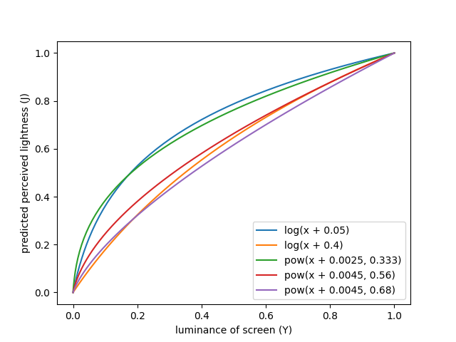
So historically there have been two different approaches to convert luminance to perceptual lightness: WCAG2 is based on the older, I am going to rework the analysis with the new perspective, but it is going to take me some days. But I already plotted some curves for both of these approaches with different parameters:
For details, please see the script that generated that graph.
With this historical context, I now better understand what APCA is doing. But it still seems like the parameters are unusual. My original observation that APCA is similar to a modified WCAG 2.x with an ambient flare value of 0.4 has not changed. And the exponents between 0.56 and 0.68 are all much higher than the 1/3 used by CIELab and Oklab. So I would still say that APCA is an outlier. Is that intentional? |
|
The AGWG chairs are temporarily locking this thread. We will reopen it next week. |
I wrote a detailed analysis of APCA here: https://github.com/xi/apca-introduction/blob/main/analysis.md
The main result was that APCA is not actually that different than WCAG 2.x if you change the ambient light value from 0.05 to something like 0.4. By not removing polarity and adding some scaling you also get very similar developer ergonomics, e.g. like this:
This approach has two main benefits: It stays much closer to established standards such as sRGB and Weber, and it also gives us a single parameter for tuning. On the other hand, the more complex APCA might have additional benefits that cannot be captured by such a simple model.
So I have the following questions:
The text was updated successfully, but these errors were encountered: