-
Notifications
You must be signed in to change notification settings - Fork 1.2k
Bugfix/fix thread composer ux #2936
Bugfix/fix thread composer ux #2936
Conversation
|
@bishwenduk029 you have to put |
|
Oh sorry my bad... @dev-drprasad thanks a ton man.I have updated the same accordingly. |
 dev-drprasad
left a comment
There was a problem hiding this comment.
Choose a reason for hiding this comment
The reason will be displayed to describe this comment to others. Learn more.
@bishwenduk029 There is lot of redundant logic in handleIncomingProps method. since we dont need to know active community, we can remove that logic.
src/components/composer/index.js
Outdated
| onChange={this.setActiveChannel} | ||
| value={activeChannel} | ||
| > | ||
| <option key={-1} value=""> |
There was a problem hiding this comment.
Choose a reason for hiding this comment
The reason will be displayed to describe this comment to others. Learn more.
As for I know we don't need key prop here. we use key prop only when we do .map. though i might be wrong
There was a problem hiding this comment.
Choose a reason for hiding this comment
The reason will be displayed to describe this comment to others. Learn more.
@dev-drprasad Oh I think you were reviewing an older version actually, I made some updates to the PR afterwards to remove redundant code. As for the key parameter, I think post render the above option also becomes a part of the rendered array of options(via . map). Since all are now siblings so key should be unique I think.
|
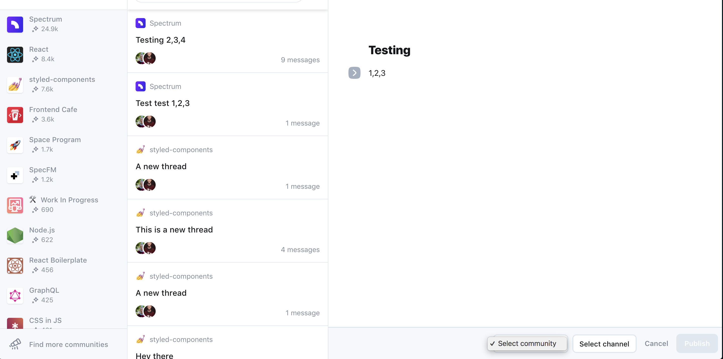
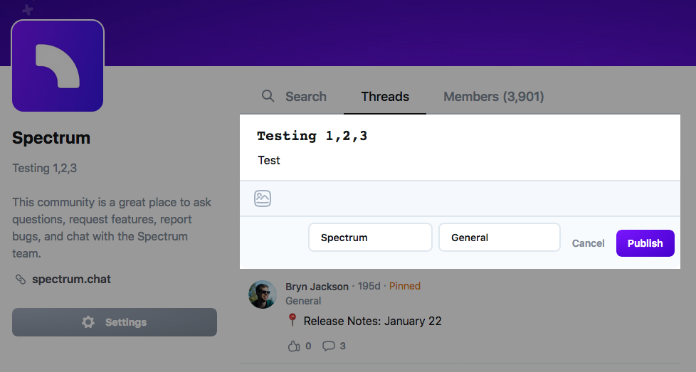
One feedback on the design - if we are moving the controls next to the publish button we don't need the 'to' bar in the top. And the order of the actions in the bottom bar should be: If that makes sense :) |
|
@bishwenduk029 good to put first menu item in dropdowns like |
src/components/composer/index.js
Outdated
| availableChannels: channels, | ||
| activeCommunity: community ? community.id : null, | ||
| activeChannel: activeChannel ? activeChannel.id : null, | ||
| activeCommunity: '', |
There was a problem hiding this comment.
Choose a reason for hiding this comment
The reason will be displayed to describe this comment to others. Learn more.
so this means that i have to select a community every time?
If i have already selected a single community at the left side navigation we should also pre-select this community here
There was a problem hiding this comment.
Choose a reason for hiding this comment
The reason will be displayed to describe this comment to others. Learn more.
Agreed - it should be pre filtered if the user has selected a community or channel in the left sidebar.
There was a problem hiding this comment.
Choose a reason for hiding this comment
The reason will be displayed to describe this comment to others. Learn more.
Sure I am on it to make the necessary changes for pre-selected community/channel.
|
@dev-drprasad yup, sounds good 😀 |
src/components/composer/index.js
Outdated
| const showSelectedCommunity = activeCommunity | ||
| ? activeCommunity.length > 0 | ||
| : false; | ||
| const showSelectedChannel = activeChannel |
There was a problem hiding this comment.
Choose a reason for hiding this comment
The reason will be displayed to describe this comment to others. Learn more.
showSelectedChannel and showSelectedCommunity are unused atm. Dont know if you plan on using them? :)
There was a problem hiding this comment.
Choose a reason for hiding this comment
The reason will be displayed to describe this comment to others. Learn more.
No, I need to remove them, thanks @littleStudent .
There was a problem hiding this comment.
Choose a reason for hiding this comment
The reason will be displayed to describe this comment to others. Learn more.
Generated by 🚫 dangerJS |
|
@mxstbr thanks. I checked the use case and it seems I missed an edge case when none of the communities are selected, sorry my bad. So I have made the changes accordingly. |
 mxstbr
left a comment
There was a problem hiding this comment.
Choose a reason for hiding this comment
The reason will be displayed to describe this comment to others. Learn more.
Getting there—it is now defaulting to the first community again, but it should default to no community, and it doesn't unlock the "Publish" button when you have both a community and a channel selected.
…shwenduk029/spectrum into bugfix/fix-thread-composer-ux
|
@mxstbr , I have made the changes accordingly to allow a user to select community in the event there are no pre-selected communities. But for unlocking the Publish button, I need some help understanding. Because I thought title of the thread is also another necessary input for unlocking the Publish button. 1.) Community Selected & Unlock the Publish button. Please correct me if I am wrong, I will make the change accordingly. |
|
Oh yeah that is correct, my bad! 😅 I'll take another look at this tomorrow if @brianlovin doesn't beat me to it! |
 mxstbr
left a comment
There was a problem hiding this comment.
Choose a reason for hiding this comment
The reason will be displayed to describe this comment to others. Learn more.
This works super great now, exactly how I imagined! 😍
@brianlovin want to give this some last polish and then we ship this?
|
Wow gr8!! Thanks @mxstbr and thanks everyone @dev-drprasad @brianlovin and @littleStudent for helping out and also being patient with me. It is really an awesome community to work in. Do you think similar changes would be needed in mobile counterpart of the app. |
|
Looks like there's a failing test here on composing new threads - @bishwenduk029 would you be able to look into this? |
|
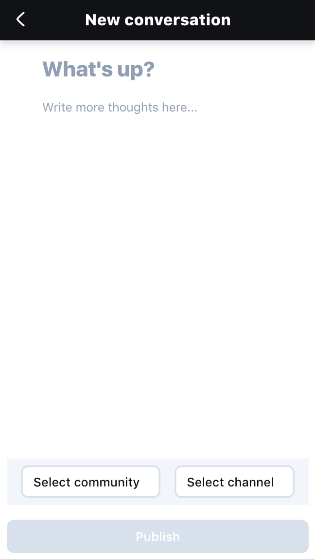
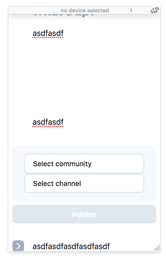
It also looks like this is fairly broken on mobile - the thread content has some overflow issues, the composer doesn't take up the full height of the view, and there doesn't seem to be a way to leave the composer on mobile. |
|
@brianlovin tried fixing the mobile screen discrepancies, can you please review and let me know your feedback on the same. Sorry for the large screenshot below tried reducing the size but could not Regards |
|
@mxstbr, @brianlovin , @littleStudent and @dev-drprasad , can you please review PR once and let me know if any further changes are needed |
|
Sorry for the super slow reply here @bishwenduk029, I'm taking a look now! |
|
This is actually looking great, not sure why we haven't shipped this yet! Thanks so much @bishwenduk029 🙏 I've got one tiny nit that I'm going to look at before merging this:
|
|
Actually, this also has some pretty big issues on mobile: Not sure how to best resolve this, any ideas @brianlovin? |
|
It looks like this branch just needs some work on mobile to flow the content and actions properly. I haven't had much time to put thought into this design though, sorry. |
|
We've made a lot of improvements to this with #4575, so going to close this as it's a bit stale. Always room for mobile ux improvements though :) |
Status
Ready for Review
hyperion (frontend) I am not sure on this, but I did made changes so I think this may be needed
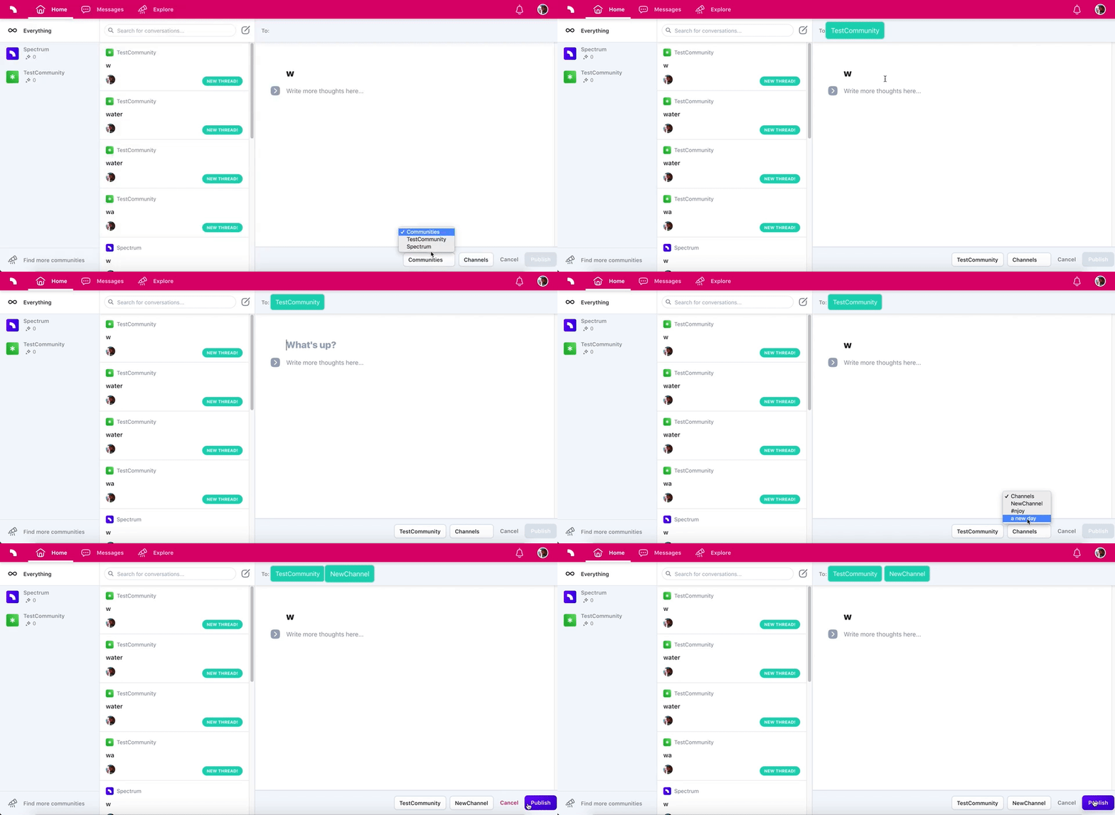
I created this pull request to be sure that I am coding the fix correctly, so if someone could please review and give any feedback, would be great. Thanks You.
closes #2872