icon brainstorming #21
Comments
|
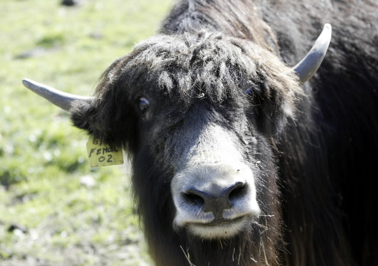
In my mind it's a big Yak face staring out at you. |
|
@rhoconlinux there is a guy working on an icon right now. he's not ready to show it to the world just yet, but i don't want anyone to start investing a lot of time in various routes. |
|
strike that. here's the work-in-progress. specifically the dude doing it is not totally happy with the colours and the relative sizes of the bubbles.
|

|
likey! Can you share the source (e.g. svg)? so I can throw some ideas or do some mods from here! :) First things that comes to my mind: I would like to put some frame on the stuff, somehow. Is me or It doesn't seem to have a squared template, but a rectangular one? |
|
I spent a few design iterations thinking about the icon. How does this look?
Additionally, we could use a single-color version:
Edit: Favicon, anyone? |


|
hahah i think it's very funny!! but it looks more like a pig than a yak. At least judging by this |
|
Cool! I like the idea of combining the commas from the Hangouts logo with a yak. But I agree that it looks more 🐖 than 🐄 at the moment. I tried something too based on @mdciotti's idea that looks more yak-ish.
I'm not very good at this 😟 Here's the SVG. |

|
here's a yak from the side (svg)
|

|
@maxkueng the one from the front is great! i think the nostrils should be a bit closer together, but otherwise perfect. we have a winner :D |
|
@algesten haha, yeah it looks funny but it doesn't really look like a real icon. Too many colors, no grid. I'm not a designr. I think @mdciotti did a better job at it. Would you be up to it, making it look more like a yak, @mdciotti? |
|
I'm playing around with the Material Design guidelines a bit. |


|
Am I going in the right direction? More abstract or more details? I'm trying to follow the Material Design outlines/grid:
|


|
Hey, didn't see that issue. I realy like your work though, especially second row, 5th column one (colored with eyes and green backrgound) |

|
+1 @Ariu 👍 |
|
@maxkueng cows are go |
|
I have to say, I'm highly partial to @Ariu's basic Y icon. I think many of the "Yak" icons are really great too, but the whole cow face seems a bit much. The simpler ones are more successful. They contribute to a more professional appearance/branding for the app. |
|
The biggest concern I have about the yak is what it looks like scaled down (say in the menu bar/tray on OSX). There are lots of details that may get muddy at a really small size. I haven't tried the new build yet so I don't know if it's in there. |
|
@randymorris you can check small and big sizes here: https://github.com/yakyak/yakyak/tree/master/src/icons |
|
@Ariu Thanks. To me it's pretty hard to distinguish at 16x16, and even at 32x32 everything sort of starts to run together. I think if I were going to use the yak as the logo I would consider maybe using a version with less detail for smaller sizes. In particular, I think the solid green one (fourth row, fourth column) would look great at any size, but would be a good choice as a simplification at smaller sizes. I don't want to clutter this thread up with my opinions though so that's the last I'll say on it. |
|
for 16x16 i'd like to see just a black/white with alpha channel. 32x32 is kinda ok. |
|
Dang... I liked the YakYak yak... complete with single-quote-nostrils irony |
|
I liked it too, but it was too much different from the new style. I tried to keep it for a while when i was testing but it was too much distonic so i decided to change it (I actually just used the one that was in the new-ui pull request). Maybe the yak, with some gradient/shadow eye-candyness would work better.. |
|
But if most people prefer the old one I can revert to it. Maybe tomorrow i can make a pre-release with the new UI and the old icon for you to try and we can gather feedback here
|

|
Drawing the yak was probably my biggest Inkscape adventure. I'm not really a designer and I learned a lot doing it. It's a bit sad that it had to go. But I had fun doing it and I also like the new "Y" icon. The new icon no doubt fits better with the new design and colors.
Bye bye YakYak yak 👋 |

|
But just ignoring all criticism doesn't make a design perfect. |
|
I feel very honored that people like my yak though 😻 |
|
@maxkueng not all criticism is valid though. it may not have to work on a dark background. you could just frame it in something lighter. always. but yes. i do love the yak ;) |
|
@maxkueng dunno, maybe @dliscomb will explicit his idea. I'd say, just try some green gradient, such as http://www.colorzilla.com/gradient-editor/#0f9d58+0,0b6e3e+100 |
|
many thanks, @arnriu, both for the full-size 'System Preferences' and for the gradient. Combine the two, and you have what I was trying to convey. I was trying to find a compromise that would address the concerns, but to paraphrase @algesten, that will end up being... a compromise. I love that OSS has the freedom to be different. I have a pronounced contrarian streak, and so I find the 'Y' too derivative. Regardless, I won't stop using YakYak regardless of the icon. Many thanks to all the committers, and to those who contribute their viewpoints to this particular discussion! (hmmm... maybe if the YakYak was blonde... :D ) |
|
I like how the current yak's (full size) horns seem to change when the icon is highlighted (via command tab). |
|
fwiw, atom's icon is a black rectangle, but there is a fine edge around the rectangle to highlight it. Thus, against a light background, the edge 'disappears', but against a dark background it serves to make the rectangle 'pop'. |

|
Hey everyone, please go and vote for which icon you want over in #249! |
|
The icon proposed in #265 is pretty cool, have you guys seen it? |
|
Yeap... according to the voting process should be #249 right? :) |
|
@davibe What work specifically do you think needs to be done? or do you not know specifics, just a vague understanding of what needs to be done? |
|
@davibe would be useful to know what "needs work". |
|
Any chance we could get a description? I would be happy to make the changes
an icon with the changes.
|
|
Idea / suggestion (submitted in #308 before I saw this - should have searched, sorry).
SVGs, zipped: Public domain. I suck at Inkscape, so if anybody knows a way to make them better then please do! |


|
More fiddles.
Wtih zipped SVG. |


|
More ideas back on #308 but I liked this one:
|

|
haha, for some reason i see a sad pacmam instead of the yak |
|
ROFL that's 2 iconic references! Here's another fiddle...
|


|
Ok! @davibe I will work on this ASAP. |
|
This issue has been automatically marked as stale because it has not had recent activity. It will be closed if no further activity occurs. Thank you for your contributions. |
Hi guys, I'm in for the icon design. We can start throwing ideas here so I may find some directions on how to build the first proposals.
If you don't have any premises, I can start with something. Just let me know. :)
The text was updated successfully, but these errors were encountered: