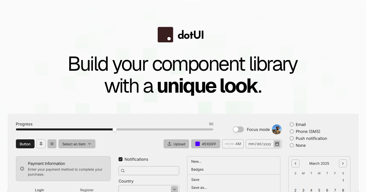
dotUI helps you quickly build a component library with a unique style.
- You can start by choosing or creating your style
- Init the foundations
npx shadcn@latest init https://dotui.org/r/{styleName}/base- Add any component
npx shadcn@latest add https://dotui.org/r/{styleName}/button- React 19
- Tailwind CSS 4.0
- Typescript
shadcn-ui gives you a starting point to create your component library, but this starting point is the same for everyone.
dotUI gives you a custom starting point based on the style you've chosen or created.
- We use react-aria-components instead of radix-ui.
- We use tailwind-variants instead of cva.
- The color system is based on 6 color scales (neutral, accent, warning, info, danger and success).
- All components offers the posssibility to use composition or not.
We’d love your contributions! See the contribution guide to share your ideas, refinements, and innovations.
Join our Discord community to discuss and collaborate.
Distributed under the MIT License. See LICENSE for more information.