⚡️ Simple yet powerful drag-and-drop for React and Vanilla JS ⚡️
Snapdrag is an alternative vision of how drag-and-drop should be done in React - simple, intuitive, and performant. With just two hooks and an overlay component you can build rich drag-and-drop interactions - starting from simple squares, ending with scrollable and sortable multi-lists.
Snapdrag is built on top of snapdrag/core, a universal building block that works with any framework or vanilla JavaScript.
- 🚀 Minimal, modern API: just two hooks and one overlay component
- 🎛️ Full control: granular event callbacks for every drag stage
- 🔄 Two-way data flow: draggables and droppables exchange data seamlessly
- 🗂️ Multiple drop targets: supports overlapping and nested zones
- 🔌 Plugins system: easily extend functionality
- 🛑 No HTML5 DnD: consistent, reliable behavior across browsers
- ⚡️ Built for performance and extensibility
import { useDraggable, useDroppable, Overlay } from "snapdrag";
import "./styles.css";

const App = () => {
  const { draggable } = useDraggable({
    kind: "SQUARE",
    data: { color: "red" },
    move: true,
  });

  const { droppable } = useDroppable({
    accepts: "SQUARE",
    onDrop({ data }) {
      alert(`Dropped ${data.color} square`);
    },
  });

  return (
    <div className="app">
      <div className="absolute left-100">
        {draggable(<div className="square red">Drag me</div>)}
      </div>
      <div className="absolute left-300">
        {droppable(<div className="square green">Drop on me</div>)}
      </div>
      <Overlay />
    </div>
  );
};
Result:
- Installation
- Basic Concepts
- Quick Start Example
- How Snapdrag Works
- Core Components
- Draggable Lifecycle
- Droppable Lifecycle
- Common Patterns
- Examples
- API Reference
- Plugins
- Browser Compatibility
- License
- Author
# npm
npm install --save snapdrag

# yarn
yarn add snapdragSnapdrag is built around three core components:
useDraggable- A hook that makes any React element draggableuseDroppable- A hook that makes any React element a potential drop targetOverlay- A component that renders the dragged element during drag operations
The fundamental relationship works like this:
- Each draggable has a
kind(like "CARD" or "ITEM") that identifies what type of element it is - Each droppable specifies what
kinditacceptsthrough its configuration - They exchange
dataduring interactions, allowing for rich behaviors and communication
When a draggable is over a compatible droppable, they can exchange information. This unlocks dynamic behaviors such as highlighting, sorting, or visually transforming elements based on the ongoing interaction.
Here is more comprehensive example that demonstrate the lifecycle of draggable and droppable items. Usually you need to use only subset of that, but we will show almost every callback for clarity.
DraggableSquare.tsx
import { useState } from "react";
import { useDraggable } from "snapdrag";

export const DraggableSquare = ({ color }: { color: string }) => {
  const [text, setText] = useState("Drag me");
  const { draggable, isDragging } = useDraggable({
    kind: "SQUARE",
    data: { color },
    move: true,
    // Callbacks are totally optional
    onDragStart({ data }) {
      // data is the own data of the draggable
      setText(`Dragging ${data.color}`);
    },
    onDragMove({ dropTargets }) {
      // Check if there are any drop targets under the pointer
      if (dropTargets.length > 0) {
        // Update the text based on the first drop target color
        setText(`Over ${dropTargets[0].data.color}`);
      } else {
        setText("Dragging...");
      }
    },
    onDragEnd({ dropTargets }) {
      // Check if the draggable was dropped on a valid target
      if (dropTargets.length > 0) {
        setText(`Dropped on ${dropTargets[0].data.color}`);
      } else {
        setText("Drag me");
      }
    },
  });

  const opacity = isDragging ? 0.5 : 1;

  return draggable(
    <div className="square draggable" style={{ backgroundColor: color, opacity }}>
      {text}
    </div>
  );
};
DroppableSquare.tsx
import { useState } from "react";
import { useDroppable } from "snapdrag";

export const DroppableSquare = ({ color }: { color: string }) => {
  const [text, setText] = useState("Drop here");

  const { droppable } = useDroppable({
    accepts: "SQUARE",
    data: { color },
    // Optional callbacks
    onDragIn({ data }) {
      // Some draggable is hovering over this droppable
      // data is the data of the draggable
      setText(`Hovered over ${data.color}`);
    },
    onDragOut() {
      // The draggable is no longer hovering over this droppable
      setText("Drop here");
    },
    onDrop({ data }) {
      // Finally, the draggable is dropped on this droppable
      setText(`Dropped ${data.color}`);
    },
  });

  return droppable(
    <div className="square droppable" style={{ backgroundColor: color }}>
      {text}
    </div>
  );
};
App.tsx
import { Overlay } from "snapdrag";

export default function App() {
  return (
    <div className="app relative">
      {/* Just two squares for simplicity */}
      <div className="absolute top-100 left-100">
        <DraggableSquare color="red" />
      </div>
      <div className="absolute top-100 left-300">
        <DroppableSquare color="green" />
      </div>

      {/* Render overlay to show the dragged component */}
      <Overlay />
    </div>
  );
}
This example on CodeSandbox
Under the hood, Snapdrag takes a different approach than traditional drag-and-drop libraries:
- Event Listening: Snapdrag attaches a
pointerdownevent listener to draggable elements - Tracking Movement: Once triggered, it tracks
pointermoveevents on the document untilpointerupoccurs - Finding Targets: On every move, it uses
document.elementsFromPoint()to check what elements are under the cursor - Target Handling: It then determines which droppable elements are valid targets and manages the interaction
- Event Firing: Appropriate callbacks are fired based on the current state of the drag operation
Unlike HTML5 drag-and-drop which has limited customization options, Snapdrag gives you control over every aspect of the drag experience.
You can change settings of draggable and droppable at any time during the drag operation, making Snapdrag extremely flexible. Want to dynamically change what a draggable can do based on its current position? No problem!
The useDraggable hook makes any React element draggable. It returns an object with two properties:
draggable: A function that wraps your component, making it draggableisDragging: A boolean indicating if the element is currently being dragged
Basic usage:
const DraggableItem = () => {
  const { draggable, isDragging } = useDraggable({
    kind: "ITEM", // Required: identifies this draggable type
    data: { id: "123" }, // Optional: data to share during drag operations
    move: true, // Optional: move vs clone during dragging
  });

  return draggable(<div className={isDragging ? "dragging" : ""}>Drag me!</div>);
};
Important Note: The wrapped component must accept a ref to the DOM node to be draggable. If you already have a ref, Snapdrag will handle it correctly:
const myRef = useRef(null);

const { draggable } = useDraggable({
  kind: "ITEM",
});

// Both refs work correctly
return draggable(<div ref={myRef} />);
You can even make an element both draggable and droppable:
const { draggable } = useDraggable({ kind: "ITEM" });
const { droppable } = useDroppable({ accepts: "ITEM" });

// Combine the wrappers (order doesn't matter)
return draggable(droppable(<div>I'm both!</div>));The useDroppable hook makes any React element a potential drop target. It returns:
droppable: A function that wraps your component, making it a drop targethovered: Data about the draggable currently hovering over this element (ornullif none)
Basic usage:
const DropZone = () => {
  const { droppable, hovered } = useDroppable({
    accepts: "ITEM", // Required: which draggable kinds to accept
    data: { zone: "main" }, // Optional: data to share with draggables
    onDrop({ data }) {
      // Optional: handle successful drops
      console.log("Dropped item:", data.id);
    },
  });

  // Change appearance when being hovered
  const isHovered = Boolean(hovered);

  return droppable(<div className={isHovered ? "drop-zone hovered" : "drop-zone"}>Drop here</div>);
};The Overlay component renders the currently dragged element. It should be included once in your application:
import { Overlay } from "snapdrag";

function App() {
  return (
    <div>
      {/* Your app content */}
      <YourDraggableComponents />

      {/* Required: Shows the dragged element */}
      <Overlay className="your-class" style={someStyles} />
    </div>
  );
}
You can add your own classes and styles to the overlay to make it fit your application.
The draggable component goes through a lifecycle during drag interactions, with callbacks at each stage.
Called when the drag operation begins (after the user clicks and begins moving, and after shouldDrag if provided, returns true):
const { draggable } = useDraggable({
  kind: "CARD",
  onDragStart({ data, event, dragStartEvent, element }) {
    console.log("Started dragging card:", data.id);
    // Setup any state needed during dragging
  },
});
The callback receives an object with the following properties:
data: The draggable's data (from thedataconfig option ofuseDraggable).event: ThePointerEventthat triggered the drag start (usually the firstpointermoveafterpointerdownandshouldDragvalidation).dragStartEvent: The initialPointerEventfrompointerdownthat initiated the drag attempt.element: The DOM element that is being dragged (this is the element rendered in theOverlay).
Called on every pointer movement during dragging:
const { draggable } = useDraggable({
  kind: "CARD",
  onDragMove({ dropTargets, top, left, data, event, dragStartEvent, element }) {
    // dropTargets contains info about all drop targets under the pointer
    if (dropTargets.length > 0) {
      console.log("Over drop zone:", dropTargets[0].data.zone);
    }

    // top and left are the screen coordinates of the draggable
    console.log(`Position: ${left}px, ${top}px`);
  },
});
In addition to the properties from onDragStart (data, dragStartEvent, element), this callback receives:
event: The currentPointerEventfrom thepointermovehandler.dropTargets: An array of objects, each representing a droppable target currently under the pointer. Each object contains:data: Thedataassociated with the droppable (from itsuseDroppableconfiguration).element: The DOM element of the droppable.
top: The calculated top screen coordinate of the draggable element in the overlay.left: The calculated left screen coordinate of the draggable element in the overlay.
Note: This callback is called frequently, so avoid expensive operations here.
Called when the drag operation completes (on pointerup):
const { draggable } = useDraggable({
  kind: "CARD",
  onDragEnd({ dropTargets, top, left, data, event, dragStartEvent, element }) {
    if (dropTargets.length > 0) {
      console.log("Dropped on:", dropTargets[0].data.zone);
    } else {
      console.log("Dropped outside of any drop zone");
      // Handle "cancel" logic
    }
  },
});
Receives the same properties as onDragMove (data, event, dragStartEvent, element, dropTargets, top, left).
If the user dropped the element on valid drop targets, dropTargets will contain them; otherwise, it will be an empty array.
The top and left coordinates represent the final position of the draggable in the overlay just before it's hidden.
The droppable component also has lifecycle events during drag interactions. All droppable callbacks receive a dropTargets array, similar to the one in useDraggable's onDragMove and onDragEnd, representing all droppables currently under the pointer.
Called when a draggable first enters this drop target:
const { droppable } = useDroppable({
  accepts: "CARD",
  onDragIn({ kind, data, event, element, dropElement, dropTargets }) {
    console.log(`${kind} entered drop zone`);
    // Change appearance, update state, etc.
  },
});
The callback receives an object with:
kind: Thekindof the draggable that entered.data: Thedatafrom the draggable.event: The currentPointerEventfrom thepointermovehandler.element: The DOM element of the draggable.dropElement: The DOM element of this droppable.dropTargets: Array of all active drop targets under the pointer, including the current one. Each entry contains:data: Thedatafrom the droppable (from itsuseDroppableconfiguration).element: The DOM element of the droppable.
This is called once when a draggable enters and can be used to trigger animations or state changes.
Called as a draggable moves within the drop target:
const { droppable } = useDroppable({
  accepts: "CARD",
  onDragMove({ kind, data, event, element, dropElement, dropTargets }) {
    // Calculate position within the drop zone
    const rect = dropElement.getBoundingClientRect();
    const x = event.clientX - rect.left;
    const y = event.clientY - rect.top;

    console.log(`Position in drop zone: ${x}px, ${y}px`);
  },
});
Receives the same properties as onDragIn. Like the draggable version, this is called frequently, so keep operations light. This is perfect for creating dynamic visual cues like highlighting different sections of your drop zone based on cursor position.
Called when a draggable leaves the drop target:
const { droppable } = useDroppable({
  accepts: "CARD",
  onDragOut({ kind, data, event, element, dropElement, dropTargets }) {
    console.log(`${kind} left drop zone`);
    // Revert animations, update state, etc.
  },
});
Receives the same properties as onDragIn. This is typically used to undo changes made in onDragIn. Use it to clean up and reset any visual changes you made when the draggable entered.
Called when a draggable is successfully dropped on this target:
const { droppable } = useDroppable({
  accepts: "CARD",
  onDrop({ kind, data, event, element, dropElement, dropTargets }) {
    console.log(`${kind} was dropped with data:`, data);
    // Handle the dropped item
  },
});
Receives the same properties as onDragIn. This is where you implement the main logic for what happens when a drop succeeds. Update your application state, save the new position, or trigger any other business logic related to the completed drag operation.
Snapdrag makes it simple for draggables and droppables to talk to each other by exchanging data in both directions:
// Draggable component accessing droppable data
const { draggable } = useDraggable({
  kind: "CARD",
  data: { id: "card-1", color: "red" },
  onDragMove({ dropTargets }) {
    if (dropTargets.length > 0) {
      // Read data from the drop zone underneath
      const dropZoneType = dropTargets[0].data.type;
      console.log(`Over ${dropZoneType} zone`);
    }
  },
});

// Droppable component accessing draggable data
const { droppable, hovered } = useDroppable({
  accepts: "CARD",
  data: { type: "inbox" },
  onDragIn({ data }) {
    console.log(`Card ${data.id} entered inbox`);
  },
});
This pattern is especially useful for adapting the UI based on the interaction context.
Here's how to create a draggable that changes color based on the droppable it's over:
// In DraggableSquare.tsx
import { useState } from "react";
import { useDraggable } from "snapdrag";

export const DraggableSquare = ({ color: initialColor }) => {
  const [color, setColor] = useState(initialColor);

  const { draggable, isDragging } = useDraggable({
    kind: "SQUARE",
    data: { color },
    move: true,
    onDragMove({ dropTargets }) {
      if (dropTargets.length) {
        setColor(dropTargets[0].data.color);
      } else {
        setColor(initialColor);
      }
    },
    onDragEnd() {
      setColor(initialColor); // Reset on drop
    },
  });

  return draggable(
    <div
      className="square"
      style={{
        backgroundColor: color,
        opacity: isDragging ? 0.9 : 1,
      }}
    >
      {isDragging ? "Dragging" : "Drag me"}
    </div>
  );
};

// In DroppableSquare.tsx
import { useDroppable } from "snapdrag";

export const DroppableSquare = ({ color }) => {
  const [text, setText] = useState("Drop here");

  const { droppable } = useDroppable({
    accepts: "SQUARE",
    data: { color }, // Share this color with draggables
    onDrop({ data }) {
      setText(`Dropped ${data.color}`);
    },
  });

  return droppable(
    <div className="square" style={{ backgroundColor: color }}>
      {text}
    </div>
  );
};This example shows how to create a visual indication of where an item will be dropped:
import { useState } from "react";
import { useDroppable } from "snapdrag";

export const DroppableSquare = ({ color }) => {
  const [text, setText] = useState("Drop here");
  const [borderPosition, setBorderPosition] = useState("");

  const { droppable } = useDroppable({
    accepts: "SQUARE",
    onDragMove({ event, dropElement }) {
      // Calculate which quadrant of the square the pointer is in
      const { top, left, height } = dropElement.getBoundingClientRect();
      const x = event.clientX - left;
      const y = event.clientY - top;

      // Set border on the appropriate side
      if (x / y < 1.0) {
        if (x / (height - y) < 1.0) {
          setBorderPosition("borderLeft");
        } else {
          setBorderPosition("borderBottom");
        }
      } else {
        if (x / (height - y) < 1.0) {
          setBorderPosition("borderTop");
        } else {
          setBorderPosition("borderRight");
        }
      }
    },
    onDragOut() {
      setBorderPosition(""); // Remove border when draggable leaves
    },
    onDrop({ data }) {
      setText(`Dropped ${data.color}`);
      setBorderPosition(""); // Remove border after drop
    },
  });

  // Add border to appropriate side
  const style = {
    backgroundColor: color,
    [borderPosition]: "10px solid red",
  };

  return droppable(
    <div className="square" style={style}>
      {text}
    </div>
  );
};Snapdrag handles the case where multiple drop targets overlap:
const { draggable } = useDraggable({
  kind: "ITEM",
  onDragMove({ dropTargets }) {
    // Sort by order to find the topmost
    const sorted = [...dropTargets].sort((a, b) => b.data.order - a.data.order);

    if (sorted.length) {
      console.log(`Topmost target: ${sorted[0].data.name}`);
    }
  },
});

// ... somewere in your code

const { droppable } = useDroppable({
  accepts: "ITEM",
  data: { order: 10 },
});
You also can you DOM elements to get the topmost drop target:
const { draggable } = useDraggable({
  kind: "ITEM",
  onDragMove({ dropTargets }) {
    // Sort by order to find the topmost

    const sorted = [...dropTargets].sort((a, b) => {
      // access drop target element instead of data
      const aIndex = a.element.getComputedStyle().zIndex || 0;
      const bIndex = b.element.getComputedStyle().zIndex || 0;

      return bIndex - aIndex;
    });

    if (sorted.length) {
      console.log(`Topmost target: ${sorted[0].data.name}`);
    }
  },
});For finer control, you can start dragging only after the pointer has moved a certain distance:
const { draggable } = useDraggable({
  kind: "ITEM",
  shouldDrag({ event, dragStartEvent }) {
    // Calculate distance from start position
    const dx = event.clientX - dragStartEvent.clientX;
    const dy = event.clientY - dragStartEvent.clientY;
    const distance = Math.sqrt(dx * dx + dy * dy);

    // Only start dragging after moving 5px
    return distance > 5;
  },
});Snapdrag supports touch events out of the box. It uses PointerEvent to handle both mouse and touch interactions seamlessly. You can use the same API for both types of events.
To make your draggable elements touch-friendly, ensure they are touchable (e.g., using touch-action: none in CSS). The container can have touch-action: pan-x or touch-action: pan-y to allow scrolling while dragging.
Snapdrag includes several examples that demonstrate its capabilities, from simple to complex use cases.
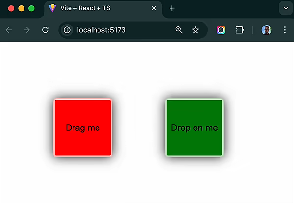
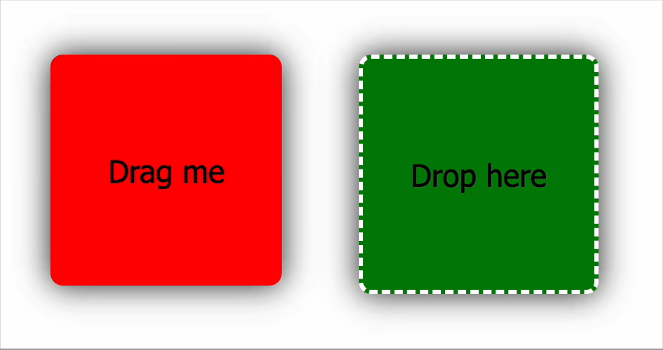
The simplest example shows dragging a colored square onto a drop target:
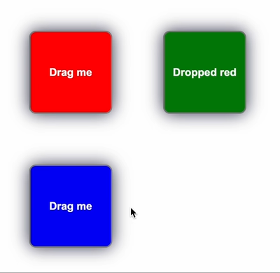
This demonstrates the fundamentals of drag-and-drop with Snapdrag:
- Defining a draggable with
kindanddata - Creating a drop target that
acceptsthe draggable - Handling the
onDropevent
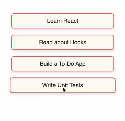
A sortable list where items can be reordered by dragging:
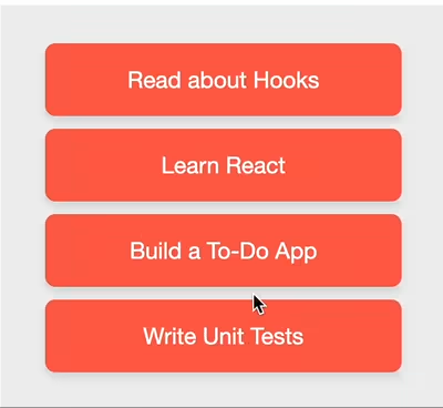
This example demonstrates:
- Using data to identify list items
- Visual feedback during dragging (blue insertion line)
- Reordering items in a state array on drop
A more sophisticated list with smooth animations:
This example showcases:
- CSS transitions for smooth animations
- A special drop area for appending items to the end
- Animated placeholders that create space for dropped items
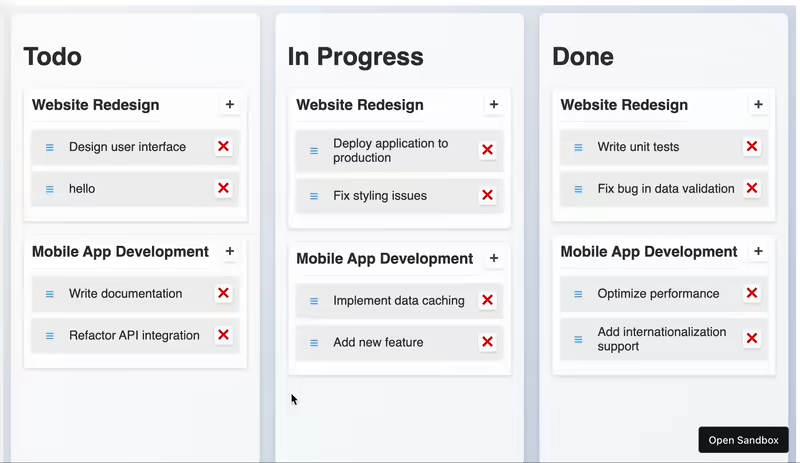
A full kanban board with multiple columns and draggable cards:
This complex example demonstrates advanced features:
- Multiple drop targets with different behaviors
- Conditional acceptance of draggables
- Smooth animations during drag operations
- Two-way data exchange between components
- Touch support with drag threshold
- Item addition and removal
All this is achieved in just about 200 lines of code (excluding state management and styling).
The useDraggable hook accepts a configuration object with these options:
| Option | Type | Description |
|---|---|---|
kind |
string or symbol |
Required. Identifies this draggable type |
data |
object or function |
Data to share with droppables. Can be a static object or a function that returns data |
disabled |
boolean |
When true, disables dragging functionality |
move |
boolean |
When true, moves the component instead of cloning it to the overlay |
component |
function |
Provides a custom component to show while dragging |
placeholder |
function |
Custom component to show in place of the dragged item |
offset |
object or function |
Controls positioning relative to cursor |
Event Callbacks:
| Callback | Description |
|---|---|
shouldDrag |
Function determining if dragging should start. Must return true or false |
onDragStart |
Called when drag begins |
onDragMove |
Called on every pointer move while dragging |
onDragEnd |
Called when dragging ends |
Defines the type of the draggable. It must be a unique string or symbol.
const { draggable } = useDraggable({
  kind: "SQUARE", // Identify this as a "SQUARE" type
});Data associated with the draggable. It can be a static object or a function that returns an object:
// Static object
const { draggable } = useDraggable({
  kind: "SQUARE",
  data: { color: "red", id: "square-1" },
});

// Function (calculated at drag start)
const { draggable } = useDraggable({
  kind: "SQUARE",
  data: ({ dragElement, dragStartEvent }) => ({
    id: dragElement.id,
    position: { x: dragStartEvent.clientX, y: dragStartEvent.clientY },
  }),
});When true, temporarily disables dragging:
const { draggable } = useDraggable({
  kind: "SQUARE",
  disabled: !canDrag, // Disable based on some condition
});When true, the original component is moved during dragging instead of creating a clone:
const { draggable } = useDraggable({
  kind: "SQUARE",
  move: true, // Move the actual component
});
Note: If move is false (default), the component is cloned to the overlay layer while the original stays in place. The original component won't receive prop updates during dragging.
A function that returns a custom component to be shown during dragging:
const { draggable } = useDraggable({
  kind: "SQUARE",
  component: ({ data, props }) => <Square color={data.color} style={{ opacity: 0.8 }} />,
});A function that returns a component to be shown in place of the dragged item:
const { draggable } = useDraggable({
  kind: "SQUARE",
  placeholder: ({ data, props }) => <Square color="gray" style={{ opacity: 0.4 }} />,
});
When specified, the move option is ignored.
Controls the offset of the dragging component relative to the cursor:
// Static offset
const { draggable } = useDraggable({
  kind: "SQUARE",
  offset: { top: 10, left: 10 }, // 10px down and right from cursor
});

// Dynamic offset
const { draggable } = useDraggable({
  kind: "SQUARE",
  offset: ({ element, event, data }) => {
    // Calculate based on event or element position
    return { top: 0, left: 0 };
  },
});
If not specified, the offset is calculated to maintain the element's initial position relative to the cursor.
Function that determines if dragging should start. It's called on every pointer move until it returns true or the drag attempt ends:
const { draggable } = useDraggable({
  kind: "SQUARE",
  shouldDrag: ({ event, dragStartEvent, element, data }) => {
    // Only drag if shifted 10px horizontally
    return Math.abs(event.clientX - dragStartEvent.clientX) > 10;
  },
});Called when dragging begins (after shouldDrag returns true):
const { draggable } = useDraggable({
  kind: "SQUARE",
  onDragStart: ({ event, dragStartEvent, element, data }) => {
    console.log("Drag started at:", event.clientX, event.clientY);
    // Setup any initial state needed during drag
  },
});Called on every pointer move during dragging:
const { draggable } = useDraggable({
  kind: "SQUARE",
  onDragMove: ({ event, dragStartEvent, element, data, dropTargets, top, left }) => {
    // Current drop targets under the pointer
    if (dropTargets.length) {
      console.log("Over drop zone:", dropTargets[0].data.name);
    }

    // Current position of the draggable
    console.log("Position:", top, left);
  },
});
The dropTargets array contains information about all current drop targets under the cursor. Each entry has data (from the droppable's configuration) and element (the DOM element).
Called when dragging ends:
const { draggable } = useDraggable({
  kind: "SQUARE",
  onDragEnd: ({ event, dragStartEvent, element, data, dropTargets }) => {
    if (dropTargets.length) {
      console.log("Dropped on:", dropTargets[0].data.name);
    } else {
      console.log("Dropped outside any drop target");
      // Handle "cancel" case
    }
  },
});The useDroppable hook accepts a configuration object with these options:
| Option | Type | Description |
|---|---|---|
accepts |
string, symbol, array, or function |
Required. What draggable kinds to accept |
data |
object |
Data to share with draggables |
disabled |
boolean |
When true, disables dropping |
Event Callbacks:
| Callback | Description |
|---|---|
onDragIn |
Called when a draggable enters this droppable |
onDragOut |
Called when a draggable leaves this droppable |
onDragMove |
Called when a draggable moves within this droppable |
onDrop |
Called when a draggable is dropped on this droppable |
Defines what kinds of draggables this drop target can accept:
// Accept a single kind
const { droppable } = useDroppable({
  accepts: "SQUARE",
});

// Accept multiple kinds
const { droppable } = useDroppable({
  accepts: ["SQUARE", "CIRCLE"],
});

// Use a function for more complex logic
const { droppable } = useDroppable({
  accepts: ({ kind, data }) => {
    // Check both kind and data to determine acceptance
    return kind === "SQUARE" && data.color === "red";
  },
});Data associated with the droppable area:
const { droppable } = useDroppable({
  accepts: "SQUARE",
  data: {
    zoneId: "dropzone-1",
    capacity: 5,
    color: "blue",
  },
});
This data is accessible to draggables through the dropTargets array in their callbacks.
When true, temporarily disables dropping:
const { droppable } = useDroppable({
  accepts: "SQUARE",
  disabled: isFull, // Disable based on some condition
});Called when a draggable of an accepted kind first enters this drop target:
const { droppable } = useDroppable({
  accepts: "SQUARE",
  onDragIn: ({ kind, data, event, element, dropElement, dropTargets }) => {
    console.log(`${kind} entered with data:`, data);
    // Change appearance, play sound, etc.
  },
});
Arguments:
kind- The kind of the draggabledata- The data from the draggableevent- The current pointer eventelement- The draggable elementdropElement- The droppable elementdropTargets- Array of all current drop targets under the pointer
Called when a draggable leaves this drop target:
const { droppable } = useDroppable({
  accepts: "SQUARE",
  onDragOut: ({ kind, data, event, element, dropElement, dropTargets }) => {
    console.log(`${kind} left the drop zone`);
    // Revert appearance changes, etc.
  },
});
Arguments are the same as onDragIn.
Called when a draggable moves within this drop target:
const { droppable } = useDroppable({
  accepts: "SQUARE",
  onDragMove: ({ kind, data, event, element, dropElement, dropTargets }) => {
    // Calculate position within drop zone
    const rect = dropElement.getBoundingClientRect();
    const relativeX = event.clientX - rect.left;
    const relativeY = event.clientY - rect.top;

    console.log(`Position in zone: ${relativeX}px, ${relativeY}px`);
  },
});
Arguments are the same as onDragIn.
Called when a draggable is dropped on this target:
const { droppable } = useDroppable({
  accepts: "SQUARE",
  onDrop: ({ kind, data, event, element, dropElement, dropTargets }) => {
    console.log(`${kind} was dropped with data:`, data);
    // Handle the dropped item (update state, etc.)
  },
});
Arguments are the same as the other callbacks.
Snapdrag offers a plugin system to extend its core functionality. Plugins can hook into the draggable lifecycle events (onDragStart, onDragMove, onDragEnd) to add custom behaviors.
The scroller plugin automatically scrolls a container element when a dragged item approaches its edges. This is useful for large scrollable areas where users might need to drag items beyond the visible viewport.
Initialization
To use the scroller plugin, first create an instance of it by calling createScroller(config).
import { createScroller } from "snapdrag/plugins";

const scroller = createScroller({
  x: true, // Enable horizontal scrolling with default settings
  y: { threshold: 150, speed: 1000, distancePower: 2 }, // Enable vertical scrolling with custom settings
});
Configuration Options (ScrollerConfig)
x: (Optional) Enables or configures horizontal scrolling.boolean: Iftrue, uses default settings. Iffalseor omitted, horizontal scrolling is disabled.object (AxisConfig): Allows fine-tuning of horizontal scrolling behavior:threshold(number, default:100): The distance in pixels from the container's edge at which scrolling should begin.speed(number, default:2000): The maximum scroll speed in pixels per second when the pointer is at the very edge of the container.distancePower(number, default:1.5): Controls the acceleration of scrolling as the pointer gets closer to the edge. A higher value means faster acceleration.
y: (Optional) Enables or configures vertical scrolling. Accepts the samebooleanorobject (AxisConfig)values asx.
Usage with useDraggable
Once created, the scroller instance needs to be passed to the plugins array in the useDraggable hook's configuration. The scroller function itself takes the scrollable container element as an argument.
import { useDraggable } from "snapdrag";
import { createScroller } from "snapdrag/plugins";
import { useRef, useEffect, useState } from "react";

// Initialize the scroller plugin
const scrollerPlugin = createScroller({ x: true, y: true });

const DraggableComponent = () => {
  // State to hold the container element once it's mounted
  const [scrollContainer, setScrollContainer] = useState(null);

  const { draggable } = useDraggable({
    kind: "ITEM",
    data: { id: "my-item" },
    plugins: [scrollerPlugin(scrollContainer)],
  });

  return (
    <div
      ref={setScrollContainer}
      style={{ overflow: "auto", height: "200px", width: "300px", border: "1px solid black" }}
    >
      <div style={{ height: "500px", width: "800px" }}>
        {/* Inner content larger than container */}
        {draggable(
          <div style={{ width: "100px", height: "50px", backgroundColor: "lightblue" }}>
            Drag me
          </div>
        )}
        {/* More draggable items or content here */}
      </div>
    </div>
  );
};
How it Works
- Initialization:
createScrollerreturns a new scroller function configured with your desired settings. - Plugin Attachment: When you pass
scrollerPlugin(containerElement)touseDraggable, Snapdrag calls the appropriate lifecycle methods of the plugin (onDragStart,onDragMove,onDragEnd). - Drag Monitoring: During a drag operation,
onDragMoveis continuously called. The scroller plugin checks the pointer's position relative to the specifiedcontainerElement. - Edge Detection: If the pointer moves within the
thresholddistance of an edge for an enabled axis (x or y), the plugin initiates scrolling. - Scrolling Speed: The scrolling speed increases polynomially (based on
distancePower) as the pointer gets closer to the edge, up to the maximumspeed. - Animation Loop: Scrolling is performed using
requestAnimationFramefor smooth animation. - Cleanup: When the drag ends (
onDragEnd) or the component unmounts, the plugin cleans up any active animation frames.
Important Considerations:
- The
containerElementpassed to the scroller function must be the actual scrollable DOM element. - Ensure the
containerElementhasoverflow: autooroverflow: scrollCSS properties set for the respective axes you want to enable scrolling on. - If the scrollable container is not immediately available on component mount (e.g., if its ref is populated later), you might need to conditionally apply the plugin or update it, as shown in the example using
useStateanduseEffectto pass the container element once it's available. - The plugin calculates distances based on the viewport. If your scroll container or draggable items are scaled using CSS transforms, you might need to adjust threshold and speed values accordingly or ensure pointer events are correctly mapped.
The scroller plugin offers a straightforward way to add automatic scrolling to your drag-and-drop interfaces. It significantly enhances usability, especially when users need to drag items across large, scrollable containers or overflowing content areas.
Snapdrag is compatible with all modern browsers that support Pointer Events. This includes:
- Chrome 55+
- Firefox 59+
- Safari 13.1+
- Edge 18+
Mobile devices are also supported as long as they support Pointer Events.
MIT
Eugene Daragan