
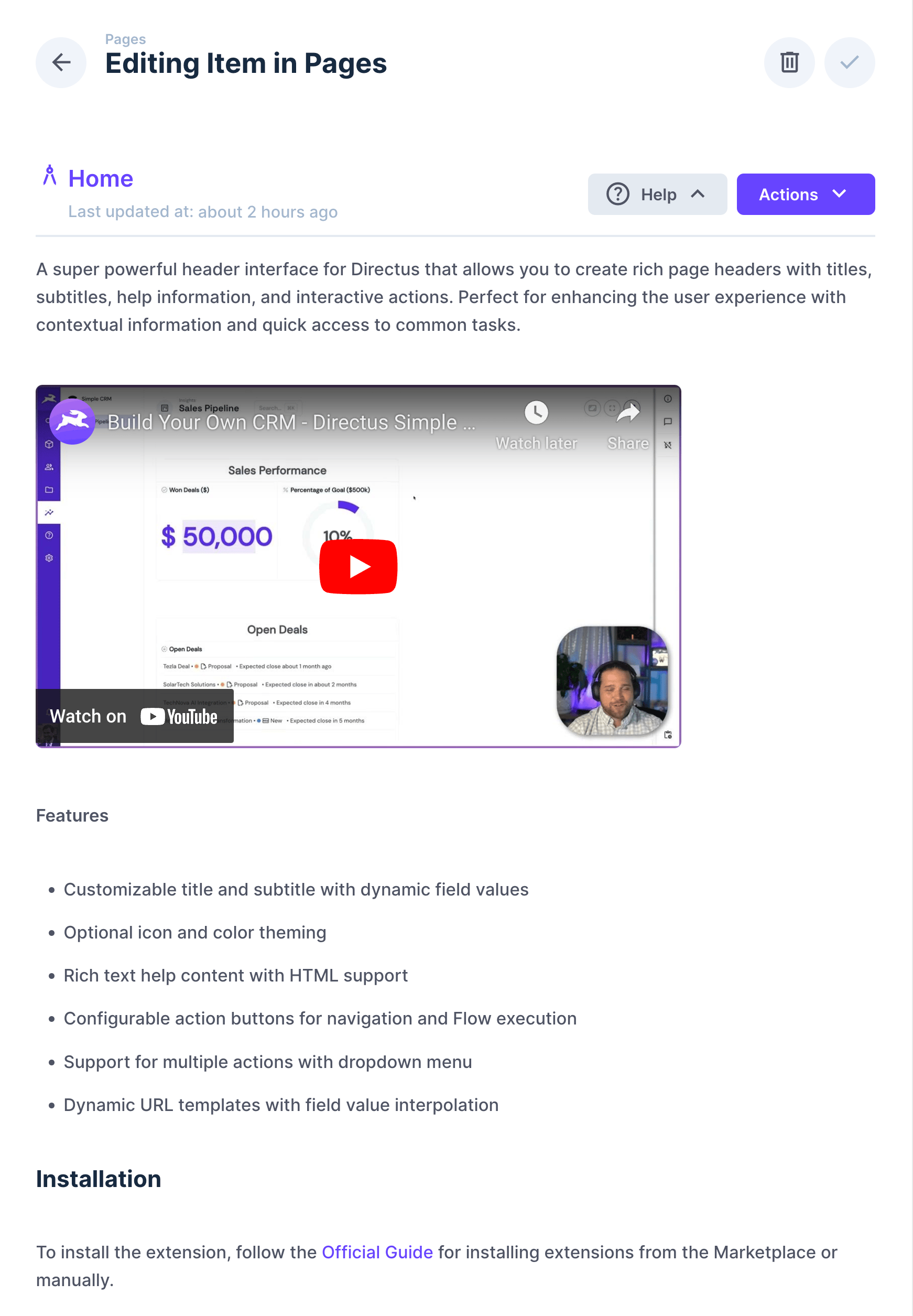
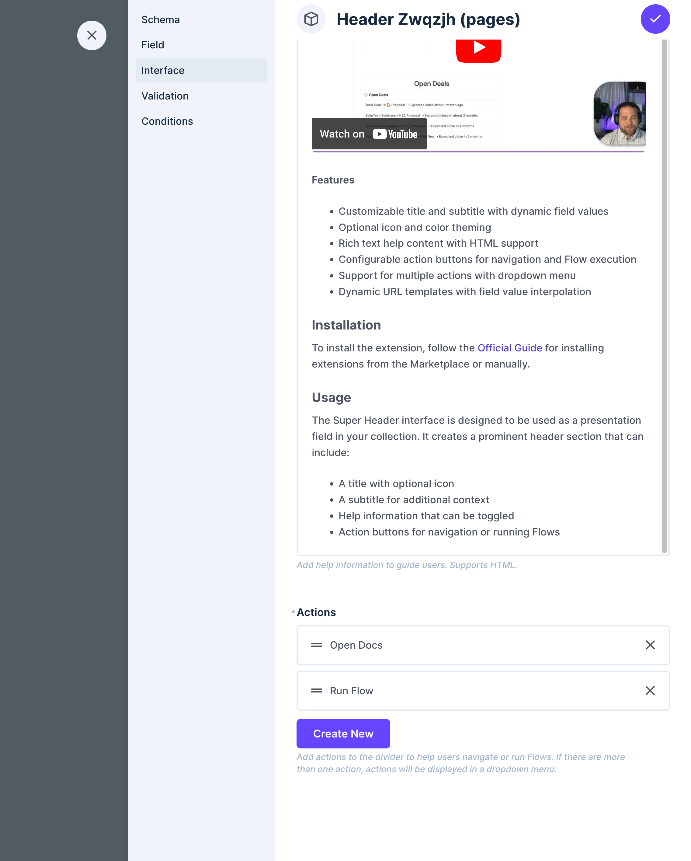
A super powerful header interface for Directus that allows you to create rich page headers with titles, subtitles, help information, and interactive actions. Perfect for enhancing the user experience with contextual information and quick access to common tasks.
Features
- Customizable title and subtitle with dynamic field values
- Optional icon and color theming
- Rich text help content with HTML support
- Configurable action buttons for navigation and DirectusFlow execution
- Support for multiple actions with dropdown menu
- Dynamic URL templates with field value interpolation

To install the extension, follow the Official Guide for installing extensions from the Marketplace or manually.
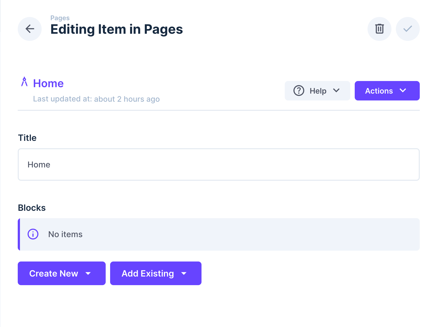
The Super Header interface is designed to be used as a presentation field in your collection. It creates a prominent header section that can include:
- A title with optional icon
- A subtitle for additional context
- Help information that can be toggled
- Action buttons for navigation or running Flows
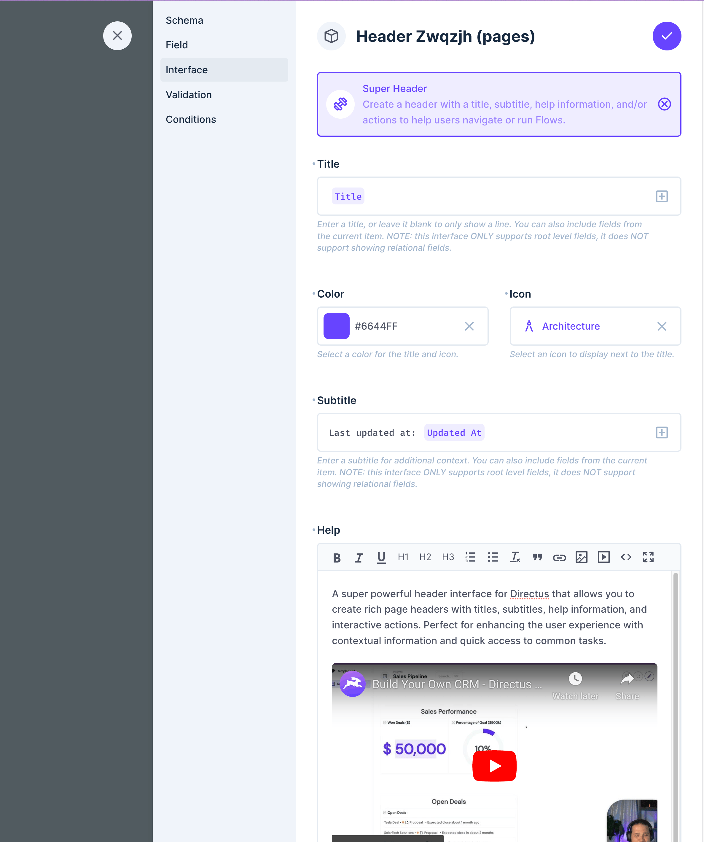
- Title - Main heading text. Supports field value templates (e.g.,
Item: {{ title }}). Only supports root-level fields. - Color - Choose a color for the title and icon
- Icon - Select an icon to display next to the title
- Subtitle - Secondary text below the title. Supports field value templates. Only supports root-level fields.
- Help - Optional help content that supports HTML formatting
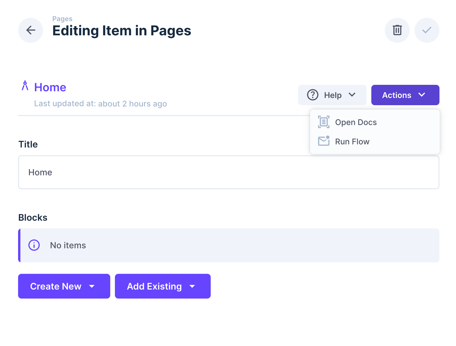
Configure buttons that appear in the header. Multiple actions will be displayed in a dropdown menu.
Each action can be configured with:
- Label - Button text (supports translations)
- Icon - Optional icon for the button
- Type - Button style:
- Primary
- Secondary
- Info
- Success
- Warning
- Danger
- Action Type - Choose between:
- Link - Navigate to a URL (supports field value templates)
- Flow - Execute a Directus Flow
- URL - For link actions, specify the destination URL. Can include field values (e.g.,
https://example.com/items/{{ id }}) - Flow - For flow actions, select the Flow to execute
- Type:
alias - Local Types:
presentation - Group:
presentation
- Field value templates only support root-level fields and do not support relational fields
- Actions with type "Flow" require appropriate permissions to execute the selected Flow
- URLs in link actions support dynamic values using mustache-style syntax (
{{ field_name }}) and only support root-level fields.