Different UX for the task completion checkbox? #219
Description
Minor UX thought: It may be confusing to users that the checkbox for completing a task is not something that the user should click. The user sees this:
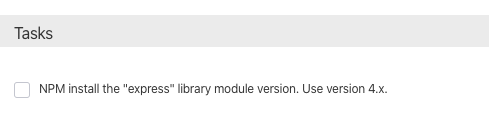
...and they may think they need to click that checkbox.
Maybe use different icons for the various task states?
Just riffing here - Maybe something like:
User hasn't completed task yet:
🟠 NPM install the "express" library module version. Use version 4.x.
Task completed correctly:
🟢 NPM install the "express" library module version. Use version 4.x.
Task failed:
🔴 NPM install the "express" library module version. Use version 4.x.
Activity