


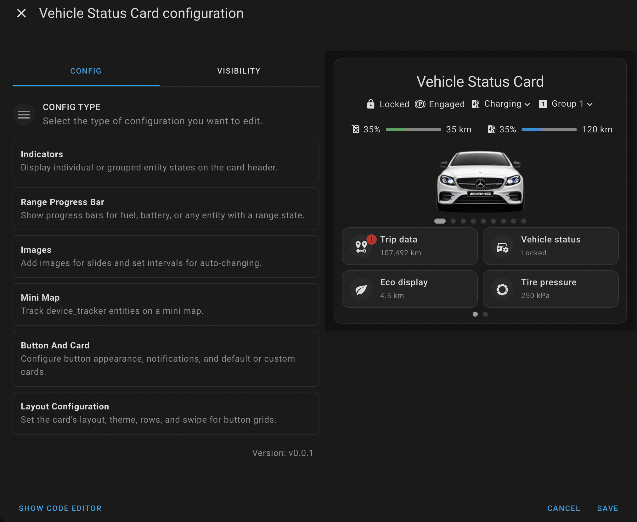
This is a custom Home Assistant card designed to display detailed status information about vehicles. It provides several features such as indicators, range progress bars, buttons for interacting with the vehicle's entities, and a mini map to track devices. The card is highly customizable with options to display various types of data and layouts.
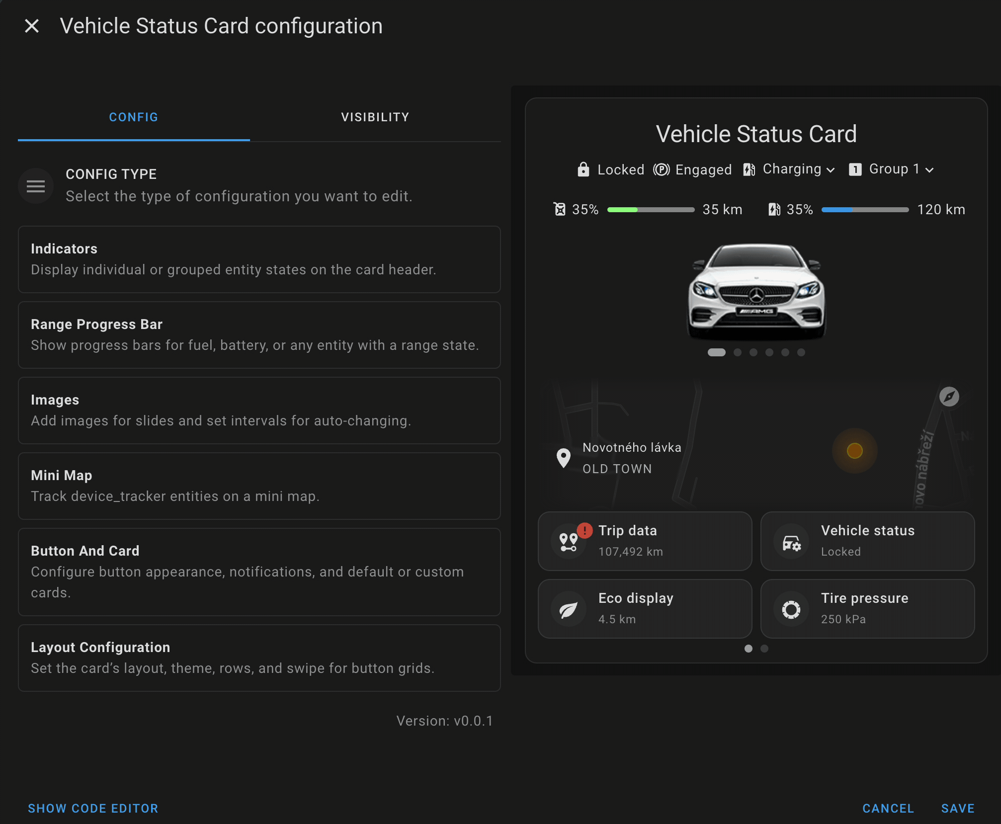
- Indicators: Display individual or grouped entity states on the header of the card.
- Range Indicators: Show progress bars for fuel, battery, or any entity with a range state.
- Images: Upload or add images for a slideshow display with customizable intervals.
- Mini Map: Track
device_trackerentities using an integrated mini map. - Button Cards: Set up primary/secondary buttons, icons, notifications, and default/custom cards to interact with vehicle entities.
- Layout Configuration: Customize the layout, theme, rows, and swipe functionality for button grids.
Table of contents
HACS (Home Assistant Community Store)
Vehicle status card is available in HACS.
Use this link to directly go to the repository in HACS

or
- If HACS is not installed yet, download it following the instructions on https://hacs.xyz/docs/use/#getting-started-with-hacs
- Open HACS in Home Assistant
- Search for
Vehicle status card - Click the download button. ⬇️
- Force refresh the Home Assistant page
Ctrl+F5/Shift+⌘+R - Add vehicle-status-card to your dashboard
- Download the vehicle-status-card.js.
- Place the downloaded file on your Home Assistant machine in the
config/wwwfolder (when there is nowwwfolder in the folder where yourconfiguration.yamlfile is, create it and place the file there). - In Home Assistant go to
Configuration->Lovelace Dashboards->Resources(When there is noresourcestag on theLovelace Dashboardpage, enable advanced mode in your account settings, and retry this step). - Add a new resource:
- Url =
/local/vehicle-status-card.js - Resource type =
module
- Url =
- Force refresh the Home Assistant page
Ctrl+F5/Shift+⌘+R. - Add vehicle-status-card to your page.
The Vehicle Status Card is fully configurable using Home Assistant's UI card editor, with no need to manually edit YAML.
When adding a new card, the editor provides a "Generate Example" option that:
- Selects random entities from your Home Assistant setup
- Creates a complete sample configuration of the card
- Provides a functional preview to help you get started quickly
This feature makes it easy for both new and experienced users to explore the card's capabilities and layout options.
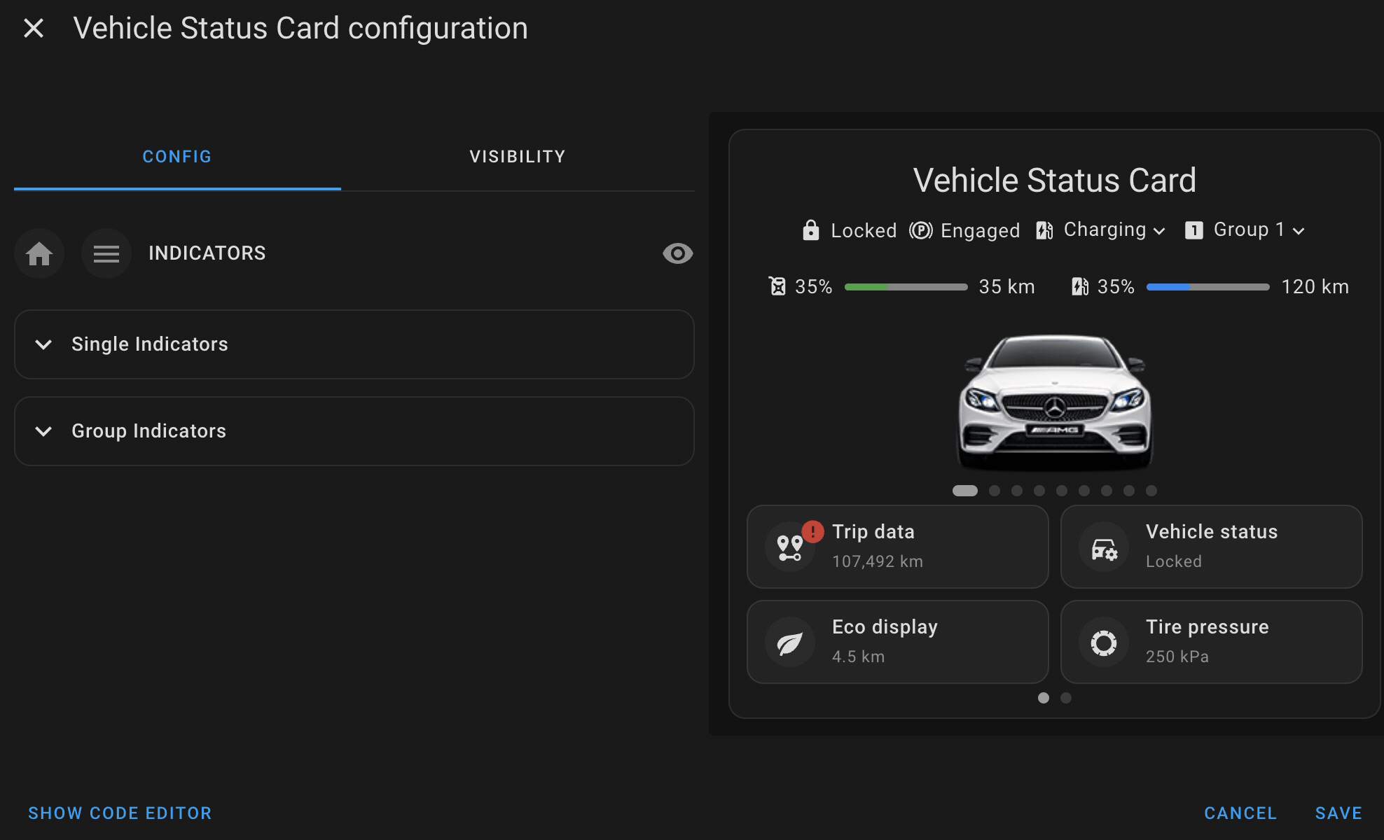
Single indicators are used to display the state of a single entity, such as a sensor or binary sensor, on the card's header. These indicators are ideal for showcasing key information like vehicle battery level, engine status, or lock state. Each single indicator displays the current state of the entity with an optional icon for better visualization.
For example, a single indicator can be used to show whether a car door is locked or unlocked, or to display the remaining battery percentage of the vehicle.
Group indicators allow you toThis is useful when you want to track the status of related entities together, such as all door locks or all tire pressures. Group indicators display a summary view of the entities they contain, giving you a quick snapshot of their states.
For instance, you could create a group indicator to monitor the lock status of all car doors, or to show the pressure levels of all tires at once. Group indicators help to keep the interface cleaner and more organized by bundling similar entities together.
Yaml Example
indicators:
single:
- entity: lock.car_lock
action_config:
tap_action:
action: more-info
- entity: sensor.car_state_of_charge
action_config:
tap_action:
action: more-info
group:
- name: Tires
items:
- entity: sensor.car_tire_pressure_front_left
name: Front left
- entity: sensor.car_tire_pressure_front_left
name: Front right
- entity: sensor.car_tire_pressure_front_left
name: Rear left
- entity: sensor.car_tire_pressure_front_left
name: Rear right
icon: mdi:car-tire-alert
- name: Windows
items:
- entity: cover.living_room_window
name: Front Left
action_config: {}
icon: mdi:car-door
- entity: sensor.amg_window_rearright
action_config: {}
name: Rear Right
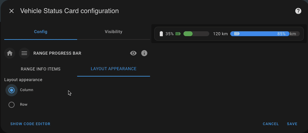
icon: mdi:car-doorRange info bars are used to display progress bars for entities that represent a measurable range, such as fuel levels, battery charge, or remaining range. These bars provide a visual representation of how much of a resource is left, making it easy to monitor critical vehicle metrics at a glance.
-
Energy Level: Track the remaining battery or fuel levels of the vehicle. This can represent a percentage or exact value, such as kilometers or liters remaining.
-
Range Level: Visualize how far the vehicle can travel with the remaining energy or fuel. This is particularly useful for electric vehicles or long-range configurations.
-
Charging Status Entity: Optionally display a dedicated charging entity to reflect whether the vehicle is currently charging. This allows for dynamic display behavior based on real-time charging state.
-
Charge Target Line: Visually show a line representing the vehicle's target charge level (e.g., 80%). This helps users understand how close the current charge is to the desired target, and plan accordingly.
-
Progress Color: Customize the color of the progress bar to better reflect energy status (e.g., green for full, yellow for moderate, red for low).
Range info bars help users keep track of their vehicle’s vital statistics in an intuitive and readable format, ensuring they always know when they need to recharge or refuel — and how close they are to their target.
You can configure multiple range info bars to monitor different metrics side by side—such as main battery level, auxiliary battery, fuel tank, or estimated range.
- Layout Options: Choose between row or column layout to display the progress bars horizontally or vertically, depending on your design preferences or screen space.
Yaml Example
range_info:
  - energy_level:
      entity: sensor.max_state_of_charge
      icon: mdi:battery
      tap_action:
        action: more-info
      value_position: inside
    range_level:
      entity: sensor.car_distancezereset
      value_position: inside
    charging_entity: binary_sensor.vehicle_status_charging
    progress_color: "#2196f3"
    bar_height: 16
    bar_radius: 8
  - energy_level:
      entity: sensor.car_state_of_charge
      icon: mdi:battery
      tap_action:
        action: more-info
    range_level:
      entity: sensor.car_rangeelectrickm
    charging_entity: binary_sensor.vehicle_status_charging
    progress_color: "#4caf50"
    bar_height: 16
    bar_radius: 8
layout_config:
  range_info_config: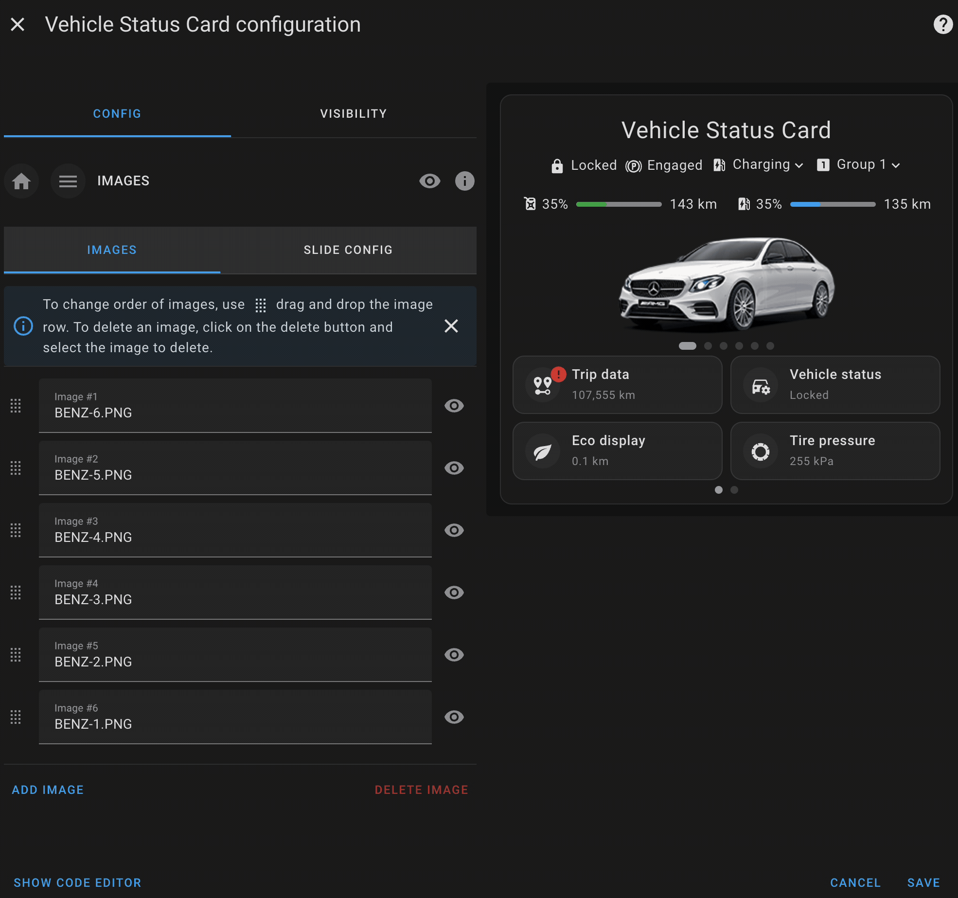
layout: rowImage slides allow you to upload or link images that will be displayed in a rotating slideshow on the card. This feature can be used to showcase vehicle-related images, such as maps, dashboards, or even real-time snapshots from cameras.
- Image Upload & Linking: You can upload images directly from your device or link to external image URLs (e.g., snapshots, maps, rendered dashboards).
- Slideshow: The images cycle through automatically at defined intervals, offering a dynamic visual display.
- Customization: Fine-tune the appearance with options like max width/height, transition speed, slideshow effects, and more.
- Editor Preview: When adding images in the UI editor, a live preview of each image is shown—helping you see exactly how your card will look.
- Drag-and-Drop Reordering: Easily rearrange the order of your images directly in the editor using drag-and-drop. No need to manually adjust the configuration.
The latest release introduces advanced swiper configuration options, allowing for more control over how images are displayed.
- Max Height: Set the maximum height for the image slides.
- Max Width: Set the maximum width for the image slides.
- Autoplay: Automatically transition between images after a specified delay.
- Loop: Whether the slideshow should loop indefinitely.
- Delay: The amount of time (in milliseconds) each image stays on screen before transitioning to the next.
- Speed: How fast the transition between images happens (in milliseconds).
- Effect: Choose between different transition effects for the slideshow:
slide: A classic sliding effect.fade: A smooth fade between images.coverflow: A 3D coverflow effect that adds depth to the transition.
- Hide Pagination: Whether hide the pagination bullets.
Yaml Example
images:
  - title: sample-car-3.png
    url: >-
      https://raw.githubusercontent.com/ngocjohn/vehicle-status-card/refs/heads/main/assets/sample-images/sample-car-3.png
  - title: sample-car-2.png
    url: >-
      https://raw.githubusercontent.com/ngocjohn/vehicle-status-card/refs/heads/main/assets/sample-images/sample-car-2.png
  - title: sample-car-1.png
    url: >-
      https://raw.githubusercontent.com/ngocjohn/vehicle-status-card/refs/heads/main/assets/sample-images/sample-car-1.png
  images_swipe:
    max_height: 150
    delay: 5000
    max_width: 450
    autoplay: true
    loop: true
    hide_pagination: true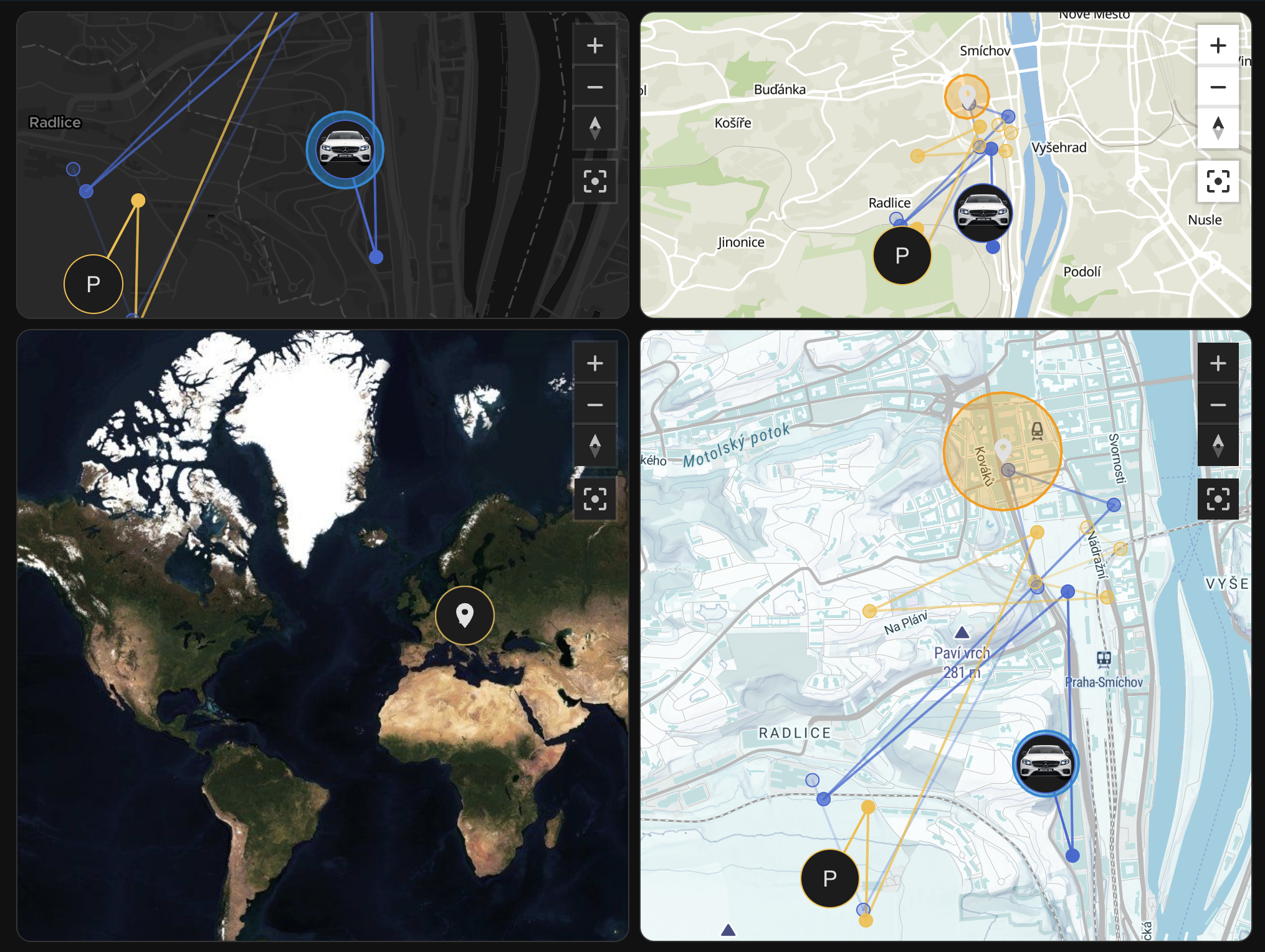
effect: slideThe mini map feature displays a real-time map within the card, tracking the location of a device_tracker entity. This is especially useful for monitoring the current location of your vehicle or other trackable devices.
- Real-Time Tracking: Show live location updates using any
device_trackerentity. - Multiple Entities Support: Track more than one device on the same map. Useful for multi-vehicle households, family members, or mixed fleet tracking.
- Custom Zoom Level: Set the default zoom level to focus on the area around the tracked device(s).
- Theming Support: Automatically adjust the map’s appearance to match your dashboard theme (light, dark, or auto based on time).
-
MapTiler Integration: Use your own MapTiler API key to unlock high-quality map tiles, including:
- Rich theming options (e.g., streets, satellite, outdoors).
- Smooth rendering and performance improvements.
- Customizable map style support.
-
Standalone Mode: With a MapTiler key provided, you can now configure the map as a standalone card — useful for displaying a larger tracking view or building a separate map-focused dashboard.
How to get API Key
For detailed maps popup, get a MapTiler API Key by following these steps:
- Create free account https://www.maptiler.com/
- Copy new key https://cloud.maptiler.com/account/keys/
- In config editor paste key into Mini Map configuration > Maptiler API
- Click Save
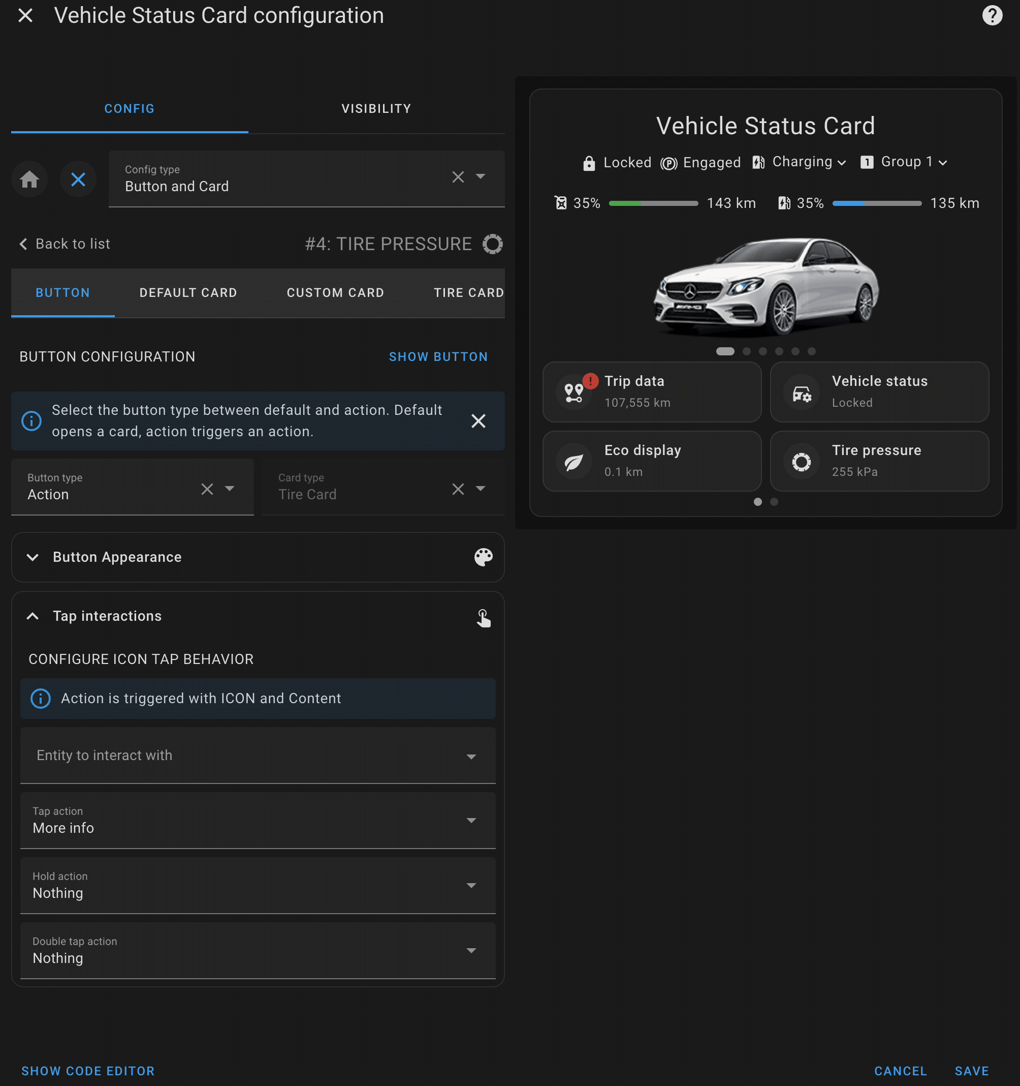
The button card is a core feature that provides interactive buttons to control or monitor specific entities in your vehicle. Each button can be customized with a primary label, secondary information, icons, and notifications.
A single button allows you to represent an entity or action related to your vehicle. You can set up the button’s appearance, behavior, and actions to suit your needs.
- Primary Label: The main label on the button, usually indicating the action or entity (e.g., "Lock Doors").
- Secondary Info: Additional details below the primary label, such as the state of an entity (e.g., "Locked" or "Unlocked").
- Icon: Customize the icon displayed on the button to visually represent the entity or action (e.g., a lock or fuel pump).
- Notifications: Set up conditional notifications to alert you when certain states occur (e.g., when the fuel level is low).
- Action Types: New feature that allows you to configure different types of actions for the button, such as
tap,hold, ordouble_tapactions.
The Action Type feature allows you to define what action should be triggered when interacting with a button. Each button can have multiple action types configured, giving you more control over how the button behaves. You can specify different actions for tapping, holding, or double tapping the button.
- tap_action: The action triggered when the button is tapped.
- hold_action: The action triggered when the button is held down.
- double_tap_action: The action triggered when the button is double tapped.
more-info: Opens the more-info dialog of the entity.toggle: Toggles the state of the entity (e.g., fromontooff).call-service: Calls a Home Assistant service (e.g.,lock.lock).navigate: Navigates to a specified path or view in the interface.url: Opens a specific URL.
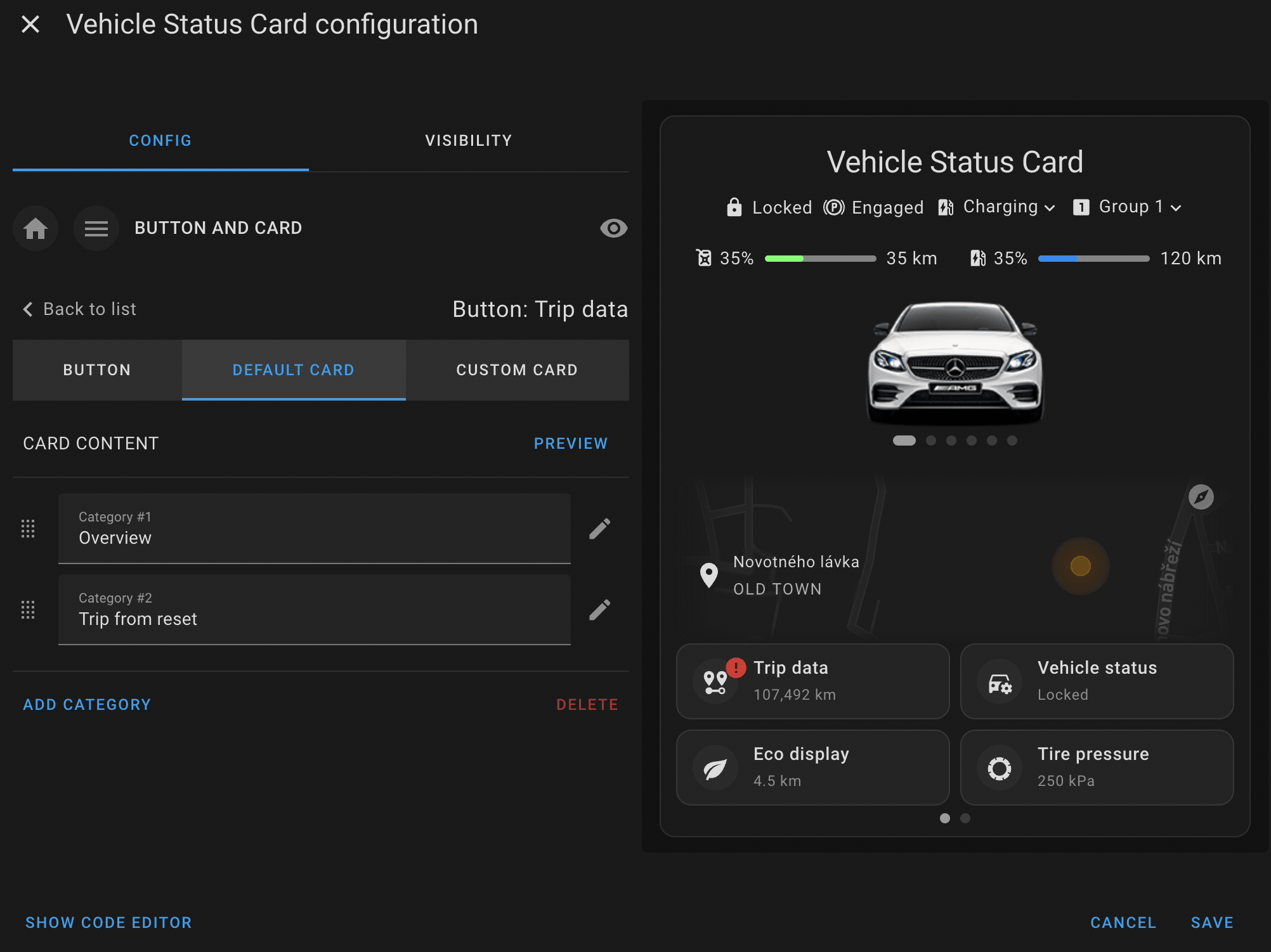
The default card configuration allows you to display a set of related entities with their states in a structured way. This card can display multiple pieces of information, such as sensor readings or status indicators, in a compact and organized format.
- Title: Each default card can have a title to define the category of items being displayed (e.g., "Fuel Status" or "Vehicle Locks").
- Collapsible Sections: You can optionally make sections of the card collapsible, allowing users to hide or show the details as needed.
- Items: Display a list of entities with their states, icons, and labels. This provides a clear overview of the current status of various vehicle sensors or controls (e.g., tire pressure, battery status).
The default card is perfect for grouping and displaying related entities in one place, giving users an at-a-glance view of the vehicle’s key metrics or controls.
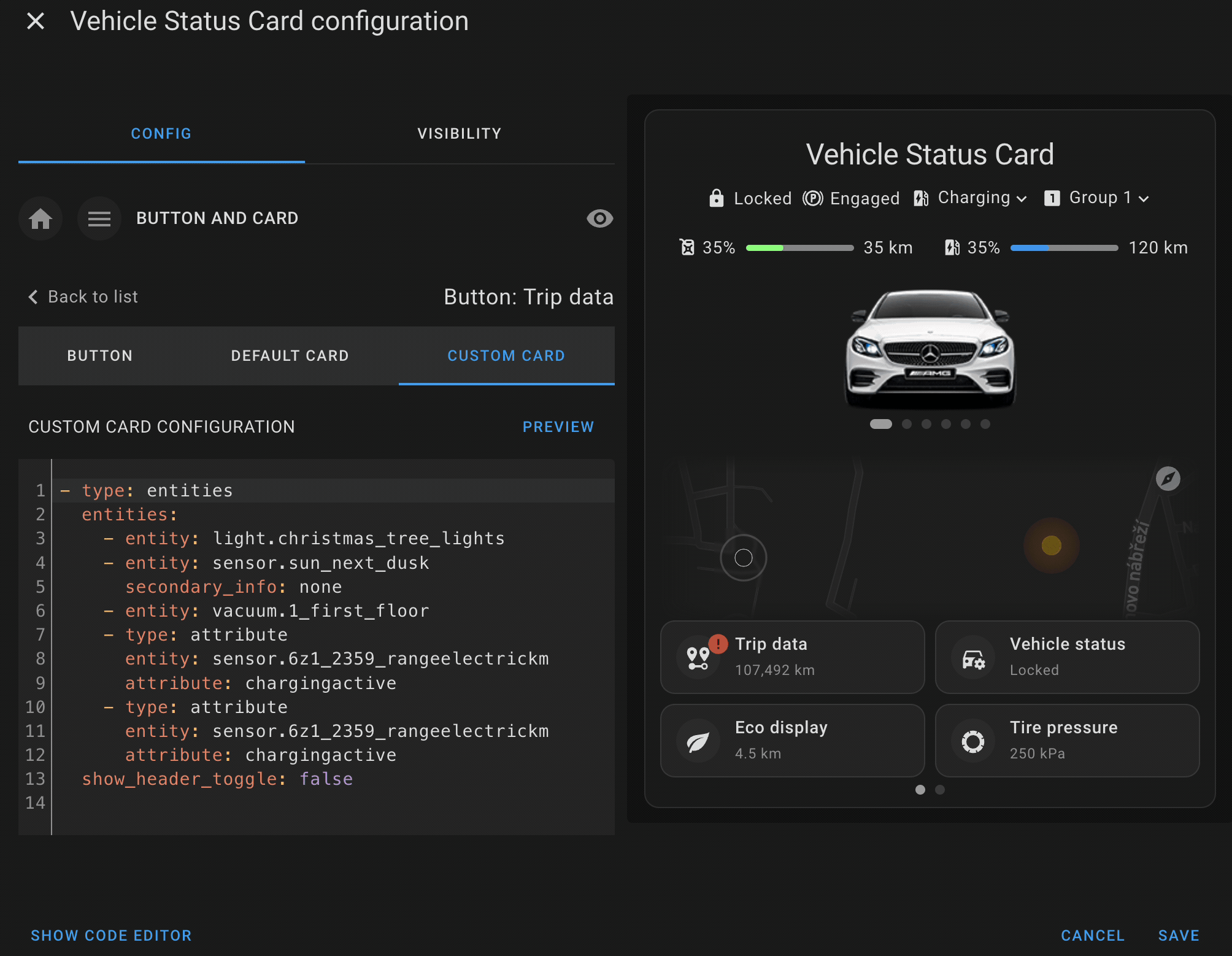
The custom card configuration allows you to integrate any Home Assistant-supported card into the vehicle status card. This feature gives you full flexibility to display or interact with various entities using custom Lovelace cards.
- Full Lovelace Support: You can embed any Lovelace card configuration, such as entity cards, glance cards, or custom third-party cards.
- Custom Layout: Customize the layout and appearance of the card to suit your preferences, allowing you to display more complex data or control options.
- Entity Control: Use custom cards to control specific entities or display detailed information, such as real-time vehicle metrics or custom sensor data.
This powerful feature allows you to extend the functionality of the vehicle status card by adding any custom elements or controls that fit your needs.
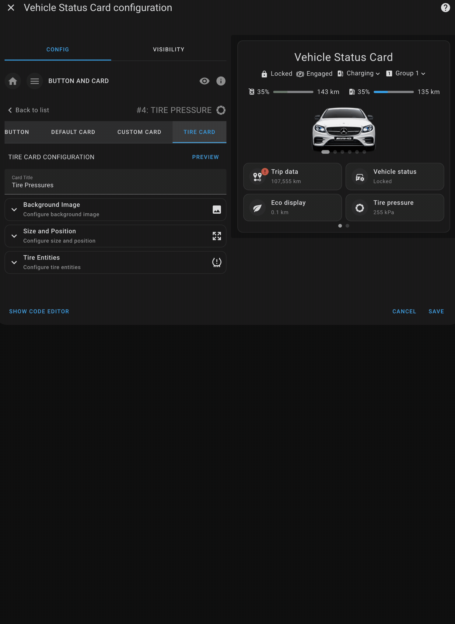
The Tire Pressures Card allows users to monitor and display the tire pressures of their vehicle in a highly customizable manner. This card provides a visual representation of the vehicle’s tires, allowing users to assign specific entities to each tire and customize the background image, layout, and size.
This card is designed to give users a clear, at-a-glance view of their tire pressure status, ensuring they can easily monitor and respond to any issues that may arise.
- Custom Background: Upload or link to a custom image of your vehicle, allowing for a personalized layout.
- Tire Pressure Monitoring: Assign specific Home Assistant entities to each tire to display real-time pressure readings.
- Customizable Layout: You can adjust the size, position, and orientation of the vehicle image and tire indicators.
- Responsive Design: Ensure the card fits neatly within your dashboard, adapting to different screen sizes and layouts.
The card supports complete customization, from setting the vehicle's background image to adjusting the size and positioning of tire pressure indicators.
-
Background Image: Set a custom image of your vehicle (or any image of your choice) as the background to enhance the visual appeal of the tire pressures display.
-
Tire Entities: Define which Home Assistant entities should be used for each tire (front left, front right, rear left, rear right).s
-
Image Size & Position: Customize the size and position of the background image, ensuring that the tire pressure indicators fit well within the image.
-
Orientation: Choose whether the layout should be horizontal or vertical, allowing you to display the tires in the correct orientation based on the background image.
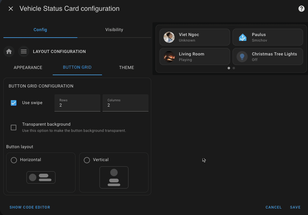
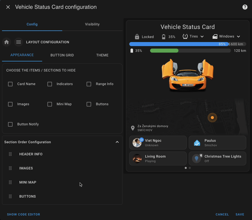
The layout configuration controls how elements within the vehicle status card are displayed, including themes, grid layout, and visibility of certain components.
-
Theme Configuration: Customize the card’s overall appearance using a theme mode:
auto: Automatically switches based on your system or dashboard theme.light: Use a light background and styling.dark: Use a dark theme optimized for low-light environments.
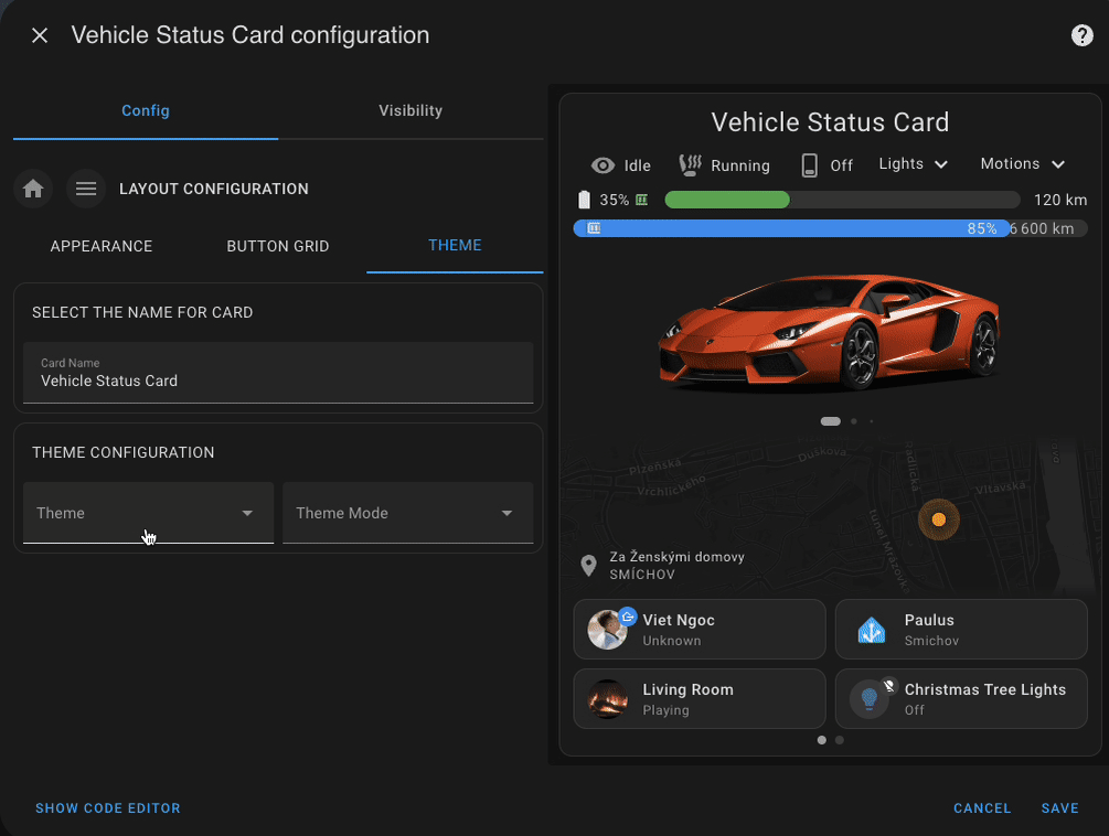
-
Button Grid Layout:
- Set the number of rows for displaying buttons.
- Enable swipe gestures for smooth scrolling on mobile devices.
- Choose between vertical or horizontal layout for each button using the new
layoutoption. - Apply a transparent background to buttons for a cleaner, more integrated visual style.
-
Visibility Controls: Toggle the display of individual card sections to match your needs:
- Card Name
- Mini Map
- Buttons
- Indicators
- Range Info
- Images
- Button Notifications
-
Section Reordering: Easily rearrange the order in which the main sections appear on the card. This lets you prioritize the content most relevant to your use case, whether that's vehicle status, location, or custom buttons.
This configuration gives you full flexibility to design the card’s layout and optimize it for different devices or user preferences.
Yaml Example
layout_config:
  button_grid:
    rows: 2
    columns: 2
    swipe: true
    button_layout: horizontal
    transparent: false
  hide:
    button_notify: false
    buttons: false
    images: true
    indicators: false
    range_info: true
    mini_map: true
    card_name: false
    map_address: false
  section_order:
    - header_info
    - buttons
© 2024 Viet Ngoc