A lightweight and customizable Vue 3 component for searching and selecting icons from the Iconify icon library.
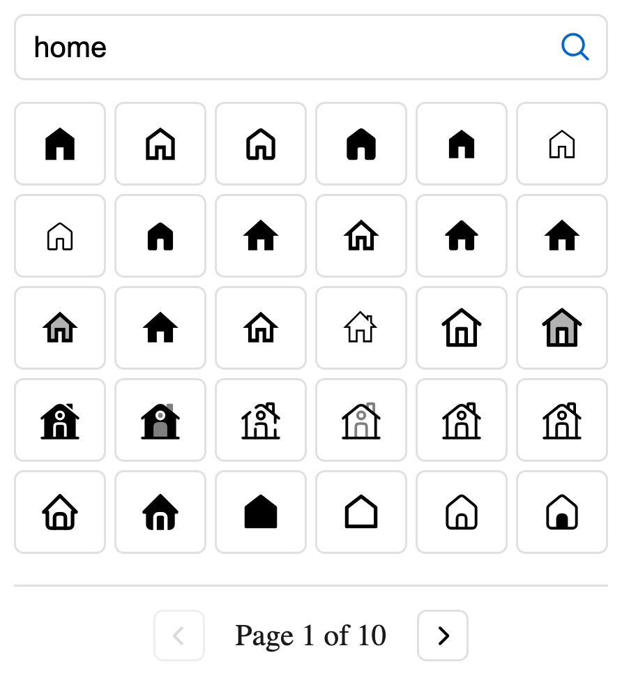
# npm
npm install iconify-icon-picker @iconify/vue

# yarn
yarn add iconify-icon-picker @iconify/vue

# pnpm
pnpm add iconify-icon-picker @iconify/vue<script setup>
import { ref } from 'vue'
import IconPicker from 'iconify-icon-picker'
import 'iconify-icon-picker/style.css'
// Define a ref to store the selected icon
const selectedIcon = ref('')
</script>
<template>
<div>
<h2>Select an Icon</h2>
<IconPicker v-model="selectedIcon" />
<div v-if="selectedIcon">
<p>Selected icon: {{ selectedIcon }}</p>
</div>
</div>
</template>| Prop | Type | Default | Description |
|---|---|---|---|
modelValue |
String | undefined |
v-model binding for the selected icon |
value |
String | undefined |
Selected icon (alternative to v-model) |
placeholder |
String | 'Search icons...' |
Placeholder text for the search input |
debounce |
Number | 300 |
Debounce time (ms) for search input |
itemsPerPage |
Number | 30 |
Number of icons displayed per page |
paginationText |
String | 'Page {0} of {1}' |
Text template for pagination (replace {0} with current page and {1} with total pages) |
| Event | Payload Type | Description |
|---|---|---|
onSelect |
String | Emitted when a new icon is selected |
The component can be customized using the following CSS variables:
:root {
	--iconPicker-text: #1a1a1a;
	--iconPicker-border: #e0e0e0;
	--iconPicker-primary: #0066cc;
	--iconPicker-primary-fg: #0052a3;
	--iconPicker-primary-hover: #0052a3;
	--iconPicker-radius: 0.375em;
	--iconPicker-gap: 0.25em;
	--iconPicker-input-height: 2.125em;
	--iconPicker-selected-bg: #e6f3ff;
	--iconPicker-font-base: 16px;
	--iconPicker-transition: all 0.2s ease;
}