Check the proyect live here!
I'm a big Formula 1 fan and one of the things I even can't ignore is how long are the races! That's why I decided to create a tool that would allow me to revisit any race in the past 20 years in just a couple of seconds without feeling like I am just seeing the highlights, I wanted more than that, I wanted to get the full context of the race to actually feel how it happened.
In this project I learned a lot about how to work with libraries in JavaScript at a deeper level, I wanted to do some advanced stuff so I needed to dig deep to understand how said library was working, I learned how important is to know how to read documentation and the advantages you get with it.
I also improved my angular knowledge, especially when working with the template/view as I got the chance to truly discover all the amazing options angular gives you as a framework to manipulate it.
The biggest takeaway from this project would be how important it is to pick the right tools and understand them, and to not surrender when encountering a huge problem that you don't know how to approach, it can get pretty tough when you are triying to, for example, use a library for something it wasn't intended to, but you will get there one way or another if you keep on persisting.
The application was built using Angular, I used Tailwind to style the site as I think its a really powerful tool that can save you a lot of time if you already have a strong CSS base, I used ngx-charts to create the dynamic race chart and globe.gl for the landing page 3D earth globe (which took way too much time!)
There are two big features on this project, the landing page earth globe, and the race viewer, the landing page earth globe was something I had in mind for this project from the start, as I wanted a "wow" factor in the landing page.
I wanted to create a 3D globe that would be "F1 related" this was a big mistake as I did not plan this feature enough and I spent a lot of time learning and reading the library documentation before even thinking what I wanted to do with it.
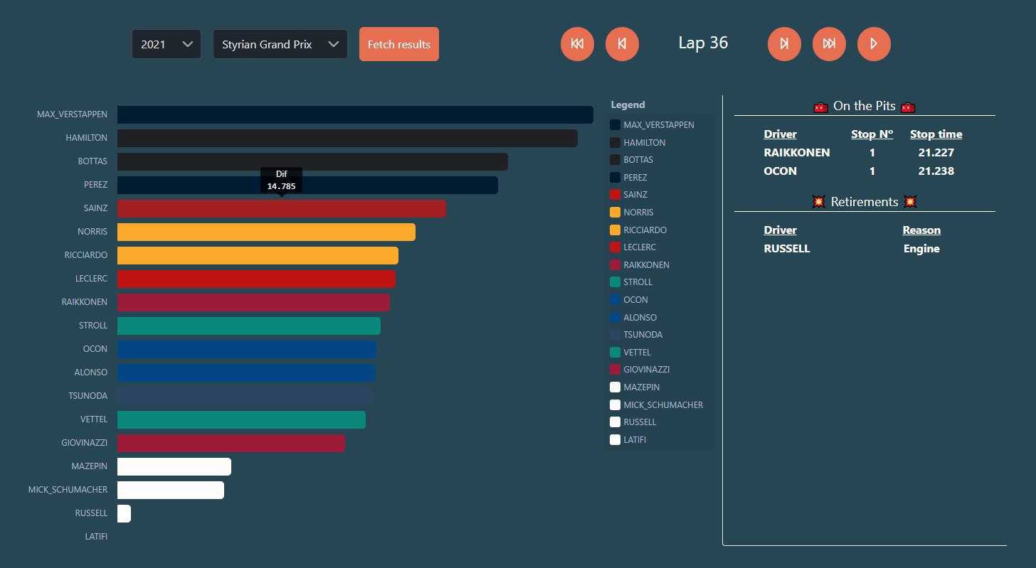
The other feature would be the race viewer, which is the main attraction of the website, while the globe is pretty much just for looks, the race viewer feature is really useful, as it lets you watch any race from the season 1996 onwards (API limitation) in a race chart like format, where the time gaps between the pilots in the race are translated into a visual chart, that makes figuring out the distances between pilots a much easier task. It also has a tab where race related events are shown, such as pitstops, fastest laps, retirements...
Especial thanks to Eargast API, the API where all the data needed for the comparissons comes from, couldn't have done it without it!