Please change the color of error output #7451
Comments
|
I agree, e.g. light green (lime) would be much more easy to recognize! |
|
I like the highlights, I think the comment color is fine, if a little subtle. I think the more traditional soft green would be better. However the error color is just as bad as it was before Anything with a heavy component of red or blue is harder to read. The human eye has the fewest cones (the elements of our eyes that see color) for red, followed by blue, and the most for green. So that orange — no matter the shade — is taxing to read, even for people with good eyesight. Factor in people with vision disabilities, or even just people getting older; and any shade of orange is going to feel downright hostel I mean the the app is short on accessibility as it is, every bit helps. There is exactly nothing wrong with making the error text white. It is completely clear that it is the error text from context; but most text is black on white, or white on black for a reason. |
|
@jockm thank you for the input. I changed the colors |
|
Here is the thing: the error text is still orange. Aside from tradition there is no good reason for that, and clearly tradition doesn't matter considering the changes you made on the code area. So please just make the error text white on black, or black on white. The color coding on the file:line part is fine. |
|
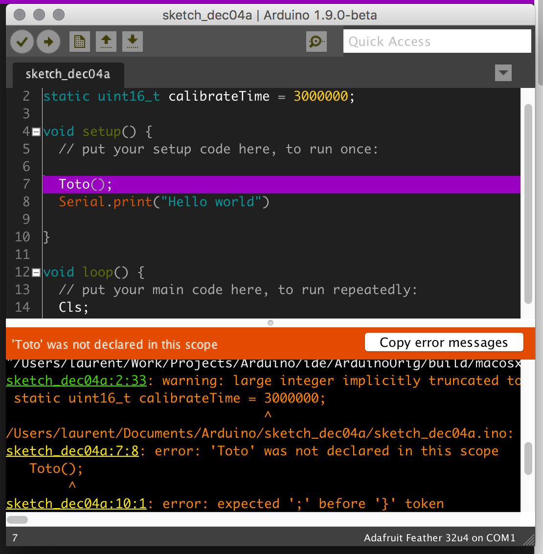
Hello, thank you for your input. I have attached a picture with the change in error color from orange to white. If this is what you are asking for, I can make a pull request and see if it gets accepted. I can also show you how to change the color if you are running on command line/ terminal in case it does not get accepted. |

|
I'm very much against changing error text color to white. It's important for errors and warnings to be visually distinct from the rest of the output. I'd hope there could be a compromise that can improve accessibility for people with visual disabilities without greatly worsening the user experience for everyone else. As Alogitt said, it's quite easy for anyone to customize the Arduino IDE's theme to their individual preference. I have attempted to document all the theme settings, as well as provide a sketch for testing themes here: Seeing as it doesn't satisfy @jockm, I wonder if there is actually a need for #7551? Is there anyone who has trouble seeing the current red color who prefers the orange color used in that PR? I have no strong preference between red and orange. |
|
@per1234 Personally, I believe the bright orange color is a bit easier to see against the black background than the original color while still conveying the warning that it is supposed to. I don't have a strong preference; just trying to help out. |
|
I disagree about orange or red - both is invisible to me! I agree with jockm ("The error text is 100% visually distinct in that screenshot. It is below the orange bar, and has a different background color than the code. It is distinct.") Perhaps you can provide a setting in the preferences window about the text color. IMO a pull request would not help, it must always be in the main branch for std Arduino downloads for all future releases. |
|
I will switch to white in my own theme.. and leave the highlights the way they are now forgot the colors but they are ... high contrast) |
|
There's an objective way to measure where certain color changes are acceptable such as this tool, which checks for W3C's WCAG 2.0 compliance in the contrast between a background color and a text color. In the case of PR #7551, the brighter orange ( Arduino users have grown to instantly spot orange as error messages, and I think it's appropriate to keep it so as to not break UX and, IMO, it's is the best color for representing errors in a black background after red. Just please don't make errors green or white, one would be REALLY counter-intuitive and the other, while easy to see once found, blends with all the other output printed in the log, which IIRC is also white. |
|
@feikname That only checks color contrast, there are other issues with vision and color that just contrast. Error messages are second only to the source in terms of the need for readability. Can we err on the side of an abundance of caution here? But I am going to argue with you that that white is somehow counter intuitive for error messages, or that the orange is deeply tied to your branding. You are going to have to present some data to justify that argument. I don't think most people would notice the change, except for finding the text easier to read. Please refer to: http://www.ldau.org/ld-facts/guidelines-for-font-size-color/ |
@jockm I wasn't talking about the code. I was talking about standard output in the console. It seems you are missing the fact that the console may display more than only warnings and errors. Standard output has always been printed in white text in the console. Warnings and error messages have always been printed in red. The difference in colors allows us to quickly notice the critical parts of the output. If you make standard output and error/warning text both white that means I need to read the entire output to find a warning or error message.
For years white text in the console has meant standard output so making error/warning text white is very much counterintuitive.
What we'll be less likely to notice is helpful warning messages. |

This comment has been minimized.
This comment has been minimized.
This comment has been minimized.
This comment has been minimized.
|
@per1234 No I knew exactly what you meant, and I am not against making error messages visually distinct. I am against doing it with colors that can be difficult to see. I am a 51 years old guy, with dyslexia and just the barest signs of macular degeneration and I cannot read the text in your screenshot without great difficulty. Make it more than a line or two and the only way I can cope is to copy the text and paste it into a text editor. I know I am not the only one from my own conversations. That is a broken UX By all means, make errors visually distinct. You could use bold or italics, you could make the words "Error", "Warning", etc a different color (which I mentioned as a possibility previously), or you could use other forms or text decorations. You have options other than simply changing the color. |
|
Seems like making error texts bold and modifying the error color to the brighter orange could be a good compromise. |
|
@feikname Bold might be a step in the right direction, but you still have the problems I outlined with red heavy colors. If we must have red/orange, why not put a "ERROR:" prefix to the message and make that red/orange, and then let the actual message be one of the two most readable colors we have (i.e. white). Because in the end, if given the choice between branding or usability (in this case readability), I think we should pick the latter ever time |
I do not think this is a good idea. The text that is currently printed in a distinct color, is the text that was printed on the "stderr" output of subprocesses. Typically, this contains errors, but this is not necessarily so. For the compiler, it is also used for warnings. Avrdude even prints all of its verbose output to stderr. Prefixing each line with "ERROR" or something similar would probably only confuse users. More correct would be to prefix each line with "stdout" or "stderr", but that would still confuse novice users who have no clue what these terms mean. The current approach of using a different color seems to bypass this problem by not explicitly stating what the colored text means, it just draws more attention to it. As for using a different color to improve readability: That seems like a viable option to me. Of course, using a red or red-ish color for errors (and some other stuff, as pointed out above) seems common, which is probably why it is done now. Using e.g. green would also draw attention to the text, but I think users would not expect green text to contain error messages, so it might be better to consider other colors. @tofrnr also suggested a yellow color, which could work IMHO. As for making things bold: I'm not sure if that would stand out sufficiently, but that might just need an experiment perhaps? |
What I was implying was that there would be some parsing of the text to inject "Error:" before error messages, and maybe "Warning:" before warning, etc. I am sorry if I wasn't more clear.
And yet I can point to people who are having trouble reading the error text, and have already pointed to two sources that say color is bad when the goal is readability — and error messages are already hard to read if in white. We have no data on how many people care about colors vis-a-vis branding, have problems with them, or who do have problems with them. Nor is there a good feedback mechanism for the average user to use. Don't we want to make the Arduino IDE as easy to use for the greatest number of people as possible? This includes making it as accessible as possible. So until and unless there is a theme editor that is directly part of the Arduino IDE along with a set of themes; what is the harm in making errors more readable? |
The problem there is that it is hard to reliably decide whether something is an error, warning, etc. Hardcoding regexes might work for (certain versions of) gcc, but third-party cores can also use different compilers and tools. Making these regexes configurable per core/board would be the correct approach to this, but also a lot more work.
I was not trying to say that the current approach is free of any problems, I'm just saying that using color to distinguish between stdout and stderr does not have the problem of labeling all stderr output explictly as "error". |
Then it could be something other than "error". I mean it would be wrong to use "stderr", but it could be anything. As an off of the top of my head suggestion "Important:"? You put that in some color, and then put the text to be read in white |
|
@jockm i totally agree with you that the color for errors of orange/red whatever should be a more distinct color for those with difficulty in reading.
other information https://github.com/per1234/ThemeTest |

Using Zip files for themesHexcode for colorshttp://www.javascripter.net/faq/rgbtohex.htm File locations:
ProcedureUsing zip application create a zip file containing the original theme.txt found in the location of your operating system. Now modify the theme.txt file for colors, font sizes, etc In the Arduino IDE goto the menu Arduino-->preferences under the option theme select theme.txt.custom.zip from the drop down list and restart Arduino IDE and the custom theme will take effect. Copy the theme.txt.custom.zip file to a safe location so it will be available when there is an upgrade or reinstallation. Some suggested changeschanged console.font to 18 changed editor.comment2 to #434F54,bold - dark grey and bold Increased linestatus.font to 14 you could also copy the attached file to the theme directory |
|
@pacav69 in Arduino IDE 1.8.6 and newer, themes can be placed in the You can put multiple themes stored in .zip files in that folder and select which one you want from the File > Preferences > Theme menu. Note that the theme files must be directly under the .zip file, not in a subfolder of the .zip file: |
|
OK it has been two years now and as I slowly develop cataracts I can read everything in the arduino IDE and yet I cannot read the error color. The idea that there is sufficient contrast or that it is accessible is just wrong. Nor should I have to load a theme just to be able to see errors. If you insist on keeping the error color there needs to be an option in the preferences dialog to easily change the color for those who find it unreadable, painful, etc |
|
I second most of the remarks above. Errors are unreadable, and this is really bad when you are with a laptop in a bright location. I always have to copy to notepad to see them. It is really BAD that there is not a simple setting to change the error color (say to white - there is already the ORANGE bar when there are errors, maybe you may put one red square char at line start if you want to permanently mark in some ways the error, no matter the color the end user chooses). I tried by the way to change theme.txt including |
|
It has been more than 4 years since I first brought this up and nothing has been done. It is disheartening that the app remains unfriendly to people with visual processing issues for what seems like the sake of tradition |
|
and the change can be optional, I think this the only bad issue I've found till now. |
|
@aldoaldoaldo Agreed, if there was simply a "visually impaired", or "high contrast", etc option so you could easily and simply get to a mode for people who have a hard time with the existing color screen it would make this issue go away |
|
Thanks all for your care and input about this important subject. I think the best way forward is to focus on the accessibility of the actively developed Arduino IDE 2.x project. The discussion here got into implementation details which are specific to the Arduino IDE 1.x code base, and not relevant to Arduino IDE 2.x, which is a complete rewrite in a different programming language. So it will be best for you to create a new issue in the Arduino IDE 2.x's repository: |
|
@per1234 And how many more years must we wait for accessibility to be a
consideration in 2.0? My problem is that this has been sat on long enough for you to say lets sit on it longer. Does 2.0 have a release date? How long will 1.x be supported after 2.0 is out? Why wait any longer for the simple option of a high contrast/colorless option for people with visual disabilities?
I do not say this lightly: it genuinely feels like you do not care, not in an active hostile way, but in the soft neglectful way that someone who doesn't actually understand the problem and thinks it is fine asking people underserved to wait even longer
|
|
@jockm this sort of negative uncompromising attitude is counterproductive. If you only want to vent, do it somewhere else. If you actually want to work together to make this free open source project better, you need to find a different approach. |
|
@per1234 and that is the kind of ablest rhetoric that is used when you don't understand the issue. Do better |
With my aging eyes that orange color is increasingly hard to read against a black background, and there is no way to change it.
Yes I can copy and paste it into another editor, but that shouldn't be necessary just to see a simple message.
This is bad for accessibility and hard on your users. Please change to something more readable
The text was updated successfully, but these errors were encountered: