matplotlib colors darker than equivalent matlab colors #2709
Comments
|
Try "blue" instead of "b". "Blue" refers to the w3c HTML/CSS color spec for Cheers!
|
|
Hi Ben, I see a similar output even when I use "blue". Anything else I might have missed? FYI, I am using matplotlib in windows with Python 2.7. |
|
There is something very wrong with your mpl installation, I think. An mpl line with a simple 'b' or 'r' color should not look anything like what appears in your top example above. It should look like this: http://matplotlib.org/examples/lines_bars_and_markers/line_demo_dash_control.html or like any of many other examples in the gallery. This should not depend on the backend. I have no idea what is going wrong on your installation--I've never seen, or heard of, anything like this before. |
|
To me it looks like you are not plotting a line but a lot of points very close together. Is that right? Point Markers in matplotlib has a border which is black by default. By plotting a lot of point on top of each other the border will dominate. You can either change the colour of the border or change the width of it. Consider the difference between: x= np.arange(1,10,0.001)
y = x
plt.plot(x,y,color='b',marker='o',markersize=4, linestyle='None')and x= np.arange(1,10,0.001)
y = x
plt.plot(x,y,color='b',marker='o',markersize=4, linestyle='None',markeredgecolor='b')I don't think either of these plots are good. Better alternatives would be either just plot the line between the points since there are so many or to use the markevery to reduce the number of points plotted or perhaps a combination like: x= np.arange(1,10,0.001)
y = x
plt.plot(x,y,color='b',marker='o',markersize=4, linestyle='-',markevery=300) |


|
@jenshnielsen Good eye, thank you! I should have noticed that--I completely missed the reference to markers. You can also use "mec='none'" or "markeredgecolor='none'"to suppress the coloring of marker edges. Note that this is the string 'none', not the Python object |
|
Cool beans. That did it. You guys were right, I was trying to plot a lot of points that are very close to each other. This is an extra parameter that I was not aware of. Should marker edge be the same as the marker color by default? For my purpose, even if they are close it's fine as long as I can see the two colors. Efiring: Setting mec='none' hid the plot completely. Something else seems to be broken there. Thanks for all the quick help! |
|
I can't reproduce the issue with mec='none', Which marker are you using? The example that you gave about IMHO a black edge makes sense for a normal amount of points. It is difficult to find optimal plotting settings for all types of plots with the default settings. |
|
Hmmm. Interesting. Looks like my code was not reproduced in my post correctly. I was using * as the marker. Following is the code again: plt.plot(x,y,color='blue',marker='*',markersize=4, linestyle='None',mec='none') |
|
If you use a larger markersize, I think you will see the blue; but at a markersize of 4, it might become too small to see with some screen resolutions. |
|
Hi efiring, plt.plot(x,y1,color='blue',label='Data A',marker='*',markersize=10, linestyle='None',mec='None') plt.plot(x,y2,color='red',label='Data B',marker='*',markersize=10, linestyle='None',mec='r') I tried using marker size of 10. It didn't help. Following is the output for the above code: |

|
I cannot reproduce this. Is it possible for you to attach the input used to generate the plot? |
|
Happens with any data: from matplotlib import pyplot as plt plt.plot(x,y2,color='red',label='Data B',marker='*',markersize=10, linestyle='None',mec='r') from matplotlib import pyplot as plt plt.plot(x,y2,color='red',label='Data B',marker='*',markersize=10, linestyle='None',mec='r') |


|
Strange. I Cannot reproduce this issue. I have tested it with several different backends (qt, wx, tk and ipython inline) on linux and all work as expected. I'm using mpl 1.3.1 |
|
I believe I am on mpl 1.1.0 and I am using Windows. For some reason, my ipython is using version 1.3.1 of mpl and there I don't have any issues. It seems like it is an old issue. |
Hi,
I am trying to move some plotting tools from Matlab to matplotlib and I see that the colors are darker in matplotlib. For example, I am attaching two images for the same data. Matlab plots are much clearer than the matplotlib one. Is there a setting I am missing? I searched the issue list and google and didn't find anything. Thanks in advance for the help.
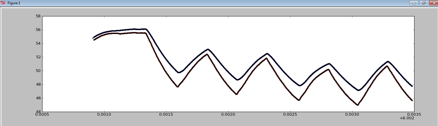
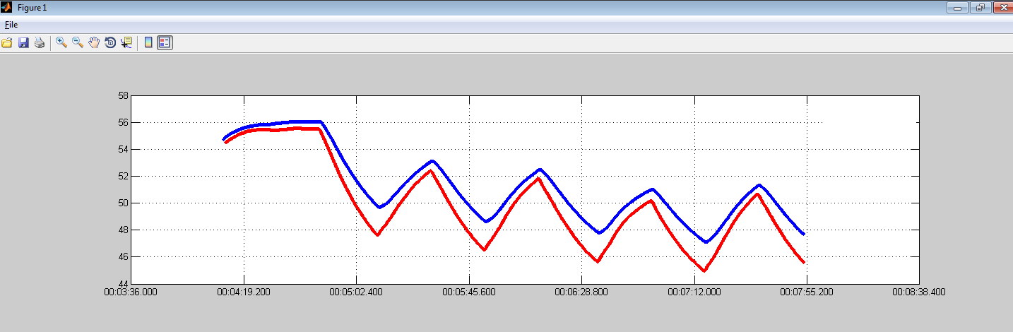
Code snippets:
Matlab: plot(x,y,'MarkerSize',4,'Marker','','LineStyle','none');
matplotlib: plt.plot(x,y,color='b',marker='',markersize=4, linestyle='None')
The text was updated successfully, but these errors were encountered: