If you are looking for QCalendar that works with Vue 3, head over to the new docs.


QCalendar is a Quasar component. It is a powerful calendar that plugs right into your Quasar application and allows for viewing of day (1-6 days), week, monthly, scheduler and agenda views. Painstaking care has been given to make almost every aspect of QCalendar configurable and/or modifiable in some way and control given to the developer.
v3.2.0: New property for interval-based calendars: time-clicks-clamped. What this does, is instead of returning a timestamp with the exact time of the click position, it returns the timestamp of the interval. If normally, your timestamp would have a time of 13:20, this property makes it return 13:00. This is also based on your settings of interval-minutes. If your interval-minutes is set to 15, then the same click above would return a timestamp with time set to 13:15.
Day and Week calendars now have the ability to toggle selected intervals or a range of selected intervals (even across multiple days) with properties selected-dates and selected-start-end-dates. These properties not only need the date (like the month view uses), but also the time (use the Timestamp exported method getDateTime). See the examples to learn how to do this.
Timestamp has a new exported method: getDateTimeIdentifier which is a convenience method that combines getDayIdentifier and getTimeIdentifier.
You can find out more information here.
v3.0.0: As QCalendar strives to be the most exstensible calendar available, to be consistent with this ideology, we had to make a LOT of changes.
Among other updates, several things have become "native" for QCalendar:
- The largest overhaul was introducing css vars to allow users the ability to customize QCalendar
- QCalendar was compared to dozens of other calendars and the look was optimized to be more modern
- The original theming has been removed. The css vars are 25% faster than the previous theming code
- You no longer need to provide a
.q-active-dateclass of your own. You can now change the active date colors via css vars - You no longer need to hook into the styles properties (ie: interval-style) to change the way disabled days look. You can now change the disable date colors via css vars
- 'activeDate' is now included in a lot of the scoped slots and events
- On interval-based calendars, when using the property "interval-minutes", those parts of the calendar are now called "interval sections" and can be changed via css vars. The default is to now have a "dashed" look, while at the main interval time, the lines are solid. Again, all changeable via css vars
- You no longer have to provide
.q-range-first,.q-range-lastand.q-rangeclasses viaday-classproperty for range selection. It's all built-in now. - All deprecated slots and events were removed
Also, check out the new Theme Builder in the docs.
You can find out more information here.
v2.4.0: New slots and events added. Current event system is deprecated, but still available until the next major version is released. To see the deprecated events in the QCalendar API (at bottom of the page here), select the hamburger menu, then select Show deprecated. You can find out more information here.
v2.2.0: Please be aware of breaking changes in events and scoped slotted data. You can find out more information here.
Live Demo - live docs, demo and examples
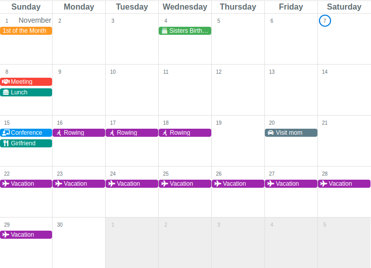
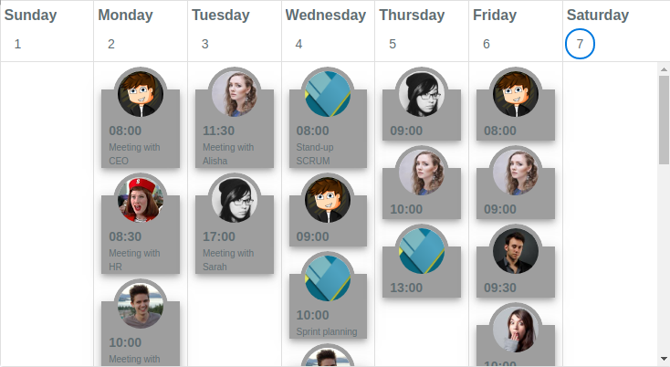
Month view with events
Planner example
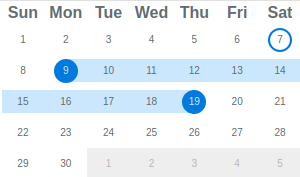
Monthly Mini-mode
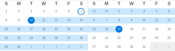
Multi-month selector (mini-mode)
Agenda view with custom content
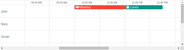
Day view with events

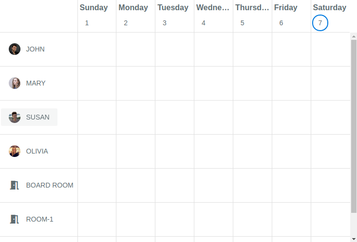
Resource view with events
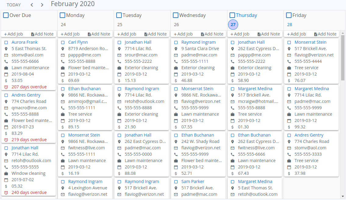
Scheduler view
Including support for locales, optional theming, 1st day Monday, 5-day work weeks, work week numbers, selected days, disabled days, day of year...
...and many more!
Can be found here
Install the App Extension.
OR:
Create and register a boot file:
import Vue from 'vue'
import Plugin from '@quasar/quasar-ui-qcalendar'
import '@quasar/quasar-ui-qcalendar/dist/index.css'

Vue.use(Plugin)OR:
<style src="@quasar/quasar-ui-qcalendar/dist/index.css"></style>

<script>
import { QCalendar } from '@quasar/quasar-ui-qcalendar'

export default {
  components: {
    QCalendar
  }
}
</script>import Vue from 'vue'
import Plugin from '@quasar/quasar-ui-qcalendar'
import '@quasar/quasar-ui-qcalendar/dist/index.css'
Vue.use(Plugin)OR:
<style src="@quasar/quasar-ui-qcalendar/dist/index.css"></style>

<script>
import { QCalendar } from '@quasar/quasar-ui-qcalendar'

export default {
  components: {
    QCalendar
  }
}
</script>Exports window.QCalendar.
Add the following tag(s) after the Quasar ones:
<head>
  <!-- AFTER the Quasar stylesheet tags: -->
  <link href="https://cdn.jsdelivr.net/npm/@quasar/quasar-ui-qcalendar/dist/index.min.css" rel="stylesheet" type="text/css">
</head>
<body>
  <!-- at end of body, AFTER Quasar script(s): -->
  <script src="https://cdn.jsdelivr.net/npm/@quasar/quasar-ui-qcalendar/dist/index.umd.min.js"></script>
</body>
If you need the RTL variant of the CSS, then go for the following (instead of the above stylesheet link):
<link href="https://cdn.jsdelivr.net/npm/@quasar/quasar-ui-qcalendar/dist/index.rtl.min.css" rel="stylesheet" type="text/css"><!DOCTYPE html>
<html lang="en">
<head>
<meta charset="utf-8">
<meta http-equiv="X-UA-Compatible" content="IE=edge">
<meta name="format-detection" content="telephone=no">
<meta name="msapplication-tap-highlight" content="no">
<meta name="viewport" content="user-scalable=no,initial-scale=1,maximum-scale=1,minimum-scale=1,width=device-width">
<title>UMD test</title>
<link href="https://fonts.googleapis.com/css?family=Roboto:300,400,500,700|Material+Icons" rel="stylesheet" type="text/css">
<link href="https://cdn.jsdelivr.net/npm/quasar@^1.0.0/dist/quasar.min.css" rel="stylesheet" type="text/css">
<link href="https://cdn.jsdelivr.net/npm/@quasar/quasar-ui-qcalendar@^2.0.0/dist/index.css" rel="stylesheet" type="text/css">
</head>
<body>
<div id="q-app">
<q-layout view="lHh Lpr fff">
<q-header class="glossy bg-primary">
<q-toolbar>
<q-toolbar-title shrink>
QCalendar <span class="text-subtitle2">v{{ version }}</span>
</q-toolbar-title>
<q-separator vertical></q-separator>
<q-btn stretch flat label="Prev" @click="calendarPrev"></q-btn>
<q-separator vertical></q-separator>
<q-btn stretch flat label="Next" @click="calendarNext"></q-btn>
<q-separator vertical></q-separator>
<q-space></q-space>
<div>Quasar v{{ $q.version }}</div>
</q-toolbar>
</q-header>
<q-page-container>
<q-page>
<q-calendar ref="calendar" v-model="date"></q-calendar>
</q-page>
</q-page-container>
</q-layout>
</div>
<script src="https://cdn.jsdelivr.net/npm/quasar@^1.0.0/dist/quasar.ie.polyfills.umd.min.js"></script>
<script src="https://cdn.jsdelivr.net/npm/vue@^2.0.0/dist/vue.min.js"></script>
<script src="https://cdn.jsdelivr.net/npm/quasar@^1.0.0/dist/quasar.umd.min.js"></script>
<script src="https://cdn.jsdelivr.net/npm/@quasar/quasar-ui-qcalendar@^2.0.0/dist/index.umd.js"></script>
<script>
new Vue({
el: '#q-app',
data: function () {
return {
date: '',
version: QCalendar.version
}
},
beforeMount () {
const now = new Date()
// set initially to today's date (YYYY-MM-DD)
this.date = now.getFullYear() + '-' + (this.padNumber(now.getMonth() + 1, 2)) + '-' + this.padNumber(now.getDay(), 2)
},
methods: {
calendarNext () {
this.$refs.calendar.next()
},
calendarPrev () {
this.$refs.calendar.prev()
},
padNumber (num, length) {
let padded = String(num)
while (padded.length < length) {
padded = '0' + padded
}
return padded
}
}
})
</script>
</body>
</html>In both the ui and ui/dev folders:
$ yarnIn the ui folder
# start dev in SPA mode
$ yarn dev

# start dev in UMD mode
$ yarn dev:umd

# start dev in SSR mode
$ yarn dev:ssr

# start dev in Cordova iOS mode
$ yarn dev:ios

# start dev in Cordova Android mode
$ yarn dev:android

# start dev in Electron mode
$ yarn dev:electron$ yarn build$ yarn build:apiIf you appreciate the work that went into this, please consider donating to Quasar or Jeff.
MIT (c) Jeff Galbraith jeff@quasar.dev